Psycho!!
-
Model by Eric Lay (Boofredlay) c/o Form Fonts.
When I saw this model I knew it was itching for a render, I changed a few things like the alpha based .png lattice texture, created physical geometry for railings etc that were only line, and added a few tiny details and textures as per photo's I found online.
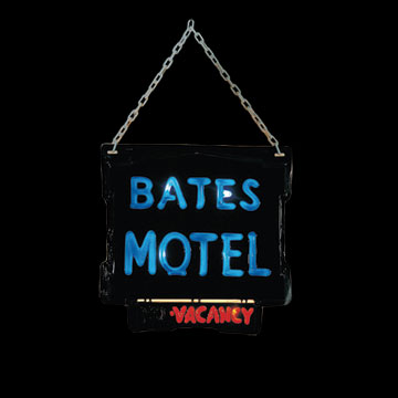
I created the sign, as many young folk may not recognise the house.

Rendered with Vue, minimal post edit (Saturation levels)
-
Very cool! I bet you can do creepier feeling light from the windows, though...
-
a real beauty, pete!
-
Another stunner Pete. Thanks for sharing
-
Son, you make me proud!
-
Don't go to the bath

-
Now delete these signs, make this sky more simple, more abstract, give a lot more space to this marvelous grass, less trees maybe, keep light this way (what a light)...
Yes, you are too close to this great american painter "Andrew Wyeth"
http://en.wikipedia.org/wiki/Christina's_World. See all his work if haven't already.Boofredlay and solo.
This is a great image here. I even don't care about 3d modeling, renders... -
Hey Pete, would love to see a render with an alternative sign. The sign is done well but maybe does not fit the mood of the render. I would like to see a sign with the same back board, but chipped, black pant instead of the neon tubes.
Overall insane render, always excited to see your work!! -
Like Alfred Hitchcock said, "Good E-E-Evening".
-
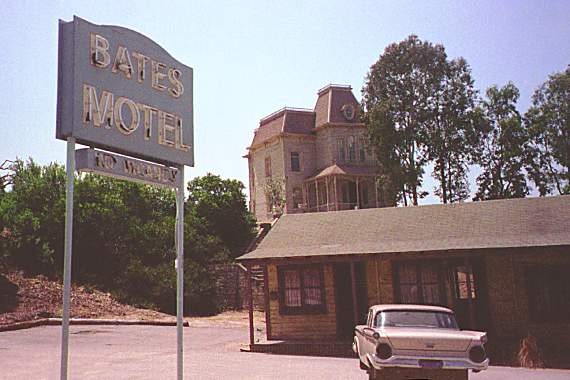
The sign is pretty accurate to the original. Or at least, the official knock-offs of the original.

-
-
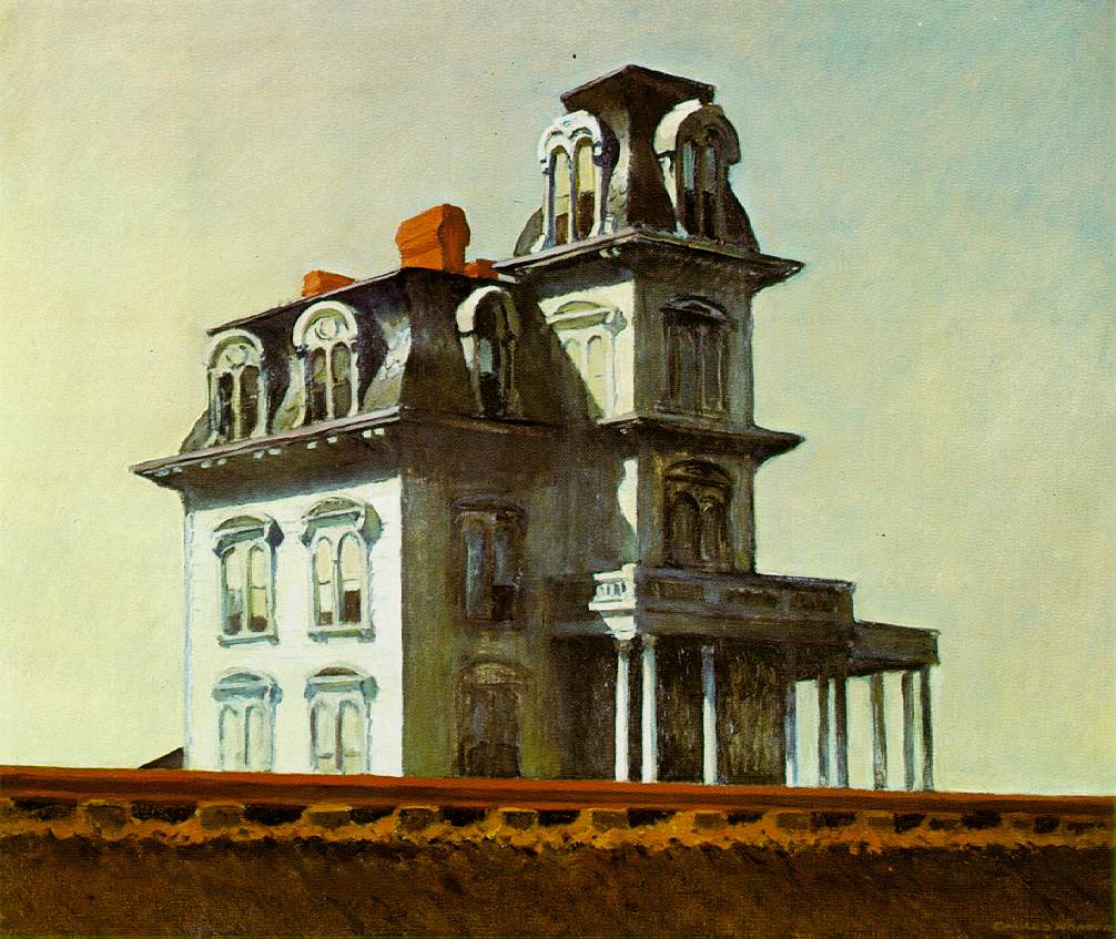
kinda reminds me of an edward hopper painting.
pete could you please do a b+w version of this with an old school grain overlay? I think it would look fantastic, like an old scary movie. I agree about losing the sign.
-
Hopper vs Wyeth. You're right oli. Two really great watercolor american masters.
-
Very great image...my only critique would be to straigten out the verticals. I think it will help make the house look a little more dramatic and dynamic.
-
Looks great, Pete, but where is the silhouette of Norman (as his mother) in the window?
-
@daniel said:
Looks great, Pete, but where is the silhouette of Norman (as his mother) in the window?
I saw her there a min. ago...

-
you can actually see a slight outline of someone, maybe its my eyes. maybe its a murderer.
-
Interesting about the Hopper connection, I've wondered before if the hotel design was influenced by this Hopper painting - House by the Railroad (1925)

or is this a fairly standard USA style of house ?
-
Does any 3d render has to say anything more against this masterpiece? What a painting! What a render! We discovered America yesterday. But she was always there, waiting... Thanks cosycat for this, thanks pete and eric for this fine post. A challenge, my friends.
-
Yes, let's have a Hopper rendering challenge - Solo over to you
Some inspiration perhaps:-
NY movie, The Night, Evening. Light house at two lights, Queensborough Bridge and of course Nighthawks
Hello! It looks like you're interested in this conversation, but you don't have an account yet.
Getting fed up of having to scroll through the same posts each visit? When you register for an account, you'll always come back to exactly where you were before, and choose to be notified of new replies (either via email, or push notification). You'll also be able to save bookmarks and upvote posts to show your appreciation to other community members.
With your input, this post could be even better 💗
Register LoginAdvertisement


