[WIP] Discworld - Ankh Morpork - Assassin's Guild
-
I'm a fan of Terry Pratchet's books. And I got some of the extra material to the Discworld series, including maps and illustrations. So I figured I'd model some scenes from Ankh Morpork, one of my favourite Discworld locations. I plan to texture and render the scenes, giving me some exercise.
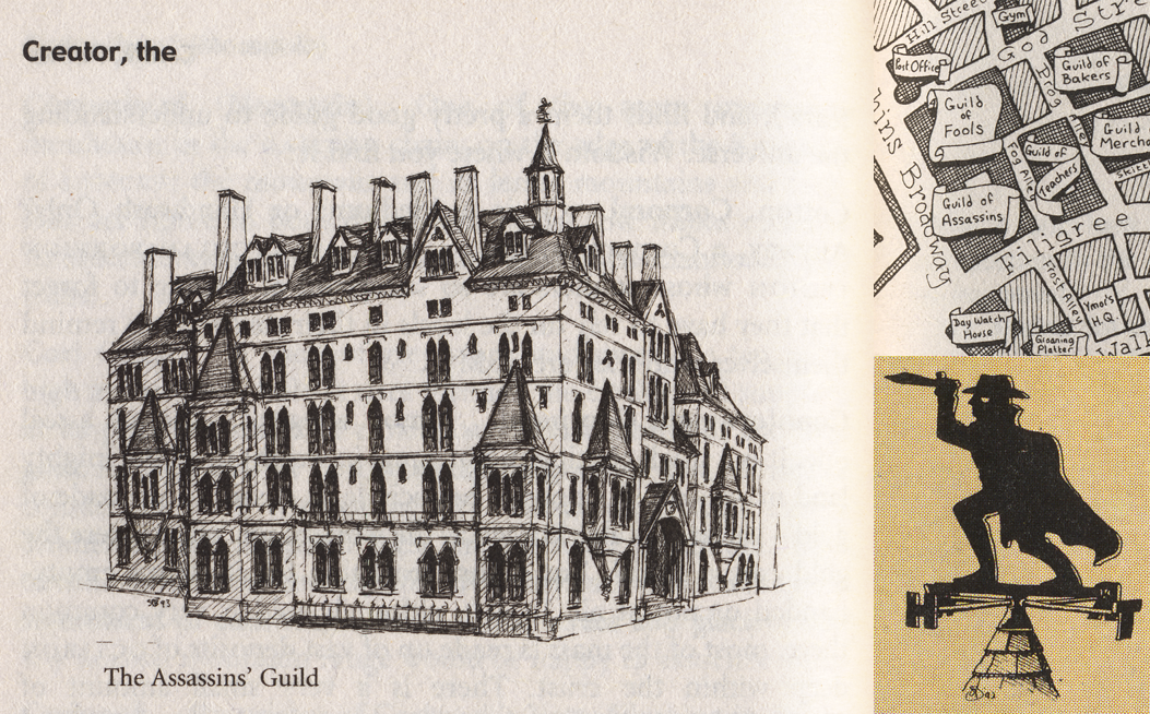
I've done the big bulk of the modelling. What I haven't modelled is the front doors, the wall facing Fog Alley, and the courtyard walls needs some doors etc. Then there's the scenery around it of course.
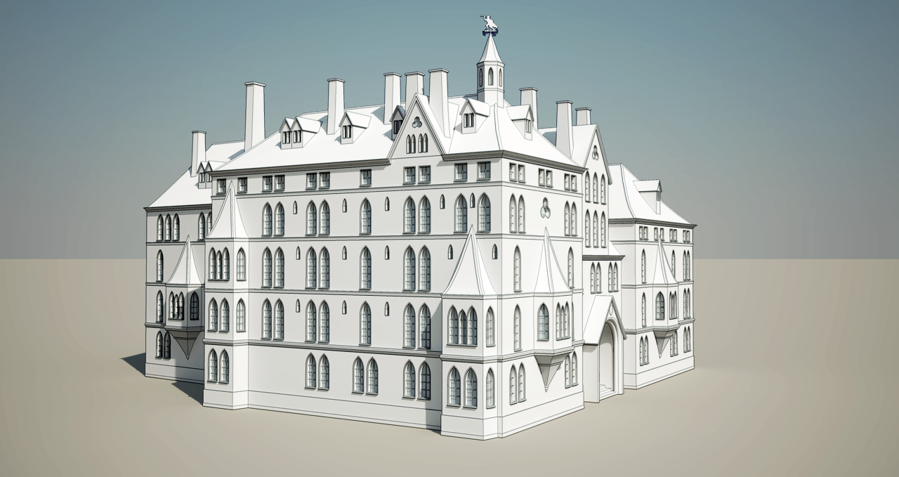
As you see, towards the left, there's a window missing. I can't quite work out how the reference drawing means it should be like. It kind of looks like there's an extra but sticking out, but it doesn't look like it goes flush. Some weird perspective. And to the right of it there's something which nearly seem do indicate a fence? But that doesn't seem ot fit either as the lines seem to indicate the the first level is flush with the second. Anyone got some thoughts?
Also; can anyone remember if any of the books describe the Assassin's Guild? Such as materials? If there's no indication I'm thinking I might make it some whiteish sandstone.
I also think I might add some wobble to the bands dividing the different elevations. But not too much, as I imagine the Assassin's would make sure their HQ is in good condition.
I also consider adjusting the roofs. The big ones need some smoothing as it's currently to much visible hard kinks. And the smaller ones along the façades looks to curved, too fairytale castle -like.
It'd be nice if anyone got some links to some nice inspirational images of similar real life building. Especially doors and walls facing narrow alleys. (I'm thinking of the wall facing Fog Alley.)
-
Very nice, i especially like the presentation style

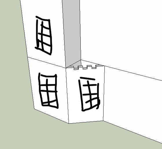
With regards to the strange window, i reckon it's meant to look something like this:
-
I don't think it is meant like that. It is straight wall which has return. Railing is to close void (light for basement).
-
That's what I thought initially. But the extra lines next to it plus the fence-looking lines confuses me. And I can't see it making much sense. But it's not a real building anyway, so I'll just decide on something.
-
@sepo said:
I don't think it is meant like that. It is straight wall which has return. Railing is to close void (light for basement).
Yea, I was leaning towards this. though it seems it's not quite straight. But I guess that's the hand sketch nature of it.
Fence in front of basement makes sense, but there's a second set of railings of some sort on the second level.
-
I think that is balcony with railings. That balcony slab goes full depth of the projecting parts. You are right as it is hand sketch that balcony slab confuses further.
-
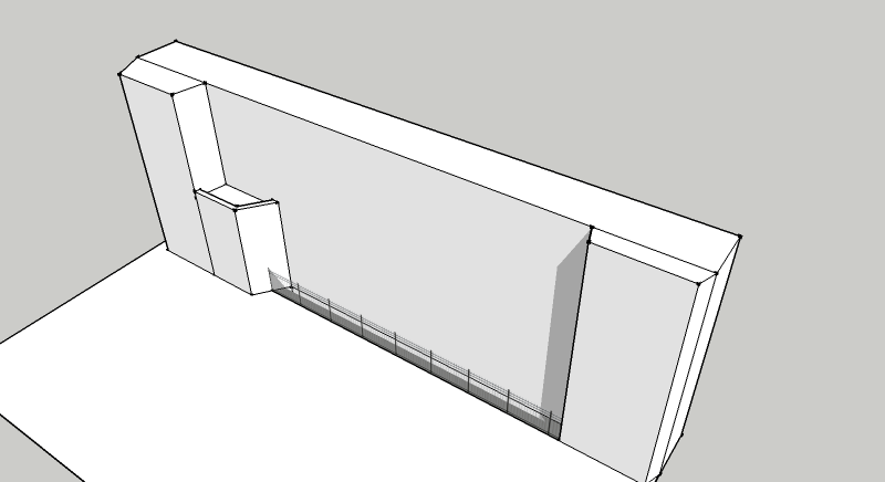
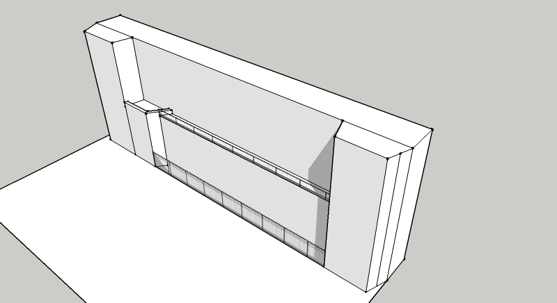
I think I might have it now. The left most part that sticks out is deeper that it appears in the drawing.
-
Hmm... A revision here:
-
@sepo said:
I think that is balcony with railings. That balcony slab goes full depth of the projecting parts. You are right as it is hand sketch that balcony slab confuses further.
Ah! I see it now. There's some support underneath the balcony. That'd be a neat feature to model. Though the railing looks too short.
-
I see what you mean, your revision is looking good

-
I do not see it tapering like that. It goes agains logic of Gothic. I even think the left part projects for 450-600 mm to allow cornices to return properly. In that case railing goes past one on the right. Also I think You had your right bit correct first time.
It appears there are some stone springers under the balcony on the first floor (you call it second) -
@sepo said:
It appears there are some stone springers under the balcony on the first floor (you call it second)
Yea. I keep doing that. In Norwegian we don't have 'ground floor'. The floor at the ground is the 'first floor'.
Anyone got an idea of what the features above the windows are?
-
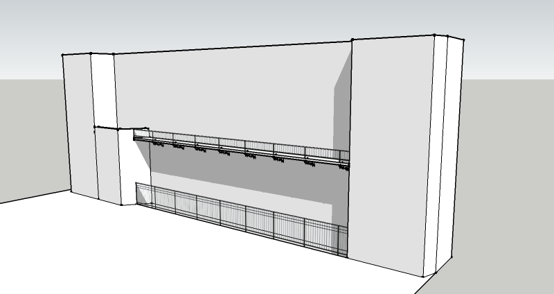
Third revision.
Thanks guys. I know it's neat picking being so obsessed about details in a sketch drawing, but... I like details.
-
These are stone profiles which project. They are usually profiled. They are decorative and not really gothic...but than again the building looks more Victorian play of Gothic than true excersize in style.
BTW again your right corner would never return dead in the corner of the building so I am convinced the return is 90 rather than 45 or so exactly like you did first time. -
Railing to ground floor needs to go further to front of the left piece so that it allows railing to go past right piece and than return 90 to the corner.
-
I'm not on top of the term used.
@sepo said:
These are stone profiles which project.
I'm not sure what this means.@sepo said:
BTW again your right corner would never return dead in the corner of the building so I am convinced the return is 90 rather than 45 or so exactly like you did first time.
Return? Where the outset wall meets the original wall? I didn't intend changing that from the WIP model, which does 'return' before the corner. It was just the quick draft. (If I understood this right...)
-
@sepo said:
Railing to ground floor needs to go further to front of the left piece so that it allows railing to go past right piece and than return 90 to the corner.
Gotcha! Nice observation.

-
@sepo said:
They are decorative and not really gothic...but than again the building looks more Victorian play of Gothic than true excersize in style.
I'm not surprised that style clashes. Sketcher isn't an architect.
Do you know of any city's or building that'd be nice reference inspiration for further detailing?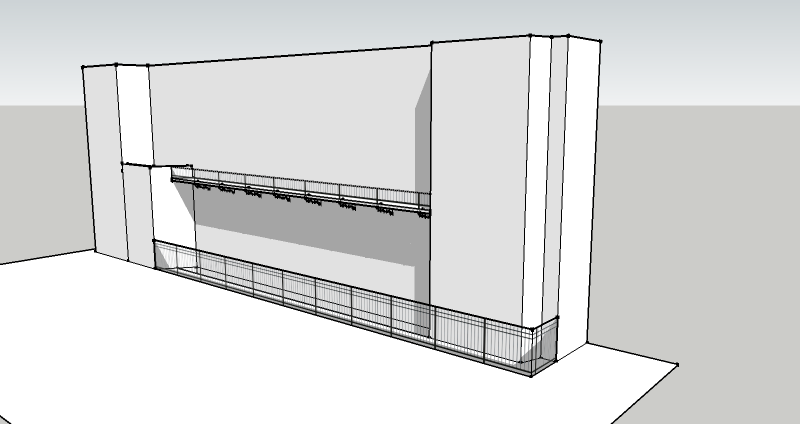
-
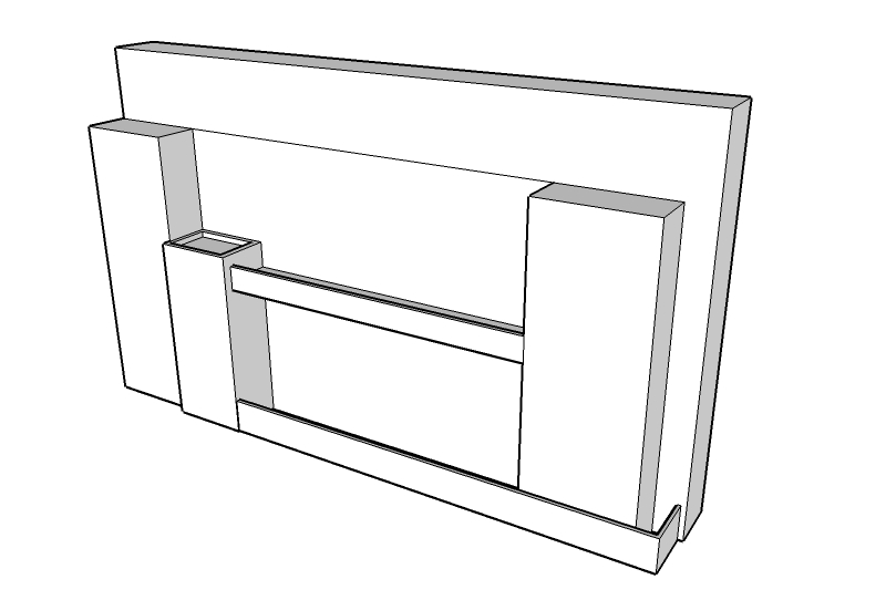
Quick sketch
-
Now that looks much better. It is difficult one to pin on any city. I would think if the sketches are done by Terry or his mate they would probably reference what they know. A lot of town halls are doen in Gothic revival in England.
Hello! It looks like you're interested in this conversation, but you don't have an account yet.
Getting fed up of having to scroll through the same posts each visit? When you register for an account, you'll always come back to exactly where you were before, and choose to be notified of new replies (either via email, or push notification). You'll also be able to save bookmarks and upvote posts to show your appreciation to other community members.
With your input, this post could be even better 💗
Register LoginAdvertisement


