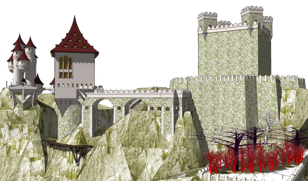
Fantasy distraction...
-
...from life happenin': some C&C please?


-
LOVE the look of the buildings, but the sharp edged cliffs are hurting it, for me..
-
Wooooow!
-
Yeah, Jason, the intent was the stone cut on site so the faceted look was ok...but the contrast does go too far some places. I think this material fix will look better...? We'll see later today.
Miguel, I get the same feeling every time I open the skippy: very much fun to play with...but hard to work on 'cause so big.
-
Great looking model Tom and is good to see something so different.
I personally prefer the pure SU version. -
Great painterly style! I absolutely love the sky and castle. I agree about that rocks though. maybe a bit more natural and the entire thing would come togeter beautifully.
-
Spooky, I like the atmosphere

-
Another pass at it...more please.


-
That last one is great. And it almost looks like the sky outside my office right now save the castle

Great stuff.
-
Tom - Absolutely love the last one! Maybe a tad less sunlight on the castle to match the foreboding sky?
Dean
-
When does the movie come out?
-
Wow. That first one of the set of 3 with the stormy sky reminds me of Roger Dean's style.
However, they are all excellent.
-
Great work. Defiantly has a lot of mood in the image. I agree with bytor about the castle being a little too bright for the sky.
Hello! It looks like you're interested in this conversation, but you don't have an account yet.
Getting fed up of having to scroll through the same posts each visit? When you register for an account, you'll always come back to exactly where you were before, and choose to be notified of new replies (either via email, or push notification). You'll also be able to save bookmarks and upvote posts to show your appreciation to other community members.
With your input, this post could be even better 💗
Register Login


Advertisement