Restaurant Fitout
-
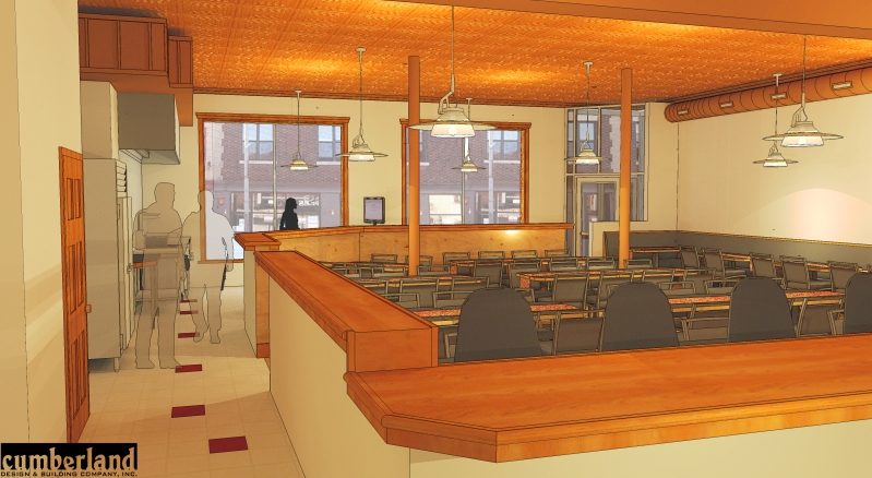
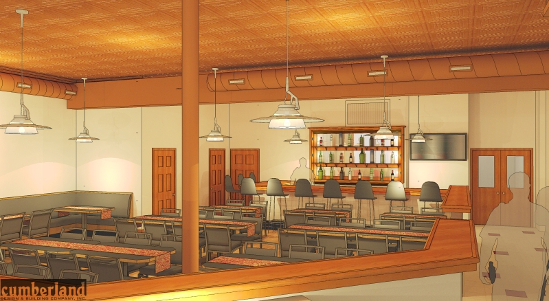
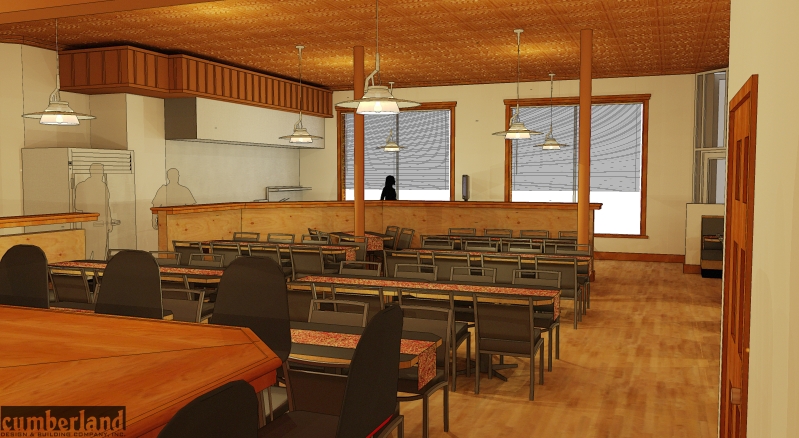
Hello, its been a while since i have posted here... All comments welcome...

-
Really really nice. Some rendered versions would look excellent I think.
-
nice, i love the coppery tones. are you using Lightup?
-
No, he seems to be using Kerky's little brother, Podium, and then adding an overlay.
I love the atmosphere of the restaurant.
Could you please attach the images to your posts instead of linking them? They are too wide.
-
I like the look of these billet, please could you explain the technique?
-
Thanks guys... I am using Podium to render and then exporting a line drawing from Sketchup... I overlay this in Photoshop... As for attaching the images... I dont see where that option is? I have to give credit to Zem for this style... Add ticks for an extra cartoony look.
-

-
fantastic..I love it..

only minor crit would be the blinds in 3rd pic down look a little distracting.
and I noticed that the side doors have a veneer in which the grain carries on through to the door frame, you may have selected materials and pasted as a group here..now thats picky isnt.Id still give you 99/100. very nice
-
thank you all for your kind words... I have noticed a lot of things i messed up on... ill have to fix on the next project... We have already gotten this project... so no need to continue working on it other then for personal satisfaction... For instance... the men are apparently cops? I noticed the night stick and gun after renders were finished... At the bar area i forgot to pull the wall up to the counter... there is a space there... I didnt turn the omni lights off on the line drawing so there are specs everywhere... but other then that im pretty happy with the lighting... thanks again for all and any comments... and as for the posting image thing... all i see here is "Img" what am i doing wrong as far as posting pictures?
-
Great it works! Thanks!

-
another image

-
Great work.

-
Thank you everyone!
-
design thought.
You have a panelized frieze / soffit in one part of the restaurant. Could you hide the ducts in such a soffit on the other sides?
I really like the look and feel of the renderings. Good luck. Peter
-
Hey Peter I agree with your suggestion... Only snag... The owner likes the duct work... this is an existing space and we are simply doing a fitout... we usually do large commercial projects, but unfortinately in this economy we have to pick up these types of projects as well... There are a few changes that im going to work on tonight and hopefully be able to post tomorrow... when we speech with our client the next time (in 2 days) i will mention your suggestion. Thanks a lot!!!
-
Welcome. Always looking for scope-creep ideas!
-
haha i hear ya... we have a few of those for our next meeting as well (what im working on tonight)... so i perhaps may show in the duct work as well... We are going to propose high glass at the pick up counter... with logo etc... and a higher wall at the kitchen side... any other suggestions would be greatly appreciated! Thank you
-
Nice job, looks great. I've found that if you paint the duct and the bulkhead the same color as the wall it seems to fade into the background. Nice thing about a model, it just takes a second to make changes and have a look.
-
Very nice. I like the warmth. Good restaurant colors.
Like the style as well.
-
does the door in the first pic seem kind of short, or is it a bad angle?
Hello! It looks like you're interested in this conversation, but you don't have an account yet.
Getting fed up of having to scroll through the same posts each visit? When you register for an account, you'll always come back to exactly where you were before, and choose to be notified of new replies (either via email, or push notification). You'll also be able to save bookmarks and upvote posts to show your appreciation to other community members.
With your input, this post could be even better 💗
Register LoginAdvertisement


