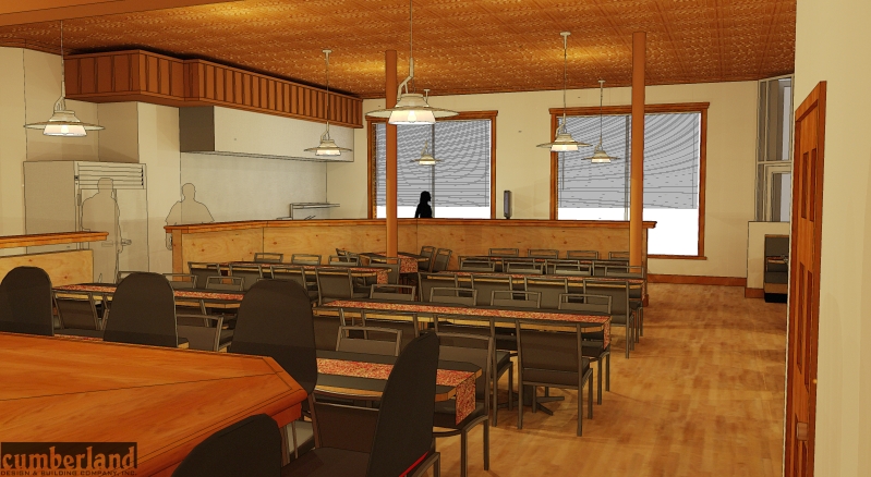
Restaurant Fitout
-
another image

-
Great work.

-
Thank you everyone!
-
design thought.
You have a panelized frieze / soffit in one part of the restaurant. Could you hide the ducts in such a soffit on the other sides?
I really like the look and feel of the renderings. Good luck. Peter
-
Hey Peter I agree with your suggestion... Only snag... The owner likes the duct work... this is an existing space and we are simply doing a fitout... we usually do large commercial projects, but unfortinately in this economy we have to pick up these types of projects as well... There are a few changes that im going to work on tonight and hopefully be able to post tomorrow... when we speech with our client the next time (in 2 days) i will mention your suggestion. Thanks a lot!!!
-
Welcome. Always looking for scope-creep ideas!
-
haha i hear ya... we have a few of those for our next meeting as well (what im working on tonight)... so i perhaps may show in the duct work as well... We are going to propose high glass at the pick up counter... with logo etc... and a higher wall at the kitchen side... any other suggestions would be greatly appreciated! Thank you
-
Nice job, looks great. I've found that if you paint the duct and the bulkhead the same color as the wall it seems to fade into the background. Nice thing about a model, it just takes a second to make changes and have a look.
-
Very nice. I like the warmth. Good restaurant colors.
Like the style as well.
-
does the door in the first pic seem kind of short, or is it a bad angle?
-
Ill have to check the door sizes... should be 3068? Anyhow im trying to post some new images... and it keeps going to a no respnse page?
-
-
Cops.... Is this a doughnut shop
 Really love your work.
 -
haha are they still cops? I thougth i got rid of them before... anyhow.. its actually a Belgium resteraunt. Thank you very much for your kind words

Hello! It looks like you're interested in this conversation, but you don't have an account yet.
Getting fed up of having to scroll through the same posts each visit? When you register for an account, you'll always come back to exactly where you were before, and choose to be notified of new replies (either via email, or push notification). You'll also be able to save bookmarks and upvote posts to show your appreciation to other community members.
With your input, this post could be even better 💗
Register LoginAdvertisement


