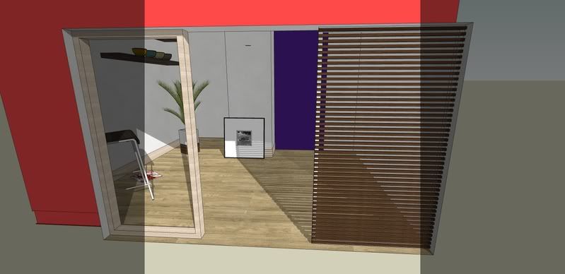
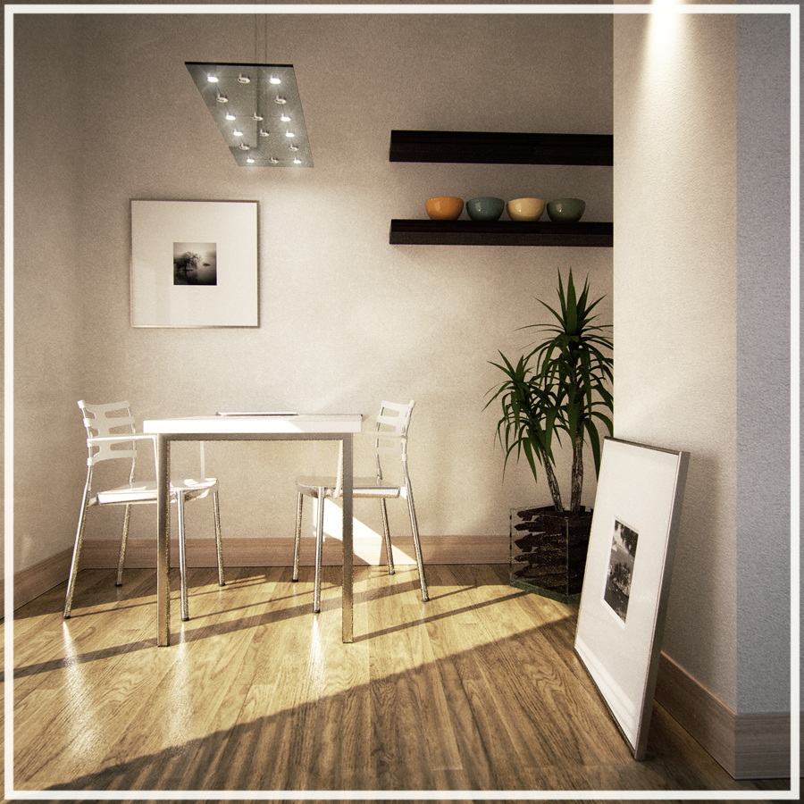
INDIGO STUDY INDOOR SCENE
-
Great work, I like the Indigo
-
@unknownuser said:
.it looks like the picture is not leaning on the wall.
It may be viewing perspective, but to me it does look like it is leaning on the wall - at the far back corner - but I could be wrong.
It seems to have been placed in the way that I often find panels or pictures are left if I just lay them down on the floor in a hurry
 so to me looked quite realistic.
By the way - Nice job

-
Lovely, but unbiased renderers are just far too slow imo..
-
I think it is leaning but only at one point near corner.....btw nice render but 8 hours is outside of my comfort zone as well.
-
nice work, Pibuz! lovely.
-
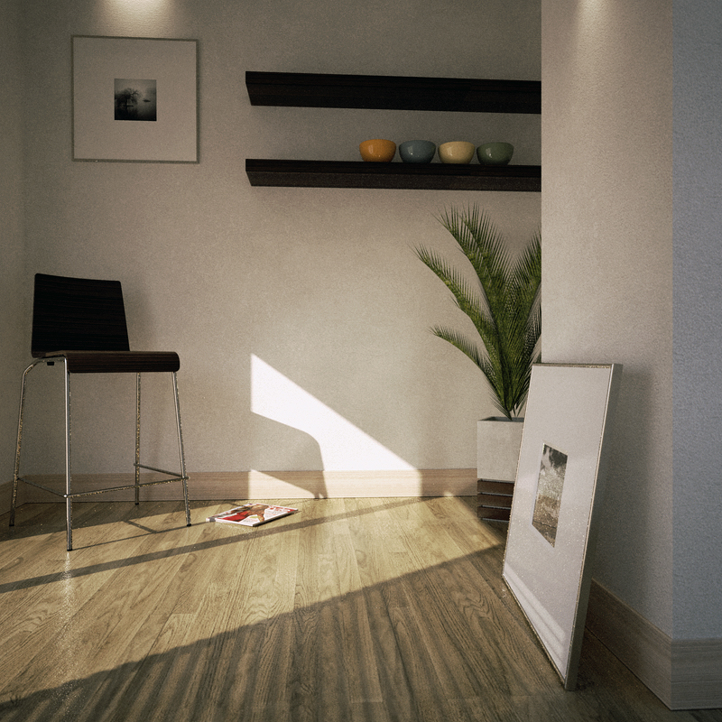
Hi guys, thank you!
Yes, the picture is leaning to the wall on the far corner, but i see it's not so noticeable
I personally don't mind too much to wait a little more, at the moment: perhaps i've never been in such a hurry to compel me to wish for 30mins renders, THANK GOD! BTW, a couple of times I happened to be in a little hurry, but i simply ran Indigo in cooperative mode through the LAN of my office, and it all went just fine: rendertimes were still huge, but consistently shorter than a one-pc process..
I'm not a fan of long rendering times, to tell the truth to you guys: it's just that Indigo integrates itself so well into my SketchUp workflow, that now I fell a little uncomfortable working with other systems: I think it's a sort of cursed addiction
-
Very nice renders and scene. Could you post the scene? Im looking for a good test scene for indigo and Fryrender. Your scene would be great.
-
Glad to be of any help!
I post you the link only if you promise you will post your results in this topic!
Oh: if you use Indigo stable release, this scene is ready-to-render!
Only, be careful to apdate the paths for the nkData-based materials..
Perhaps you won't be able to use the IES lights, though..
EDIT
I attach here the IES file I used in the scene: just download it and load its right path in the sketch mat named IES!
-
Thank you for sharing the scene and the nice renders Pibuz.
You are really mastering Skindigo and the scene setup is spot on.@pibuz said:
..
I post you the link only if you promise you will post your results in this topic!
Okidoki.

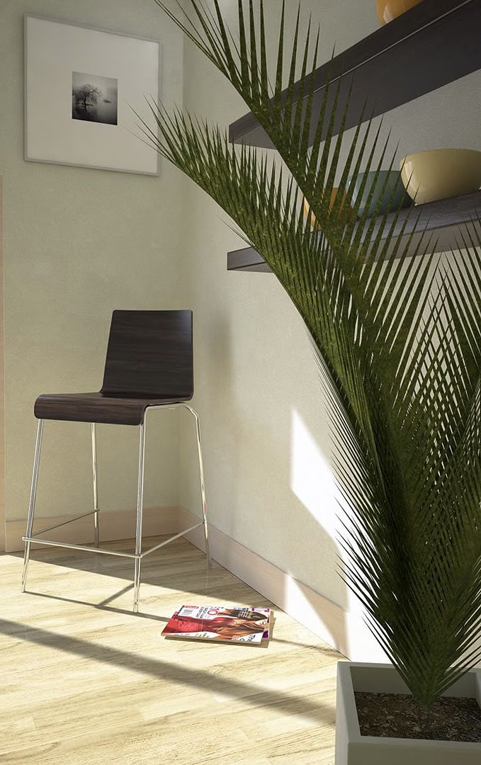
I gave it a try in Vray and produced a second shot as well. Both took about 15 minutes to render (Octocore).
For the spotlights I used a bitmap emitting material instead of IES. I believe IES is the best solution for these things though.
You're right about Skindigo being such a good partner to Sketchup. The setup can be so lightning fast...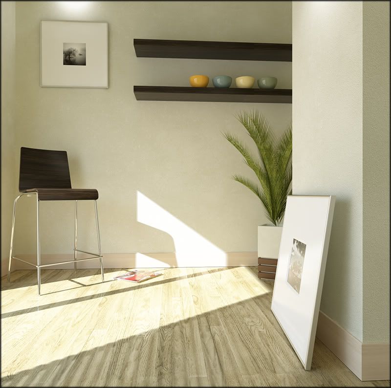
-
Hi Kwisten! happy to hear you!!

I noticed that your renders look more real than mines! So, now with a comparison, i can see what's wrong and maybe adjust a few things. This is what i call a constructive posting!
Maybe overexposing something isn't such a bad affair, as I tend to think.. And a lighter atmosphere won't harm either..
Fine! Something learned!I'm experiencing troubles with the indoor plants: they're not convincing at all

I'll try to substitute them with other objects...Thank you Kwisten for posting!
-
Looks good. Thanks for sharing the scene. I think it will find good use.
-
@pibuz said:
Maybe overexposing something isn't such a bad affair, as I tend to think.. And a lighter atmosphere won't harm either..
I think the most important thing is that your image has a wide range going from full white 255,255,255 to full black 0,0,0.
That doesn't always mean the image would be overexposed (unless it is the effect you are after).
Overexposed would be having too much areas in the image going full 255,255,255 white.I tried to reproduce what I mean:
The following image isn't overexposed but it does contain full black ( shadow part of chair/shelves) and full white (a small strip of white in the picture frame).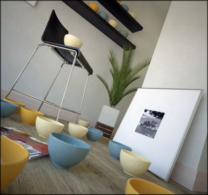
Another example:
Although the next image has a soft and warm mood, there is still enough contrast between light and dark.(light range going from full black (small shadow parts on the chair) to full white (small parts of the reflections on the bowls and chrome).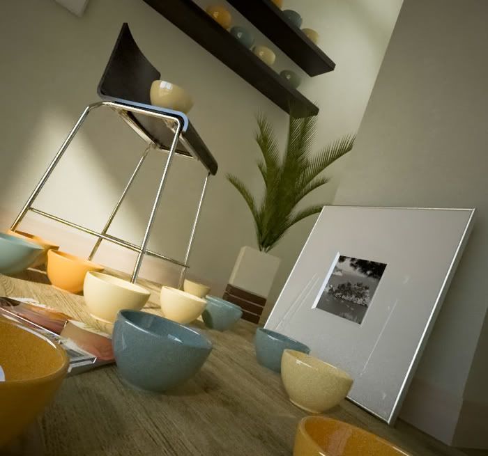
The best tool to control the light range in Photoshop is the 'levels' tool , but I know you know that

I don't think there is anything wrong with your image when it concerns light by the way.Unbiased render engines do seem to have trouble to control the midtone contrast. Using Reinhard tonemapping helps a bit (clamping the overexposed/underexposed areas), but somehow Reinhard does seem to reduce the realism a little by flattening the midtones a little too much).
The linear (and exponential tonemapping) presets provide a great sense of realism but your images are easily overexposed or underexposed and with a too steep lighting 'curve' ,meaning that there is not much of a gradient between the lightest and darkest colors.
The 'curves' tool in Photoshop can fix this.Another thing: When your RAW render output is heavily overexposed or underexposed, you might not be able to correct it in Photoshop as the image misses information as too much areas went full white or black.
So you're better of with a raw image that lacks some contrast which is much easier to fix in Photoshop. -
Thanks for that Kwisten, very informative.
I was wondering if you would post your scene with out post-pro. It would help in seeing the difference and, for me, in interpreting what you mean. For some reason (I don;t really know why) I almost never use PS for my Indigo renders.
I'm going to take some and use what you said.
and thanks for the scene Pibuz!(crojack from the Indigo forum)
-
Why are there patterns on wall?
-
-
Nice test scene Pibuz, thanks! v.nice renders too Kwistenbiebel.
Here are my attempts with Hypershot, around 20mins each, two cores. Thing with Hypershot is that you can't use the native su sun, so I had to get as close as possible with a hdri.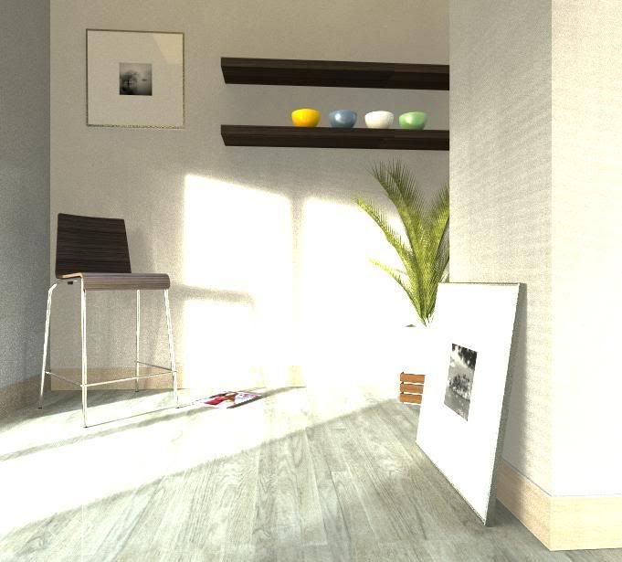
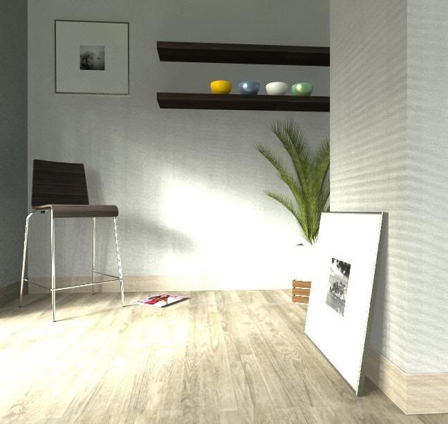
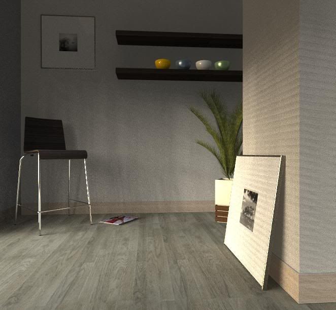
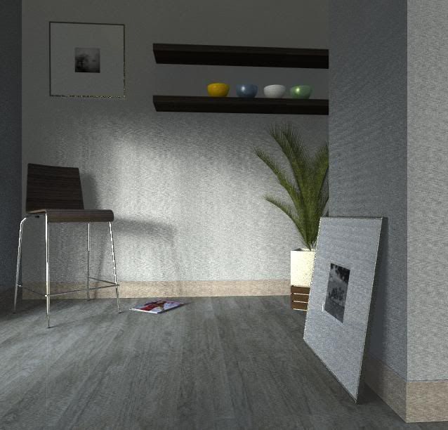
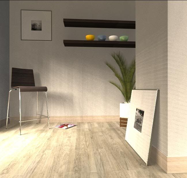
Who likes what best and why?
-
I encourage my
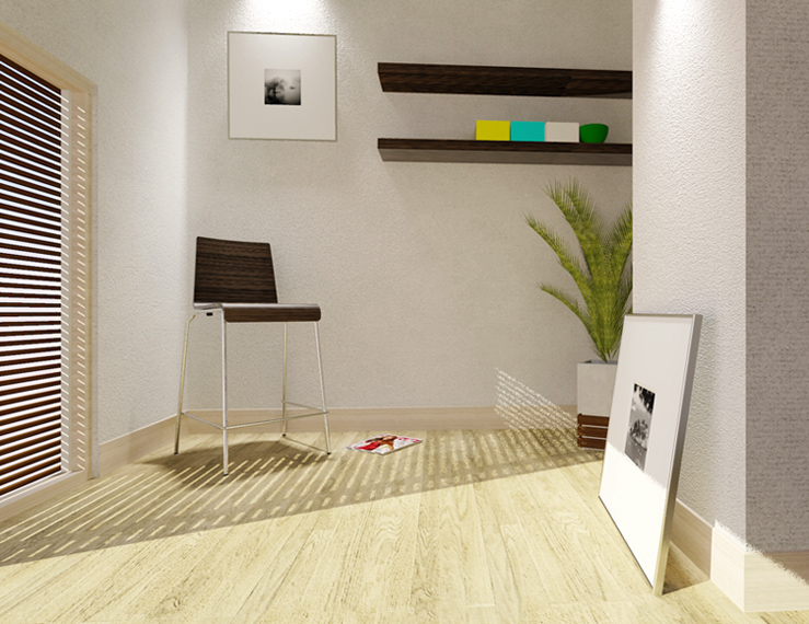
This image was made with kerkyhea, 2000x1200 image original size.
rendering in method number 11 with 2 nucleos, an athlon 64x2 4800 and 2 GB of RAM.
Approximate time 40 minutes.
-
Nice stuff here, guys!
Kwisten, top class renders, I try it myself, but your renders are just perfect! -
I'm going on modifying the things i'm not satisfied with; next step: replace the plant!!!
This is a small update: done a fantasyless postpro work with PS, and testing a whatsoever "definitive" layout...
-
let relax with your scence


Hello! It looks like you're interested in this conversation, but you don't have an account yet.
Getting fed up of having to scroll through the same posts each visit? When you register for an account, you'll always come back to exactly where you were before, and choose to be notified of new replies (either via email, or push notification). You'll also be able to save bookmarks and upvote posts to show your appreciation to other community members.
With your input, this post could be even better 💗
Register LoginAdvertisement
