Modeling C&C request
-
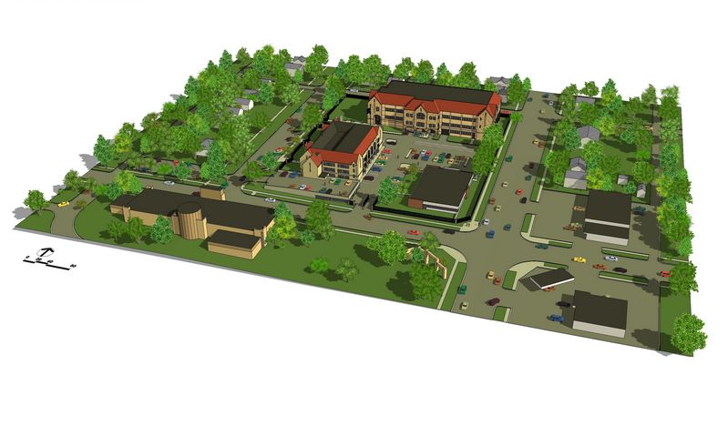
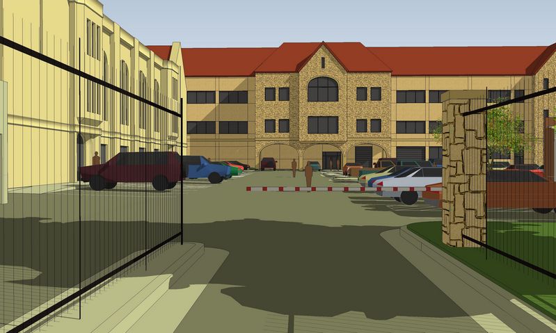
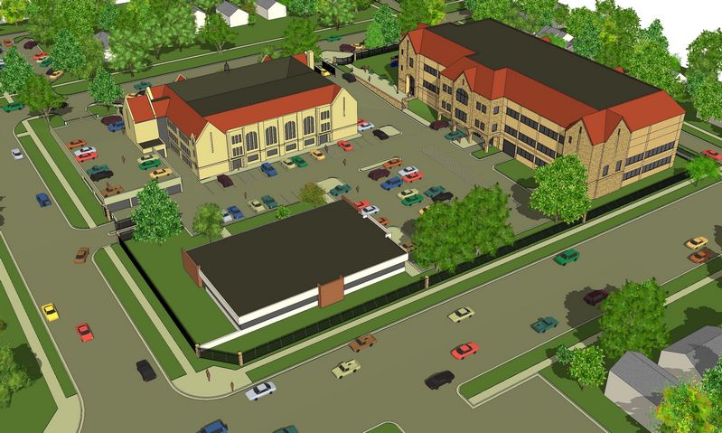
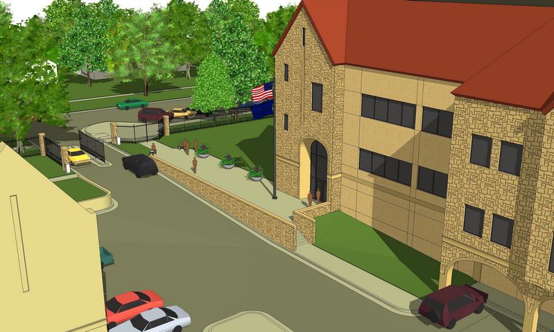
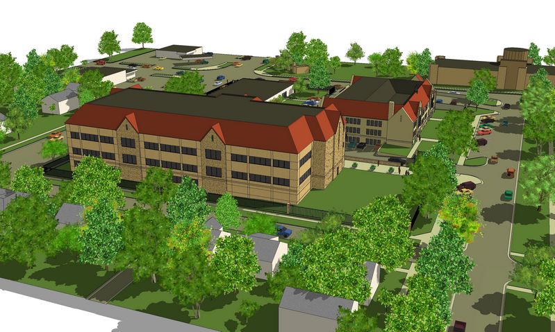
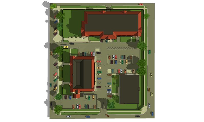
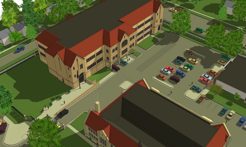
This glorified study model was done in just over 80 hours from a dozen hi-res aerial photos, a half incorrect campus-only autocad site plan, and the architect's guess that the center city block sloped 8' NE to SW. Except for the building showing stone/precast textures, including the grading and parking around it...and that costly fence, all is existing condition. It is being presented to the client today and then to a state legislature funding committee later this month.
EDIT: I should have mentioned this is a new forensics lab for the KBI campus. The process for that part of the modeling has evolved thru several models for this client: my fleshing out a massing model from floor plans and some discussion of roofs, etc; his redlines of the massing plus penetration discussion and sketches; more fleshing; more corrections/additions; finally detailing and materials (here cut to a minimum since such a preliminary phase of this project).
I'm mainly interested in what you think of the time taken...kind of a check on my speed (please consider that all vertical dims were interpolated from the photos, as well as the few details shown to give the feel of the existing buildings and surrounding neighborhood :`)
I'm also interested in your professional opinions on the modeling, the overall style, etc...whatever you'd care to comment about. Please and thank you, Tom.
(Of course, if you want, my client the architect always likes to hear if his designs please you guys too :`)
-
Tom,
Can't comment on the time especially given that you had to use aerials.
Couple of things I noticed.
The concrete seems yellowish. Might want to try it with one of the SU 6 concrete textures. "Concrete Rough" is a nice texture for concrete.
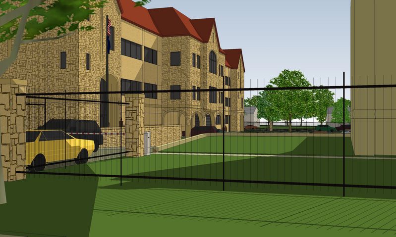
Consider replacing the fence with a 3D fence. Don't need it in the wide views but the close-ups. You can use these in the particular scenes and hide accordingly.
Traffic and parking striping could be bumped up a bit. Perhaps make it white for the parking. Add a centerline for the traffic flows. You could also add a crosswalk. Basically use rectangles which you can intersect against the asphalt and paint accordingly.
The stone veneer also looks yellowish. Standing seam roof could also use a texture with line work to better depict the seams.

Gus
-
Impressive!-given what you had to go from. I like your DWC pictures too. I am not experienced enough to speak to the time. But if you don't mind me butting in... where can I get those trees?
Thanks, Peter
-
What were you going off of for the proposed stuff (as opposed to the existing site and such)?
I tend to work on projects that aren't so different in scale. I do hospitals so typically there is less site but more building than what you're showing. My models are also done in the design phase though so it's not just a one shot deal. One model I did has taken over a year (not because it's so great, just because it keeps changing). I'd say that regards to time, if it took 80 hours primarily because of the quality of information (and misinformation) you had then that's fairly reasonable. Likewise, if there were changes in the middle of modeling, same thing. If you felt like your info was reasonable and it took you that amount of time just plugging away in SU, then I'd have to say that would seem long to me.
My other guess would be that the 8' grade change probably caused you some fits. If not, let me know your secret. For me the buildings are a breeze in SU. However, I cringe everytime I see a lot of contour lines on my site plan. I'm working w/ one of those currently I'm afraid.
I think for a "glorified study model" your quality seems pretty good. Same comment as above in regards to color. The site looks good but the building seems a bit off. I'd also agree in regards to the metal roof. Details would go a long way there and you'd have some nice shadows to show for the effort. I'm not a big fan of dark windows in SU but that's just me. I use an image of a sky as my window texture to give the impression of being able to see some reflection. I'd go either abstract/cartoony or hand colored though if you do that as a real sky image looks odd. Also dittos on the lines in the road. Looks a bit chaotic out there.
I'd also recommend toning down the variety of car colors too. At least less saturation would be good. I've experimented w/ using a white or gray transparent material for all my cars before too w/ good effect. That way the focus is brought back to the building but you've still got the scale there for reference.
Good job,
-Brodie
-
Unless someone is familiar with the site already then they won't know what exists already and what is proposed.
To seperate the 2 I would suggest fading the colours for everything but the new building/changes.
-
First of all, thank you all for taking the time to respond...I appreciate the insight. (Though at first I thought you all were smoking the same bad crack since I mistakenly understood the yellow you were talking about to be the concrete road and walk colors...looked pretty grey to me: on two machines :`)
Anyway...once I got back on track, I took all the color comments to the model as most seemed resonable to me(I didn't like that specific yellow either: our limestone is very yellow until it weathers out, but there is a lot of rust color to it as well), and the cars absolutely. But had to laugh this AM when my client the architect responded to my "do you like this better" with "no". All went back to the original, even the cars "cars are pretty shiny"...more so, he had me change the new building colors to match the existing "yellow". Eye of the beholder, I guess :`) Part of the reason, I'm sure, is that this phase of the project isn't about the new building specifically...more to do with the overall campus: impressive enough to look worth all that money, but benign enough to assume there will be no public outcry for the neighborhood.
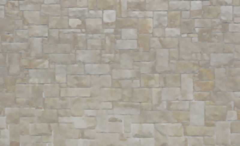
His other request was to change the sketchy-stone texture to something that didn't look "dirty" when zoomed out (the dark joints did reduce to black specks). So I made one from an ashlar texture (from cgtextures.com hit with soften and smooth filters, then lightened the joints and desaturated the colors...see attached).
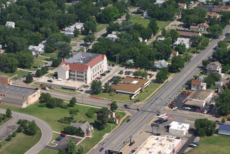
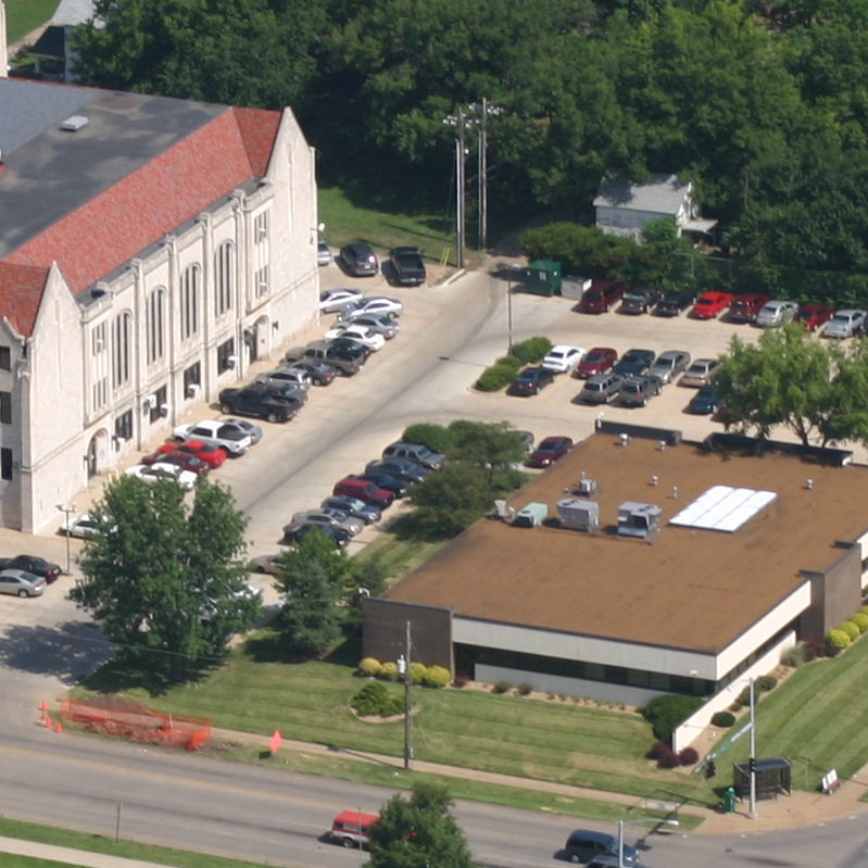
So glad to hear I'm in the same ballpark: timewise. (Bruce, I don't think age much affects speed...it's experience, as you said, that gets in the way in the short-run. Even so, in the long-run, I'll still stand at the line with the best of them expecting to finish ahead :`) Yes, lots of by-guess and by-golly...and some oh-golly from bad (hurried) guessing. Attached is one of the aerials I used for scaling all vertical dims (with a full size detail)...pretty good res, huh? (And yeah, there are some blatant errors that wouldn't pass muster normally, but this is what it is and only for that: a quick presentation to a funding committee.)
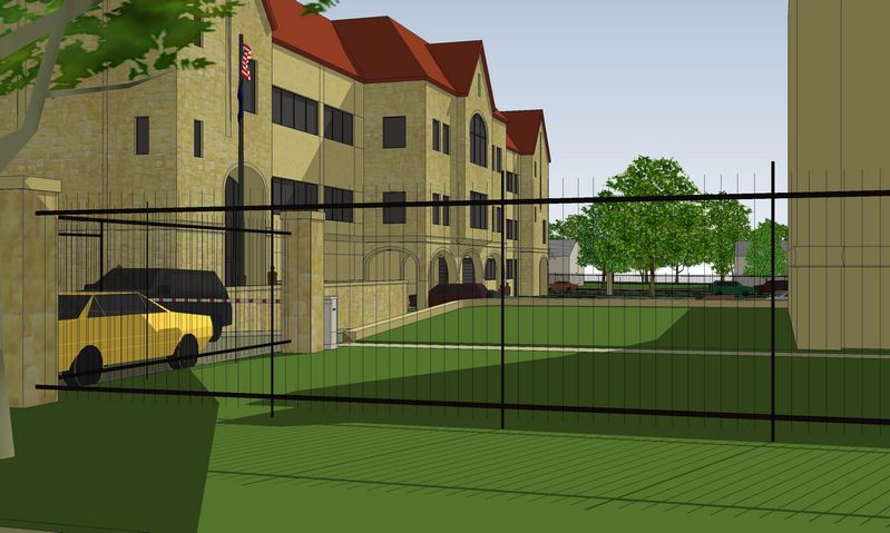
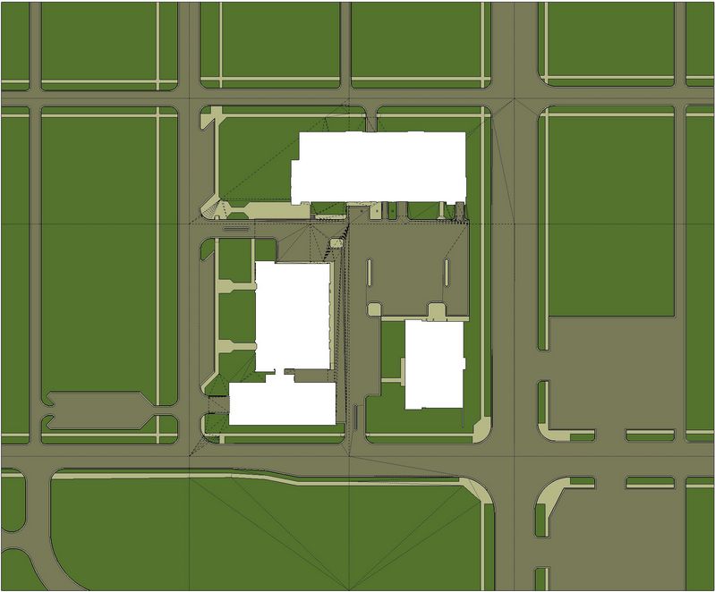
Brodie, you're right: the site probably took half the time (without drop.rb...I'm not on the right computer right now to give proper credit, sorry, but my undying thanks...it would have taken twice again). I do have a trick now that is a real time and frustration saver. This site was modeled as a flat plane first, push-pulling the grass up 2", the street and gutters down 6". Then I cut this plane into 16 segments, each of these grouped, careful not cut through any curves (see attached hidden lines). Since I had been given approximate elevation drops for each of the campus corners and one at the only site feature, the steps in front of the new building, I moved the four corner 16th-drants up or down appropriately. Then I rotated each of the two middle groups of the outside ring to hit the corners. Then rotated the center four groups in both directions close to fitting all around. Now the fun part: alt-selecting the edge stuff of each group and moving all the edges and corners to match up. It really did go quite well but, as you can see from all that mess of hidden lines in the center of the center, a few missing sidewalks and misplaced doors in the cad site plan can be a pain...but I didn't have to fix the mess, so it didn't really trigger my OCD until after...like now :`)
Okay, thanks again, Guys...long winded enough. Peter, all the trees in this model are my 2.5d faceme creations. You should be able to find most of them here by searching my posts for "tree" or "trees". Any I'm thinking are here but were really posted on the old forum: just ask, I'll be happy to provide.
-
Tomsdesk,
That's funny about the architect not liking the changes. I've had the same experience a number of times. Usually I'll have a nifty idea or find a look that I really like at the time but by the time I come to my senses the client has decided he'll have none of my updates.
Interesting technique on the site. I just did something on a current project that seems to have worked well so far. There was a dramatic shift in elevation in one portion but elsewhere it wasn't as drastic.
This gave me the idea to have 2 flat planes, one lower in front of the building and a raised one which happens to be in the back of the building. I grouped each of those and then created a contoured plane connecting the 2 via the sandbox tools.I had a flat site plan (which someone else had created from CAD previously) so I placed that above my new contoured site (2 flat planes and 1 contoured) and used the drape tool to drape the flat site onto each of my 3 areas. The 2D areas are easy enough to push/pull the elevation difference for grass/curbs/etc. The tricky part will be changing levels on the contoured part. My plan is to copy the street down 6" in the z direction and then erase the original. The time consuming part will be having to make all the connecting lines so those 2 planes connect (ie. creating the sides of the curbs).
Another thought just came to me though. I wonder if I could offset a line 1/16" to the inside of the road and then just move the road down the 6". There will be a very slight slant to the curb but that's no biggy. hrm...
-Brodie
-Brodie
-
Brodie, your "another thought" is exactly how I do it whenever I'm working with a contoured site model: it works slick if you can get all the draped lines to cut the planes (why I normally just do it the old way before sandbox)...just some hidding of the "stretch-marks" created in the alt-move process.
Hello! It looks like you're interested in this conversation, but you don't have an account yet.
Getting fed up of having to scroll through the same posts each visit? When you register for an account, you'll always come back to exactly where you were before, and choose to be notified of new replies (either via email, or push notification). You'll also be able to save bookmarks and upvote posts to show your appreciation to other community members.
With your input, this post could be even better 💗
Register LoginAdvertisement


