Want to Enhance SketchUp Drawings
-
Hi everyone, I am an architecture student. I like to use Sketchup for my designs, but find the graphic quality of a rendered Sketchup model is not overly appealing. I am not interested in taking the time to learn any advanced 3D modeling software, but I wonder if there is some way to make Sketchup models look better? I am pretty good with Photoshop, so that would be an option. I basically want to take Sketchup models and make them look hand drawn....
I read through the Sketchup to Photoshop tutorial, and it was helpful, but not exactly what I'm looking for... any tips?
-
mns,
Hand drawn illustrations is a broad term. It can be pencil sketch in which case I suggest you play a bit with styles and style builder , then if you mean watercolour or some other effects have a look at some of the works by Grant Marshall or Dennis Nikolaev because that is the best as it gets.
But in any case it is not easy , There is no a click a button solution , just like in classic traditional art it requires a great deal of skill , patience and practice to produce these remarkable digital pieces of art.
In my opinion much more difficult to produce than a good rendering
Here:
http://www.rapidillustrations.com/ -
Msm,
Well, since I have been trying to do the same thing since I started using SU here's what I've learned so far.
A rough outline towards that end would be:
-
Styles
-
Background Image
-
Photoshop Effects
-
Scene Setup and Shadows
-
Styles
With regards to the first item you can find some pretty good styles here at Sketchucation in the “Components, Materials, and Styles” section. You’ll have to poke around and see if there’s something you like. A quick link would be to grab some here:

And the winning Styles are...
Follow the SketchUpdate blog for SketchUp news, modeling tips and tricks, user stories and more.
(sketchupdate.blogspot.com)
My favorite of these being by “Mark Pachke of Milwaukee, Wisconsin , Pencil edges with whiteout border.” I do a variation of that using a straight edge line. You can also replace the watermark background image.
Follow the instructions there regarding saving this model to save those styles:
- Background Image
As I mentioned in the first section you can replace the background image with a “backdrop” image such as a city, country, or suburban style.
- Xero has some free and really good Photoshop effects available at:
http://www.xero-graphics.co.uk/downloads.htm
Scroll down and grab all of the plugin sets. Try using ArtGrain, Artifax, or Tekstya. You can also use the built in color pencil effect or watercolor. One thing I like to do is “fade” the effect after applying it since it tones down the effect creating a more pleasant mood. You can also overlay a copied layer of your rendering and manipulate the blending change and vary the fill percentage.
- Lastly, scene set-up is important as well as your shadow settings. Best times are after sunrise or before sunset.
Gus
-
-
@msm said:
Hi everyone, I am an architecture student. I like to use Sketchup for my designs, but find the graphic quality of a rendered Sketchup model is not overly appealing.
Are you using the built in renderer or an external one? I have seen renders, like this one using programs such as Kerkythea.
-
One thing I have been doing a lot lately is to export multiple images of the same view then combining them in photoshop later taking advantage of the power of layers. What I mean by multiple images is exporting the same shot in a variety of different styles. For example I often will export a shaded with textured image without edges. Then I'll export a hidden line image. What this allows me to do then is control which edges I want to see in the finished rendering and I can control their intensity. I've also done the same thing with shadows. You can also then apply filters to portions of your images as necessary. Often I'll add noise to soften the image as a whole or to emphasize the texture of a rough surface.
I think the key to generating a good rendering straight from sketchup is to start with good material maps. Take the time to ensure that they are scaled correctly and ensure they tile in a way that isn't obvious. Take a moment and pay attention to the small details like door knobs, or other things that are easy to forget but make a world of difference.
Depending on your desired level of rendering I would suggest that you take a look at the people, cars, and trees in your model. These can be too cartoony at times and such entourage elements might actually kill a good rendering. Sometimes a bit of post processing is all that's required. Try this link http://www.howardmodels.com/digital-content/index.html for some great skies, and trees. What I do is let sketchup render the shadows of a component tree. Then in photoshop place on of these real ones over the sketchup tree. The shadows will be a bit off but they'll be close enough. Be sure when inserting entourage elements into your model either via components or in photoshop to ensure that they are lit in the same way your model is.
If you want an easy "photoreal" rendering program to work with Sketchup I recommend podium. Its great for adding light and reflections directly within sketchup itself.
-
@msm said:
Hi everyone, I am an architecture student. I like to use Sketchup for my designs, but find the graphic quality of a rendered Sketchup model is not overly appealing. I am not interested in taking the time to learn any advanced 3D modeling software, but I wonder if there is some way to make Sketchup models look better? I am pretty good with Photoshop, so that would be an option. I basically want to take Sketchup models and make them look hand drawn....
I read through the Sketchup to Photoshop tutorial, and it was helpful, but not exactly what I'm looking for... any tips?
A quick way to do this is to take your rendered SU jpg. into Photoshop and render it using an Artistic filter.
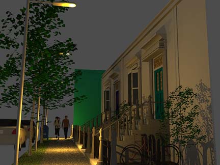
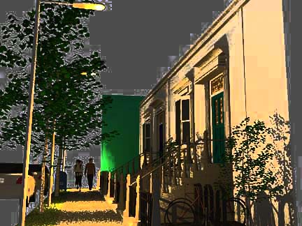
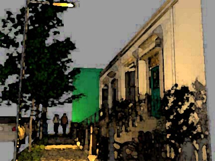
Here's an example showing a SU+Podium render that has been taken into Photoshop and rendered using Watercolor and Film Grain filters.[attachment=2]NewYorkstreet#1.jpg
[attachment=1]NewYorkstreetfilmgrain.jpg
[attachment=0]NewYorkstreetwc.jpg


-
Thanks for all the help. I am going to try all of the suggestions...
I am wondering if anyone knows any good entourage sites like the Howard Models one for people, cars, etc.?
-
@unknownuser said:
Check these out as well, especially the 'Dennis Technique'
http://www.sketchucation.com/forums/scf/viewtopic.php?p=52668#p52668
May be of some help to you.Fabulous link James. Now I'll never get back to work feeling the sudden urge to try some of these techniques.

-
I've been looking around at some of the work people do on this forum. If I want that hand-drawn look, I wonder if it's better to put the trees in my model on Sketchup or in Photoshop?
I ask because I've noticed hardly anyone uses Sketchup trees in their models...
-
@msm said:
I ask because I've noticed hardly anyone uses Sketchup trees in their models...
Do you think so? Have a look at Tomsdesk's posts in the gallery!
Edit: The link I previously put in contained [ and ] characters therefore was broken by the phpBB codes. Sorry,I simply could not get it to work.
-
@msm said:
I've been looking around at some of the work people do on this forum. If I want that hand-drawn look, I wonder if it's better to put the trees in my model on Sketchup or in Photoshop?
I ask because I've noticed hardly anyone uses Sketchup trees in their models...
Assuming you are only concerned with producing a 2D illustration you need to consider that once you move from the 3D model to 2D you are committed to things like perspective, light and shadow etc. Which means that any objects you source and add after the fact must conform. I always try to include as many 'ornaments' as possible in Sketchup before it goes into Photoshop or Paint.
Tip: The secret to working in Photoshop is 'layers' - these work differently than layers in Sketchup. Always make a duplicate of your master and call it something like 'master working copy'. Now create a layer called trees or whatever and make sure it is the overlay layer. You can now use the pencil or brush tool to add freehand strokes over the 'master wc'. If you don't like the effect just delete that layer and you have the untouched working copy underneath. When you are happy with the result you can merge the layers and take it into a filter like watercolor or play with some of the light renders.
I also suggest you check out a pen/tablet for drawing instead of a mouse. Wacom makes some good inexpensive ones.
Play around... be happy.DE
Hello! It looks like you're interested in this conversation, but you don't have an account yet.
Getting fed up of having to scroll through the same posts each visit? When you register for an account, you'll always come back to exactly where you were before, and choose to be notified of new replies (either via email, or push notification). You'll also be able to save bookmarks and upvote posts to show your appreciation to other community members.
With your input, this post could be even better 💗
Register LoginAdvertisement


