A series...?
-
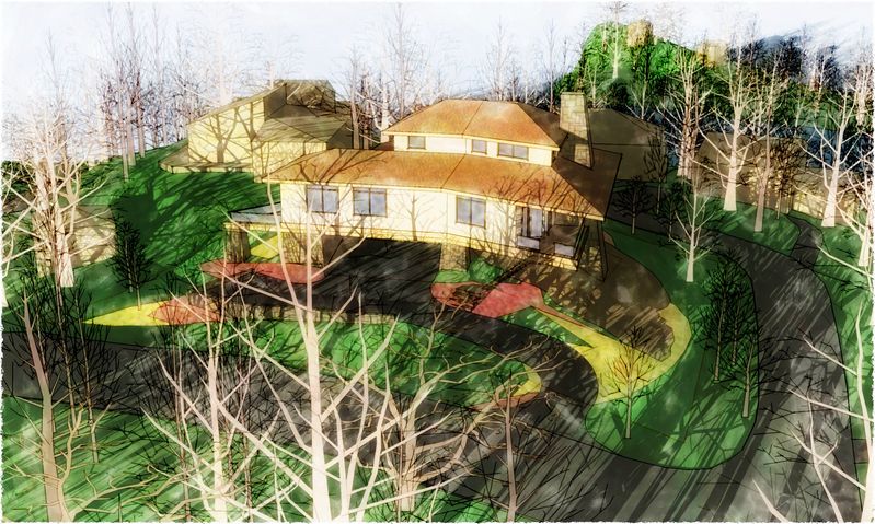
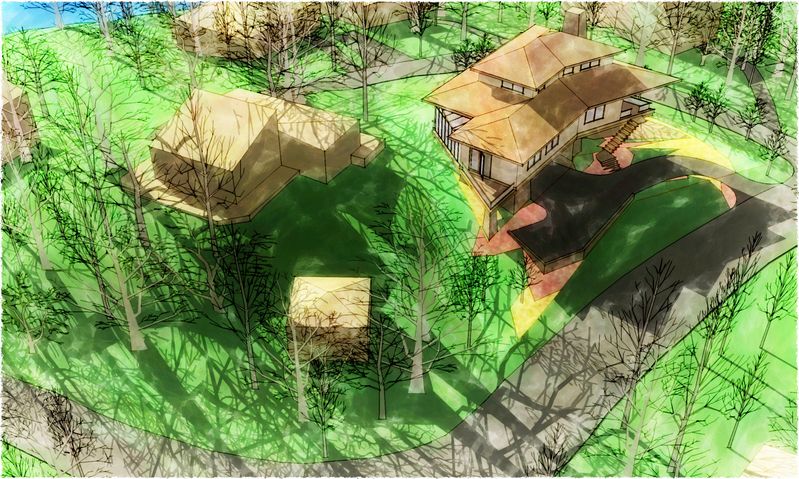
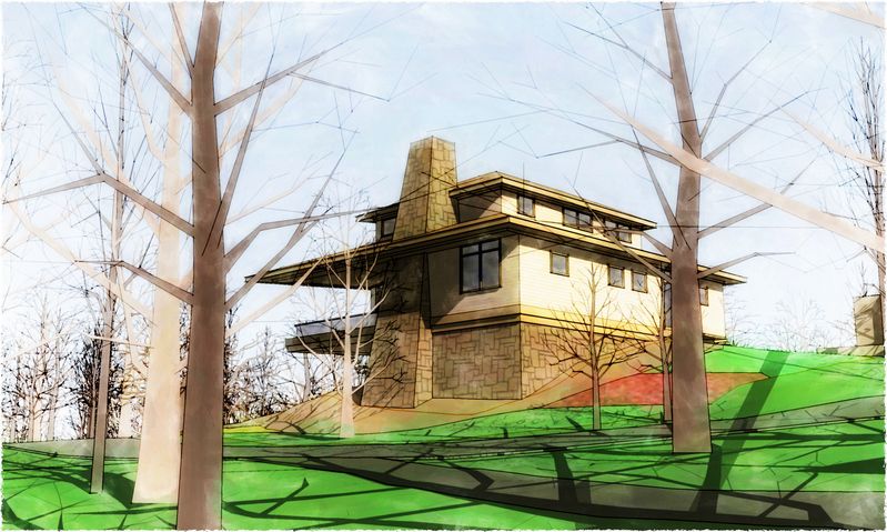
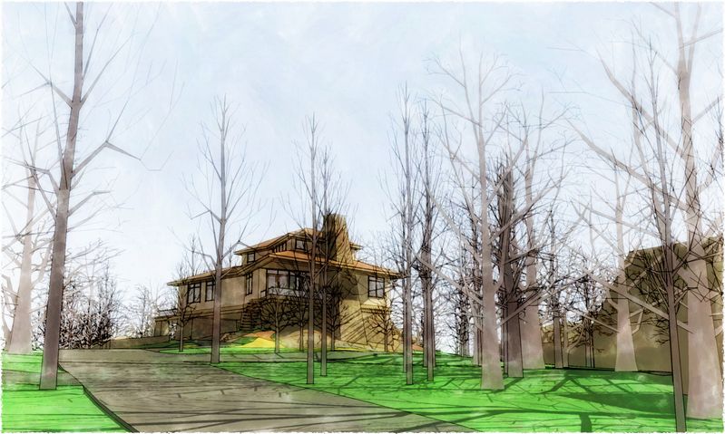
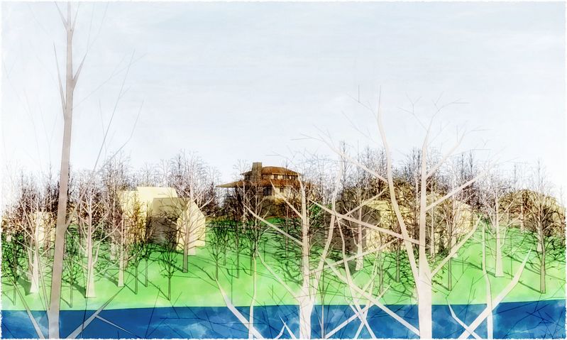
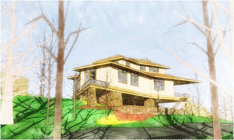
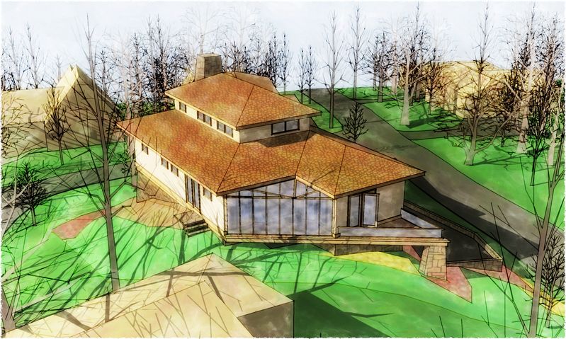
Meaning to produce several images looking to be a set (by the same artist in the same style for a change :`) How'd I do?
-
Tom, these are fantastic.
In my opinion best images You have done so far.
-


 thanks!
 -
Amazing stuff. I love it!
-
great work and camera angles
-
..have to agree with Mateo..def the best stuff to date! love the 3rd, 4th and 5th... great, Tom.
-


-
Tom I have to say that sometimes I wonder where your going with your experimentation

But...WOW!!...these are beautiful.....particularly the lower views!!!! -
Great Series Tom!

I really like the feel of these and the colors are wonderfull. The ony crit I would have is that in some of the images the shadows from the bare trees are a little overpowering, and take my attention away from the subject. I like the low angle of the sun - so maybe just save out the shadows for the trees as a seperate layer and play with the transparency in post? Not too much though as you don't want to lose the depth and contrast of these beautifull images!
Bytor
-
Thanks so much, Guys...I needed that: I was thinking I'd made something of a breakthru, but past experience had me doubting my opinion (remembering all the crap I've posted since starting my studies of this process :`) Speaking of: I want to thank all those who have had such great patience encouraging me throughout the process so far! It's really helped. Anyway, I do feel I have finally taken the first steps in the new territory I've been traveling toward...we'll see?
Good point, Dean...especially on the first one, I think.
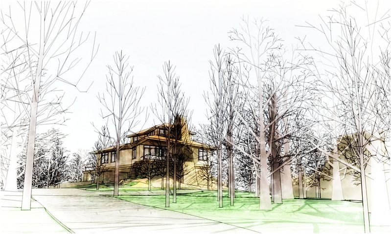
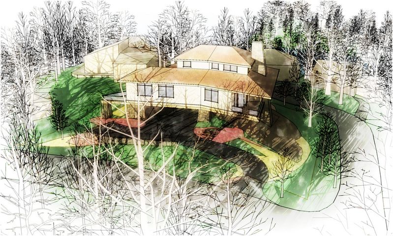
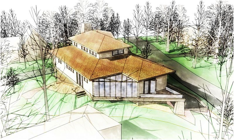
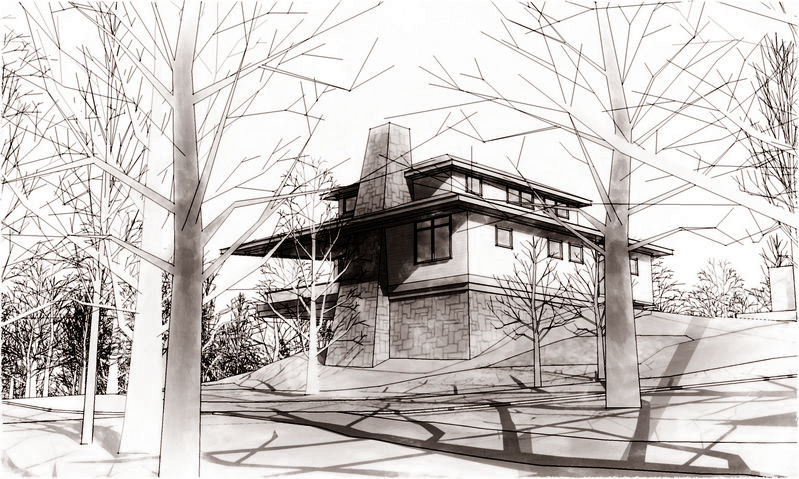
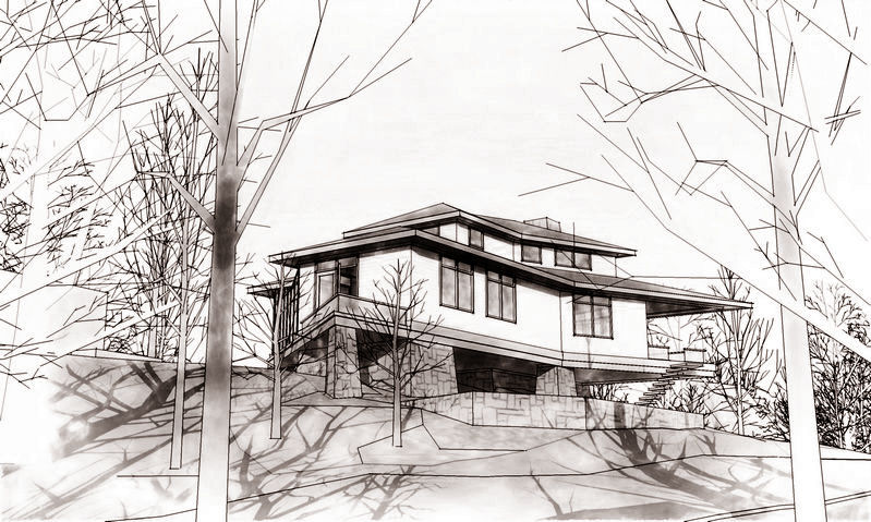
I had time to push these a little further before I get back to modeling (got the architect's sketches for the actual design of this project today). Here's a couple of them...and a couple of monochromes the architect asked to see (maybe there's another buck or two to be made?). Whadaya think? :
-
Tom,
I agree with Dean about the tree shadows.
The trees are dramatic enough in themselves...how about turning off their shadows all together?...and using them [the trees] as framing for the architecture while keeping the ground planes uncluttered?
In particular, I would be interested in seeing the first couple of overheads without the tree shadows, where they seem to dominate. -
The last 2 images are fantastic. You have completely set a mood. Great work!
Scott
-
great work, tom. however, it is difficult to say it is the best you've done, as all you do seems to the be the best you've done. that is, you keep outdoing yourself.
-
I love 2, 3, 4 and 6 of the first series, and the greyscale ones of the second.
Cheers
Anssi
-
Tom,
I love all of them!
Fantastic job

Daniel
-
the second series is exceptionally good!
the colour fading out at the outer parts of the images draws the attention to the buildings. this dreamlike, slightly gloomy winter-look is really great.
and the black-and-white/sephia ones travel back in time... phantastic@edson said:
...it is difficult to say it is the best you've done, as all you do seems to the be the best you've done. that is, you keep outdoing yourself.
absolutely right, Edson
-
Blush, I don't know what to say...besides: thank you, very much! You All have filled the tank for more of the "hard at it". My best, Tom.
-
Tom,
Are the black and whites in the second set a style or is it done in post production? If its a style could you share the style? if it is post production could you share the workflow? I just love the feel of the black and whites.
Scott
-
Scott: post-production...and not much of it, I must admit:
I just reduced the saturation of the second batch of images to -100%, then added a multiply layer that was a solid sepia tone to warm up the image without affecting the whites. (A bit of good fortune that they worked as well as they did...but on my side: I do squint a lot at my images checking composition, so some colors were intentionally darkened or lightened as needed beforehand. :`)
-
Thanks Tom. I appreciate the description.
Scott
Hello! It looks like you're interested in this conversation, but you don't have an account yet.
Getting fed up of having to scroll through the same posts each visit? When you register for an account, you'll always come back to exactly where you were before, and choose to be notified of new replies (either via email, or push notification). You'll also be able to save bookmarks and upvote posts to show your appreciation to other community members.
With your input, this post could be even better 💗
Register LoginAdvertisement


