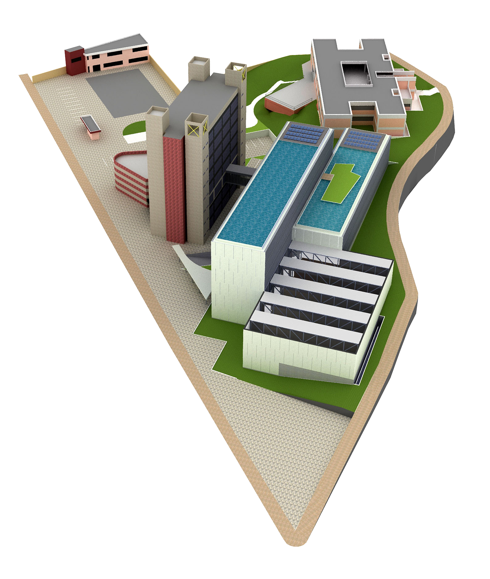
Competition project
-
Hi Edson,
Wow , I like this image a lot.
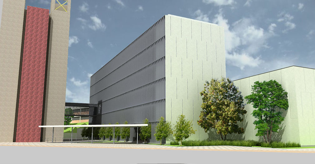
The composition of all these orthogonal elements is strong, and even though the building has a Spartan appearance, the athmosphere created is quite playfull.There is one thing that could improve the image: getting rid of the repetitivity (is that the correct word?) of the brick texture on the left.
Keep those fine images coming.
-
Are the trees meant to be pointing through the canopy? or is it just my imagination that they are?
Interesting design by the way. any more pics you can show us?
-
@solo,
yes, indeed. luckily for me the beta tests started just as i was about to render these. i was able to render these on mac at 1/2 the time that i was getting on win xp under parallels.@biebel,
i did not want to touch those walls as they are from an ugly existing building but you have a point there. perhaps blurring them would work too.@remus,
the canopy only touches the building at the point of entrance. those trees are in between the two.p.s: i posted a couple more picts at the podium forum.
-
Clean, very clean indeed with nothing forced about the design,
I like it.Looking forward to seeing more details and info.
Mike
-
Looking really good, Edson..!!

Only small crit will be the red tile material you've used on the left wall... Looks a bit CG to me...
Great to hear that the Podium Mac version is working like a charm..!!

-
@frederik said:
Only small crit will be the red tile material you've used on the left wall... Looks a bit CG to me...

Great to hear that the Podium Mac version is working like a charm..!!
i agree with you, kim. i did not pay much attention to the existing building in the renders, as it is so bad. but since everyone is pointing out the inadequacy of those textures i'd better fix them.
yes, i am quite happy with podium. i am getting satisfactory results with it with very little tweaking. take care.
-
Beautiful job Edson. I like it very much

-
thanks, tina. i shall post more when the results come out.
-
Those louvres look like you're getting in touch with your inner Richard Neutra.
Chris
-
cant wait to see the rest of the images...love the geometry of the louvers and the composition of the image.. (yes, definiltey work on the texturing of that exist'g building... )
-
chris and jason,
you soon will see that those louvers are at the same time sun breakers AND part of the structural system. instead of having columns every Xm i have many thin elements made of steel: the whole outer limit is load bearing. the idea was to create a sort of steel baloon frame. to be continued...
-
gotcha.. kind of like the world trade center exterior columns? very cool....columns suck!
-
@marked001 said:
gotcha.. kind of like the world trade center exterior columns? very cool....columns suck!
sort of, but hopefully not the same fate...
-
well that's a given... i coudlnt think of any other 'known' buildings that used exterior columns besides one here in philly....so i had to use it.. haha.
-
An elegant design and beautiful image; good luck on the competition.
My only crit would be to add some people.
When I click on the image and see it at a larger size, the tiling of the pink brick(?) material on the left is not as obvious to me. -
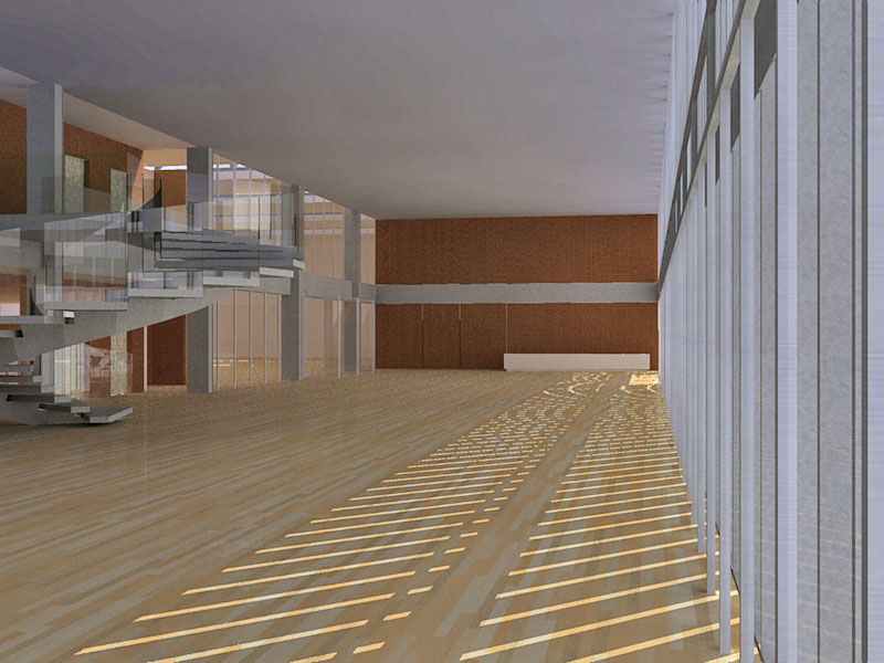
well, now that the competition has ended (and i did not get anything) i can post some other picts here. more to come soon.


-
Edson, you design such comfortable large spaces: my hat's off!
-
Bump...'cause it appears Friday's stuff isn't showing up in "New Posts".
Hello! It looks like you're interested in this conversation, but you don't have an account yet.
Getting fed up of having to scroll through the same posts each visit? When you register for an account, you'll always come back to exactly where you were before, and choose to be notified of new replies (either via email, or push notification). You'll also be able to save bookmarks and upvote posts to show your appreciation to other community members.
With your input, this post could be even better 💗
Register LoginAdvertisement


