My recent tries
-
@majid said:
recent render of a monumental building
با کمی ویرایش فتوشاپ . این آخرین کارائیه که واسه "هیراد نقش" انجام دادمHi Majid -- I really enjoyed seeing those renderings. Your project images make very effective use of the sketchy edge style. Great stuff!
Regards, Ross
-
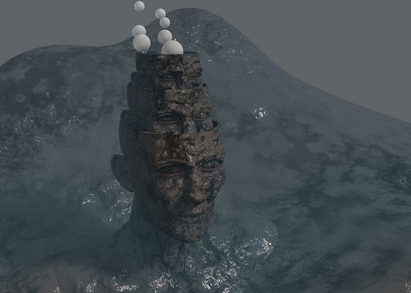
hi all . i guess my recent renders would be effective too !!! but more like a nightmare


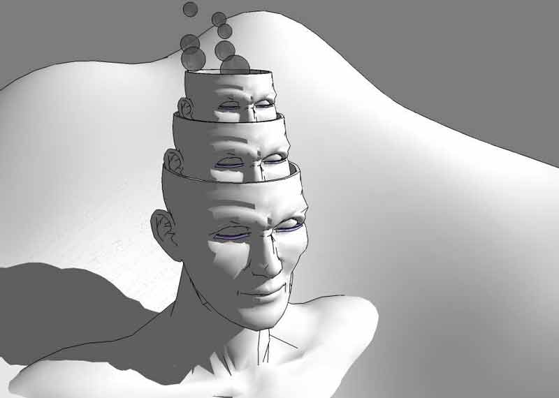
a composition of makeHuman+sketchup ( rendered using KT )
-
Majid, I like this one a lot. I only wish you would brighten it up just a tad so we can see more of what is going on! Nice work!
-
ok . and thanx... i attached another render + SU exported model .. hope u joy


-
Yea... Majid I like this one a whole lot more than the other. The Sketchup output looks awesome too! Can you lead me to the MakeHuman program... I'm having trouble finding it! Thanks Majid...
-
http://www.makehuman.org/blog/index.php
what's the best method for getting these makehuman models into sketchup?
looks like fun Majid, well done! -
i export obj , then import to SU using free obj importer plugin .!!
-
the first one is really convincing - makes me feel like I could do with a weekend at the ocean.
what happened to the windows in the second image? is the seperation in several faces with different angle on purpose?
a beautyful vessel in the third one. and I like the highlights on the waves. somehow the water seems quite solid though...
thanks for sharing. you allways succeed in setting up a whole scene - not only a model, but a real scene with it's own moode. great!
-
thankx Jakob , for comments . at the last image i'd tried to sumulate water using just KT tecturs ( in fact i'dnt used any bump or other maps in su ....) so it was an interesting experience for me myself....and bkz i was tring to simulate near shore sea ...then it is not so clear water.... but the whole seen ( maybe soon i'l send some renderes ) seems to be more real .
about the 2nd image i 'd used 2 type of faces beside each other and then used diferent bump map for each other so that they seem more real ( not flat and non-real glasses ).u can read more here :at kt forum
http://www.kerkythea.net/joomla/index.php?option=com_wrapper&Itemid=76 -
i thought my recent works have no new thing , but maybe interested to be seen . so i desided to share them . hopr u joy


http://i34.tinypic.com/332mj9u.jpg
http://i33.tinypic.com/eqchoi.jpg
http://i37.tinypic.com/w80ua9.jpg
all modeled in su , rendered using kt , and just 4 fun
majid -
pure render just some detailes by ps

-
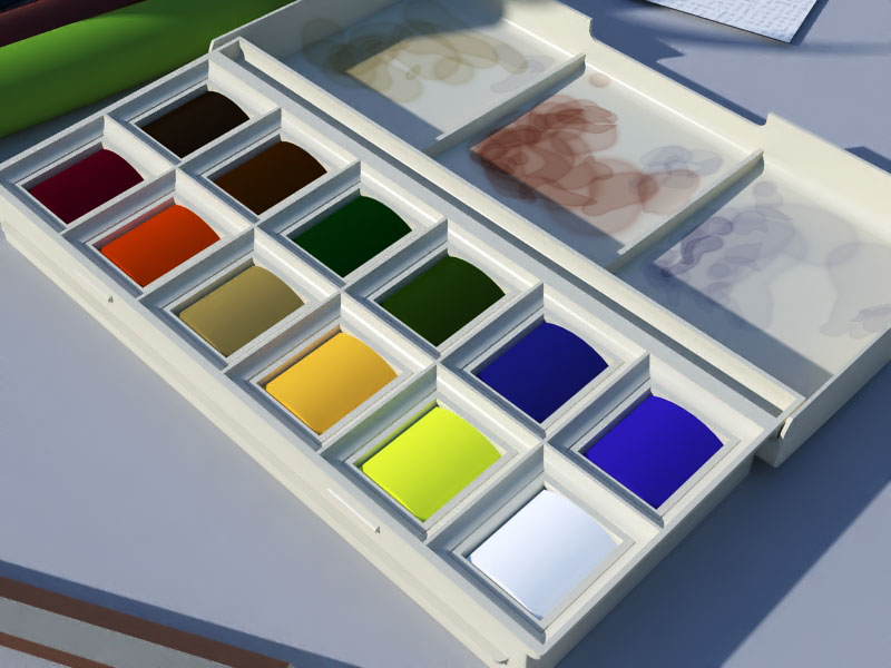
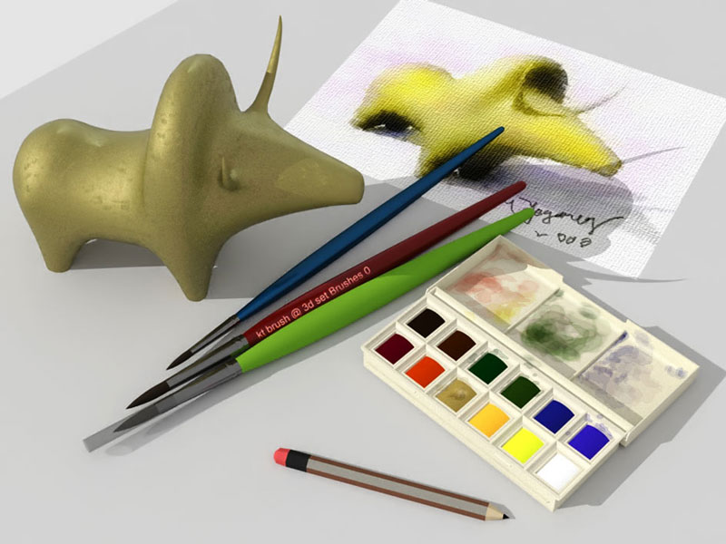
So wheres the brush? Or are these finger paints?
-
ok bob , here r the brushes ...

-
Majid, you have definately become a Master

-
tanx mike , here we have a friendly forum that helped me alot ! thanx to all masters
-
i changed some kt settings , and here is the result .
cheers
-
by now i think my best interior render is this kitchen ( 2 h kt render preset 20 )
i'm trying other lighing test ..and soon ll uplod it
cheers
-
this is an over night result,some change in lights . just noise reduction ( a bit of lightening over the hood part )

-
nice kitchen model, majid.
i like the lighting effect on the lampshade. did you use several light bulbs within the lamp for that?
the workface, especially on the left looks a bit sterile; perhaps because of the utterly sharp edges. or maybe a slightly different material would help.
-
thanx dear Jakob for comments . i used several lamps and also whit several shadow color to have a colorish space theme.
Hello! It looks like you're interested in this conversation, but you don't have an account yet.
Getting fed up of having to scroll through the same posts each visit? When you register for an account, you'll always come back to exactly where you were before, and choose to be notified of new replies (either via email, or push notification). You'll also be able to save bookmarks and upvote posts to show your appreciation to other community members.
With your input, this post could be even better 💗
Register LoginAdvertisement


