sketchucation logo sketchucation
    • Login
    ℹ️ Licensed Extensions | FredoBatch, ElevationProfile, FredoSketch, LayOps, MatSim and Pic2Shape will require license from Sept 1st More Info

    Living with Moore

    Scheduled Pinned Locked Moved Gallery
    15 Posts 9 Posters 1.2k Views 9 Watching
    Loading More Posts
    • Oldest to Newest
    • Newest to Oldest
    • Most Votes
    Reply
    • Reply as topic
    Log in to reply
    This topic has been deleted. Only users with topic management privileges can see it.
    • L Offline
      lewiswadsworth
      last edited by

      I suspect a little lesswould be Moore.

      Perhaps an untextured version (hidden line/profiles with shadows)--or a Stylized NPR rendering--would be more effective than outright texturing. Why not try this out with one of Dave R's retro textures?

      col sporcar si trova

      1 Reply Last reply Reply Quote 0
      • K Offline
        kwistenbiebel
        last edited by

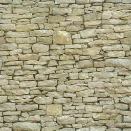
        Looks cool Fred.....but I would change the rock texture:


        Stone_Coursed_Rough.jpg

        1 Reply Last reply Reply Quote 0
        • I Offline
          igor
          last edited by

          make it a bump and we're good to go!

          The genius switch has no "off" position
          Intelegence is natrual, it takes real effort to be ignorant

          1 Reply Last reply Reply Quote 0
          • ___olo_ Offline
            ___olo
            last edited by

            yes, I agree with Kwistenbiebel.
            Hope you continue make it more beautiful.

            Xin chào nhau giữa con đường
            Mùa xuân phía trước, miên trường phía sau

            1 Reply Last reply Reply Quote 0
            • F Offline
              fbartels
              last edited by

              Thanks all for the feedback. Very helpful! Chris, I tried that stone material but it gives a little too rough and rustic a feel for where I'm aiming. My initial vision for this house had the blobs having a rich brown-bronze finish like that on many of Moore's sculptures. I found some nice Moore sculpture images on Flickr this morning, one of which had a good area for a texture lift. The first image below doesn't use a texture but is about the color I'm aiming for. The next three use the borrowed Moore texture. This is getting pretty close to what I want.

              http://dws.editme.com/files/MayJune2008/aeh 6 with dark brown v1.jpg

              http://dws.editme.com/files/MayJune2008/aeh 6 with moore v1.jpg

              http://dws.editme.com/files/MayJune2008/aeh 6 with moore v2.jpg

              http://dws.editme.com/files/MayJune2008/aeh 6 with moore v3.jpg

              1 Reply Last reply Reply Quote 0
              • J Offline
                Jon
                last edited by

                that looks great, IMO 😄
                So, I guess you're one of the people more than anyone anticipating Whaat's new UV mapping tool. 😎

                Jon
                KT Team member

                1 Reply Last reply Reply Quote 0
                • F Offline
                  fbartels
                  last edited by

                  Jon, Thanks for the comment! I'm definitely looking forward to Whaat's new mapping tool... along with anything else he creates. 😄

                  Finally found a texture I can live with - for a while at least - so back to work on the modeling.

                  http://dws.editme.com/files/MayJune2008/aeh 6 with moore light v2.jpg

                  http://dws.editme.com/files/MayJune2008/aeh 6 with moore light v1.jpg

                  1 Reply Last reply Reply Quote 0
                  • F Offline
                    fbartels
                    last edited by

                    Added some screening panels last night. The screens soften the floor edges and echo the original driving shape.

                    http://dws.editme.com/files/Home/aeh 6 with moore light_screen  v1.jpg

                    http://dws.editme.com/files/Home/aeh 6 with moore light_screen v2.jpg

                    1 Reply Last reply Reply Quote 0
                    • P Offline
                      pav_3j
                      last edited by

                      hmm, i think i liked the design better without the screens.
                      the juxtaposition of the two elements is one of the main features, so why hide it?

                      still lovely sketch-upping though!

                      pav

                      Just won the 'Who is Least Competitive Championships' where trying to win will make you lose. Trying to lose makes you win which makes you lose. Not trying at all makes you lose which makes you win which makes you lose.

                      1 Reply Last reply Reply Quote 0
                      • plot-parisP Offline
                        plot-paris
                        last edited by

                        I prefer the building with the newly added screens - thus the two shapes seem more united and the building is much more integrated in the sculpture.

                        Fred, you should seriously consider going into rendering! I think the building-sculpture would be much more pronounced in it's depth (through indirect lighting, shadowed corners...)
                        surely you would produce some stunning results

                        1 Reply Last reply Reply Quote 0
                        • 1 / 1
                        • First post
                          Last post
                        Buy SketchPlus
                        Buy SUbD
                        Buy WrapR
                        Buy eBook
                        Buy Modelur
                        Buy Vertex Tools
                        Buy SketchCuisine
                        Buy FormFonts

                        Advertisement