Living with Moore
-
thats an interesting if impractical housing method. looks great, though the projection on the stone arches is making the texture bend and it doesn't look very realistic. could be fixed easily, but i understand that these might have just been some quick models and the details werent focused on as mush as a full on project.
honestly, i think it would be pretty cool to live in that house. great job!
-
That's cool, very impractical to built, but cool


-
HFM and igor,
Thanks very much for the feedback. Agreed about the impracticality. Just letting my imagination play here.

I'm struggling to find a good texture for the "blobs". I've gone through most of the SketchUp options without finding anything that looks right to me. I'll keep looking.
A couple of new image exports with different textures.


Fred
-
i personaly like the first textures better, even if they are a little distorted.
-
I suspect a little lesswould be Moore.
Perhaps an untextured version (hidden line/profiles with shadows)--or a Stylized NPR rendering--would be more effective than outright texturing. Why not try this out with one of Dave R's retro textures?
-
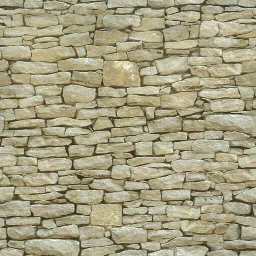
Looks cool Fred.....but I would change the rock texture:

-
make it a bump and we're good to go!
-
yes, I agree with Kwistenbiebel.
Hope you continue make it more beautiful. -
Thanks all for the feedback. Very helpful! Chris, I tried that stone material but it gives a little too rough and rustic a feel for where I'm aiming. My initial vision for this house had the blobs having a rich brown-bronze finish like that on many of Moore's sculptures. I found some nice Moore sculpture images on Flickr this morning, one of which had a good area for a texture lift. The first image below doesn't use a texture but is about the color I'm aiming for. The next three use the borrowed Moore texture. This is getting pretty close to what I want.


-
that looks great, IMO

So, I guess you're one of the people more than anyone anticipating Whaat's new UV mapping tool.
-
Jon, Thanks for the comment! I'm definitely looking forward to Whaat's new mapping tool... along with anything else he creates.

Finally found a texture I can live with - for a while at least - so back to work on the modeling.


-
Added some screening panels last night. The screens soften the floor edges and echo the original driving shape.


-
hmm, i think i liked the design better without the screens.
the juxtaposition of the two elements is one of the main features, so why hide it?still lovely sketch-upping though!
pav
-
I prefer the building with the newly added screens - thus the two shapes seem more united and the building is much more integrated in the sculpture.
Fred, you should seriously consider going into rendering! I think the building-sculpture would be much more pronounced in it's depth (through indirect lighting, shadowed corners...)
surely you would produce some stunning results
Hello! It looks like you're interested in this conversation, but you don't have an account yet.
Getting fed up of having to scroll through the same posts each visit? When you register for an account, you'll always come back to exactly where you were before, and choose to be notified of new replies (either via email, or push notification). You'll also be able to save bookmarks and upvote posts to show your appreciation to other community members.
With your input, this post could be even better 💗
Register LoginAdvertisement


