Thank you all for your comments, I very much appreciate them 
@jo-ke said:
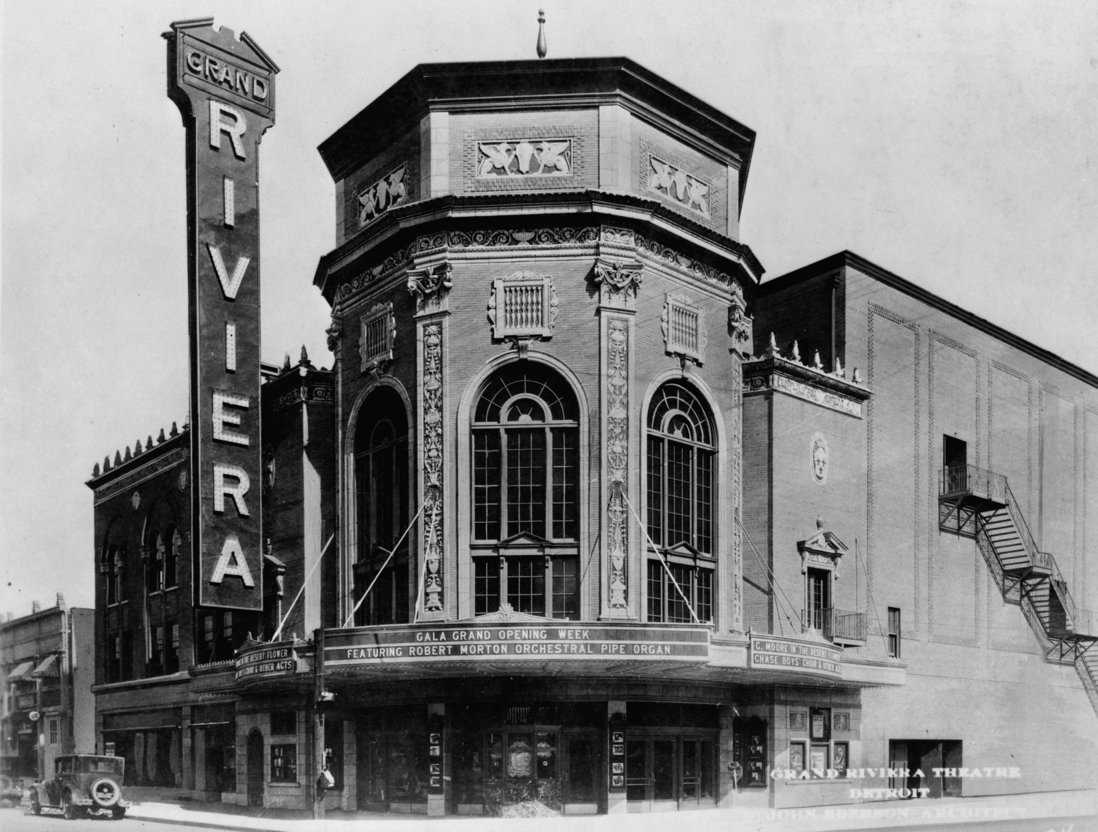
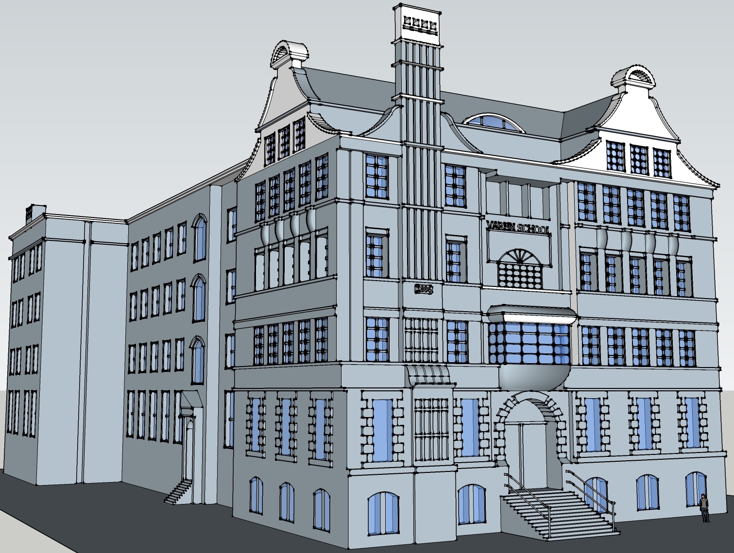
My only crit is that the font, that you used in the sign is not right. In the picture it is a more clear one, without serifs
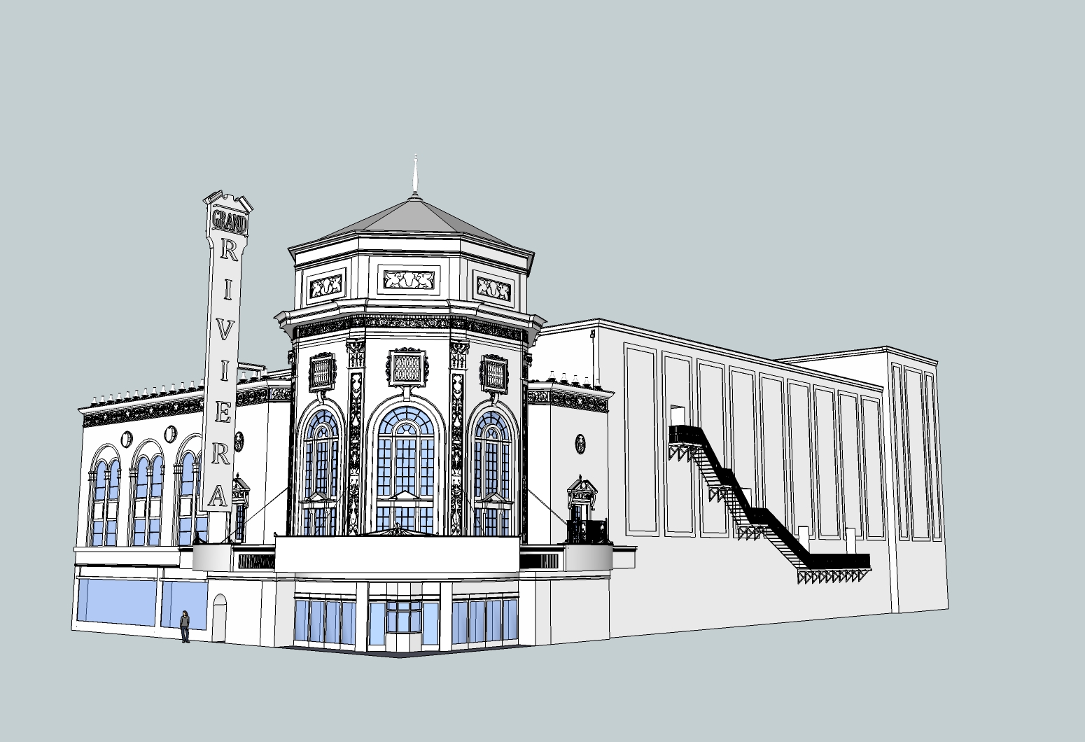
I agree. I finished this on my wife's machine and she doesn't have a lot of fonts installed on it (not like I personally do on my machine either), and I made the sign last, so by that point I was quite exhausted and didn't want to spend an hour just to find a decent enough font online or otherwise. That font just seemed like it at least centered well enough. What I probably should have done, besides spending the time to find a better font, was make each letter individually and manually center them.
@unknownuser said:
i'm thinking you should rework the front (entrance)
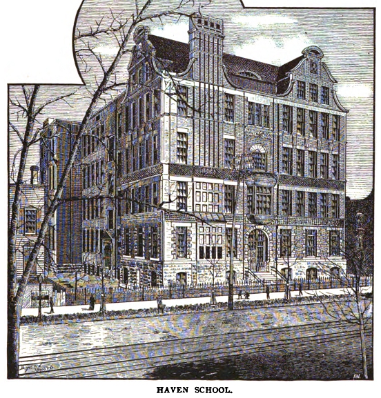
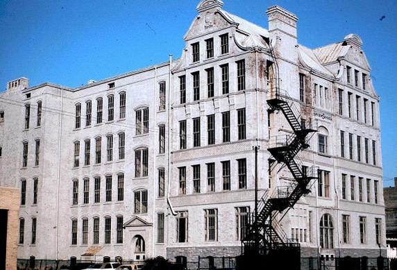
it looks too much like something you'd see nowadays and missing the little deco hint of the original.
i think the entrance is more rounded off instead of the chamfer look.
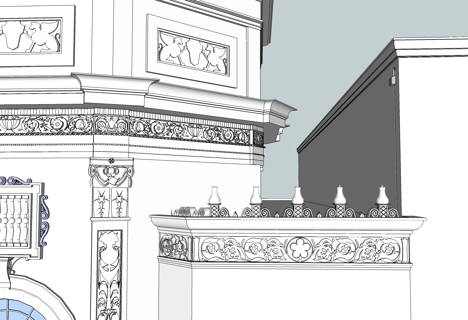
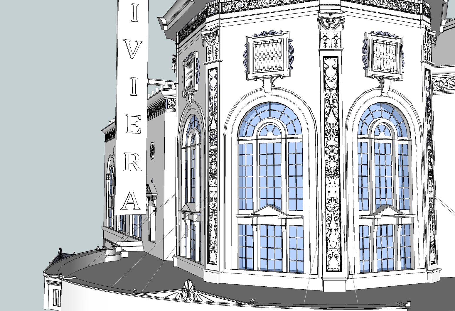
I definitely made a big compromise there. I already went through quite an ordeal to make those flower decorations on the top of the marquee actually match the curve of the sign below them. From looking at the pictures and plans, you are right in that it should be a round entrance instead of what I did - but I knew that in order to make it look more like the plan, I would have had to do the same type of work which I did with the marquee decoration and wrestle with a lot of face intersection and subsequent line erasure.
What I should do next time, given that I have that type of drawing available, is start by reproducing the drawn plan using photo match and pull the entire line work up to the needed height, and work from there.
