Szacun! 
Posts
-
RE: NPR Colourful landscape -includes basic steps
Do you use some special plugin or soft for that rocks in the wall?
-
RE: NPR Colourful landscape -includes basic steps
Very inspirational post!From pure curiosity - the buildings are from some real place or yours?
-
RE: NPR Colourful landscape -includes basic steps
Wow! Great, thanks so much for explaining your technique! It's quite similar to my approach. Where do you get your backgrounds, foregrounds, trees, grass etc.? Do you use photos or some of them are rendered? Thanks again - great job!
-
RE: NPR Colourful landscape -includes basic steps
Great! Really beautiful. Would love to read some workflow.

-
RE: Invisible Cities- Diomira
Very interesting approach and subject. Though I can't completely disagree with Dale - he has a point to some degree at least, and for sure he has some good advice in his reply. I'm not sure if I would hang this first image on my wall, but one thing I know for certain - I will impatiently wait for the rest of the series!
-
RE: Windmill
Last two are great. The one against the sun light and the NPR one. Is the NPR one pure Lumion, or some postwork?
-
RE: Log house
The last one is great! I'm sitting in my cheerless office, winter behind the windows, boring job waits to be done. I'm looking at this image and I just wish to transfer myself to this place with a bunch of friends and a dozen of cold beers. Dammit, you made my work day much more difficult!

-
RE: Lifepod Project
You guys should contact Architecture for Humanity - they might be interested in your ideas and projects.
-
RE: Log house
Great contribution, thanks for sharing! Very nice looking plants, grass and light. Like that a lot.
Things that could be even better:- Adding a little bit of depth - now it seems like a part of a photo taken with super-zoom. But one might like it that way of course.
- Some diversification of those stones.
Overall - well done!
-
RE: Lifepod Project
Can't really evaluate the project itself, as I don't know this subject well enough, but what I have to say is that I have a great respect for you and your project. I hope that it'll work and change something for the better. That's the best use for tools such as Sketchup. Well done and keep it up!

-
RE: Burnt Post
Where the hell are the birdies! Joke.
Very interesting idea! I really love it! My subjective opinion is that it's a bit to tidy, clean and straight. I don't know if I'm using the right words here, but what I mean is that it would be nice to see some cracked bricks and a bit skewed frames here and there. And birds of course!
-
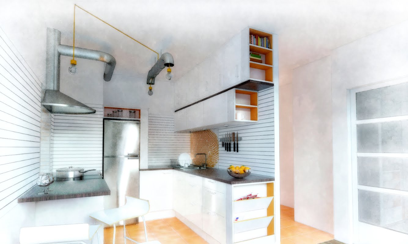
RE: Small kitchen design
Thanks guys for all the kind words!
@unknownuser said:
Subjectively, say as layman-client, I would like it if the effects, glow/over-exposure and the vignetting were toned down a little.
I know what you mean - there is a trend for over-exposure and glow effects, mainly in the photo-realistic visualizations, giving them a kind of "magical realism" feeling. That's how I perceive it at least. And well - I like it more then very strict, classic realistic approach. But I imagine it might be annoying. Next time I'll try to make some different versions - I wouldn't like to start to overdo with this style.
@unknownuser said:
Is that slatboard? That's a hell of an idea for a kitchen.
Wow - that is a hell of an idea! Probably hard to keep it clean, but - nevertheless! Sadly it's your idea, not mine!:D My design has just painted lines, or some striped waterproof - wallpaper. I didn't even know what a slatboard is! It's not very popular here in Poland.
Thanks again and have fun on this Saturday evening!
-
RE: Small kitchen design
Thanks - this friend wanted to have a glass covered graphics over the sink and the oven. Over the oven he chose a handwritten cocktail receipt and over a sink wanted to have something personal. Fingerprint is very personal, so I thought it will suit
 . Probably none of them will be done because they are quite expensive and the whole kitchen is on the cheap - mostly IKEA actually.
 -
RE: First finished Maxwell renders
Hi, by second plans I meant the background of your views, especially on the first two ones. Somehow I find them unnatural, but I can't really put my finger on it. Maybe it's the case of depth of field (the first plan bush is very blurred) - don't really know, maybe just other images would fit better. On the third one it looks good. As for the sof shadows - the sky looks a bit cloudy, so soft shadows probably would look more natural, but again it's a matter of a bit of experimenting.
-
Small kitchen design
Kitchen design made for a friend. He bought orange tiles earlier and wanted to match the design to them
 . In this view I wanted to achieve somewhere between NPR and realistic look. First attempt to such an approach in interior, so comments are appreciated.