Landscape Job
-
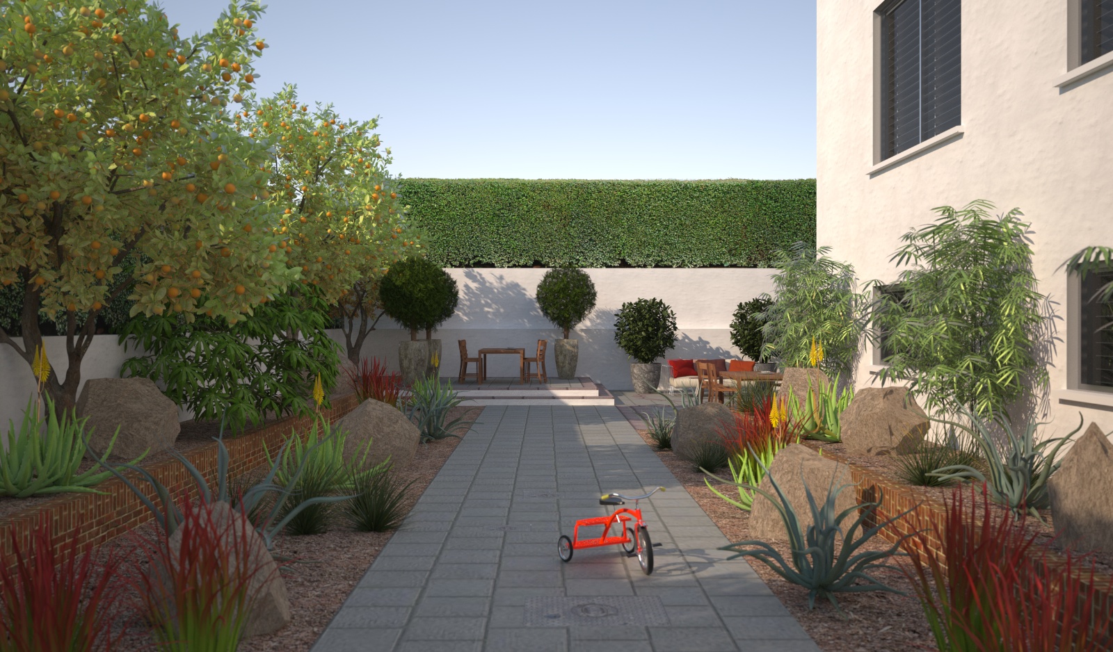
This render had a crippling benchmark because of the high poly objects. However the proxy feature of the plugin makes this normally impossible scene easy within Sketchup. Sketchup model & Maxwell Render C&C welcome.
Happy Christmas fellow skippers.

-
nice model and render...my critic would be the materials. you have bricks, you have concrete-grey paving, you have the beige-looking gravel and rocks...they don't fit together in my opinion. for the paving i would go with a sandstone polygon paving and for the walls i would use sandstone too. that would fit better in the mediterrean character of this model.
-
Ditto on Carloh's comments... also, to me the blank patch of sky in the middle looks a little empty. It's a good break from the high detail of the foreground, but maybe add some faint scenery in post? This is nitpicking, of course... the pic looks great. There's so much snow in my yard right now I'm considering moving into your model for the winter.
-
Thanks for the comments guys. Carloh your right it is a little diverse with the materials. However the brick planters exist along with the house. The grey & red paving was chosen by the clients. I am trying to convince them of a soft approach with the bark chips as they had previously decided to pave the entire area. Chris the sky is preferable to the huge neighbours house which fills this sky space !
-
Chedda, mate I'm with the others on the colour of the hardscapes. I'd also suggest that you might want to clump some of the rocks together rather that having them so uniform and pull some into the ground. For me at the moment they are too "arranged".
Also the amount of colour variety in the ground level plantings distract from a more homogeneous theme. This could be what your aiming for but it's very "cottage" like. They all probably need more massing or population too!
And mate might I ask the source of the trees on left? They are very nice!
-
Thanks for the comments Richard the trees are from evermotion vol 61.
-
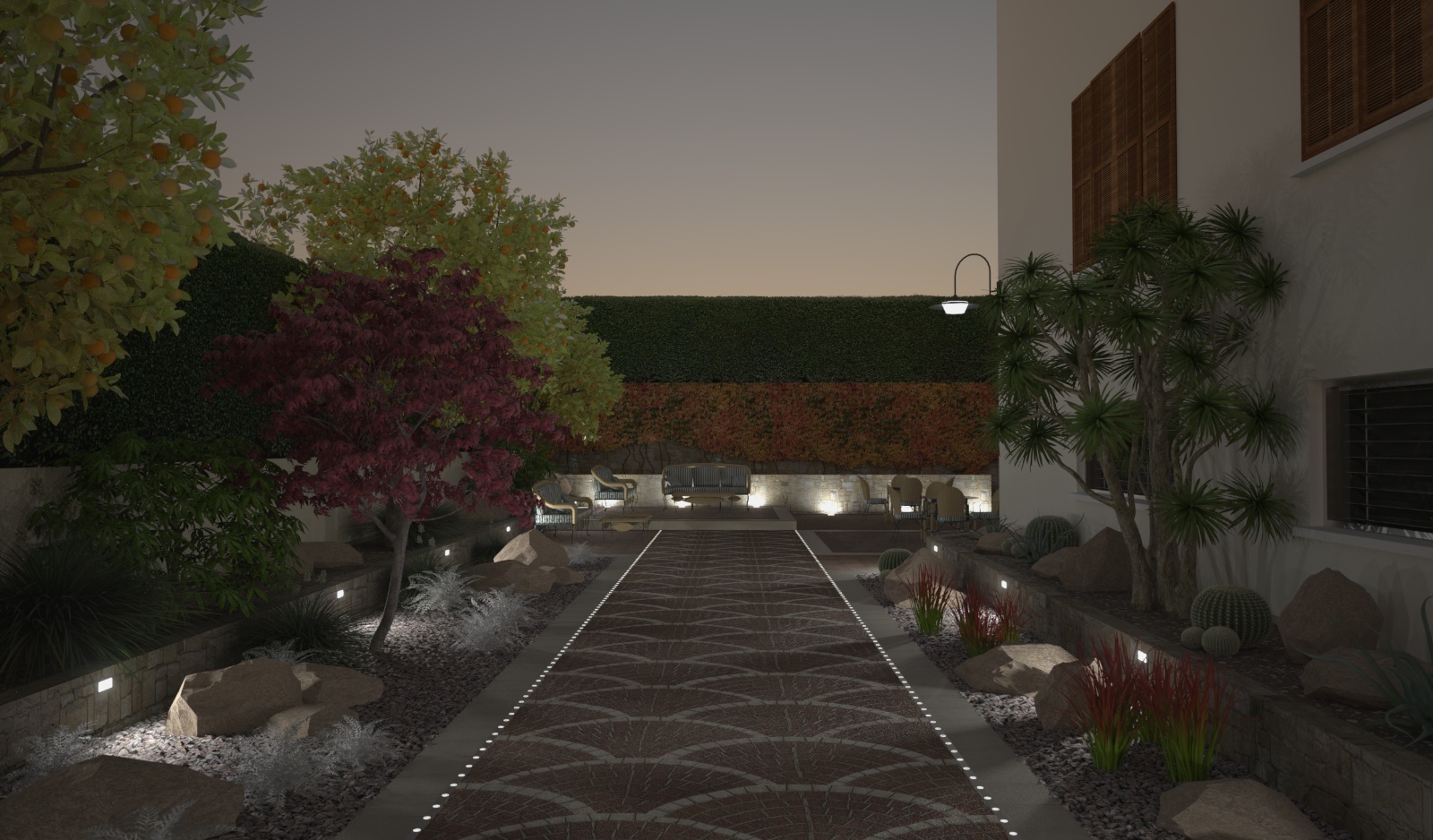
Here is the polished, final version.Thanks for the feedback everyone.

-
Looks great. Hope your client thinks so, as well. (they should!)
-
Chedda
Mate for me the night shot needs a little more flood lighting - maybe a light panel where the camera is to simulate a flash!
-
Do you have a final version of the day shot?
-
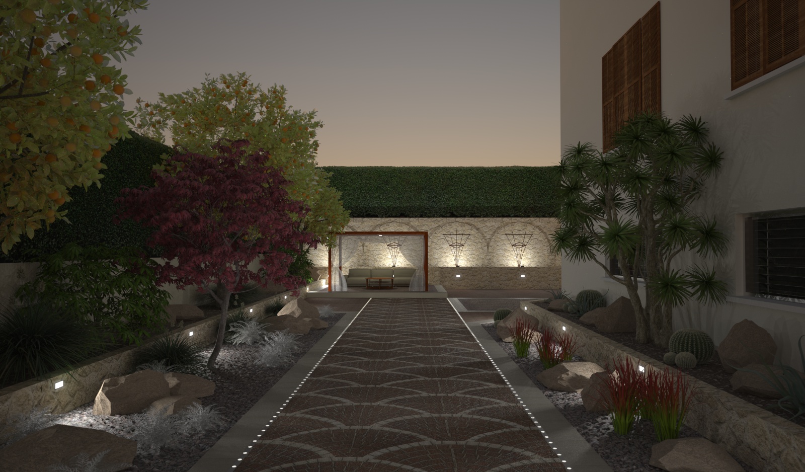
Some updated images:


-
As always guys just when i think it's finished their are changes again, watch this space for the next episode ! Good tip Richard on simulating a flash i will try to mimic it.
-
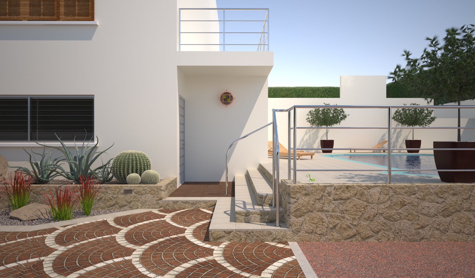
This steps detail is a WIP as i try to find a solution for this difficult space, can anyone help with the layout it has me puzzled ?

-
you mean layout of the actual project? I would try to make the steps go down in both directions if you have space in the foreground. Wrap them on the corner for a more generous use of the space. Is that a door at the building? Is that why the steps are going there? Looks like one too many landings to be nice, but appears you have a level challenge--- I'd prefer to make all the steps come down to one level, perhaps it needs to then step down to the path. But I don't like single steps out in the middle of things either...
So have one set of steps go to the door and one set come out towards us with a planter (and that one step you have between)? Maybe that planter would relate to the planter on the left of the step. I'd put a handrail at the wall beyond and not have one in the middle of the steps if you are OK with that. Can the steps move a little towards the pool to make the landing less abrupt? It looks like that can't much
or are you asking something else?
-
That's exactly what i'm asking. This house has been renovated about 3 times in different areas, where they join is problematic. The door is one step up the pool four, there is a little space to play with at the top. It's difficult to understand your suggestion. The rail your right should be pushed back under the light. I put it here to prevent any confusion with the steps and try and make it safer.Thanks for the feedback.
-
Well, I guess one part i mean is put a planter to divide the steps instead of the rail.
-
Thanks for the tip pbacot.

-
You're welcome. Nice picture! I admire your rendering skills.
I guess I do like the direction, the various stepping forms are juxtaposed on two axes, even the hedges. The planter highlights the entrance to the pool deck. I do feel uneasy about swimsuits and cacti though. Heh!
Those are nice plants BTW. Did you model them?
Congrats!
-
Thanks pbacot the trees & pot plants are from evermotion. I use a proxy in the maxwell plugin.Yes Cacti means respect & caution but this is Cyprus ! Thanks for taking the time.
-
NICE modification to the stairs there mate! Great recommendation Peter!!!
Mate have you played at all with the shift lens? Very useful for landscaping renders!
Hello! It looks like you're interested in this conversation, but you don't have an account yet.
Getting fed up of having to scroll through the same posts each visit? When you register for an account, you'll always come back to exactly where you were before, and choose to be notified of new replies (either via email, or push notification). You'll also be able to save bookmarks and upvote posts to show your appreciation to other community members.
With your input, this post could be even better 💗
Register LoginAdvertisement


