Great work! "To God be the victory!" 
Posts
-
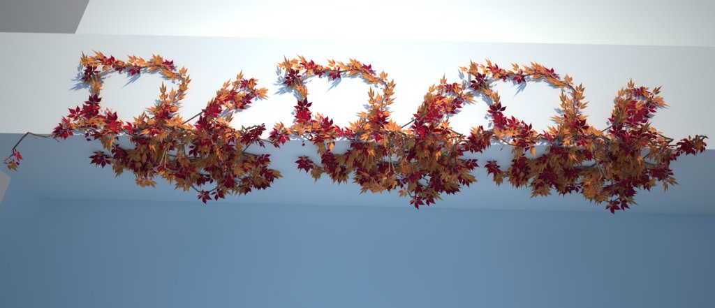
RE: [Plugin] Sketchup Ivy
Thank you Pierreden, this is very nice! Looking forward for a new Release with new features.

-
RE: Just wanna share- newbie
@roger said:
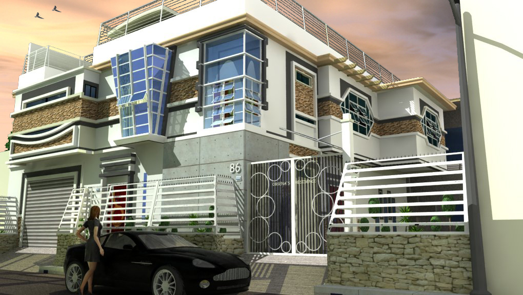
The guacamaya in the sky, the proximity to the street, the louvered windows, the owner's name on the building, the use of concrete and stone, your name, and the extensive security measures all point to a tropical location in South America. At first I would have guessed Venezuela.
On the other hand, in Venezuela the windows would have steel bars up to the third floor. The name would be cut out of brass and say, "Quinta Obsena". Also the hex shaped windows are vaguely oriental. Lastly tilting the fencing in makes it easier to climb and brings intruders closer to the building. Would this be the Phillipines or Macau?
Wow.
Its Philippines, I presume that you are an International Architect.
-
RE: Just wanna share- newbie
@unknownuser said:
That does not look like 15 feet from the street.
That aside, the textures need some work.
There is a good deal of repeating on the stone.
There should be some displacement on the stone to give it more depth.
Personal preference, but the woman takes away from the image. Sorry but some short skirt getting into an austin martin says something other than "welcome home".
I agree the image is cropped far too close. It would be better to see more of how the structure impacts the surroundings.Scott
I believe that 3M = 9'.
Sorry but my laptop is an older version of acer that cannot handle displacement. I wish I have a powerful laptop.
Now, I'm just curious on that short skirted woman that says something? Other than "welcome home" but I do respect your point of view.
It's intentionally cropped far too close because the lot area is only 412 Square Meters.Thank you Scott
-
RE: Just wanna share- newbie
@unknownuser said:
Is the house that close to the street? It looks like about 5 feet away.
Yes, its 3 meters away from the street.
-
RE: Just wanna share- newbie
@mitcorb said:
Nice job in the rendering. However, not sure if perhaps the glass surfaces would reflect the colors in the sky.
Regarding the design: While it may be customary in your culture, I perceive the complexity of the facades as a crowded palette. You threw everything at it. For instance, the "gate", or window, with the circles in it, while interesting, seem not to respect the angular geometry of other areas.
Same with the multitude of textures, although the upper "band" of brown texture seems to help unify.Thanks mitcorb
Your right the glass is my problem. I dont have such HDRI for the sky, Thats why I only put some blue background and edit it with PS.
About the design its culture based and the "gate", the circles intersects the black bars. I higly appreciate your visual ideas on the textures.
Thanks mitcorb.
-
RE: Just wanna share- newbie
@fymoro said:
Hi Carlo and welcome,
Nice image, witch render engine and process did you use ?
Ive done it with Vray for SU but only the car is linked to Vray.
-
Just wanna share- newbie
need feedbacks or comments..or tutorials.
thanks masters..

