I hope you don't mind but i couldn´t resist to render this!!!

Thea For SketchUp and PP with Gimp
I hope you don't mind but i couldn´t resist to render this!!!

Thea For SketchUp and PP with Gimp
Here is my attempt. Thea (TR2) + Gimp
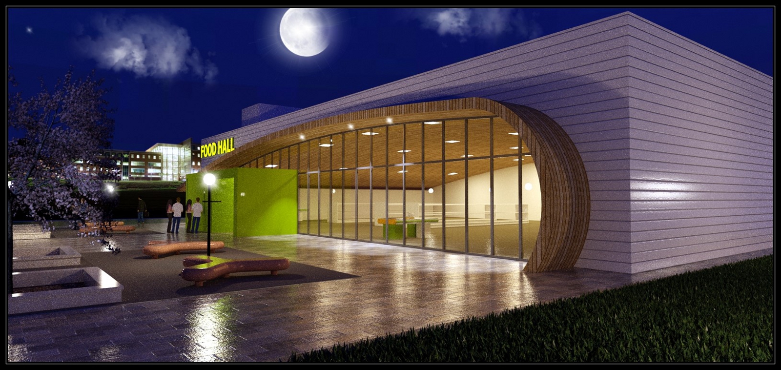
Here is my attempt. This was a 3 and a half hour render with 70 passes using Thea with TR1. I kept the original materials and only added custom bump and reflection maps. I also did some post processing work with Gimp and DenoiseMyImage_Free. The HDR image that I used is form http://www.hdrlabs.com
Thanks for this awesome tutorial!!!! 


And that you shared the Skp file and the Thea Render Scene Pack just made my day 
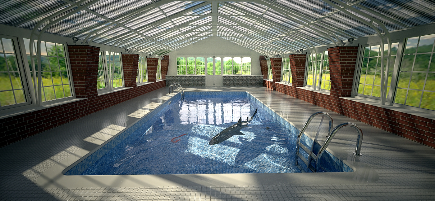
Here is my first attempt to render this scene with Thea. So far I'm not too happy with the door area and its lighting. CC are welcome.
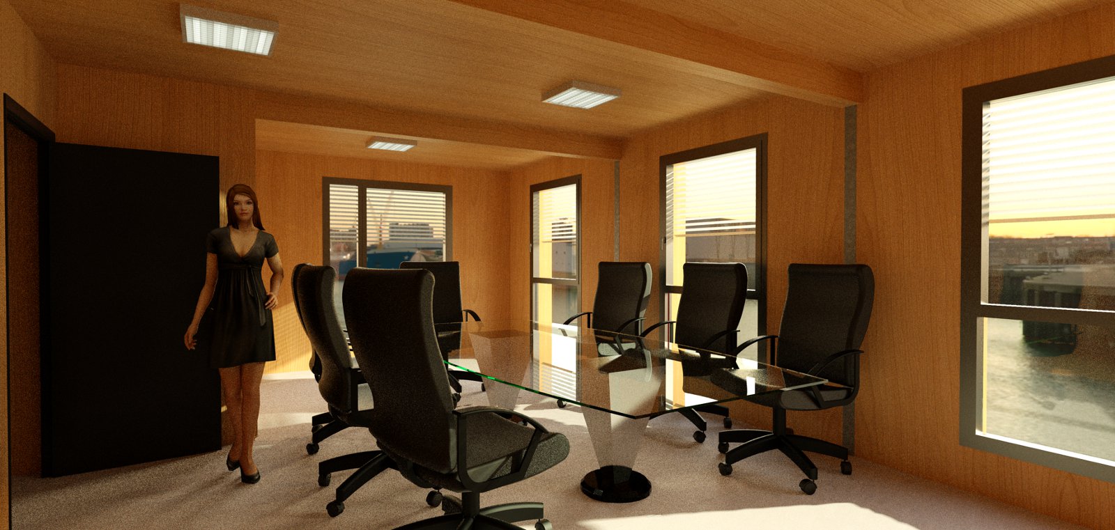
I found this today and reminded me of your BoxPod
http://www.dasparkhotel.net/rooms/index.php?lang=EN
Thanks for all the feedback and comments. Sorry that I didn't respond earlier but the last few weeks were kind of crazy...
I redid the old renders and took care of the counter as well as applied some new materials and added a new floor. I also created some additional exterior renders. All the renders were made using Thea Render and some PP with Gimp. Let me know what you think.

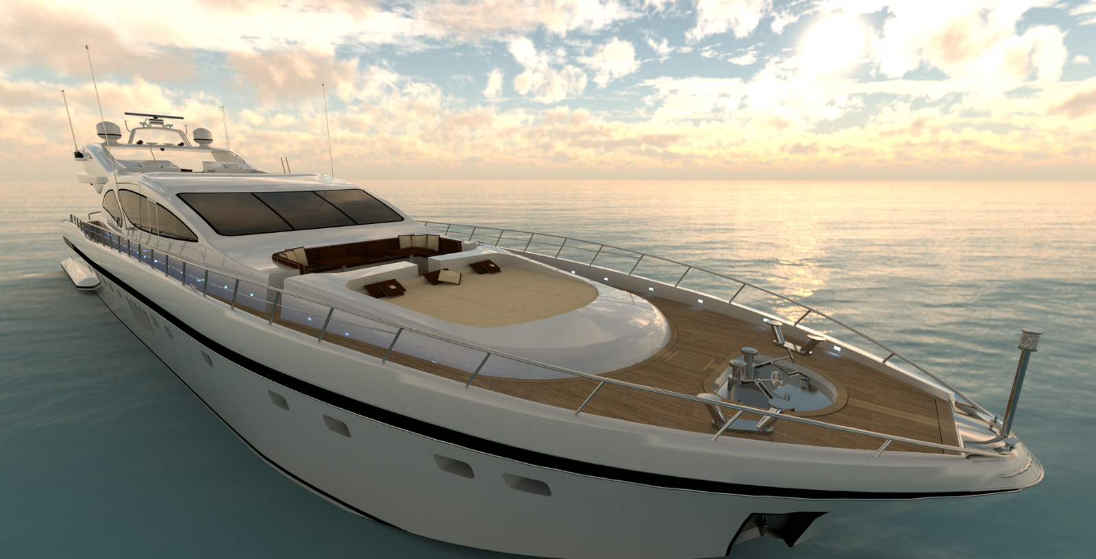
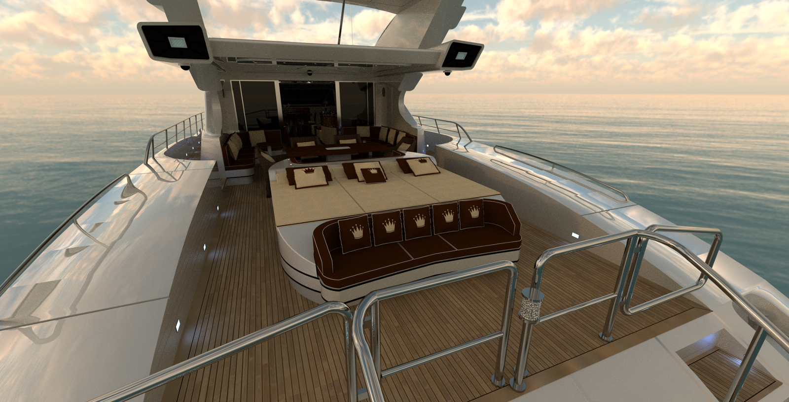
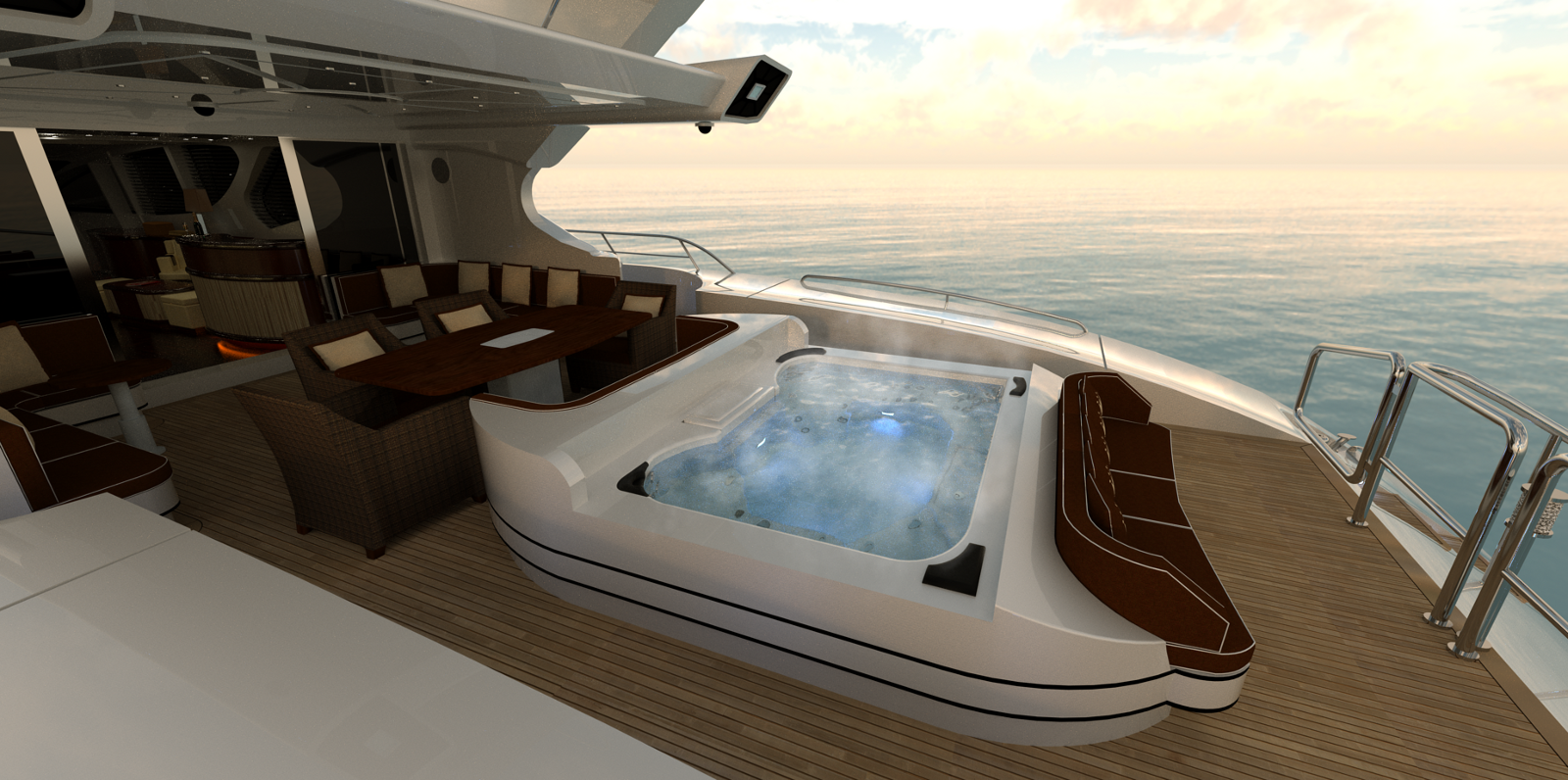
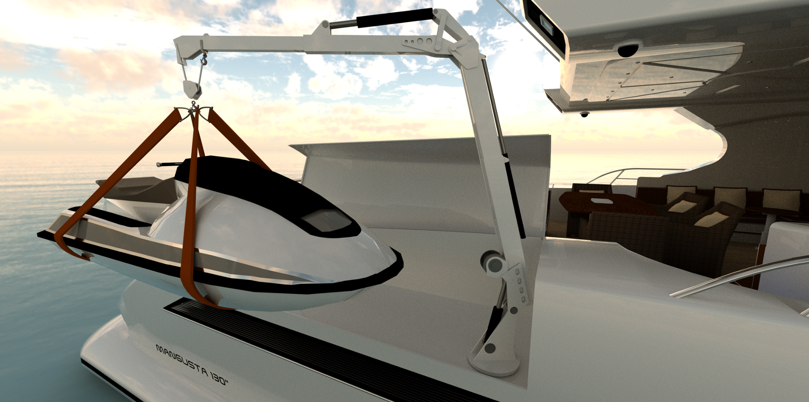


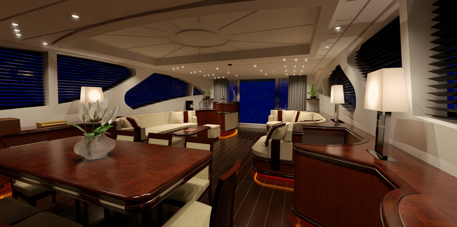
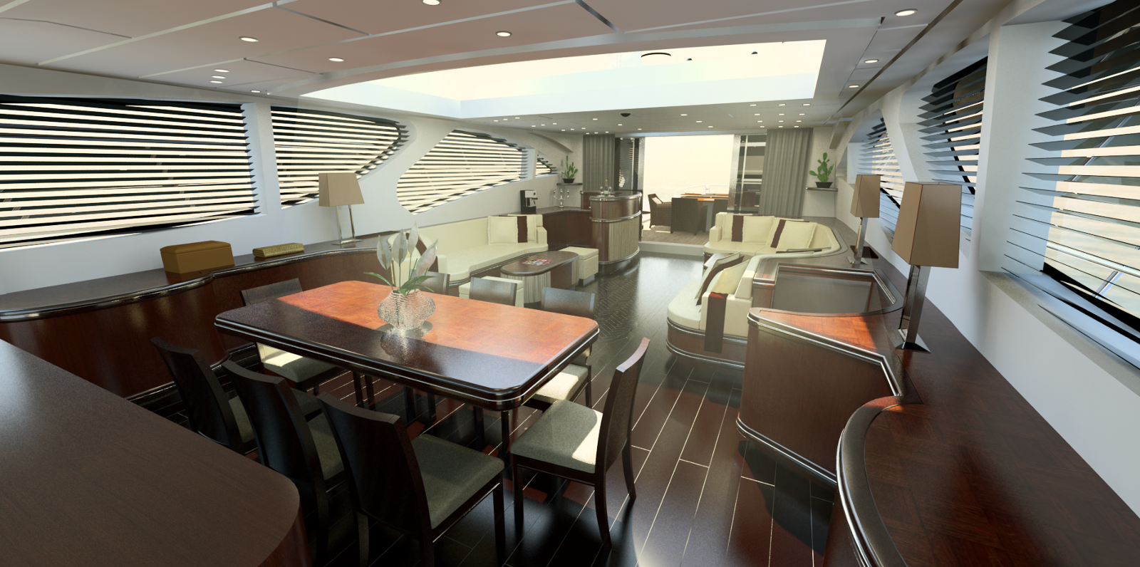
been awhile since i posted something
i hope my sketchup and rendering skills have improved a bit

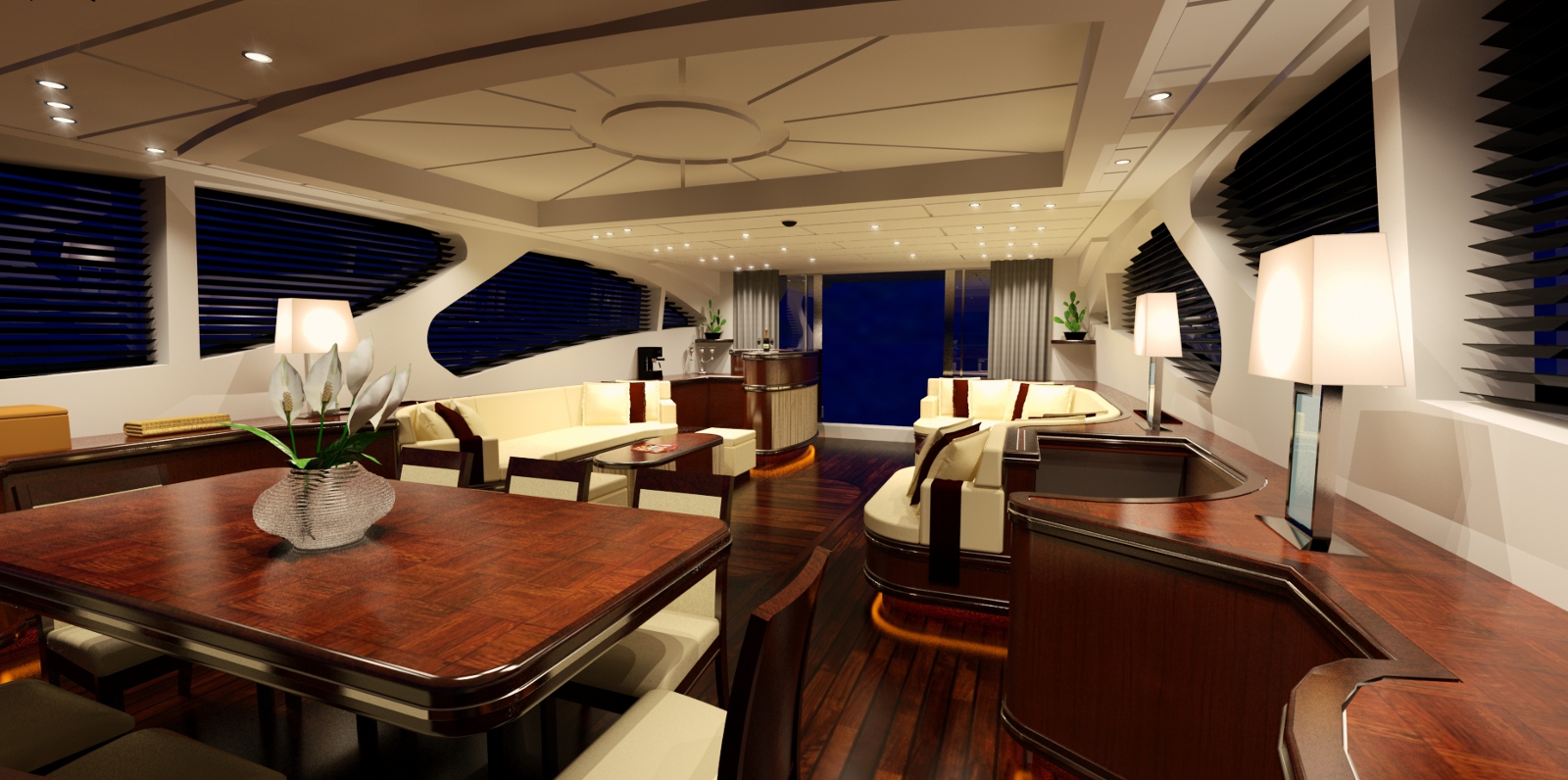
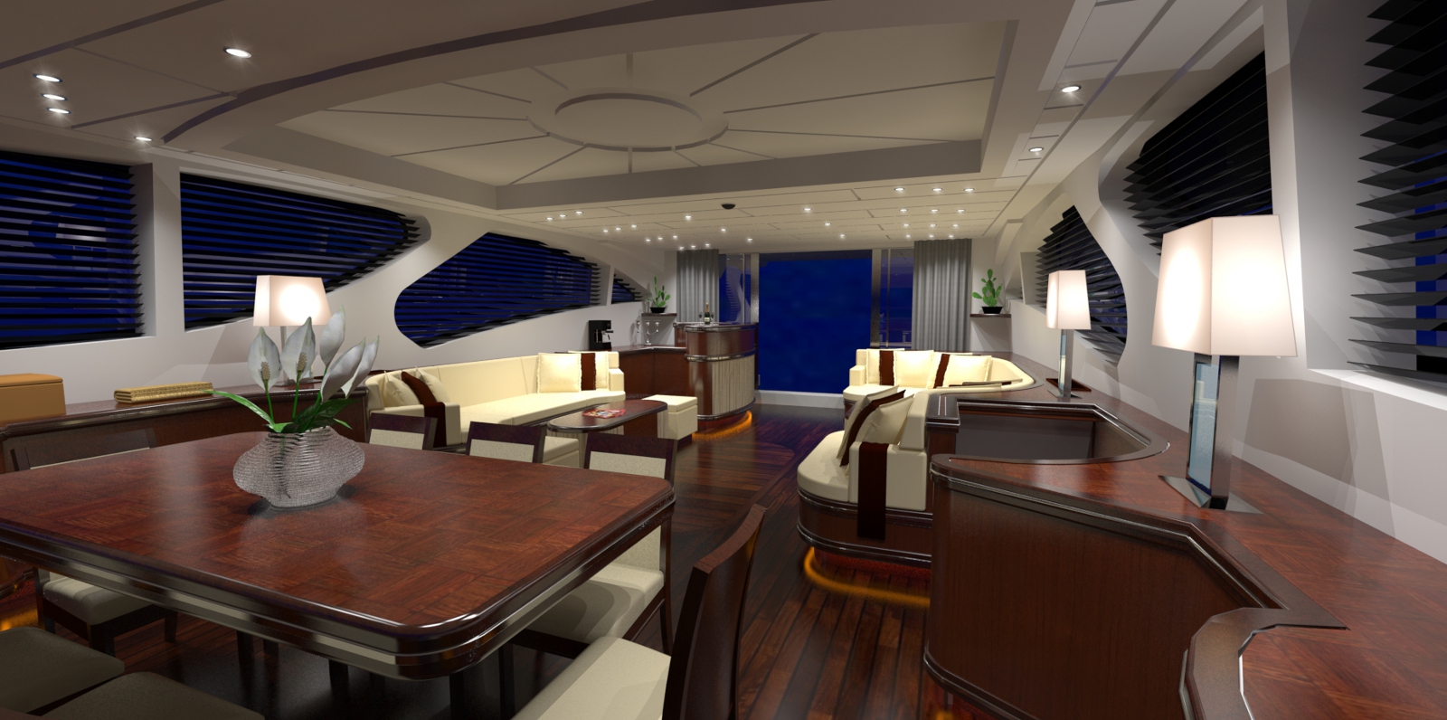
While I'm waiting for Santa to bring me my Thea license  ,
,
I was playing around with some light scattering.
C&C welcome.
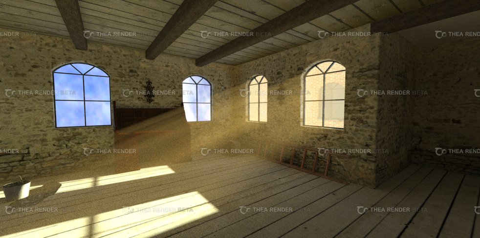
And Happy holidays to my fellow Sketch-upersx
Thanks!
@d12dozr said:
Its very good
Is the background an image, or a model?
The backround is an HDR image.
Greetz
Alex
Hey all,
I have been playing with the Thea Render (Beta) for the past two days and was trying a
few different things.
For the renders below I used an old Sketchup model I created a while ago.
I was really impressed by Thea's render speed. The render only took my Laptop about 45 minutes.
If you are interested you can check out my old model at the Google Warehouse
http://sketchup.google.com/3dwarehouse/details?mid=b0c697ac24a81838524d6da19ed105c5&hl=de&ct=lc.
I would really appreciate if you would take the time to rate and/or comment on it.


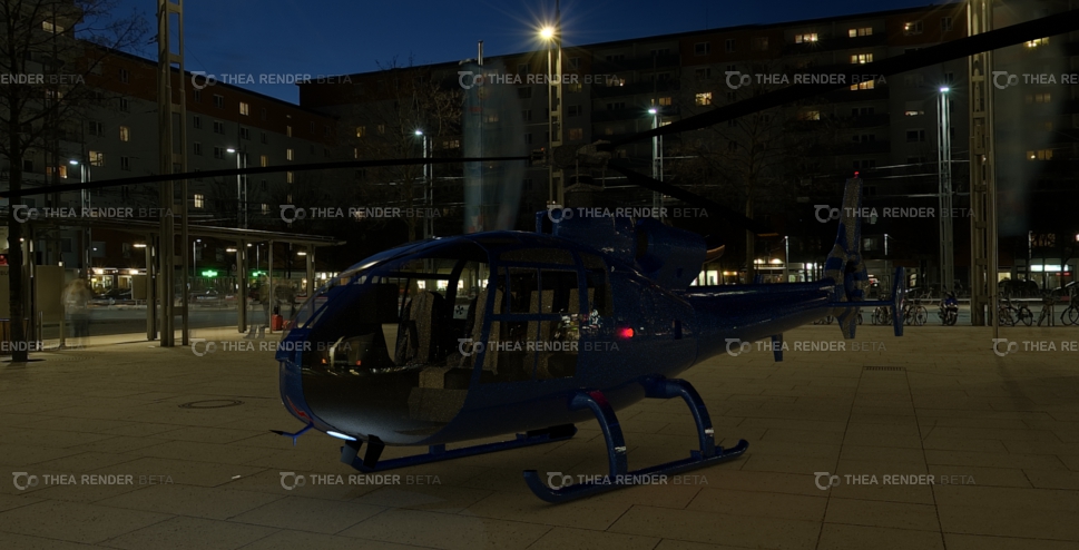
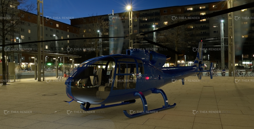
As always any feedback on my newest renders is welcome.
Greetings,
Alex
Hi guys
@sir said:
great start and welcome. nice layout and some good stuff you grabbed from the warehouse.
some crits
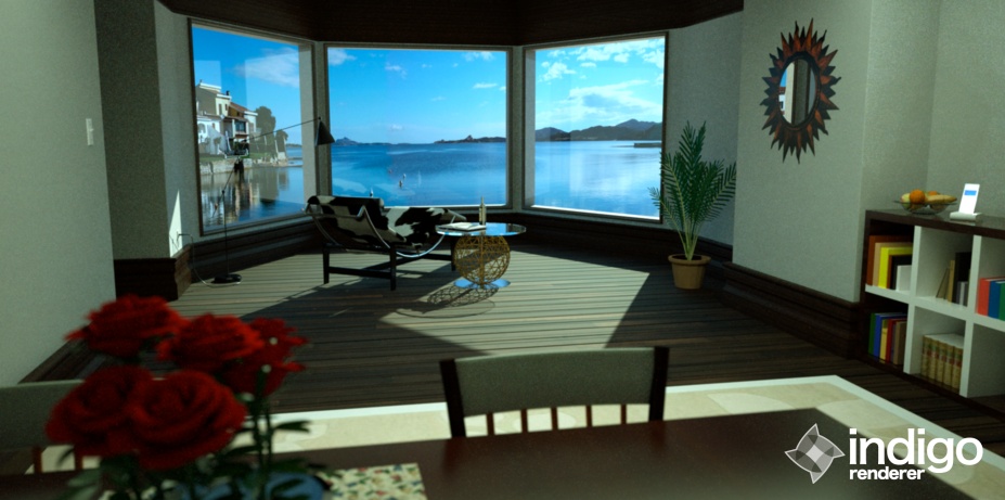
the whole thing is a bit dark, and id say the sun on the floor needs to be a bit brighter too
maybe move the roses left a bit more, to draw the eye into the center, i thikn they draw too much attention atmfinally, im not quite sure what is meant to be the focus of the image, if its the chair then maybe the background is too much? if its the background, its not enough
maybe put a boat or something!
just my opinions
You are right, I tried to put the camera focus on the chair, but that might have been not the greatest idea. Thank you very much for your feedback
@unkr3at1v said:
I think I remember this room from some kind of vray interior tutorial!
Am I right? But the picture looks nice, also if it has a little too much green in it!Greetz, Fritz
Thank you very much for your feedback. And you're right this room is from a vray interior tutorial from andeciuala
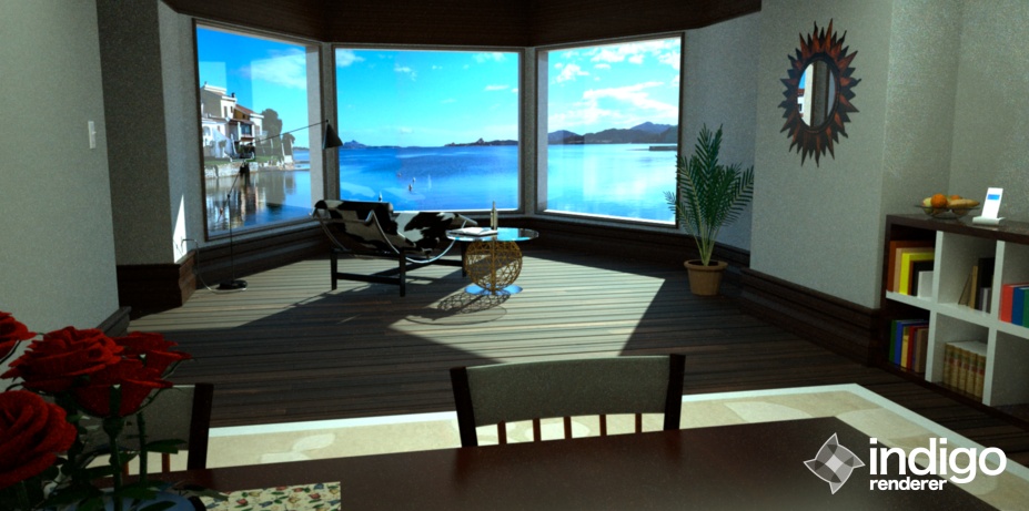
In my new render I tried to incorporate all your guys feedback and I wanted to see what you think about the changes I made.
Greetz, Alex
Hi guys,
I have been surfing the forum for quiet some time and now I feel it's finally time to post something myself. I would like to show you my render I created using Indigo. All the objects in the image come from Google Warehouse and in this way I want to give credit to all the people that created them. I slightly modified some textures and objects to create this nice living room. I would be happy to get some feedback from you guys, so please don't hesitate to let me know what you think.
