Hello everyone! I have just finished up my website for abSketches. http://www.absketches.com all renderings are done with sketchup & Podium then finished off with Photoshop. All C&C welcome!
Thanks!
Hello everyone! I have just finished up my website for abSketches. http://www.absketches.com all renderings are done with sketchup & Podium then finished off with Photoshop. All C&C welcome!
Thanks!
anyone else find the sister idol a little strange...  Nice renders non the less...
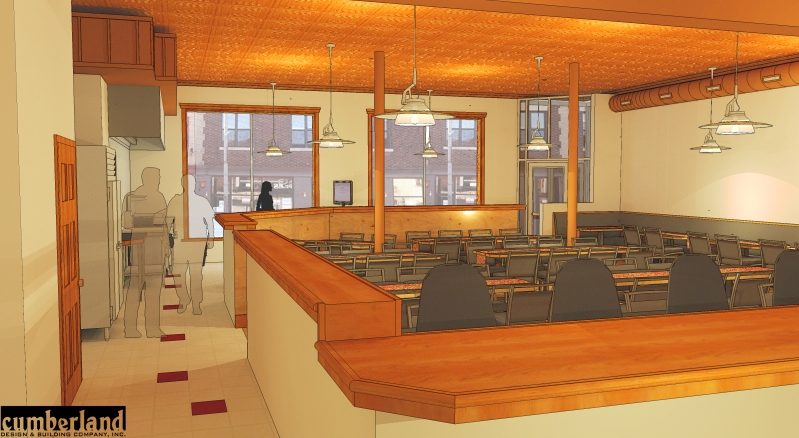
I would have to agree with Oli... although it really does look really good... Id personally like to see a hard surface for the counter... Not a big fan of wood edging... but thats a personal thing! Keep up the great work 
I agree with you about the trees in the foreground... The client wanted the image to match exactly with the existing site... (in reality, the pines would make it impossible to see the building as well as the other buildings the client requested... so i fudged them a bit... (hence looking fake) I need to improve them...
As for the trees added in photshop: the trees jutting in from the upper corners are the only added trees in photoshop. The rest are rendered.
Sketchup, Podium, Photoshop
well done!!! Great job... my only crit would be the bushes in the fore ground... are a little scewed.. But absolutely beautiful render 
haha are they still cops? I thougth i got rid of them before... anyhow.. its actually a Belgium resteraunt. Thank you very much for your kind words 
Ill have to check the door sizes... should be 3068? Anyhow im trying to post some new images... and it keeps going to a no respnse page?
haha i hear ya... we have a few of those for our next meeting as well (what im working on tonight)... so i perhaps may show in the duct work as well... We are going to propose high glass at the pick up counter... with logo etc... and a higher wall at the kitchen side... any other suggestions would be greatly appreciated! Thank you
Hey Peter I agree with your suggestion... Only snag... The owner likes the duct work... this is an existing space and we are simply doing a fitout... we usually do large commercial projects, but unfortinately in this economy we have to pick up these types of projects as well... There are a few changes that im going to work on tonight and hopefully be able to post tomorrow... when we speech with our client the next time (in 2 days) i will mention your suggestion. Thanks a lot!!!
thank you all for your kind words... I have noticed a lot of things i messed up on... ill have to fix on the next project... We have already gotten this project... so no need to continue working on it other then for personal satisfaction... For instance... the men are apparently cops? I noticed the night stick and gun after renders were finished... At the bar area i forgot to pull the wall up to the counter... there is a space there... I didnt turn the omni lights off on the line drawing so there are specs everywhere... but other then that im pretty happy with the lighting... thanks again for all and any comments... and as for the posting image thing... all i see here is "Img" what am i doing wrong as far as posting pictures?
Thanks guys... I am using Podium to render and then exporting a line drawing from Sketchup... I overlay this in Photoshop... As for attaching the images... I dont see where that option is? I have to give credit to Zem for this style... Add ticks for an extra cartoony look.
Hello, its been a while since i have posted here... All comments welcome...

Great Balance!! Love the seriousness of the hardwood, chair and lamp... and the comic relief of the illustrated wallpaper! Great job!!!