@pbacot said:
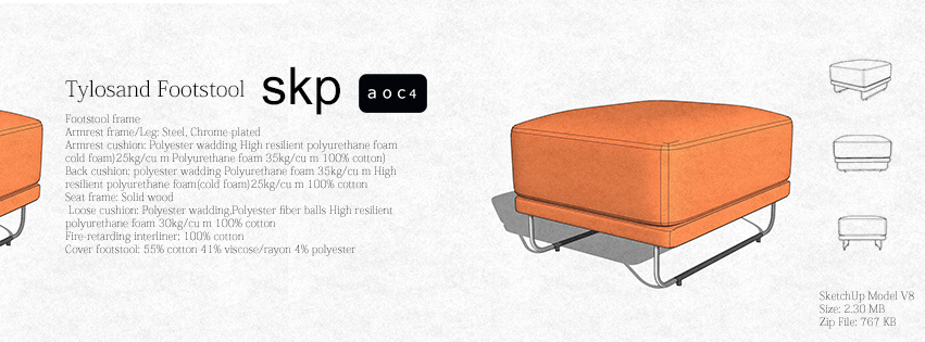
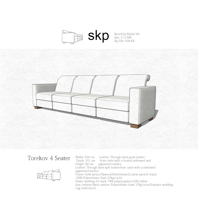
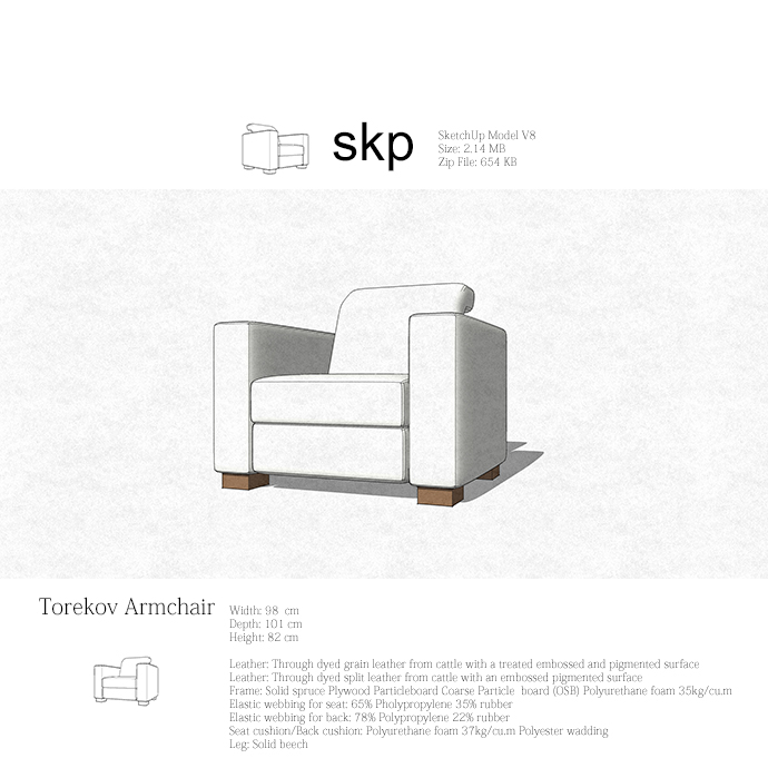
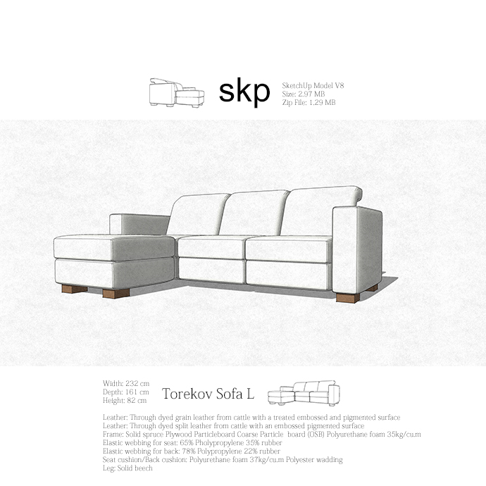
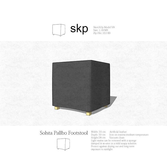
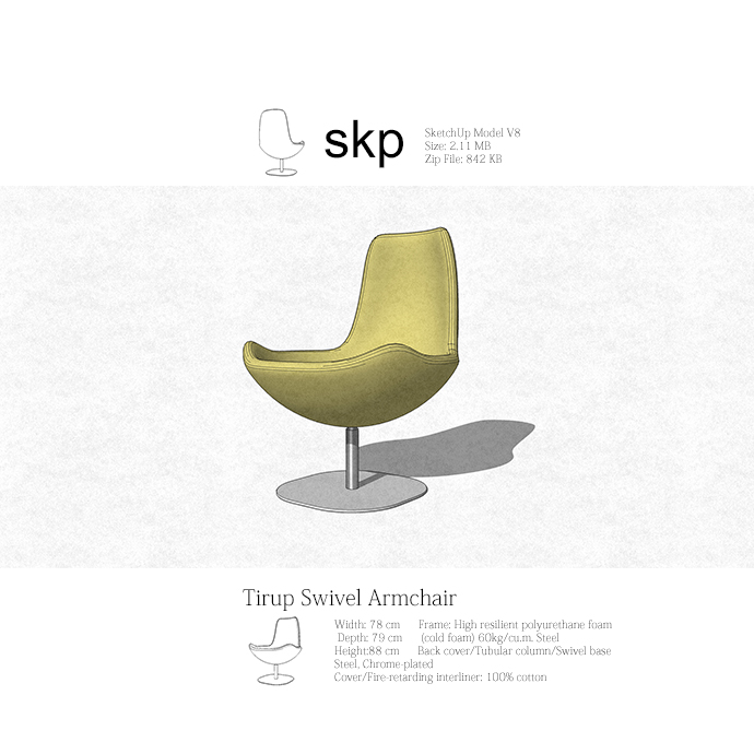
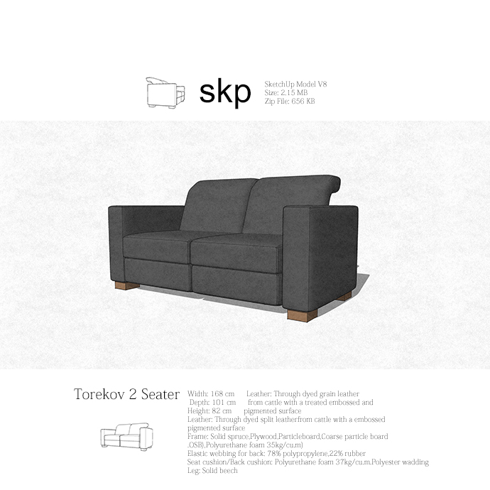
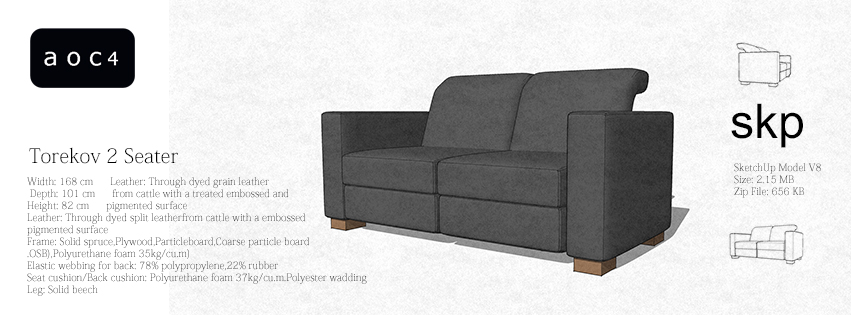
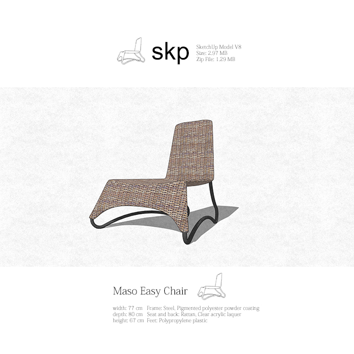
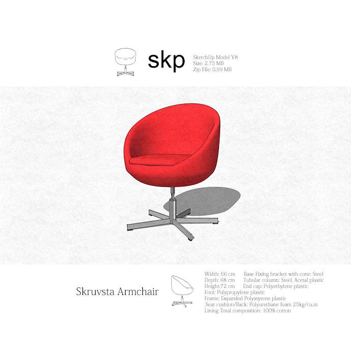
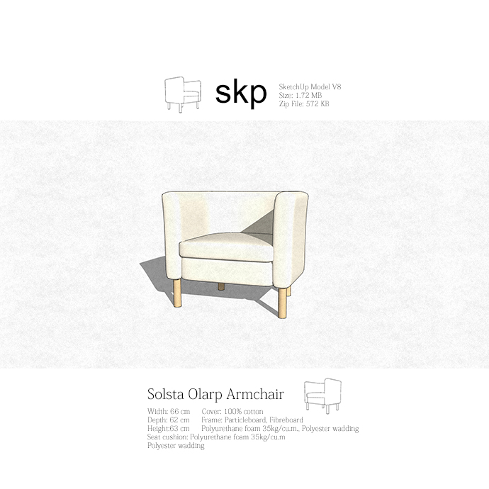
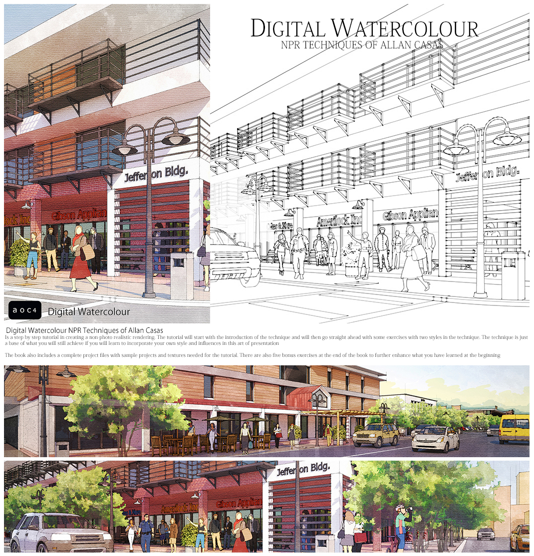
Nice layouts Alan. I like the first--horizontal--design best. Easier to read than the last one too.
might as well make the text a little larger so it's easy to read at normal screen size, say for an iPad.
What would be cool is a plugin that displays this directly in SU before you import the file.
Thanks Peter, you are right about the text kinda hard to read with some devices...
Yeah it'll be cool if we have this inside SU as a plug-in...
allanx

