Podium render contest
-
@lrsuser said:
I would suggest looking at the first contest.
chk out the model provided (skippy file in the first post) here
http://www.websitetoolbox.com/tool/post/supodiumforum/vpost?id=1743294and then chk out the winners' take on it..here
http://www.websitetoolbox.com/tool/post/supodiumforum/vpost?id=1786065I didnt participate last time. but followed through it...some really amazing interpretations and results!
I guess I should ask this then– what level of user are you aiming Podium? Do you have a profile in mind of what you hope the power Podium user will be in the future?
-
I am sorry if my post sounded challenging, I am the last person that would consider questionng Jeff Jacobs abilities, His talent with any renderng softwares is mind blowing and his attention to detail is incredible. I am and will always be a fan, please understand my comments referred to the competition and understanding that limits have been created to challenge in order to create more than just imported props, rooms with views, fancy architecture and POV's.
-

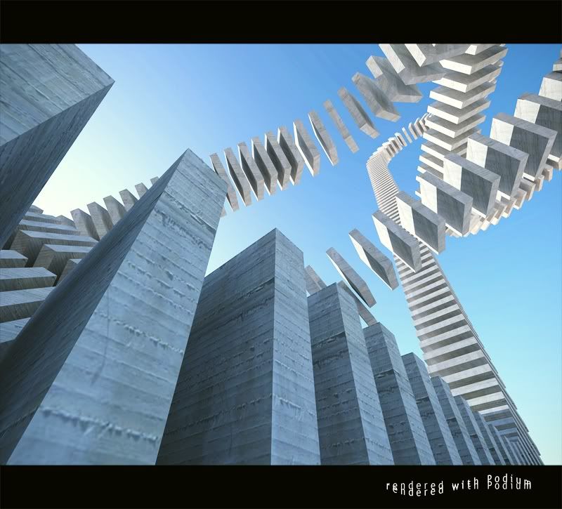
The above is achieved with just one of the primitives (a work in progress)
I hope this helps in understanding -
solo,
that's impressive as are some of the last contest winners, but what more do we need than fancy architecture?
just kidding.
judging by the look of your model there are no limits on how distorted one can get with the primitives. if this is correct then this contest should be more impressive than i thought. i just didn't get that from reading the text post & looking at the model. still, i don't understand why the no import limits are set on a rendering program, those limits seem more like a modeling program contest?
just asking, not that it's a bad thing again i'm not following with the feeble ole' mind. -
@solo said:

The above is achieved with just one of the primitives (a work in progress)
I hope this helps in understandingBrilliant work.
-
Jeff,
A little explanation is required I think. The idea was to open the contest to the widest range of users. Podium is aimed at people who don't want to spend ages learning the intricacies and jargon of a high end renderer. I guess it follows the 80% rule.
Many people want to use 3d as a proper design tool, and get reasonable images so that when you discuss things with clients, you get to talk about design, because you can show clients what it is that your concept means.
So, the software tries to make the most likely assumptions about most things and lets people concentrate on the design.
We are finding that lots of accomplished people used to other higher end apps are moving to Podium because it is really easy.
So, the contest tries to find a way to get these people with different abilities to compete on a level playing field. The people that can really model well should be able to take the primitives, distort, duplicate and combine them to make some quite complex objects. The people who texture well can keep the geometry simple and do most things with the idea, mood, camera positions and textures. Novice users who recognise their limitations can think of a really cool, simple scene and try to capture a mood. Guys like you of course, can do all these things

The limitations force people to think carefully about what they want to achieve. Sure you might get some crap, but arguably that's just like life, and better to get genuine, carefully considered crap that people have made after thinking about it in detail, than crap that people have assembled using free models from wherever.
Podium is about using simplicity to bring out people's creativity - and so is the contest.
Come on, the contest is designed to encourage evaluation version users, why don't you enter and show people how it is done, and that you don't need fancy tools, just a strong idea and a good eye!
-
I think Solo just rescued the concept of the Contest!
Count me in!

Jeff, you were straightforward in your replies (I was sharing your concerns). I think you will reconsider after seeing Solos image, right? In the end, the creative possibilities are endless....
This is going to be a nice competition.
I hope you will enter the game as well.Regards,
Kwistenbiebel. -
biebel, solo never 'rescued' the contest, it was alway intended to be that way

Solo does deserve credit though for posting that image some time ago, which influenced the way the contest was conceived.
I guess these things weren't obvious initially. If you look back at the Podium thread, look at the first reference to solo's superhero figure. That was exactly the sort of thing we had in mind when the model was created.
-
Thanks for clarifying this Bigstick.
Looks like a great contest. -
I'm sorry, I'm not convinced. I see some potential for Podium and the interior work that Kwisty has done is outstanding. The contest is essentially an Art 101 type of exercise that I had in highschool back in 1972. It seems counterproductive to the professional appearance and forward direction that work like Kwisty's has taken Podium.
Quote by bigstick:
"So, the software tries to make the most likely assumptions about most things and lets people concentrate on the design"The design of what, the texture maps? Why do I say that? Item 5 is why.
Item 5 says the entries are assessed principally on the basis of render quality.
Item 5 in the rules:
5. Entries are assessed principally on the basis of render quality, however consideration will be paid to 'artistic interpretation'.It would seem, based on item 5 that the creativity and design have little to do with with winning but "render quality" does. Can one of you please define "render quality" for me so I can understand.
Again, I have to add, I'm not trying to be antagonistic or a hardcase about this. I think Podium looks like it has a lot of potential or I wouldn't even bother with this thread.
I must also add that I use six of those "crappy macs"
 and won't be entering the contest anyway. Maybe I will load up Parallels and give Podium a shot since your website says there is not performance hit. I would like to at least give it a try to have an basic understanding of the software.
 -
Jeff, are you familiar with the work of Andy Goldsworthy? This is just one of the possibilities that the render contest allows.
@unknownuser said:
The design of what, the texture maps?
That's a bit of a cheap shot really, as I'm sure you realise

@unknownuser said:
It would seem, based on item 5 that the creativity and design have little to do with with winning but "render quality" does. Can one of you please define "render quality" for me so I can understand.
Well, that's a tricky one, can you or anyone else define it adequately? By that I mean succinctly and clearly enough to be used as part of the documentation/rules to accompany the contest. Sure it is to do with light quality, mood, textures, idea and an appropriate model, but how do you really define the assessment criteria? You know a great image when you see it. This isn't intended to be a cop-out, but sometimes it just isn't worth an extended diatribe on the critical process. I'm sure we have all listened to far too much bulls**t in crits to want to hear some more.
@unknownuser said:
Again, I have to add, I'm not trying to be antagonistic or a hardcase about this
But it does tend to sound a bit like exactly that though...
I have seen a fair bit of negative criticism from some people (not you) about SketchUp and Podium, and I suspect that in lots of cases it is sour grapes. Some people have spent a lot of time and money to buy and learn Max/Lightwave/Maya (and I've seen some really crappy Vray images), and they can't get decent results. When they hear that some people have been using SketchUp and Podium and getting good results, they get superior and snotty. Some people just don't realise that there is no point having impressive kit unless you really know what to do with it

I can't vouch for how well Podium works on a Mac. Native Mac support is planned, but not even in time for contest #3 probably.
-
Jeff,
Off course you are right.
There is a bit of difference between how the contest is 'meant to be' and how it really profilates.
As much as the Contest holder (Podium team) wants it to be just a render competition, it is actually more of a modeling competition too.
'there is no good rendering without a good model', right?
I think the 'intentions' here aren't the most important thing . don't see it as a 3dallusions/cgarchitect or whatever competition.
This competition should be just big fun. And I think it is!
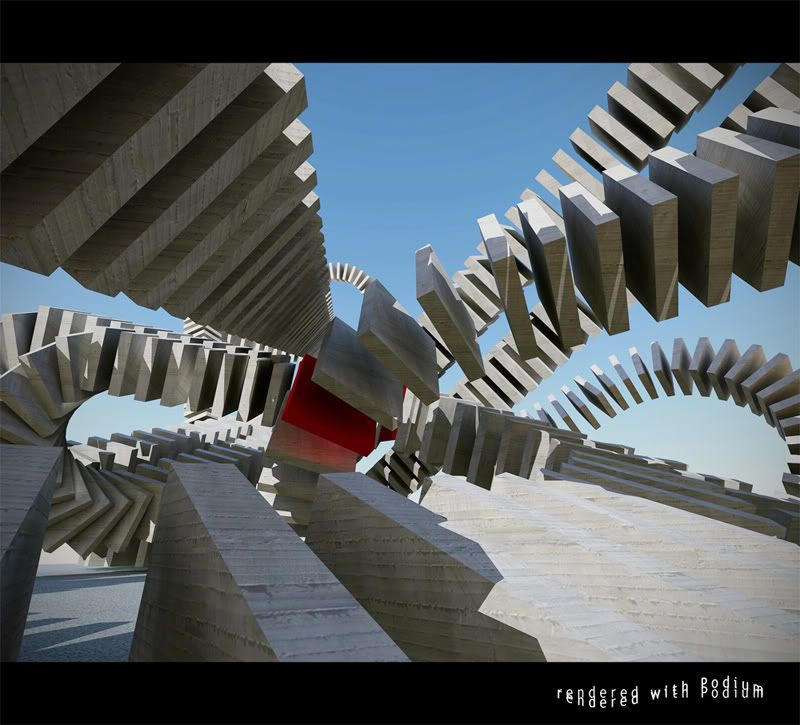
And besides, it's the second Podium contest and there will probably follow more...maybe some pure architectural who knows.Here is a quick 'doodle' I did just as an experiment using one of the primitives of the contest SU file. This will off course not be a contest entry.
(both images rendered within 5 minutes.original size: 2048 X 1536 )

Hello! It looks like you're interested in this conversation, but you don't have an account yet.
Getting fed up of having to scroll through the same posts each visit? When you register for an account, you'll always come back to exactly where you were before, and choose to be notified of new replies (either via email, or push notification). You'll also be able to save bookmarks and upvote posts to show your appreciation to other community members.
With your input, this post could be even better 💗
Register LoginAdvertisement


