Free Font Samples I Found
-
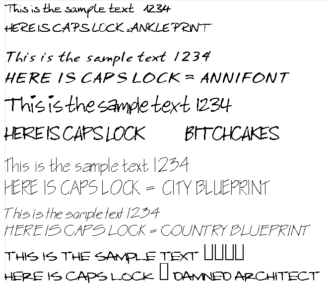
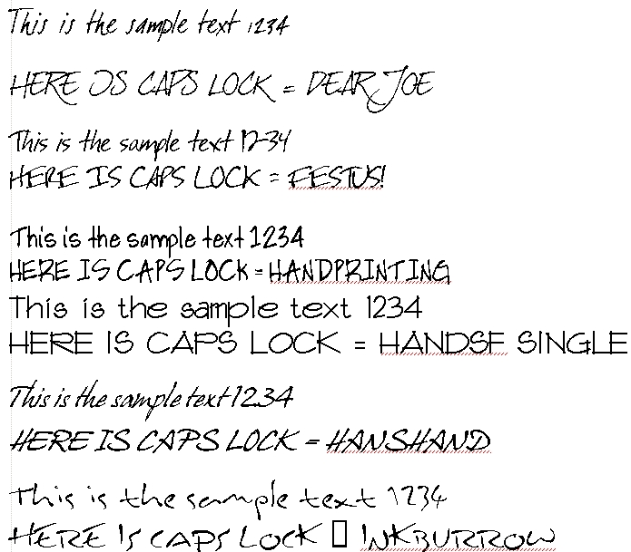
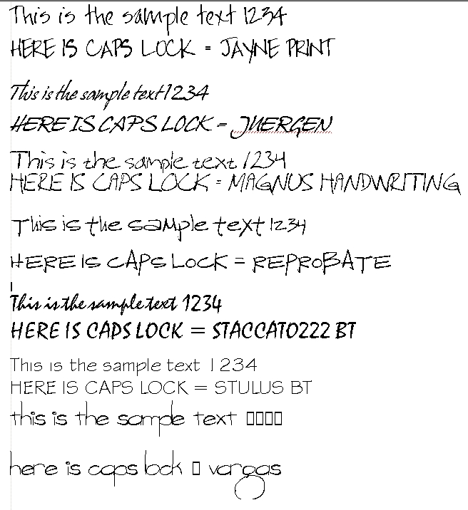
So I spent a while on free font sites looking for some new fonts for a project. I found some nice ones seen in the screen shots below. Most of what you see in the pics below are free. A couple came with my copy of word perfect. If anyone is interested in these please look for the name of the font after the sample. You will have to do a search for them because I can't remember where any of them came from.
Hope it helps someone.
-
Thanks Sketchy.... Happy New Year

-
http://www.1001freefonts.com is a good source for interesting and unusual fonts.
-
Some nice fonts there.
Another source of various free, shareware and demo fonts at http://www.dafont.com aswell
-
Yup, I got a lot of the above fonts at those two sites. It's kind of insane how many fonts are out there.
-
Some nice architectural type fonts there, totally agree that there is a huge amount of fonts available.
-
It won't quiet be my cup of tea when it comes to using it on my architectural drawings, but everyone to their own. It is however a font I would use for other presentations.
-
Nice one Guite. I have added it to my collection. Thanks for sharing. It's nice to have a variety handy to suit the particular feel you want to create.
-
Unfortunately most of these fonts do not support "international" characters...

Yet I like them, too (and thatnks for sharing this one, Guite )
) -
@gaieus said:
Unfortunately most of these fonts do not support "international" characters...
Gaieus, sorry about that, it was intentional on my part
. This is just a past time for me and to include all the international and special characters would mean, apart from doing the actual linework, studying up all all its usage so that I don't goof up on placement of the characters. Which mean a lot of time input.@gaieus said:
Yet I like them, too (and thanks for sharing this one, Guite
)You are welcome, and thank you for the kind words.
Guite
-
No Guite, no need to be sorry. I actually meant this about allthe charsets (and great resource sites) linked here. Surely I didn't mean that you should have made all those characters yourself!
(and I'm also used to this anyway...)
-
Charsets can be added to, or make your own. One of the font editors with the most features for the money is FontCreator http://www.high-logic.com/fontcreator.html. You can scan and insert images for each character. Adjusting characters is similar to working with vectors in Illustrator.
Mac users have the programs by Fontlab http://www.fontlab.com/fontlab-products/. They make using scanned images a separate program though.
-
Yeah! FontCreator is the program I had used to generate the font posted above. I am aiming to finish (in my free time) two fonts within the trial period, but then I might not!
Maybe scan quality or some import setting, I had to tweak the curves a lot in FC. That's so time consuming that when it's time to finetune the font (bearing, kerning, etc.) I lose interest. Apparently it does not recognise vector linework from other programs and still trace it as if it is raster. Anyway good software.
Guite
-
Making a font is a damn big job. I never have had the time to tune the couple of my attempts to really be useful. And the tool I used, Fontographer, only works on my old, old Mac. Even when you have all the characters drawn, there is the kerning issue, and every character added, like our cherished umlauts, adds to the tedium. Still, some of it is quite fun. Must have a go at Font Creator (if I ever find the time)
Anssi
-
I had been wondering what my hand lettering would look like as a font. I am posting a work in progress and wondering whether it is worth fine tuning it further. Critiques welcome. Please note that pair kerning does not seem to be working right yet as far as my tests show.
Do you guys and gals think the slightly irregular curves gives it a more natural hand drawn feel? Or should I smooth it out?
Cheers,
GuitePS: .ttf is not allowed as attachment, so please refer the zip
Edit: Font file replaced.
file.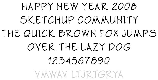
-
Just in case anybody is interested, I have replaced my font file (see a few posts above). For whatever it is worth, that would be the official version 1. The lines and curves are much smoother now, number of nodes (control points) have reduced, file size is even less and kerning is okay.
Guite
-
Thx Guite.


Hello! It looks like you're interested in this conversation, but you don't have an account yet.
Getting fed up of having to scroll through the same posts each visit? When you register for an account, you'll always come back to exactly where you were before, and choose to be notified of new replies (either via email, or push notification). You'll also be able to save bookmarks and upvote posts to show your appreciation to other community members.
With your input, this post could be even better 💗
Register Login


Advertisement