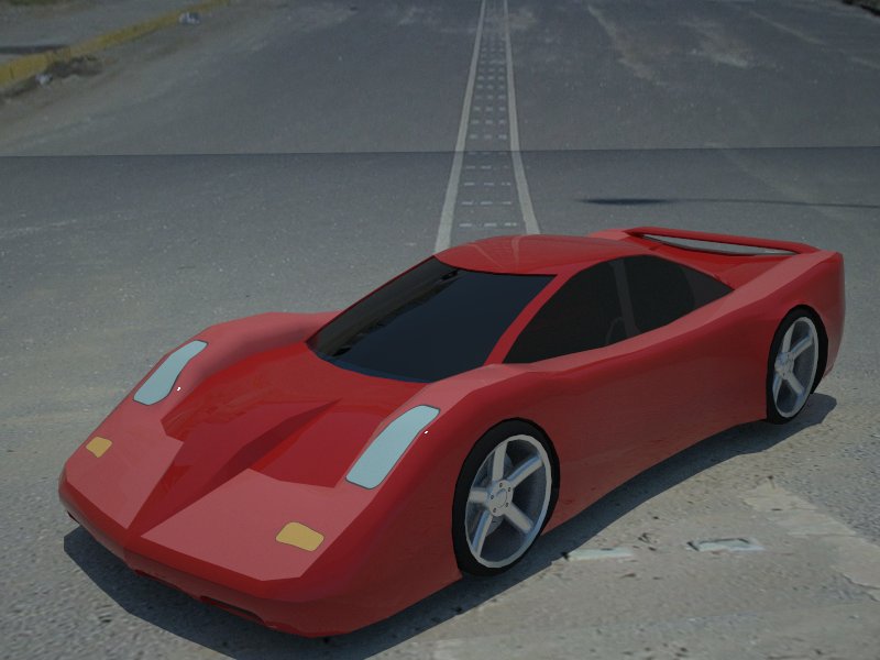
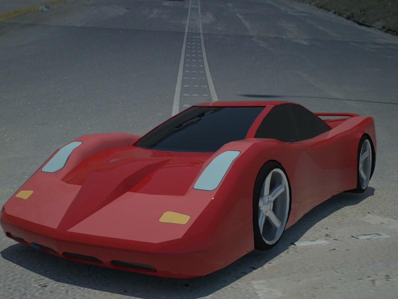
Green Toaster's Car Sketches
-
Why dont you make the bumpers lower or bigger and make the roof a teeny bit smaller?
-
@unknownuser said:
Why dont you make the bumpers lower or bigger and make the roof a teeny bit smaller?
I'm struggling with many things, including proportions: what's realistic vs. what looks good vs. how to define the geometry.
-
u can take some realistic measurements and apply them to your models
-
. . . I'm trying to figure out how to spend more time with S/U . . . life keeps getting in the way . . . I almost like this one - it may have potential . . .
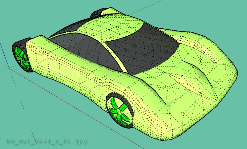
-
This one is really good. Try uploading the car.
-
@unknownuser said:
Try uploading the car.
Okay, but, it's unfinished and I really don't like the top & windshield . . . go for it, I know you'll make it look fantastic . . . this goes for anyone else too - please finish it and make it look good . . .Happy Sketching,
Brad

-
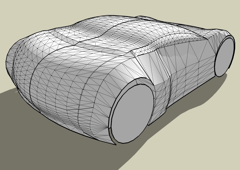
I will work on it. This is the car im currently on right now.... Just remember that im only 14 and need more experience. What do you think?
-
@unknownuser said:
What do you think?
Visually, it's very exciting. Is it practical or realistic? That's all irrelevant - nobody really cares when you make something that looks great. You're doing excellent work - I'm very impressed, but I'm not great at this, so my opinion isn't very significant. -
Dear Ray this car is pretty much like all the others you've been making...i've told you that you need to change this template and try to experiment with different shapes like Mr.GreenToaster here.Otherwise your cars are pretty cool.
-
Ray, what about trying a truck or boat - try using what you've learned applied to something else? Marian brings up a valid point.
-
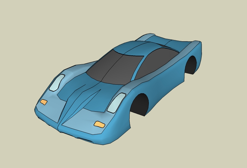
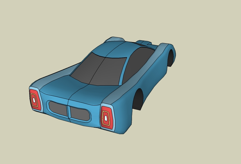
Here is what i've done so far.
-
-
Hey marian what do you think i should do to make my cars diffrent? any tips?
-
Ok thanks ely.
-
ray,c mon stop asking around for tips,i give u a lot of tips
is all about you if u don t want to change the style don t change it but if u want to try to watch some pictures on internet what u ll like try to reproduce i m 100% shure that u won t make it but u ll do a different car like those you usually do
stop asking practice!!!!! -
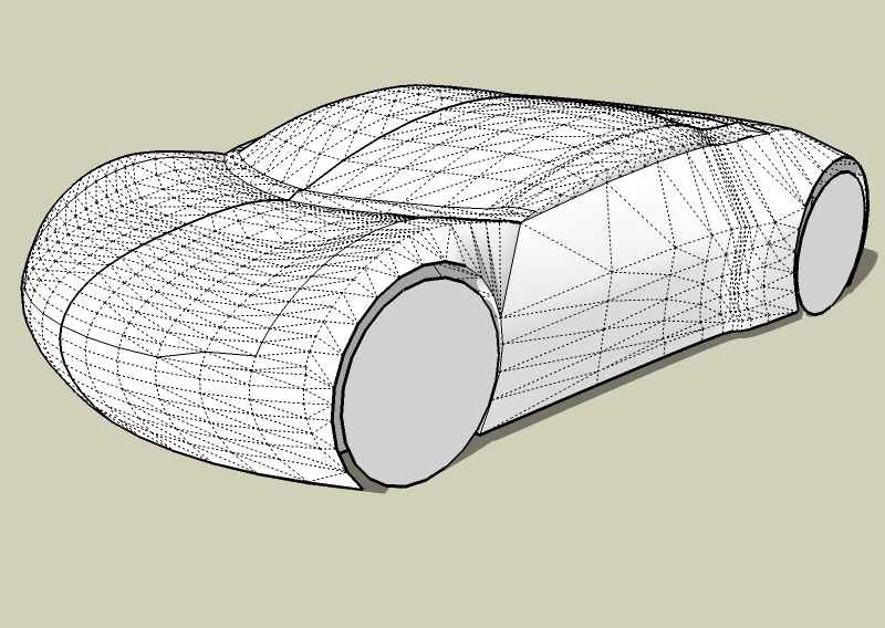
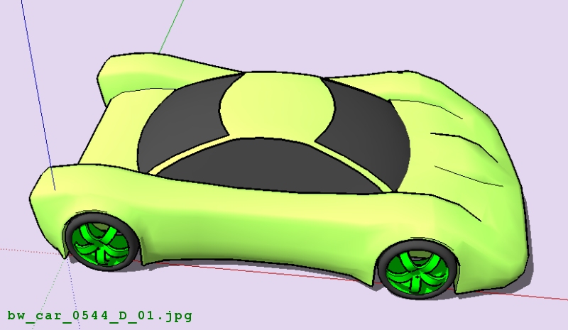
. . . finished the basic body shape, now, on to the details . . . then should I do a rendering?
Happy sketching,
Brad

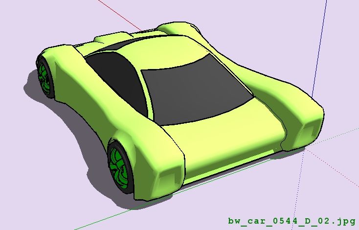
-
@Ray I won't be that harsh, you can ask whatever tips you want with the condition you try to use them. The main tip here should be...try to make your cars more funtional , realistic. at least the shape
-
Thanks for telling me that Marian.
 Hey Green toaster.. Great finish.. Try putting an interior and making headlights and rear lights. You could do an exhaust at the back or the side. Thats what i think could look cool on it.
 -
@unknownuser said:
You could do an exhaust at the back or the side.
I was thinking it would be an electric car - still like the idea of having one motor at each wheel like the Volvo electric car (I think the Volvo is a prototype) -
Ur going to put a motor on each engine?
Hello! It looks like you're interested in this conversation, but you don't have an account yet.
Getting fed up of having to scroll through the same posts each visit? When you register for an account, you'll always come back to exactly where you were before, and choose to be notified of new replies (either via email, or push notification). You'll also be able to save bookmarks and upvote posts to show your appreciation to other community members.
With your input, this post could be even better 💗
Register LoginAdvertisement
