Green Toaster's Car Sketches
-
Maybe this link will add some clarity:
http://www.gizmag.com/go/7975/
. . . time for a few simple details . . .
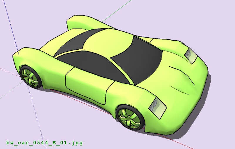
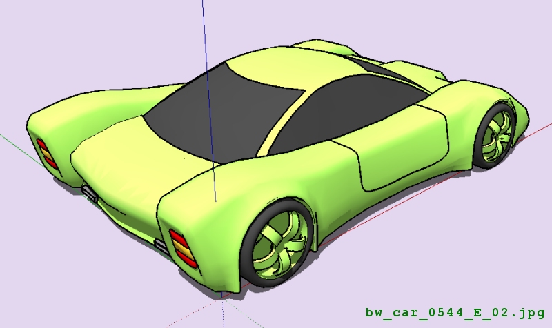
-
Hey...it's looking pretty.I like it

-
i must agree with marian

-
Thanks - this is fun - I still long way to go.
Here's another super-quicky. It's not very different from earlier models, but I used a new technique to define various areas of the geometry and this worked very well. Me thinks I'm on the verge of understanding what to do now.
Happy sketching,
Brad

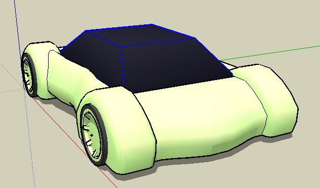
-
. . . a few more details . . . playing around with the shape a little more . . .
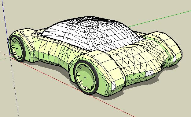
-
o man,i ve seen those wheels and i said whoaaa after that i remarked that there is the wing surface combinated with the wheels ,i gonna do something like that
thx for picture even if u don t think at this
-
Wow nice new car. The volvo you were talkin bout is awsome.
-
Check out the car i had been working on. I rendered it with Kerkythea(Couldn't delete it I had to finish it.
http://i100.photobucket.com/albums/m20/ray-ochoa/R-12.jpg -
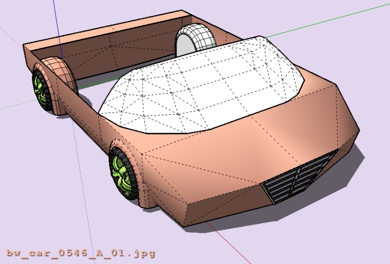
Look at the lack of details in this shape - I purposely "chiseled" out just a few corners here and there, stuck on a grill and . . . a six hundred second car . . .
-
What a productivity!

Take care, put your Savety belt!
-
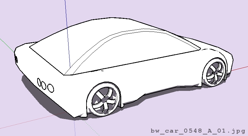
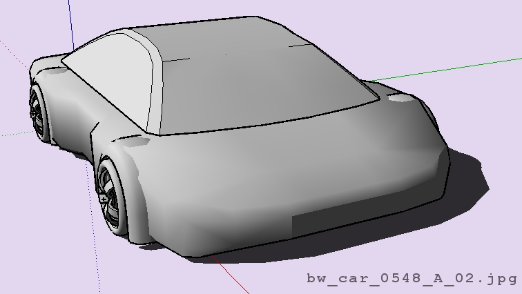
. . . another GreenToaster cookie cutter car body shape . . . (yawn) . . . fairly dull but very quickly modeled . . .
-
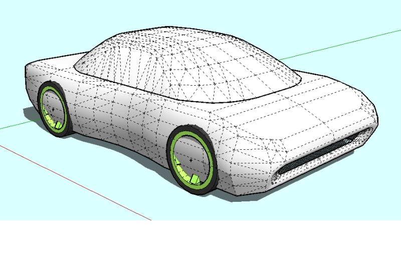
. . . another quick sketch . . . I'm trying to figure out when it's best to add certain types of details, like the scoop in the nose . . . after smoothing, or before ? . . . hmmmmm . . .
-
. . . trying for something just a wee bit more exciting than the last one . . .
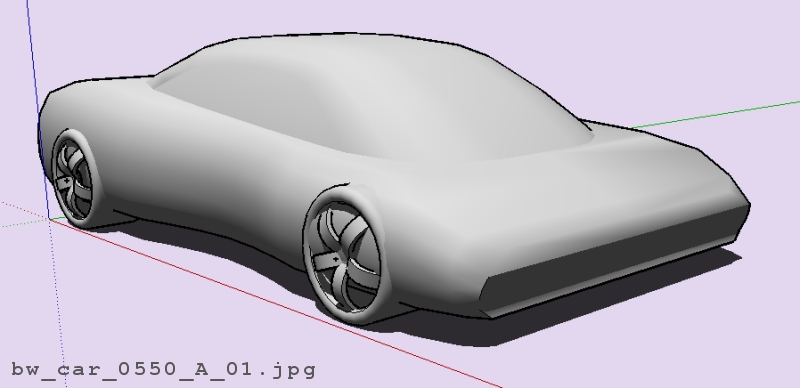
-
. . . sometimes you have to try new things . . . this obviously didn't work out as the transition didn't turn out the way I wanted . . . still a great learning experience - AND - as a bonus, I tried something new w/the top and discovered a great way to get the top done without using the SketchyFFD script (not that there's anything wrong with either that script or using it to define geometry).
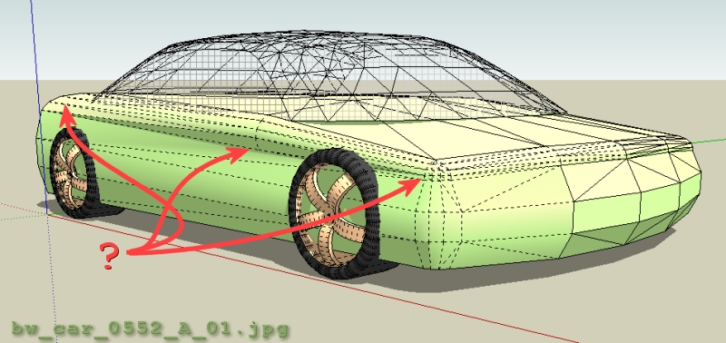
-
. . . and, if I can figure out how to use my version of Camtasia, I'll do a tutorial for the top . . . really easy schmeezy and super quick technique that provides lots of flexibility with shaping . . . or maybe I'll do an animated gif w/text like the other tutorial I did several weeks ago . . .
Happy Sketching,
Brad

-
. . . it really must be time to take a break . . . things are getting uglier by the minute . . . this one looks much better when you step away from the computer screen (far away), remove your glasses, and then squint so you can hardly see anything . . . even then, it's still not a very pretty sight . . . oh well, there's always tomorrow, right?
Happy Sketching,
Brad

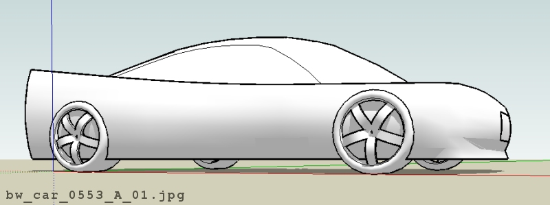
-
. . . added some fender wells to this one - 2 1/2 degrees rotated from vertical . . . I sort of like the nose on this one . . .
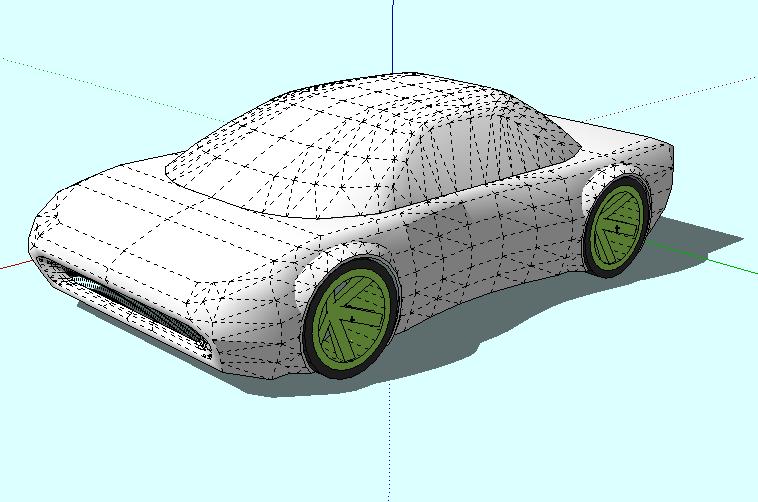
-
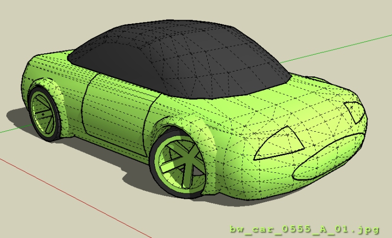
. . . slipping into the "boring" mode again . . . another fairly bland vehicle . . . next one will be exciting . . . I promise . . .
-
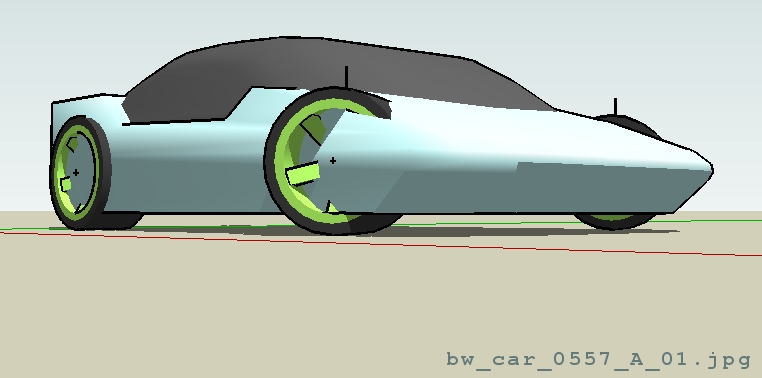
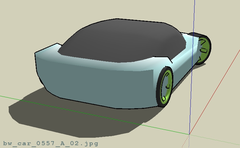
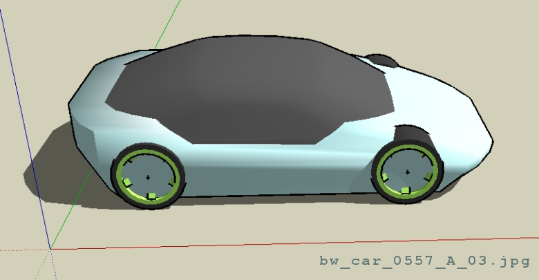
. . . I don't like the technique I used for this one but hey, for a five minute car, what do you expect . . . at least it's a little more "exciting" or sporty than the last one . . .
-
well, here is a quick post to show off what I've been working on, purely off blueprints, intersecting shapes and what have you... I tried to create a mapped layer to shape the body (kind of like in 3Ds Max) but I found it much easier to tweak solids and such...
here's my Fire Engine (WIP):

i'm liking your various models tho, keep it up!

Hello! It looks like you're interested in this conversation, but you don't have an account yet.
Getting fed up of having to scroll through the same posts each visit? When you register for an account, you'll always come back to exactly where you were before, and choose to be notified of new replies (either via email, or push notification). You'll also be able to save bookmarks and upvote posts to show your appreciation to other community members.
With your input, this post could be even better 💗
Register LoginAdvertisement


