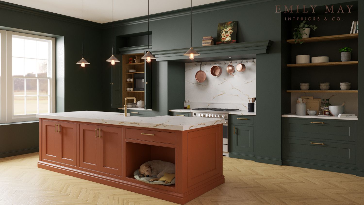
Kitchen render
-
Any feedback on this would be appreciated. I've not long started using Vray 6 and still struggling a bit with photorealism. The model of the dog is straight out of the warehouse.

Thank you. -
Overall pretty good
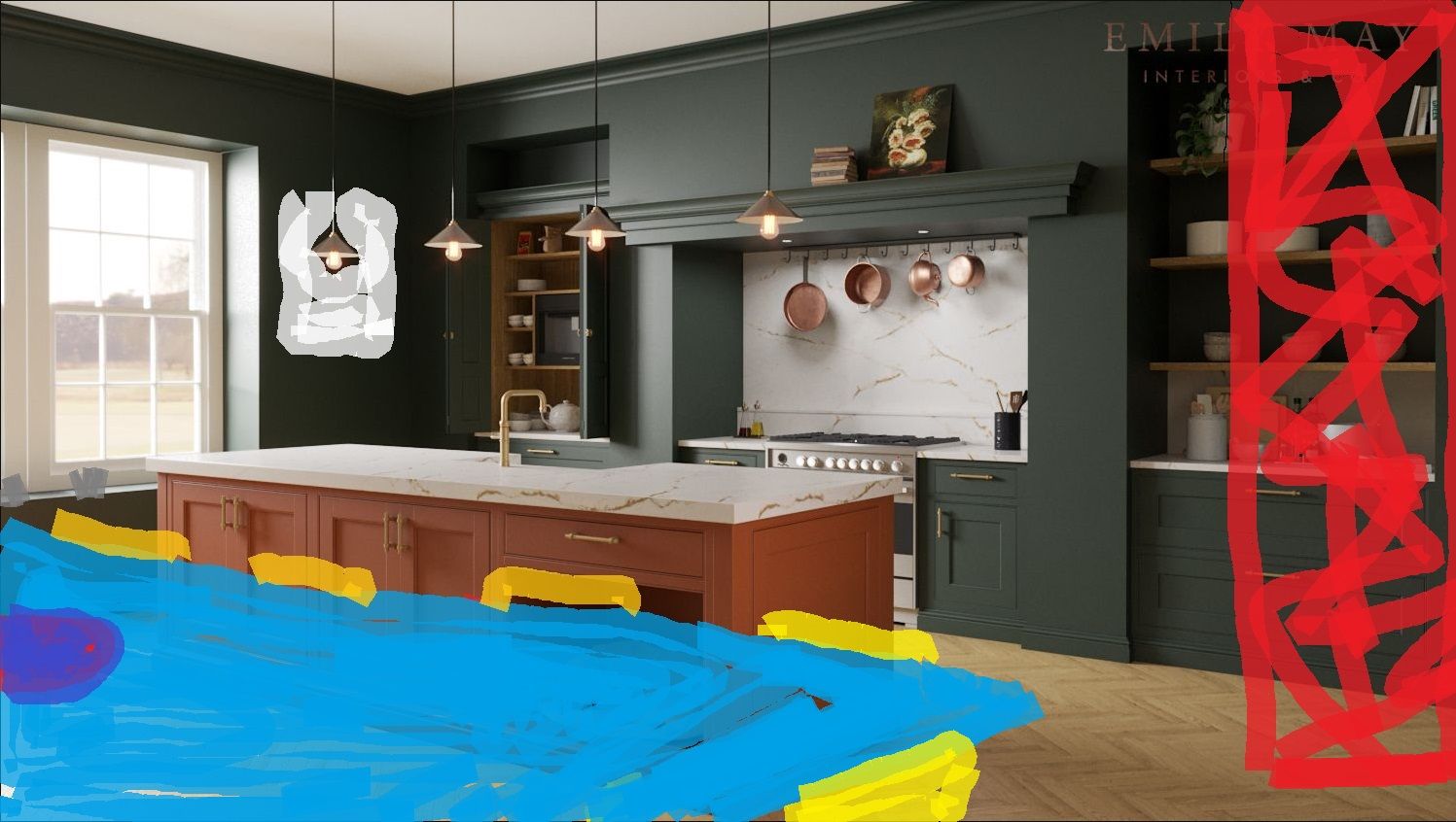
 I would suggest moving the texture on the island the grain is duplicated on the end and side.I would dress up the island a bit also with a bread board with cheese or other item. Perhaps a glass bowl with fruit. Maybe something in the foreground perhaps a dinning table with flowers in a vase or something. Perhaps an open magazine on the table. I print on the wall that I have painted in white. Maybe some cacti or plats on the windowsill.
Maybe experiment with depth of field on the dining table in the foreground.l have attached an image suggesting a better composition as there is too much empty space on the bottom right.
Just suggestions

-
@L-i-am Thank you. I missed the duplicate pattern on the island. Interesting that you have highlighted some other things I also considered but second guessed myself on. Nearly put a mirror on the wall and the edge of a side table in the foreground, but the dog bed is a feature of the design so can't be obscured.
I think I have a tendency not to over dress the scene but I think a few more of the details you suggest would help. -
Overall, pretty nice.
However, the marble needs to be a lot more shiny. Both counter and wall behind the stove.
I would put curtains, blinds or shutters on the windows.
L I am's suggestion of some kind of foreground and turning on depth of field is a good one. I would set the focal point on the sink or stove. Or.. whatever you are trying to "sell" in this picture. Maybe the dog bed. Also, a table would be perfect, but you only need to see just a small corner of it so it does not hide the dog and dog bed.
The wood needs to be a bit more shiny as well as the floor.
L I am is one of the best render people here. Whatever he suggests is usually spot on.
Again, it's overall very nice and a client would be pleased, but try the suggestions and it will really shine!
-
@Bryan-K Sorry for the late reply, I've been away.
I like the idea of shutters, it would fit well with the style of building. Definitely will put in the edge of a table in the foreground and try the depth of field.
I would have put more gloss on the surfaces but the brief is for flatter, more natural finishes, and the floor represents an actual product. Looks ok in real life but makes getting a good render more difficult.
Thanks for your comments -
Thanks for the reply.
Ah, I see, the client wants matte surfaces. That makes sense.
Hello! It looks like you're interested in this conversation, but you don't have an account yet.
Getting fed up of having to scroll through the same posts each visit? When you register for an account, you'll always come back to exactly where you were before, and choose to be notified of new replies (either via email, or push notification). You'll also be able to save bookmarks and upvote posts to show your appreciation to other community members.
With your input, this post could be even better 💗
Register LoginAdvertisement


