Fast and Loose
-
-
Very cool as always!
-
No clue what it is but cool all the same. Really like the presentation style


-
Thank you, both of you.
@unknownuser said:
No clue what it is
Sorry, Charles, it's a pulley assembly for a line shaft that would be used to drive machines like this lathe using a wide belt.

The narrow pulley is attached fast to the shaft so it is turning when the shaft is turning. The wider pulley is loose on the shaft. The belt is moved over to that pulley when the operator wants to stop the machine.
-
I love your tooling and machinery modelling — and that lathe is fantastic.
Also really like the drawing style: I assume that's one of yours? And while on the topic, do you have any advice for learning Style Builder — tutorial etc, or should I just dive in?
I found a Skill Builder video from Aaron that I'll start with:
https://blog.sketchup.com/training/sketchup-skill-builder-style-builder-on-a-microsoft-surface-2Any tricks or tips?
-
Thanks Doug. The first image is a combination of one of my sketchy line styles and a shaded, no edges, image run through a filter. The two images were then combined in an image editor.
As for working with Style Builder, here are a few things I've found.
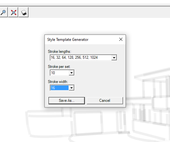
First, when you generate the template, set as many stroke lengths as you want. I generally use all available lengths. I also create as many strokes of each length as possible. As for width, it depends on the style.

I usually open the template in something like Corel Painter to add the strokes. You can also print out the template, draw your lines by hand, and then scan it to create the .png image you'll import into Style Builder. Whatever you do you must make sure the scanned image is exactly the same size as the original template image. (You can also create the strokes and then add them over the template in your image editor if you want.)
Play with the various settings to see what you like for the style. You can resize/scale the strokes if you want by changing the setting near the top of the screen.
The strokes in the style are displayed over the normal edges in SketchUp. If the edge is too short compared to the shortest stroke in the style, it won't be displayed so having short strokes in your style is a good thing. If you don't want so much detail, you can always adjust the slider. You can't increase detail to more than the style will support, though.
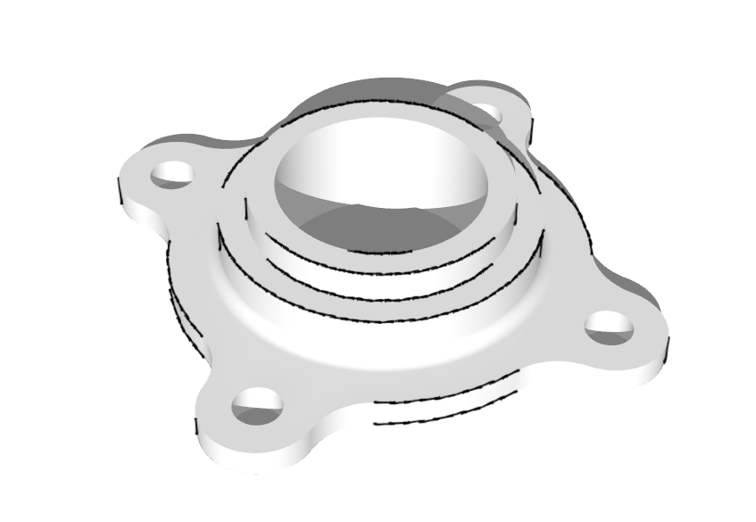
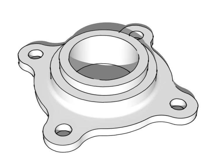
Also consider that welding edges together can help. For example, the next two images use the same style. In the first one all curves have been exploded. In the second, they've all been welded. I find Eneroth Auto Weld indispensable for this sort of thing.


And keep in mind that the export size of the image will affect the style's appearance. Below is an example made from five different exports but using the same style. Each at a different pixel width and using the same line multiplier.

So now, dive in and experiment.
-
Thanks Dave, I appreciate the advice.
Going to play with Style Builder this weekend and see if I can create something interesting. I have Gimp, but can't really say I'm that adept with it — that's another thing on my to-do list, so that I can start looking at post-processing.
-
Good luck. FWIW, post processing doesn't have to be all that complex. Get the hang of working with layers and how to blend them. That'll be most of the battle I think.
Hello! It looks like you're interested in this conversation, but you don't have an account yet.
Getting fed up of having to scroll through the same posts each visit? When you register for an account, you'll always come back to exactly where you were before, and choose to be notified of new replies (either via email, or push notification). You'll also be able to save bookmarks and upvote posts to show your appreciation to other community members.
With your input, this post could be even better 💗
Register LoginAdvertisement


