[WIP] Lionel J-38 Straight Key
-
"Futura" maybe ?
-
@tuna1957 said:
"Futura" maybe ?
Maybe. I'll check it out.
I went ahead and used Technic but modified the E and the 3. Might call it close enough for government work.
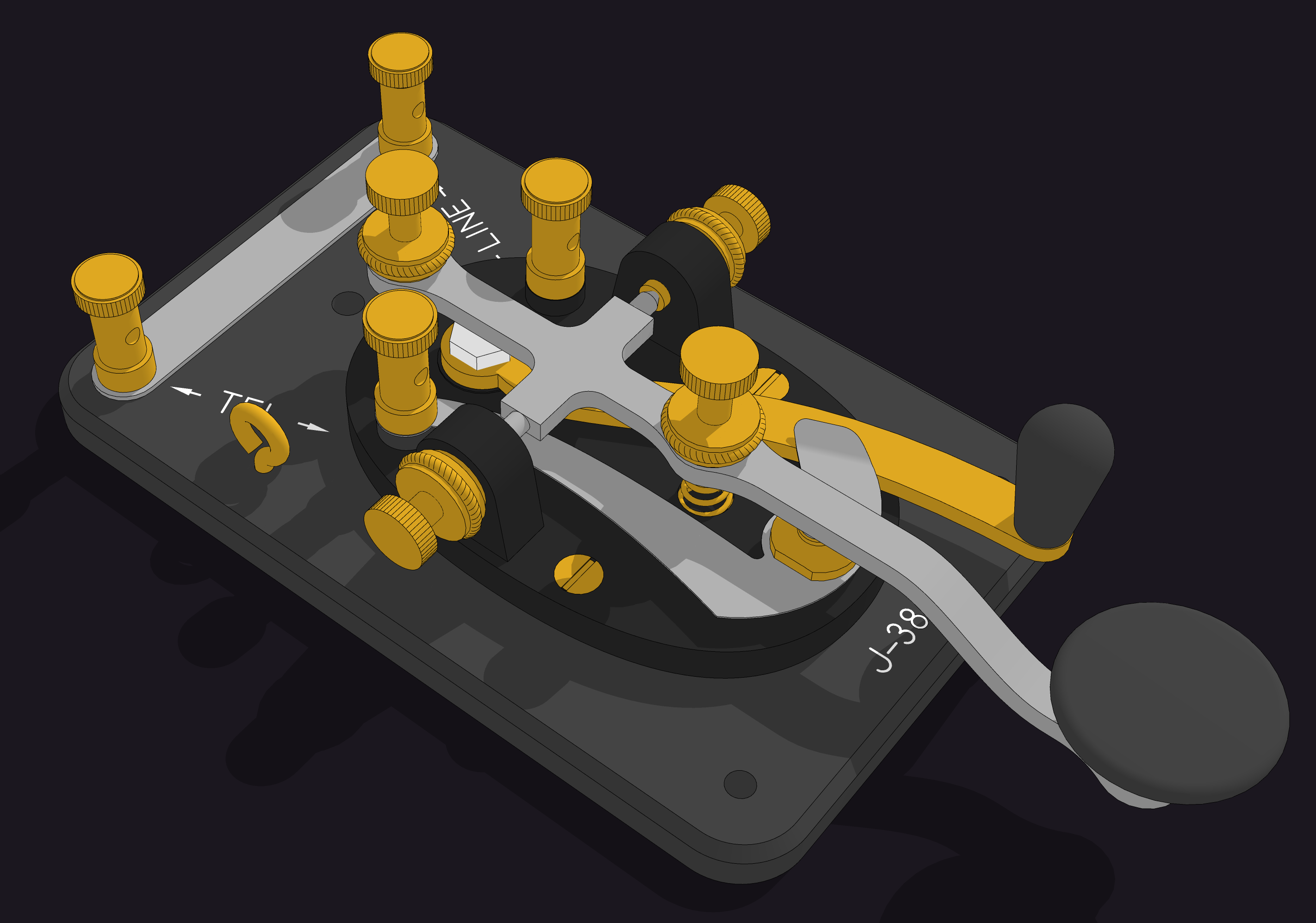
Now to create the Lionel L logo. I was hoping to find a decent BMP or other image to use but I think I'll be drawing it manually. Not a big deal, though.
-
Dave,
There must be 10,000 sans-serif type faces, and after a while they all begin to look alike. My best guess is the type face on the straight key is called News Gothic. My second-best guess is Futura. You can look up both (along with the other 9,998) on a site called fonts.com. It's also possible that Lionel created its own lettering for the straight key--something done by an underpaid draftsman using his Leroy lettering templates. Regardless, the font you chose looks pretty close to the orginal--definitely close enough for gummint work, as you said.
Best,
dh -
Thanks David! News Gothic could be it. The font/type face appears to have been available in the time period. I had thought about but rejected the Leroy lettering sets based on the 3 but you could be right. At the time, other companies manufactured the key and other devices that use the same lettering. I remember some shortwave receivers and a direction finder receiver that I was given when I was about Ian's age. They had seen action in WWII. They had the same or nearly the same lettering on them. (I wish I still had them but they got passed on being too heavy to move.)
I guess I'll leave the labeling as it is on the key now, though. Your clues led me to find a set of fonts created from the Leroy lettering guides. My next overly detailed model might be the scriber and of course I'd need to model the templates.


Advertisement