To The Sea - New Images
-
You should edit this slightly and enter it into the SketchUp competition
-
You might play with the size of the procedural bump if you can. It looks small to me, like the whole surface is somehow vibrating or a wrinkly polymeric material.
-
Well .... have played about with this a bit. Posting a couple of new images.
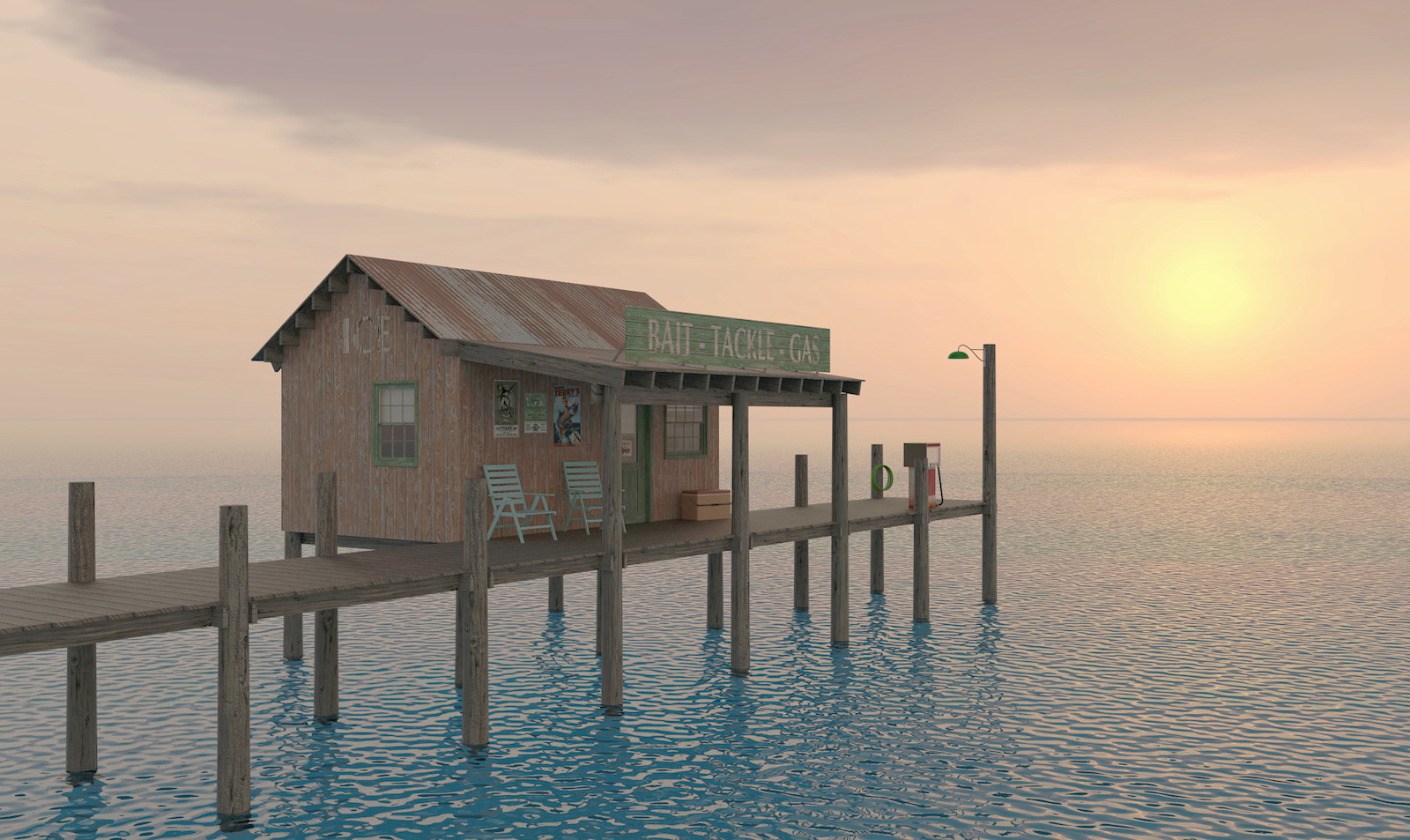
First image I changed the water procedural in Twilight from "murky water" to "ocean" and then played with the scale of the bump to reduce the "choppiness" of the water. Rotated the sunset HDRI to get the sun into view.
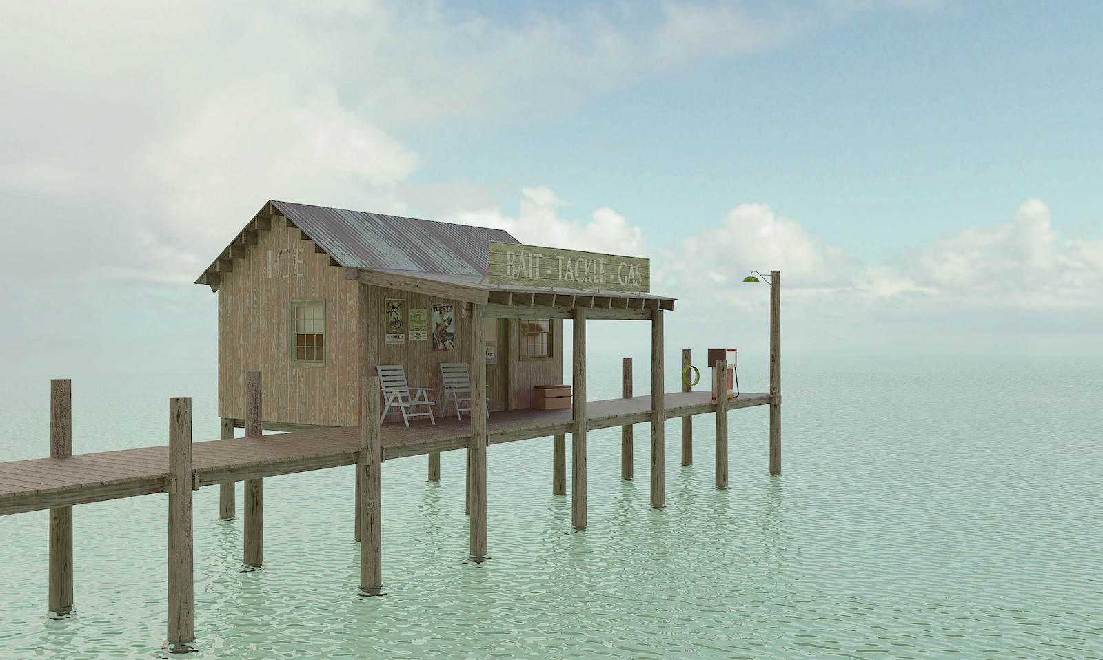
Second image swapped out the HDRI for a more middle of the day one. Also changed the water procedural to "ocean". Tried a little different scale adjustment than the sunset image. Also got a touch more "arty" on the post pro side.
Hope you enjoy them. Better than the first ... darned if I know but it was fun experimenting. I also really appreciated everyones comments and suggestions.


-
Very nice, I get a feeling of absolute peace from these. I do not have any criticisms, they just feel right to me.
-
Thanks Mike.
-
Like that one. Llke down on the gulf! Makes me think of "Bloodline" which was not relaxing
-
Thanks pbacot.... assume "Bloodline" was some type of thriller movie.... I've spent a lot of time over the years in coastal areas was trying to capture the "feel" it creates in me.

-
Bloodline is on NetFlix, a series about a family in the islands with some serious issues! Your latest post, second image is dreamy in the way the horizon just about disappears. The first one makes me want to grab a Corona and sit back for the sunset. I see the ICE sign on the dock house, hopefully there's some beer sold as well.
-
Whoa! The last image is almost perfect! There was something about the light in the first images and, as others pointed, the water was not right.
However, the last image has a far more ocean/sea atmosphere. Excellent!
-
tuna1957 :
I wish I would've seen this earlier. This project has potential.
garystan
Hello! It looks like you're interested in this conversation, but you don't have an account yet.
Getting fed up of having to scroll through the same posts each visit? When you register for an account, you'll always come back to exactly where you were before, and choose to be notified of new replies (either via email, or push notification). You'll also be able to save bookmarks and upvote posts to show your appreciation to other community members.
With your input, this post could be even better 💗
Register LoginAdvertisement


