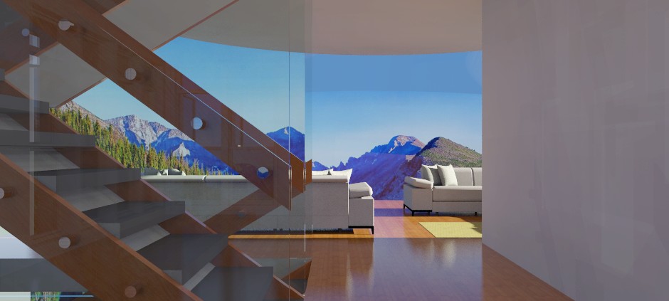
Modern lake house
-
Thanks.
Even though it's acrylic, I'm sure it won't be cheap.
-
Update of same view. That strange split down the middle of the background is due to the optics of the stair glass and curved dome surface of the main window.
I had to completely rebuild the stairs. After weeks of working on this, I noticed they were badly designed and totally misaligned. That's what I get for being sick and trying to work on anything.

-
Nice shot. I wonder how that optical shift could be avoided. Some shift would make sense, but that is distracting.
-
@pbacot said:
Nice shot. I wonder how that optical shift could be avoided. Some shift would make sense, but that is distracting.
Thanks.
I think it's a natural lens effect as the main window is curved both around and vertically.
-
Well, this will be it for this project. The file size has gotten too big for my current computer, but I've accomplished what I wanted, which was to finalize and present another of my designs from the last century.
When I get a new computer, I'll complete it.
It feels so weird saying "last century."

Hello! It looks like you're interested in this conversation, but you don't have an account yet.
Getting fed up of having to scroll through the same posts each visit? When you register for an account, you'll always come back to exactly where you were before, and choose to be notified of new replies (either via email, or push notification). You'll also be able to save bookmarks and upvote posts to show your appreciation to other community members.
With your input, this post could be even better 💗
Register LoginAdvertisement


