Twilight Render - Challenge
-
@pbacot said:
Isn't the liquid made from a copy of the glass geometry (which never moves and so needs no alignment?) At what point do you "intersect"?
See the post from Pilou on the previous page.
Not exactly sure what you are saying.
-
I see. I guess I'd approach it differently. I don't know why the glass and liquid can't be done so that they are already aligned, but OK.
-
pbacot, I get what your driving at. There may be an easier way. I've tried different approaches. One thing I
discovered. If the wine surface and inside of the glass aren't isolated by a group when you create the
meniscus and run follow me you lose one row of geometry on the side of the glass. This is right
below the line where the glass side and meniscus join. Then you have a repair job. At least that's what I
had happen during my experiments.Dave , hvanessen , You guys need to check the rocks glass. Look at the difference in the appearance of the sides
of the glass in my renders and yours. It looks like the vertical edges in your models aren't
softened. Almost like their hidden but not softened/smooth. It's like something messed up
passing the file. You need to check that out.good luck and keep experimenting and learning. chuck.
-
I just ran through it again. What I did was draw the half profile of the glass and the wine, (for wine it's just adding the center line and surface line including the meniscus profile). I double clicked on each of the two faces making a group each time. I placed the same follow me circle in each group (copy paste in place). And ran follow me for each. Check faces are correct, smooth soften where needed, and check solids. Would that be correct? So you don't have move or align the wine.
-
An added tip there pbacot, you don't need to paste the circles into the groups.
Use one circle, select it, get the follow me tool, right click on your profile group to open for edit and click the profile. Shape made within the group and circle still available for the next group. -
pbacot , I think you've hit on something. Should speed up the process. I pretty much stuck with the way massimo illustrated as it's my first tries at this liquid in a glass business. The moving the liquid in and out wasn't a real big deal worked big and used a couple of guides. Will have to try your approach. thanks, chuck.
-
Box, a double DUH! from me as I slam my head on the desk repeatedly !
-
@box said:
An added tip there pbacot, you don't need to paste the circles into the groups.
Use one circle, select it, get the follow me tool, right click on your profile group to open for edit and click the profile. Shape made within the group and circle still available for the next group.DOH! I always thought it was dumb I could NOT do FM on a grouped face-- and always had to deal with the path being in the same conext. I was the dumb one!
-
First of all, thanks for all of your feedback. I have found it very valuable and I have learned some neat tricks (like drawing one circle and applying it to 2 groups) and some other subtle things.
Now, I want to show some things that are happening and get your feedback as to why.
First I will show you the rendered version and then the SU file followed by some questions I need for you to answer for me (tell me what I am doing wrong).
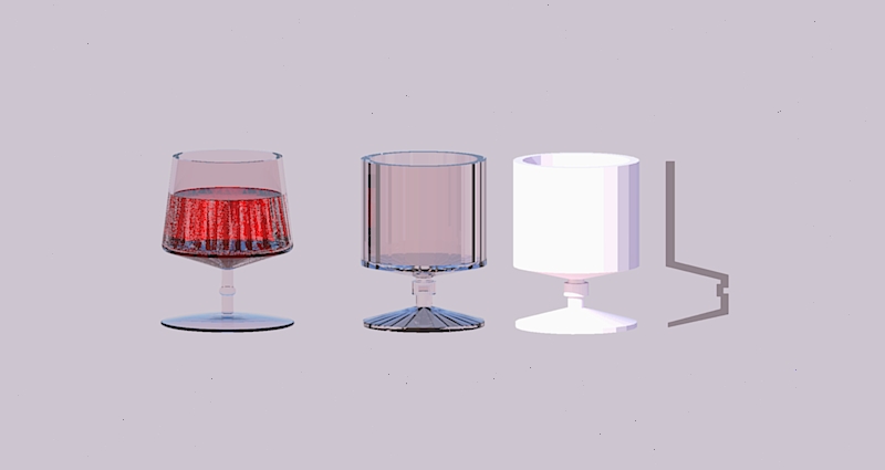
Produced from this SU model
Now here are my questions comments:
- Ignore the lines in glasses 2 & 3. I did not bump up the number of sides in the circle I used for the Follow Me path. Also on glasses 2 & 3, I did not add the wine because it would be a distraction from the problem I am seeing and I wanted to eliminate and issues with that Intersect Faces my add.
- The 1st glass on the left was developed using the techniques several of you described. It was from a previous file and I could not get back to the profile that I used for the Follow Me tool but it pointed out some of the missing faces that occur once I apply the twilight template to the model. Illustrated more drastically in glasses 2 & 3.
- The second glass was a more simplified version without any curved lines because I was thinking that when I tried to make the glass fancier that some lines were not connected properly. Notice on the rendered version that some lines are missing after I applied the Twilight template (Glass::Common)
- The third glass is a copy of the 2nd glass but with a different material and no Twilight template applied to it.
- The fourth glass is the profile that was used for the Follow Me tool for glasses 2 & 3.
In particular, why do faces disappear when I apply the Twilight template (i.e. Glass::Common)? BTW: I saw the same thing happen with the wine.
I have also attached the SU file so you can look at it and see what I am talking about in better detail.
-
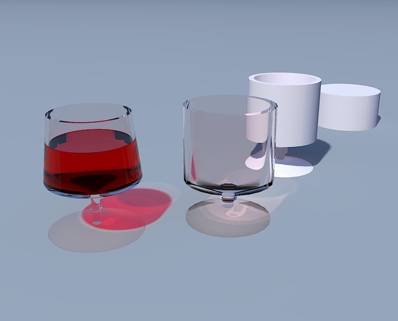
Dave, Much better. Downloaded and took a look. There was only a few minor issues. Biggest was glass on the left had the wine and glass in separate groups. If you had tried a render you'd have got weird look to the wine. Exploded both groups and then regrouped and everything was fine. What happens is the inside faces of the glass are in the same physical space as the outside of the wine . It will drive SU & TW crazy as 2 faces can't occupy the same space. Easiest way to recognize it is when you rotate the model you will see weird flashing effects on the faces that are flat against each other. You had a few edges that needed soft/smooth and there were 2 unwanted cylinders inside the stems on the center and right side glass. A left over from the follow me. Sometimes that happens depending on the shape your making.
Scaled the glasses down , checked the TW settings and ran a quick render that I've posted. The big plug in the back is one of the left over pieces of geometry from a glass stem , I didn't scale it down
 .The only things I changed in your TW settings were as follows.
You had 2 different color set ups for your glass. Deleted on and repainted one glass so they both have matching materials. Changed the channels from " sketchup" to "color" and set the alpha to 3 . Set your red color to channel also and set the alpha to 4.Ran the render on easy-medium, took 17 sec. Not bad. The funky look in the bottom of the center glass is my fault. I soft/smooth'ed the bottom edge inside and out. I was curious what would happen. If those edges were unsoftened the bottom of the glass would probably look better. So much for experiments! Keep it up your making good progress.
-
Thanks for the feedback @tuna1957 - I really appreciate it.
Now I have to embarrass myself. When I thought some faces had been deleted, I did not take the time to find out that they are really there and that I was seeing all of the green colors because I was seeing the back side of the inside face of the transparent glass. DUH

Yes, I knew there were some different colors schemes so that I could show what I was seeing in SU. Yes, I also knew that I should have softened some edges but my real concern was the DUH moment of not realizing that my green faces was because of the transparency.
 I was thinking that I had some missing lines etc. Sure was not the case.
I went back to my model and exploded that first glass and it rendered like it should have. I need to mess around with some settings a little more and learn how to set things a little better but I think all of this has been a good lesson for me. When I get a little more time, I think I might try a couple of glasses and maybe even a bottle.
Next thing I need to learn is how to generate reflections on the glasses, etc. Although I am making some pretty silly mistakes, I think I am learning and need to keep exploring some other types of renders to learn how to use the tool more fully.
Again, THANKS for your feedback and patience.


-
Dave, Don't hate me. Was a little distracted when I posted earlier. Your glass is still way to thick. Went back into model and looked again. The thickness needs to be reduced by easily 2/3 s it's current thickness. The reflections in glass are a result of good models good light set up and good materials. If you provide the "right stuff" Twilight will give you all the reflections you'll ever want. I've got a scene set up now that I've been pulling test shots off of. Have it about ready to let it run overnight. I'll post some images when I get it done. Regards, Chuck.
-
@tuna1957 - I certainly am not mad. I appreciate all of the tips and assistance you have given me.

Something a little different.........
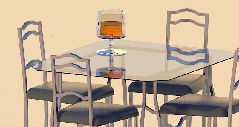
Yes, glass is still a little big compared to the furniture but am getting the idea
-
Dave, Didn't think you were mad. Figure at some point you think " oh good gosh now what" when you see my post
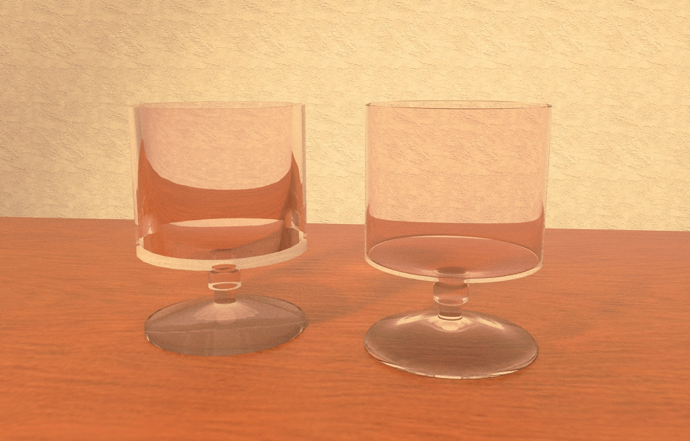
 .Several of us have hammered at you about the thickness of the glass in your glass. I thought i show you a side by side comparison . Posting at pic of your glass ( left side of pic ) next to one I cleaned up a little. Want you to see just how much a difference the small stuff makes.
I made the following changes to your glass - reduced thickness of glass by 2/3's. Used a 48 segment circle for follow me path. Added a small 3 sided radius to top edge of glass. Added radius to the square corners in the stem. Gave the bottom of of the foot a smoother curve. Probably took about 15 minutes.
Render set up - Put both glasses on a "table" inside a room. The room is a half circle. Already had one set up for some other tests. Used a combination of point lights and one spotlight. Point lights given RGB value of 100 watt light bulb. Spotlight was set to front left of table to aimed to glasses. Gave it RGB of a halogen bulb.
Spent maybe 15 minute doing quick tests to adjust power levels of lights. Rendered on 10 interior plus. Let it run 55 passes. I think the difference is pretty obvious. Check out how distorted the reflections in the thick glass are. Wouldn't matter how long it ran the result wouldn't be so good.
The renders far from perfect even on the thin glass. I do think it shows that time spent on the small details will give good rewards.
-
Will keep working on it. My glass is only .1" thick (at least that is what I thought).
At lest I liked the effect of my glass on the table. Sad part of all of this is that it is something I will probably never use. Just trying to learn how to use the tools.
-
Dave , don't get discouraged. You are making progress. Heck I never need to do this sort of stuff for my job but learning new stuff is a good thing. You never know when it might come in handy. Just keep swinging at the pitches. chuck.
-
In the world of western art paintings, the glass object was a form of showing off your skills. Nice job Tuna! I have the problem of the glass disappearing even when there seems to be nice reflections. Your stem and base show up nicely in these renders.
-
Thanks pbacot , it's kind of fun trying new stuff even if your not getting the result you want. Totally understand your comment about artists painting glass objects. Have an art background. I have to tip my hat to the guys that write the render software. When I think about the way light bounces and bends going through bottles and such. I'm guessing calculating the light paths through curved glass is one of the toughest on the software. Makes my head hurt thinking about it.
-
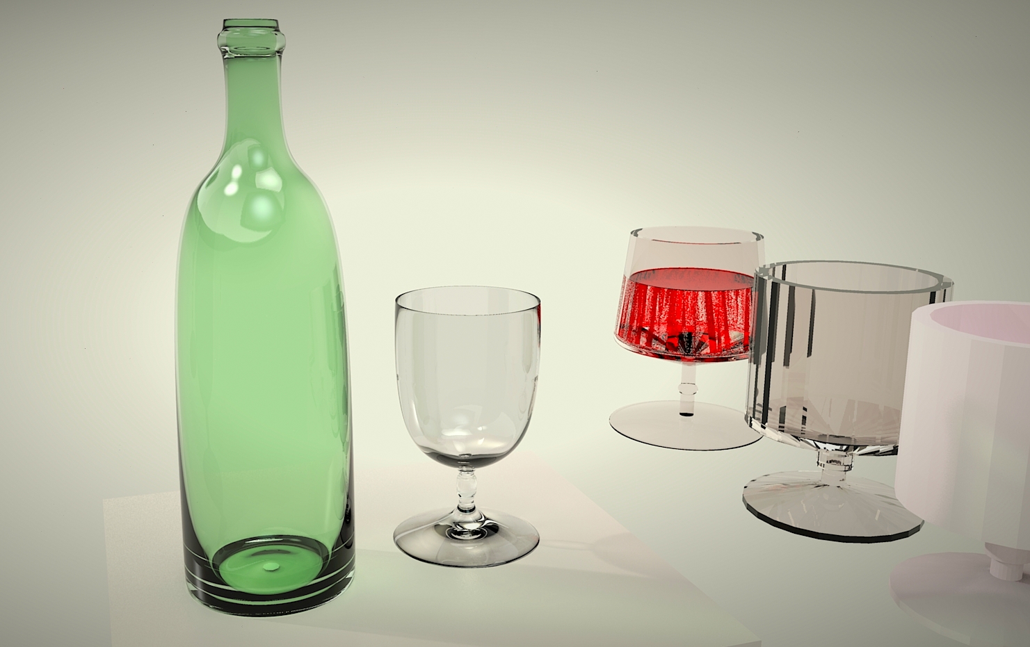
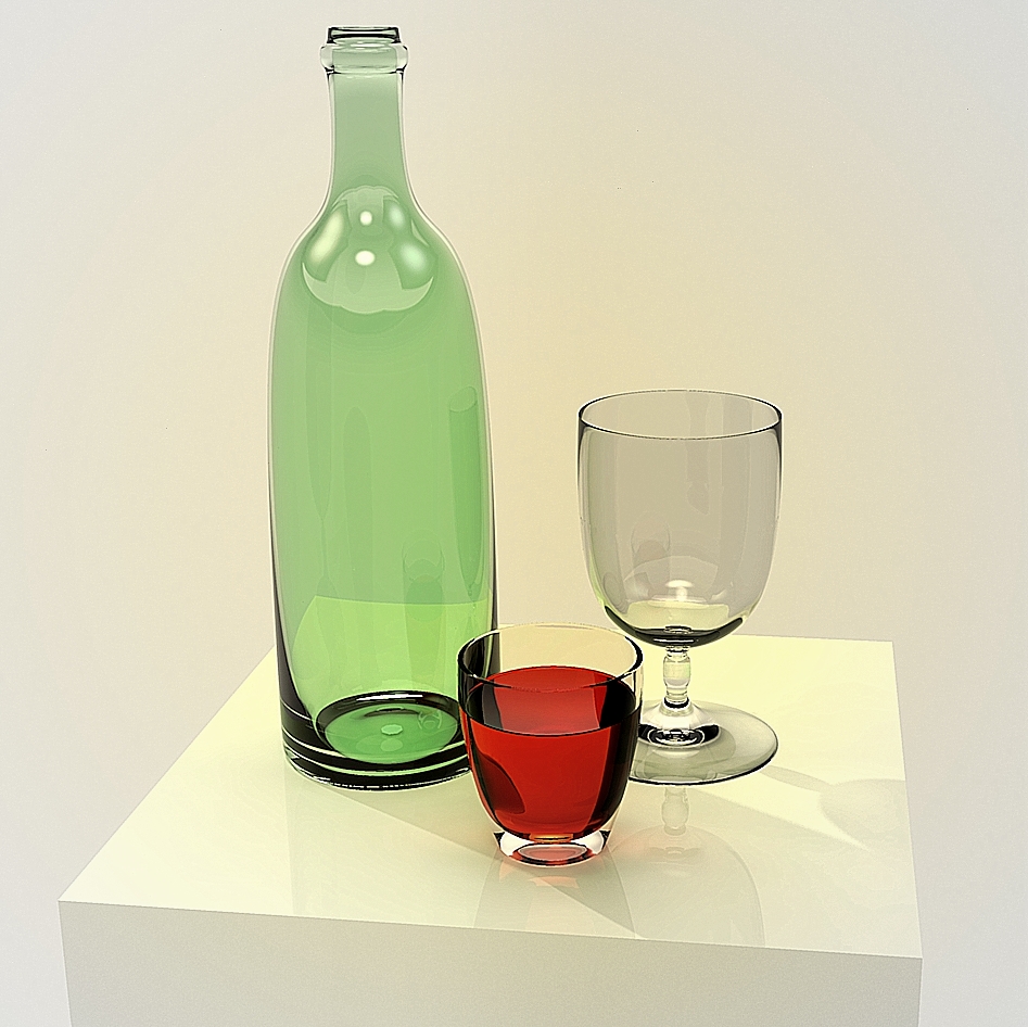
Here's a very quick one, I thinned down your profile and SUbD'd it and very quick blobby bottle, also SUbd. Honeydew uneditted for the bottle, whitesmoke uneditted for the glass, both just the default settings for Glass common. Sun turned down to 1, Hemispherical sky, hdr 001 from the studio pack set at 4 for the rest of the light. No background just your glasses and a box to sit mine on.
-
Very convincing!
That is magic beverage!
Hello! It looks like you're interested in this conversation, but you don't have an account yet.
Getting fed up of having to scroll through the same posts each visit? When you register for an account, you'll always come back to exactly where you were before, and choose to be notified of new replies (either via email, or push notification). You'll also be able to save bookmarks and upvote posts to show your appreciation to other community members.
With your input, this post could be even better 💗
Register LoginAdvertisement


