3D Visuals for Grand Designs Live in London/Bulbgate
-
Kristoff, I couldn't have worded that better myself. Very well said. I had thought that perhaps much of what Massimo had said/the tone of his comments in his initial post had also been 'lost in translation' too. But unfortunately all of the contributions from fellow forum members then focused solely on Massimo's critique and how I was either interpreting his feedback incorrectly; that I was simply 'wrong' and that I had an attitude. In my eyes, this was not a particularly pleasing environment in which to contribute. Loved the 'Go, Go, Gadget' reference!
Which is why, Cotty, I removed all of my content. I'm sorry that you feel this was wrong, in your eyes, but it's how I felt. I wasn't in the mood to benefit the 'greater good' in this way! But I completely understand the concept of learning from the mistakes of others. I take pride in my work. I'm completely self-taught and it has taken me a long time to get to this stage and I know that I still have lots to learn (darn!!). It takes a lot to put your work out there and I welcome feedback, of all kinds, and I know that in order to progress that I NEED feedback, both positive and constructive. But as I said, the overall tone of the entire thread was just not an environment in which I felt comfortable.
I'm starting to appreciate that Massimo appears to have a lot of credibility/respect in the field of rendering? I'm not sure, his information details don't specify his field of expertise. So, it's unfortunate that we started on the wrong foot. Perhaps I reacted a little too sensitively and maybe I need to be less 'precious' about my work. I'll be uploading more rendered images at some stage and would welcome any comments that Massimo may like to contribute.
Anita
-
Ahhh he's ok... http://sketchucation.com/forums/viewtopic.php?f=81%26amp;t=55188%26amp;p=500786#p500786
I could do better though. I choose not to, yeah, that's it. I choose not to.
-
Anita, I'm also learning how to render decently though I haven't had the chance to finish something worth posting here yet.
I must say though, that Massimo is considered rigthfully as one of the most talented among Sketchucation and, if he considered your renders worth of critique that is already compliment enough.
I had no chance to take a look at your render but I bet that if you follow his hints 1 by 1, and try rendering it again, you'll surely want to revive this thread by posting your image again.
I hope you do...
-
Kristoff!! Of course, you choose not to! I have to say, Massimo's work is, erm, astounding. I'm feeling extremely stupid right now...
JQL, how are you finding the world of rendering so far? It's unbelievably frustrating at times but when you produce work that is even remotely convincing, there's a great sense of achievement

Yes, I will revive this thread once I've taken on board Massimo's comments, undertaken a little bit of tweaking and then rendered the model again. I'll post the before pic too

Anita
-
I've never studied the composition of so many bulbs in my life!!
I suddenly detest bulbs.
I get what Massimo said about the bulb looking as though it was filled with water, so now I'm working on making the glass material 'thinner' and making it more reflective. I'm nearly there. Part of the reason why there wasn't much glare on the glass was the physical environment setting. I've changed that too. The cable did actually have a satin-ish finish, which Massimo thought wasn't obvious enough. I've exaggerated it more. I've also changed the angle. There are 3 hanging bulbs in this space. I like the idea of zooming into one of them, with a blurred background, maybe the particular angle I chose wasn't great (it wasn't soft focus, this was the actual DOF camera settings used in Maxwell Render). So now I've chosen a better angle (I think, I'm not sure anymore!). It's looking so much better already. I think I owe Massimo a huge handshake.
In the meantime, I'd love it if you guys could watch this small video of a restaurant in Northern Ireland. It was redesigned by an interior design team from Belfast called Brill (stupid name, right?). They were heavily influenced by industrial inspired design and used these hanging bulbs to great effect. And if you're into your high end designer goods, you should be able to spot one or two little beauties. This is a very short video but I personally love the editing and music. It's just so cool.
Anita
-
@massimo said:
If you want some crits, here they are:
-the bulbs look wrong like there is water inside. Also a bit of glare is needed;
-the DOF is distracting and has something strange and a bit unnatural;
-the image is very grainy;
-the brass, copper (?) is too clean;
-the material of the cushions & bed is a bit "evanescent" like you used a lot of translucency;
-the cables of the bulbs are really dark and flat with almost no reflectance;
-finally I don't like very much, in general, the soft focus.
Hope to not sound too harsh, but in minimalistic scenes and when you are so close to objects the details are really important.
Massimo, when you said that the brass was too clean, what did you mean? That there wasn't enough roughness/scratches to the texture?
Anita
-
If there was a render god, his name would be massimo.
-
Too uniform and clean for what I remember. Slight oxidations, finger prints, subtle scratches. Whatever you want. Also, how is made the material? Did you use a ior file? Maybe you can try to mix two ior metal materials with a mask in order to have slight variations in the colour? You removed the pic so I hope to remember well.
@ Oli...
-
Hmmmm...ok, scratches and fingerprints. Got it. I think I'll add a dirt map or something to add variations in the colour. I'll upload the original again when I upload the adjusted one. No, the brass material was created in the Maxwell Render plugin but when I add the emitters and environments lighting it no longer resembles the original colour settings. I'll adjust it in Photoshop.
Thanks!

-
Another quick question: when I upload my images after resizing them (because of the 2MB limit), they always lose clarity. Am I doing something wrong? Should they be losing clarity after I upload them?
-
Not that I'm aware of. Save them as jpeg with something like 10 in quality. That should work. If I may, don't use Photoshop too much, but try to achieve what you're after in your rendering software instead.
-
If you save your images in PS, you can "save for web..." (I don't know the English name, it's in the file menu) and choose to delete meta data to reduce filesize (or to improve image quality at maximum filesize allowed).
-
Alright guys, I've taken on board pretty much all of Massimo's feedback (this thread will forever be known as 'bulbgate'!). I studied countless bulbs, and their reflections etc. to try and get a similar photo-real look in my render. Interestingly, these bulbs in real life, have a reflection of the filament. They look like little flames. I wasn't able to get this look with my original render but when I tweaked the material settings I DID get this effect. A testament to the accuracy of unbiased rendering engines? Absolutely!
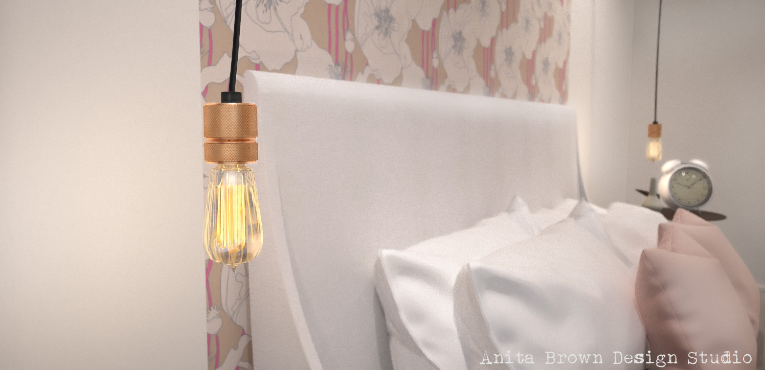
This is the original render, pre-bulbgate.

I'm not sure why this happens, but every single time I upload images onto this forum the image quality reduces. No matter what method I use to save it. If anyone can shed any light (pardon the pun), on this for me. I'd be very grateful.
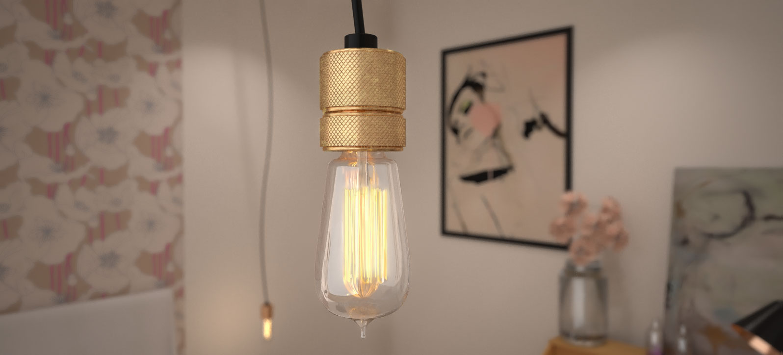
After changing the angle, cleaning up image to reduce noise, improving the bulb material settings and adding 'dirt' and inconsistencies to the brass fitting, this is how it looks now. I guess you need to click on it to get a better look. As I said, I'm having weird upload problems. What's annoying me though, is that the image is blown up way too big for the original resolution too (when you click on it).

Anyway, I'm feeling much better about the new and improved image. Thanks for your input, Massimo.
Anita
-
Oh Bugger! The critique argument again! Seriously critique is THE BEST THING IN THE WORLD!!
There is always too much back patting and we need to be encouraged to speak up to help others improve. I wish Massimo would be just as constructive with my posts, he's one of my heroes and his comments are always considered and to be considered!
-
Lol, the critique argument is old news! I think we discussed that more than enough. My last post is most definitely illustrative of the benefits of taking feedback on board

-
Anita, that bulb is looking AWESOME!
If you want it to cast more light but not effect the over bightness of the filament in the final image, you can rap the light in a "hidden from camera" cube with emitter planes.
Great job!!!!
-
Haha, I'm not entirely sure if you're trying to humour me!! Either way, thanks!
Thanks re: emitter tip. I know what you mean about placing a hidden emitter - I did that with the one in the background (you can see a slight glow on the wall). All of my scenes have hidden emitters all over the place! You can't have enough. What I have found though, is that trying to cast more general light onto an object using a hidden emitter (like a photographer would do) doesn't really have the desired effect. I've seen tutorials on it and I've tried placing planes (quite small) in directional areas and the light they emit is pants. Am I doing something wrong?
-
If you want to diffuse the light more you could try an IBL - use a circular gradient filled image (light cream centered | black rim) you can create a HDRI in PS or open the image in Maxwell Render (the actual render app not the studio. Then save as MXI.
Obviously paint the emitter with the JPG version of the image for scaling then link this to the MXI file.
Also if you want a diffused directional light make sure the light has blinkers, use matt black on these. You can put baffles in it for more direction.
-
@unknownuser said:
Seriously critique is THE BEST THING IN THE WORLD!!
Couldn't agree more. I've learned a lot, and I'm still learning, from Richard's criticisms and suggestions and from the lucidity and quality of his work.
Nice improvement on the bulb Anita.
-
Massimo, I think when it comes to 3D modelling and rendering, the path of discovery is a continual one. Which is extremely frustrating! But at least you can always see the gradual improvements you are making. Thank you, I honestly hope that you like it. I could have probably spent a little more time on the brass fitting but I'm getting to the stage where I'm sick of looking at the bulb (and I used to love them!).
Hello! It looks like you're interested in this conversation, but you don't have an account yet.
Getting fed up of having to scroll through the same posts each visit? When you register for an account, you'll always come back to exactly where you were before, and choose to be notified of new replies (either via email, or push notification). You'll also be able to save bookmarks and upvote posts to show your appreciation to other community members.
With your input, this post could be even better 💗
Register LoginAdvertisement


