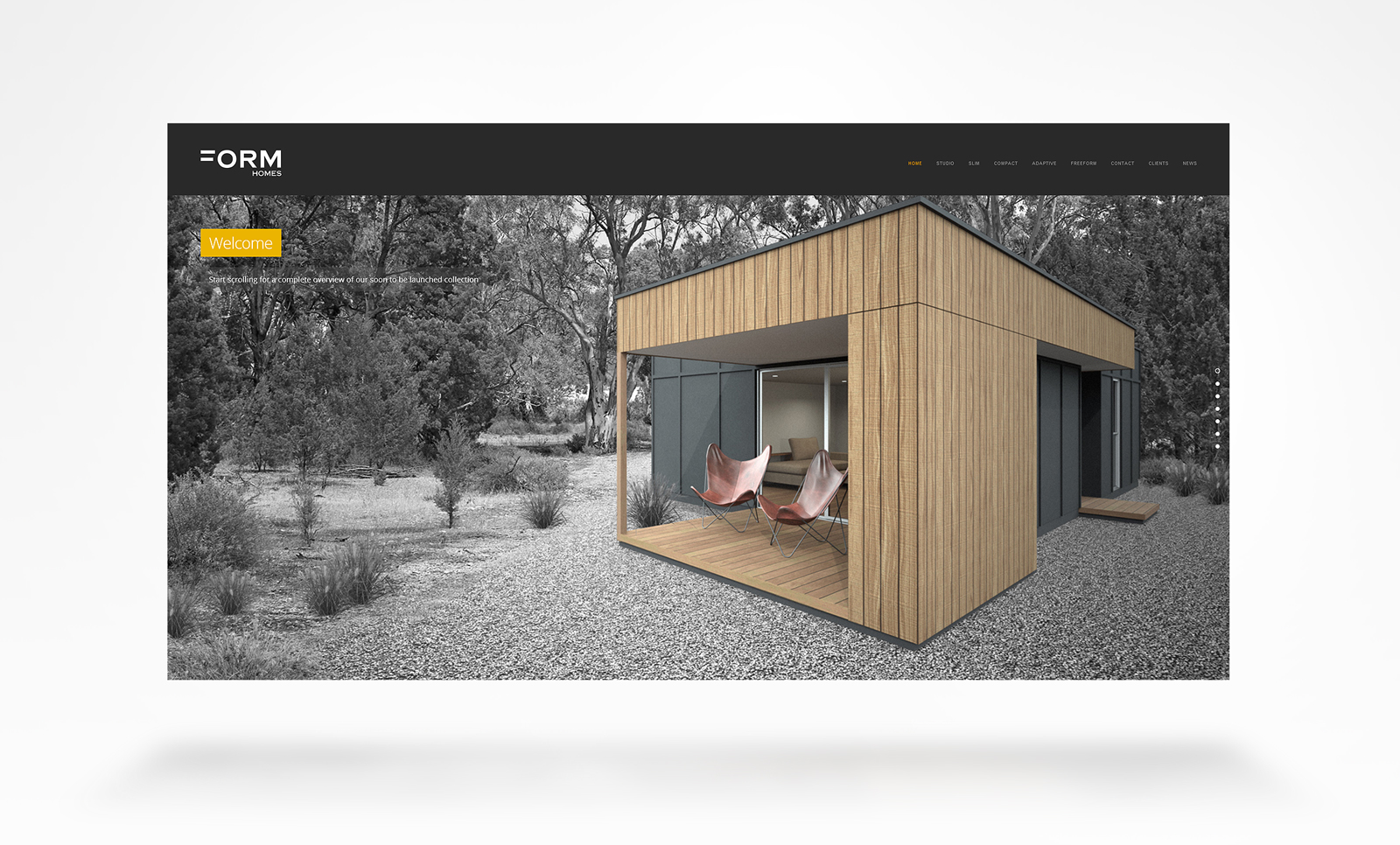
Studio Home Exterior - It's been a while
-
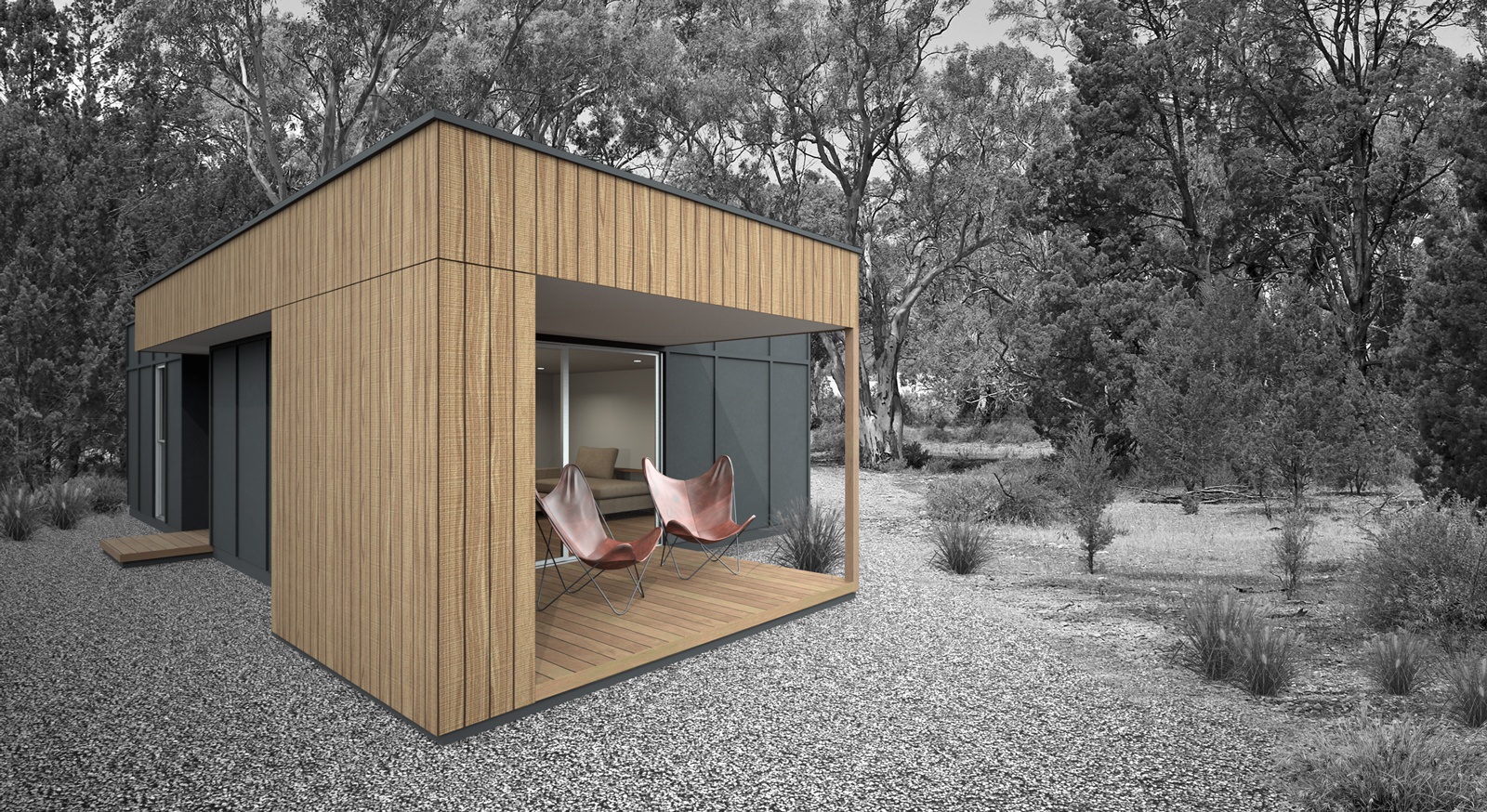
It's been about 2 years since I've had to knock out a proper render. This one is for a small 60 sq.m studio home I've designed for a building company and the first of a few! To be constructed from SIPS panels. This form of construction is something new for me as it isn't a system that has caught on in Australia.
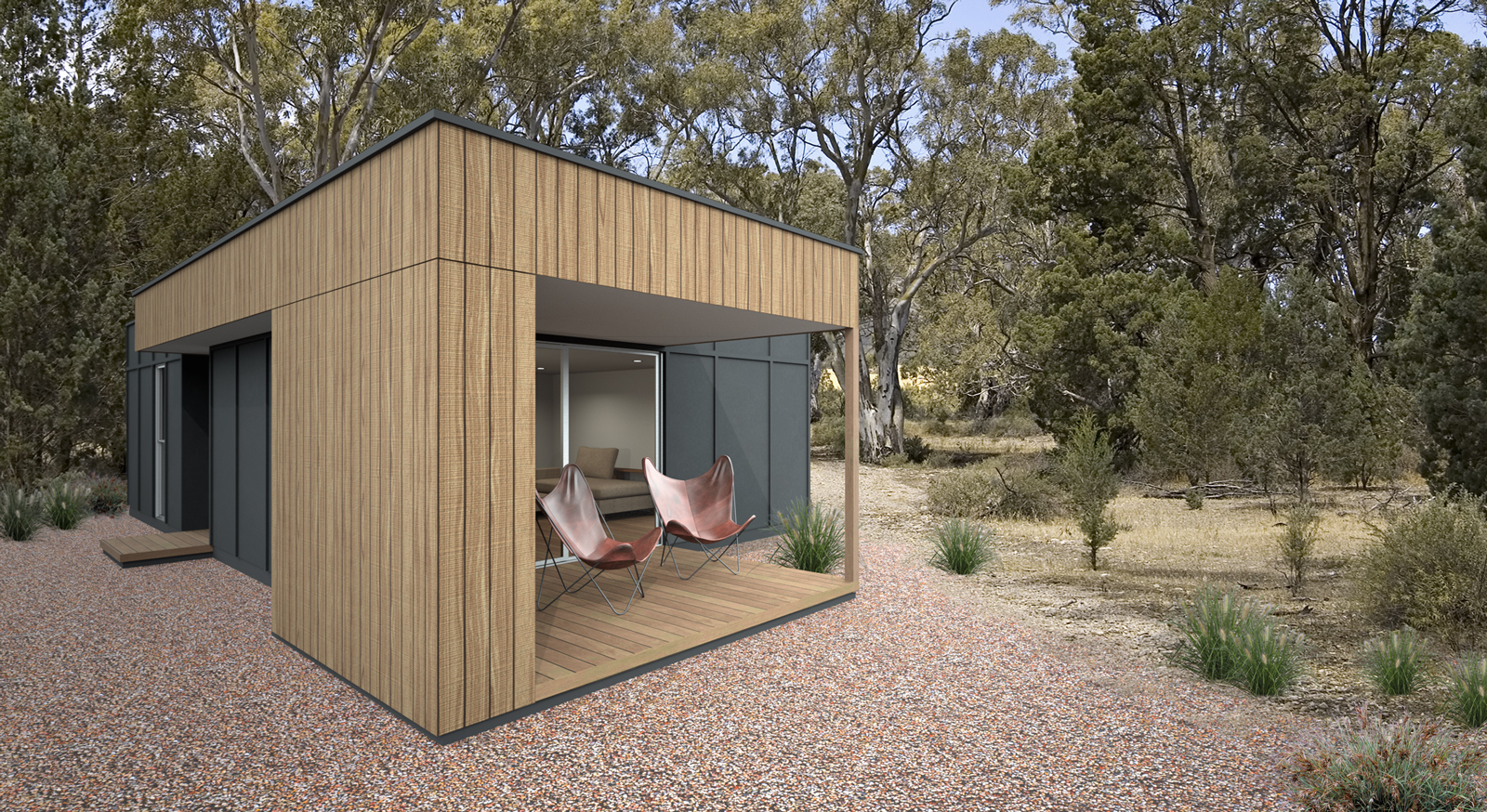
Would love thoughts on the BW background v's colour.
-
nice, Richard... graphically, I think I like the b/w image better... makes the building the focus.
I'm not sure what its missing...but in the color version, it seems like its floating a bit? not sure how to rectify that since the shadows are off to the back/right.
-
@marked001 said:
I'm not sure what its missing...but in the color version, it seems like its floating a bit? not sure how to rectify that since the shadows are off to the back/right.
Could be that I have only used the sun only very subtly!
-
Both of the renders look good but the b&w background give the home more punch and focus. Definitelt a plus when selling the property.
-
Beautiful design and rendering. I agree with Jason and Mike, the rendering with the B&W landscape has more punch to it.
-
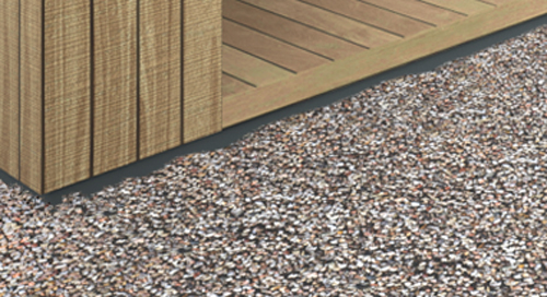
They are both great images, but to be super critical they feel a bit like the building is superimposed on the background. I can't put my finger on it but it seems to be floating, perhaps it's the lighting, lack of overlapping shadows, perhaps it's because the gravel is too smooth or that it doesn't blend with the dirt. I don't know what but something will make it perfect.
-
@box said:
They are both great images, but to be super critical they feel a bit like the building is superimposed on the background. I can't put my finger on it but it seems to be floating, perhaps it's the lighting, lack of overlapping shadows, perhaps it's because the gravel is too smooth or that it doesn't blend with the dirt. I don't know what but something will make it perfect.
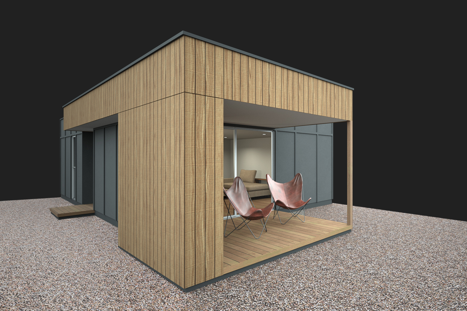
Yeah for sure mate, it's the lack of shadows. I've used about 99.99% skydome for the render for several reasons:
- To draw out the materiala more,
- To not have to fight the background image excessively with sun direction,
- To allow all facade varieties to be rendered simply with limited scene extras and post pro, see style below,
- To minimise the total cost of design / presentation for the start-up company. I've found in the past this excess cost in set up (even say 30% more) over say 20x renders adds up to what could be a few ad placements to get the company rolling. Starting a firm going has so many expenses, anywhere a dollar can be saved is a godsent.
In part that is why I favour the BW background as it allows the coverage of MANY sins!
All said I might look at how I can better "ground" these renders simply before I go too far into the next 20x renders! Thanks again for the prompts!
Mind you just going along with the clone tool to make uneven the edging could prove the most simple!
-
Thanks Mike and Daniel! The client liked the colour one more but I've made an executive decision to do the all with the B/W background. Luckily they give me license to make decisions!
It's unreal to finally find a client who gives you the opportunity to brand their company, develop the brand, design their range of homes and methods of construction, the style in which that are to be deployed, design and develop their website, develop all the online / print content! And particularly when they and their market is in a completely different state on the other side of the country and to which I've never yet visited!
I actually feel quite chuffed!

-
Good job Richard !
-
Very nice render, looks realistic.
-
I think there is something odd about the field of view for the model and the background photo Richard.... They don't seem to match. The details of the model sitting in the environment all look great, so I'm not sure what that odd feeling is if it's not the field of view being different. maybe if you applied some focal effect on the back ground image it would mimic the camera used for the model. It looks great regardless.
-
@krisidious said:
I think there is something odd about the field of view for the model and the background photo Richard.... They don't seem to match. The details of the model sitting in the environment all look great, so I'm not sure what that odd feeling is if it's not the field of view being different. maybe if you applied some focal effect on the back ground image it would mimic the camera used for the model. It looks great regardless.
You have a keen eye mate!!! There is in fact a weird camera angle - I've used a shift lens to make the image a little more dramatic. Maybe too much!
-
It's not that it's displeasing... At all. And after looking really hard I only seem to notice on the black and white background. Maybe it separates the two enough to show off the difference.
-
Top notch!
Hello! It looks like you're interested in this conversation, but you don't have an account yet.
Getting fed up of having to scroll through the same posts each visit? When you register for an account, you'll always come back to exactly where you were before, and choose to be notified of new replies (either via email, or push notification). You'll also be able to save bookmarks and upvote posts to show your appreciation to other community members.
With your input, this post could be even better 💗
Register Login


Advertisement