50s/60s Detached Property Refurb Crit
-
Hi All!
First-off, thanks to sketchucation.com for providing an invaluable and enriching resource for SketchUp. It has been a great help to me and long may it continue!
I am posting for critique on a project I have been working on (in quiet isolation!) So, I would greatly appreciate any feedback. I'm not sure if this is the right place to be posting or whether crits are entirely appreciated on here...so please bear with me (and indeed, point me in the right direction otherwise!)
The project I'm presenting is a refurbishment of a 4-bed, 50s/60s era property with swimming pool, located in Wales, UK. Some of the key goals of the design and their solutions are:
-
Improve energy efficiency of the property = external thermal envelope applied to solid masonry walls and over-rafters. Designed with passivhaus principles.
-
Extend property to the west and enhance connection of west elevation to surrounding countryside/sunset view = extension and landscape modification shown in 1a/1b.
-
Improve entrance approach to property = shown in 2a/2b, construction simplified and landscaping improved, also designed to allow Part M access to property.
-
Give the property a strong architectural treatment, with ability to discriminate between historical phases of development = differentiation introduced between 50s phase original house (under hip-roof), 60s extension (twin gables) and current phase (insulation wrap, extension and pool mods) by means of wall cladding and eaves/verge treatment.
1a.Existing:
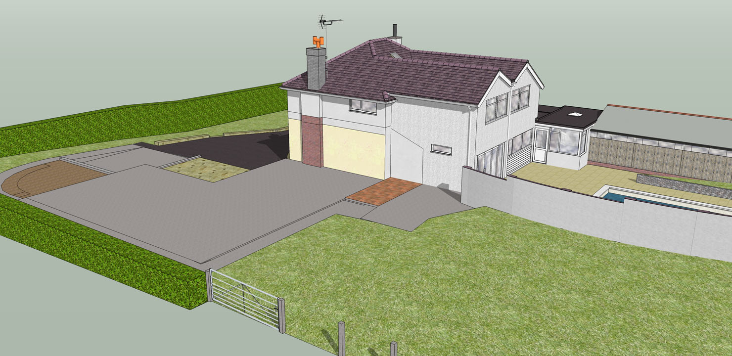
1b.Refurb: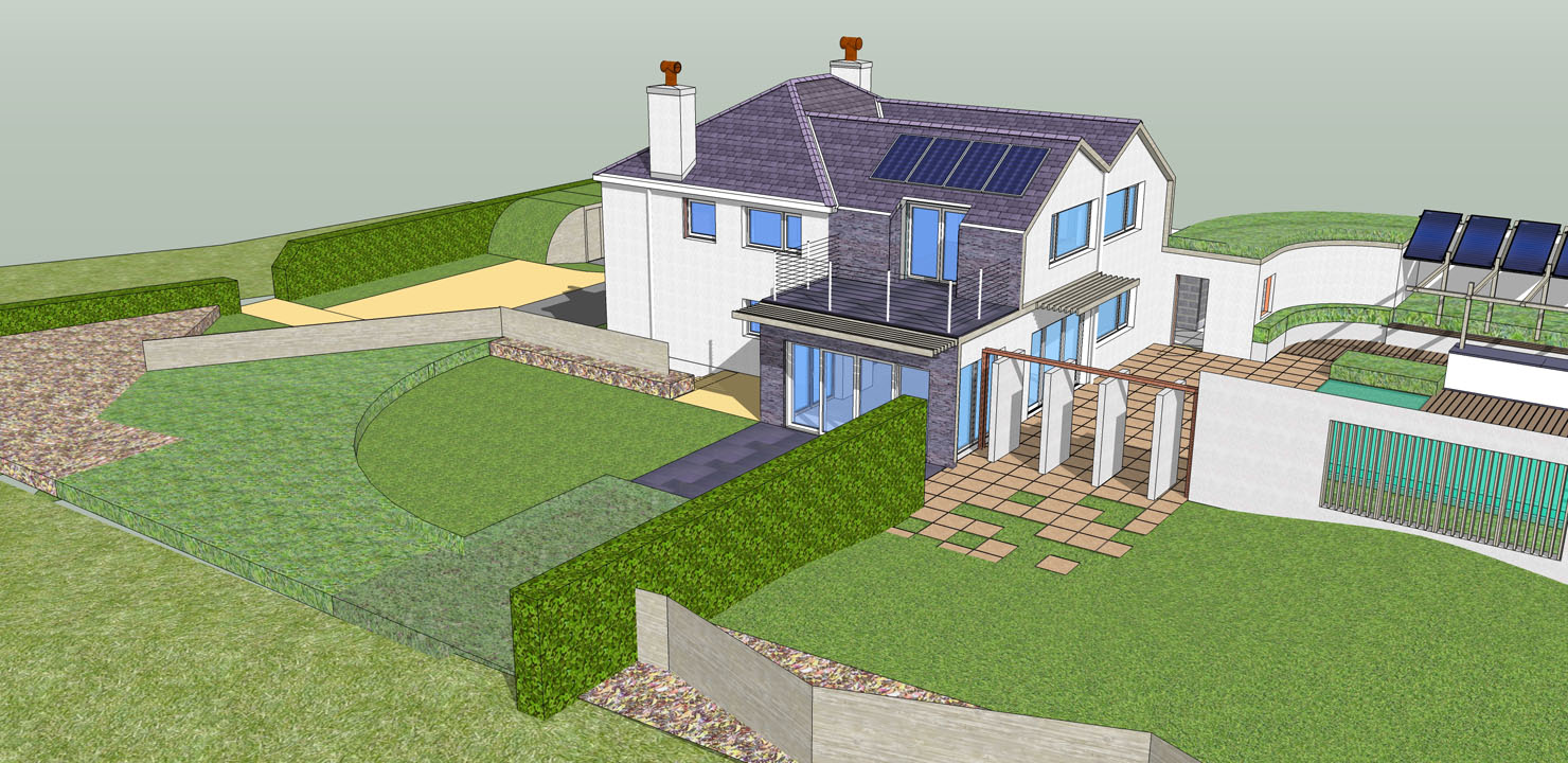
2a.Existing: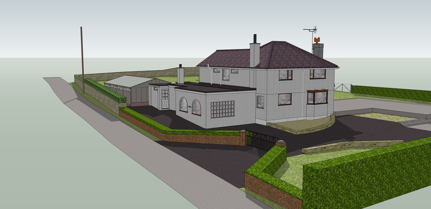
2b.Refurb: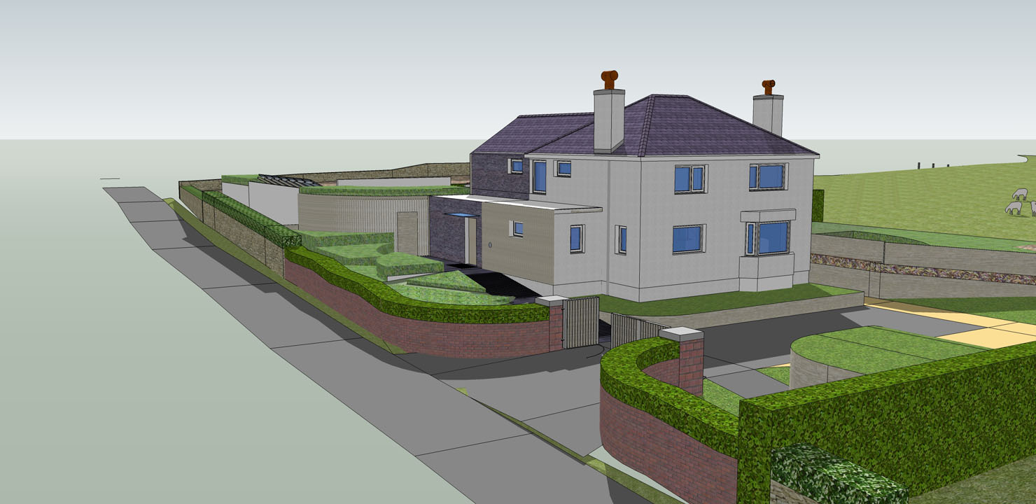
3a.Existing: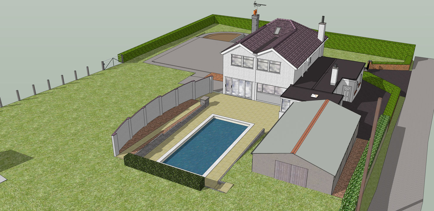
3b.Refurb: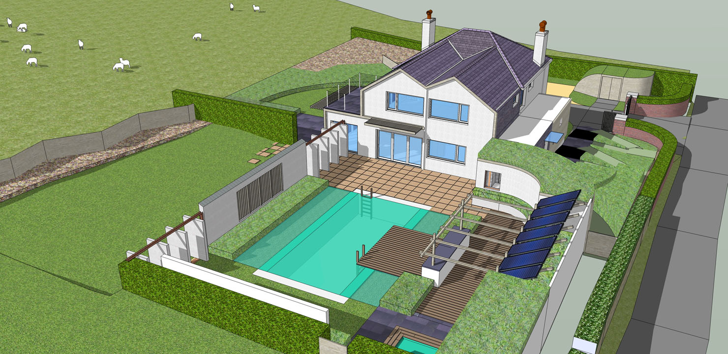
Thanks for looking!
R
-
-
Looks great

-
Thanks, tadema!
I suppose my main gripes - where the self-doubt starts to creep in - are:
-
The external insulation adds bulk, not that this is a bad thing in and of itself, but at some angles the property may lose its 'vertical elegance' and become too wide looking. Not too sure?
-
The slate wall cladding elements, used to break up the phases of construction, I sometimes think are overly bold, or perhaps a heavy handed solution to the brief? As a sideline, I am also trying to use the slate wall as a kind of ribbon of texture flowing over the roof, down the extension and out towards the field as a landscape-connecting visual tool (see 1b) - call it a 'rock ribbon' if you will/won't!
One more of the entrance area:
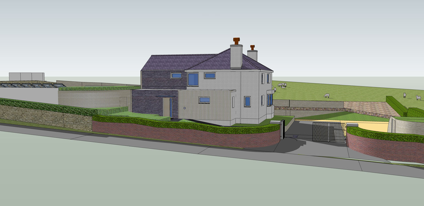
A cross-section through the ground floor giving a bit more context:
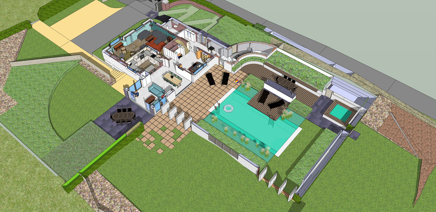
Sorry, no fancy renders

-
-
Dear LE, a few impressions:
Interesting project. Renovations/additions to existing buildings can be challenging. Sometimes the solution is obvious, and sometimes it's "oh, crap, what am I gonna do with this?"
I would lose the blue glass in the refurb model - it looks cartoonish. Try a gray colored glass. For added effect, put drapes/blinds behind them to make it look more real. Swap out your green pool water with blue water (algae makes water look green; blue water will look clean and inviting)
The area enclosing the pool seems chaotic to me. There is a lot going on. I don't see any unifying design element or materials. Part of it could be the textures you are using, too.
I don't think the idea of the slate ribbon is "too bold" - perhaps that can be the unifying element, with the slate paving flowing into the pool court and elsewhere? (just a thought)
You have a large glass window on your addition, and just outside that window is... a wall? What's up with that? Who wants to look out a window and see a wall?
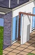
That large lawn area to the left of the pool court appears as left over space, and isn't engaged with the house or the other two site areas (pool and area off the addition).
-
Thank you for the reply, Daniel. You make many good points - I shall try and justify each with a response below.
@daniel said:
Dear LE, a few impressions:
I would lose the blue glass in the refurb model - it looks cartoonish. Try a gray colored glass. For added effect, put drapes/blinds behind them to make it look more real. Swap out your green pool water with blue water (algae makes water look green; blue water will look clean and inviting)The outputs I've posted are very rough and ready and I agree, there are quite a few improvements I can make in the presentation - including the glass, as you suggest.
No*!* the intention of the green water is to look clean and inviting
 ! ...What's not clear is the pool is to be converted and operated as a natural pool. Something along the lines of this sort of aesthetic:

I hope I've convinced you that a green pool can still be inviting:)!
@daniel said:
The area enclosing the pool seems chaotic to me. There is a lot going on. I don't see any unifying design element or materials. Part of it could be the textures you are using, too.
You might have a point here - especially with the introduction of loose planting associated with the natural pool. Perhaps if I annotate the layout it could help with your perception of the space - my original presentation is not entirely clear.
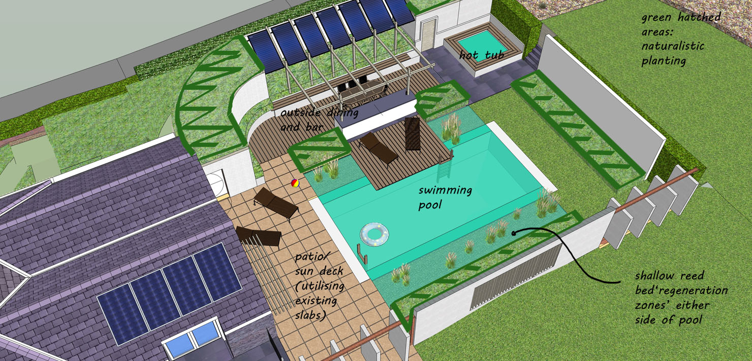
A few major unifying elements and materials that I can list:
Slender vertical or horizontal timber members (wall caldding on entrance, pool wall slats, brise, solar collector frame).
White stucco render
Slate
Naturalistic planting
Solar collector panels@daniel said:
I don't think the idea of the slate ribbon is "too bold" - perhaps that can be the unifying element, with the slate paving flowing into the pool court and elsewhere? (just a thought)
I'm buoyed by your dismissal of the ribbon being overly bold. There are slate elements elsewhere, however I fear having more slate poolside would be overpowering/dominating - but I could be wrong.
@daniel said:
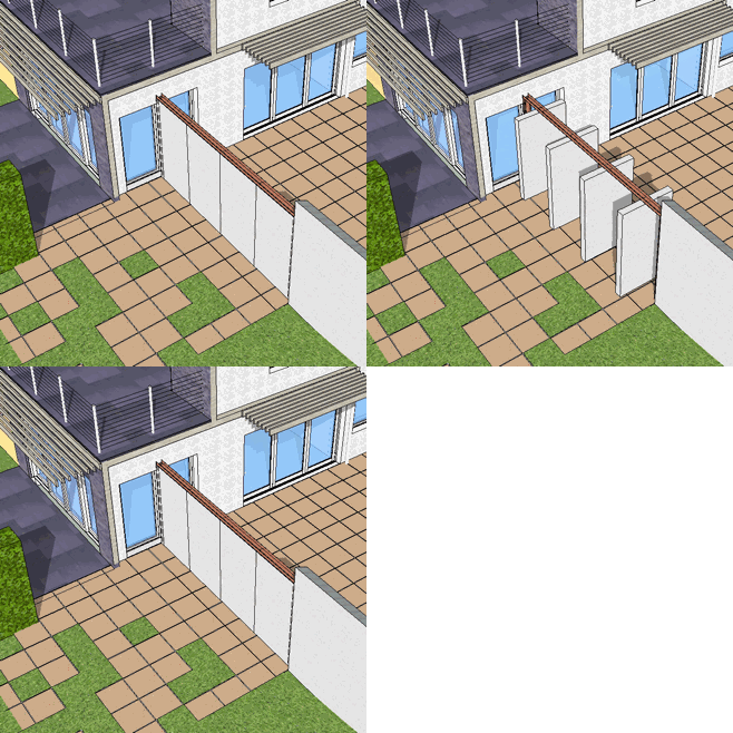
You have a large glass window on your addition, and just outside that window is... a wall? What's up with that? Who wants to look out a window and see a wall?
[attachment=4:dwdenp0r]<!-- ia4 -->1.jpg<!-- ia4 -->[/attachment:dwdenp0r]
The doors are rotating and can be open/closed individually or as a group, depending on the pool setup required.
[attachment=1:dwdenp0r]<!-- ia1 -->2.gif<!-- ia1 -->[/attachment:dwdenp0r]
@daniel said:
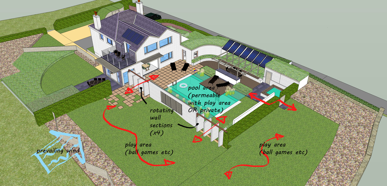
That large lawn area to the left of the pool court appears as left over space, and isn't engaged with the house or the other two site areas (pool and area off the addition).
This is a troublesome area. There are a few elements of the design that cannot be read without further explanation which aim to mitigate the 'left over' feeling and bring a cohesiveness to the two spaces which I can better explain on the annotation below.
[attachment=3:dwdenp0r]<!-- ia3 -->rearareaover.jpg<!-- ia3 -->[/attachment:dwdenp0r]
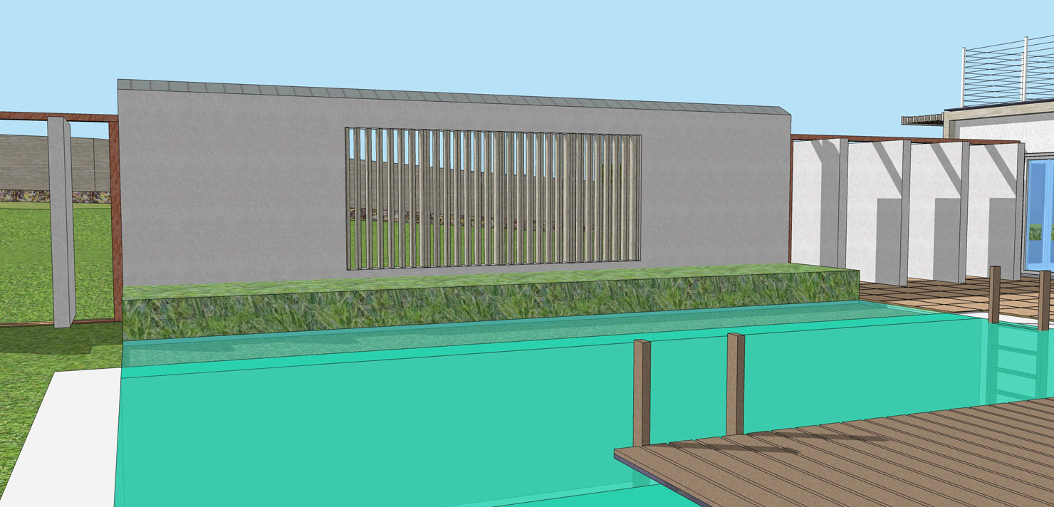
The problem is I intend the pool area to operate in two modes: 1. enclosed from the lawn/play area so as that to give privacy and/or a safe enclosure. 2. opened up to the play area, via the rotating doors. The addition of a slatted void in the main pool wall also aims to strengthen the relationship between the two spaces, as shown below.
[attachment=0:dwdenp0r]<!-- ia0 -->poolwall.jpg<!-- ia0 -->[/attachment:dwdenp0r]
Thanks,
R
Hello! It looks like you're interested in this conversation, but you don't have an account yet.
Getting fed up of having to scroll through the same posts each visit? When you register for an account, you'll always come back to exactly where you were before, and choose to be notified of new replies (either via email, or push notification). You'll also be able to save bookmarks and upvote posts to show your appreciation to other community members.
With your input, this post could be even better 💗
Register LoginAdvertisement


