I need some ideas for this kitchen
-
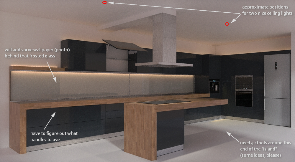
I'm a bit stuck wit this work... in my mind looked nice, but once I made a test-render on it, turned too dark, especially on the far end (where the appliances are). I tried to render it white, but it looked "unfinished".
Maybe some (slight) change in design/colors? I can't squeeze my brain for any, right now.Also, I would need some idea for ceiling lights and stools (taller than those for regular table, but shorter than bar stools) - the island's worktop is 900mm height.
Thank you very much.

-
What render engine are you using?
Have you tried a clay render to determine if your lighting is bright enough and well placed?
You could consider doors without handles. 'j' pull integrated for example.
Any render output really needs some post pro work to give it a lift, so a render with white doors would look flat without it.
There are plenty of bar stools on the Google warehouse.
Are you looking for hanging lights the positions you have marked. Something with a coloured shade matching the stool colour might help. -
@nickchun said:
What render engine are you using?
Twilight render. Lighting is as it's on the real place (and the LED lighting uses IES matched to the real thing)... so yes, the darkness on the appliances area is pretty "realistic"

@unknownuser said:
There are plenty of bar stools on the Google warehouse.
I know... this is why I feel stuck... too many options and my brain refuses to pick one
@unknownuser said:
Are you looking for hanging lights the positions you have marked. Something with a coloured shade matching the stool colour might help.
Hanging lights would be best... as it is now, is too "compact", too "high-tech", I want to "soften" it a bit, to add a touch of elegance, but without opulence.
-
This is something my wife would probably know more about as she is a CKB designer, but based on what I have seen from her I'd assume you are going for a very slick modern look similar to the Ferrari look, obviously not red.

I'd use the same panels for refrigerator so it blends in more with overall concept.
I'd also get a more modern looking hood over stove.

I cannot tell by just looking at your render but what are the distances from counter to top cabinets?
Where is the sink and dishwasher?
What is the distance between Island and cabinets?
-
- Yess... and no.. I want to combine that look with something more "warm", more organic, because as it is now, is too "rigid". Too geometric, if it makes any sense what I'm saying...
- I'll try a different hood, maybe round one, but the client already has it... and only if he can change it. (It's a little more difficult here, than in USA to change things, but not impossible).
- distance between counter and top cabinets: 600mm
-
Try Organic Blown glass lights.
-
@pbacot said:
Try Organic Blown glass lights.
A very nice idea, sir ! Thank you.
In the meantime I was looking over this:

-
You only need to humanise it. Go with your photo background to the glass. If you have room bring the island forward and lengthen the seating area. Put a cluster of small lights over the seating end to focus the importance of people. Put some warm leather stools in even if you don't like the style of them. Then render it and review it.
-
You could also use a glass panelled ceiling extractor hood to remove the focus on the hood you have now
-
Use satined metal long handles or black handles to fit the black panel

Use this stool set, since you're having a rectangular motif in your concept
 btw, kitchen looks really nice. I like. Hope the big glass panels are thermal proof glass. Use 2 spots above the block with big glass panels and two above the island. Keep it up. The result looks promising.
Stool set link : http://sketchup.google.com/3dwarehouse/details?mid=29f3332216e4578b8cc19d21e518b6c9%26amp;prevstart=0
-
@omikron said:
Use satined metal long handles or black handles to fit the black panel

Use this stool set, since you're having a rectangular motif in your concept
 btw, kitchen looks really nice. I like. Hope the big glass panels are thermal proof glass. Use 2 spots above the block with big glass panels and two above the island. Keep it up. The result looks promising.
Stool set link : http://sketchup.google.com/3dwarehouse/details?mid=29f3332216e4578b8cc19d21e518b6c9%26amp;prevstart=0
Thanks for input !
Earlier today I decided to use the Cubo Stool that is pretty similar with your idea. This boost my self-confidence, seeing that others came to similar results/ideas.
About glass lighting, I'm using LED stripe, so I don't need to use thermal proof glass. I'll post results as soon as I have some renders.
-
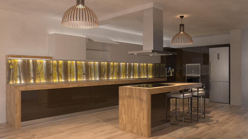
some progress... still not happy with colors.

-
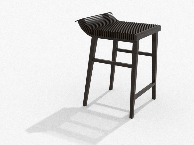
A stool that I want to use in this design.
I remember seeing something like that some time ago. And I think it would fit in this kitchen. So, I decided to follow that idea and make my own stool.
I hope you like the result. If the client will agree with this, it will be manufactured.

-
@unknownuser said:
some progress... still not happy with colors.
I guess this is where the client needs to give input, I'm not a fan of hardwoods in a kitchen, I prefer a tile finish, I think the wood floors and wood used in kitchen counters are too similar, as well as the wall cabinets seem to get lost to wall color, not enough contrast.
-
@solo said:
I think the wood floors and wood used in kitchen counters are too similar, as well as the wall cabinets seem to get lost to wall color, not enough contrast.
Yes, that is it !
 I was trying to see what is wrong here... I guess I'm too tired. You said what I couldn't see

This is why I added the light above the upper cabinets, to get them off the walls a little. I guess it wasn't enough )) I'm pretty bad at choosing colors. Actually I try to run from this part. I feel more comfortable with shapes, contours than colors.
Thanks, solo. -
If you have the time, or just for fun, I dare you to make the walls behind the furniture black, and all the cabinets white. It will pop, and the kitchen will be lighter for the eyes. Will work great with that wood.
-
Nice look of the kitchen with the painting behind the glass panel
 Usually they don't use hard-wood for kitchen furniture, rather MDF panel-built furniture. Hard wood is used mainly in separate dining-room sets.
 -
I think the kitchen is coming along.
I love the stool!
Hello! It looks like you're interested in this conversation, but you don't have an account yet.
Getting fed up of having to scroll through the same posts each visit? When you register for an account, you'll always come back to exactly where you were before, and choose to be notified of new replies (either via email, or push notification). You'll also be able to save bookmarks and upvote posts to show your appreciation to other community members.
With your input, this post could be even better 💗
Register LoginAdvertisement


