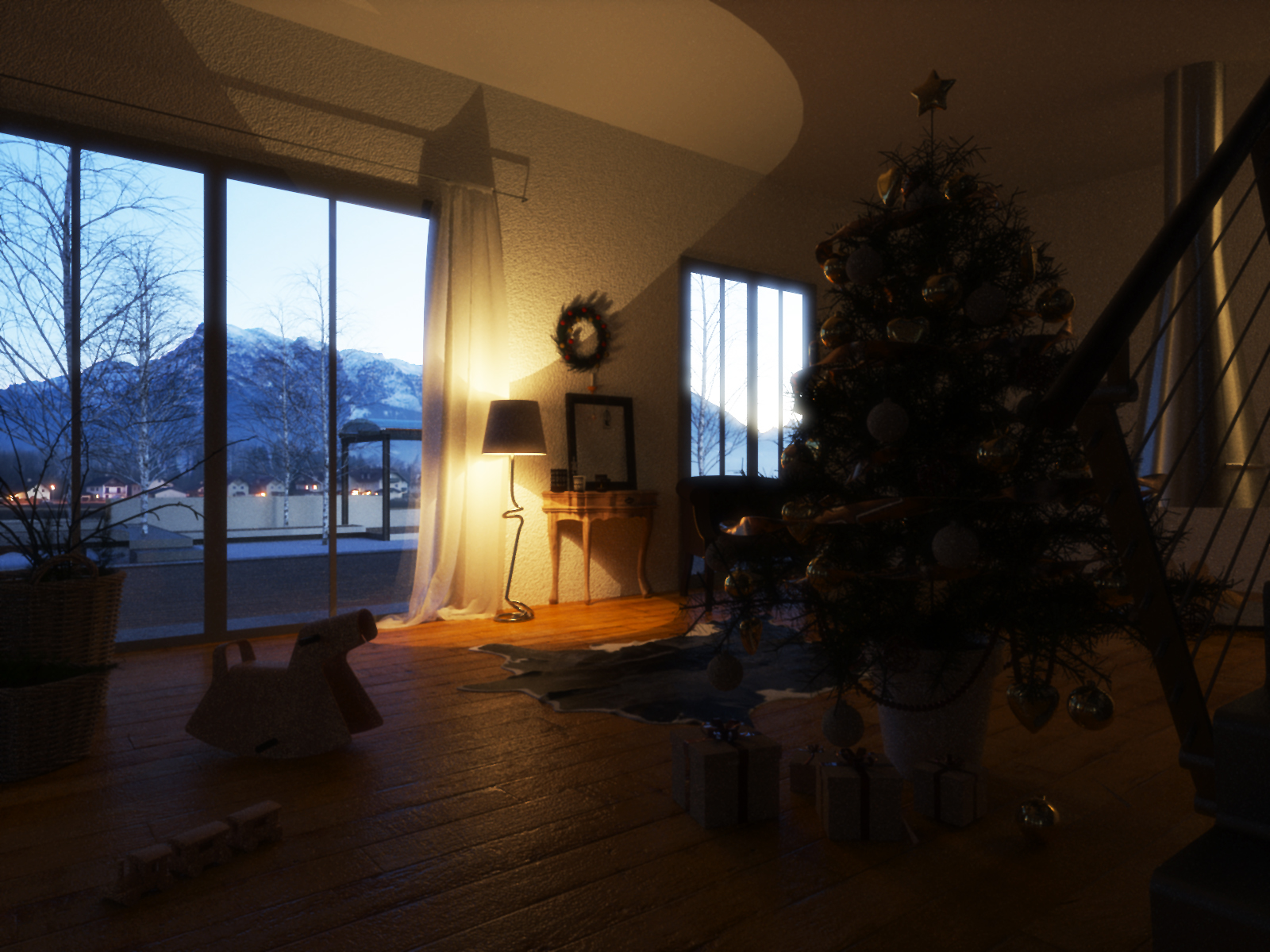
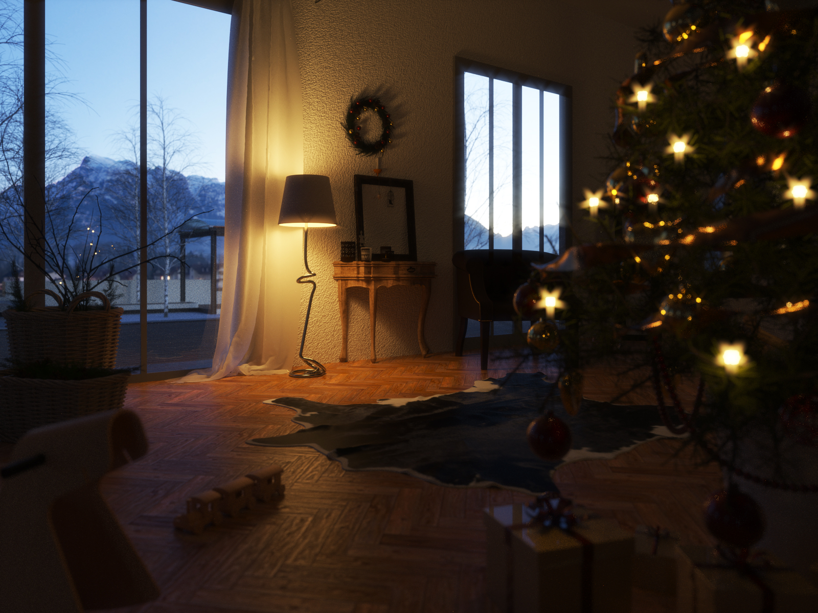
Christmas morning
-
This is my first entry in this competition: http://www.sketchuptexture.com/2013/12/mini-challenge-christmas-2013.html
Took the interior of my current university project (detached house thread in the WIP gallery) for this. My intention was to show the atmosphere in a home on christmas morning when still everyone is asleep.
Rendered with Thea TR1.

-
Very nice, Carloh...!

The crit I have would be on the material you've used on the floor...
The bump is way too strong...!
Try another floor material or drop the bump strength...
-
Thank you for your comment!

For the floor i wanted to simulate a kind of rough, used parquett floor, so i pushed the bump. But i guess you're right that a little less would be more here

-
Hi Carloh, You have no softshadows on your lamp?
-
Hmm yes there aren't...i enabled them for the point light in the lamp but it looked strange.i guess i'll have to check on it again
-
Used/rough/worn wood floor is not noisy like that, it is usually worn on the edges and it is a bit wavy. Your bump is more suited for rusted metal than worn wood floor !

Try these http://www.enchantedage.com/node/185 .
-
nice! thanks for the link ely!

-
Nice image Carloh! really liked the mood and the contrast warm-cold of the lighting... I would use a softer shadow for that lamp...
best
V -
Thanks Victor
 I'll make another entry in this competition where i'll change the lighting
-
Hi Carloh:
Image has a lovely feel w/the village lights in the background. It definitely feels like Christmas morning. Comments by others give you excellent direction to improve this scene.
Cheers,
Susan -
get those lights on the christmas tree!

-
Thank you all for your tips...i made the adjustments you suggested and i guess this will be my final entry in this competition


-
Great improvements, Carloh...!

-
@carloh said:
Thank you all for your tips...i made the adjustments you suggested and i guess this will be my final entry in this competition

Much improved!
-
Much better. Would like to see more light on tree. Not tree lights.
Maybe a dull emitter to see more of it. -
WOW !!
 That's almost real!
I don't agree with the IOR of the present though, it is too reflective for a paper! -
thank you guys!

i knew someone would notice my laziness on that present paper material...i actually used a metallic car paint material on this because i wanted to finish the render

-
I think it could be easy fixed with some postprocess work. I usually give it some roughness(if your program allows it) if I can't reduce the IOR(reflectivity).
-
Great new image Carloh. Just not massively keen on the tree lights having such a wide flare, perhaps it's just my personal taste, but the eye is instantly drawn towards them. The lamp looks a million times better. Nice work it's almost a photo.
-
Good work Carloh, especially the improvements on the shade. It has the cold/warm and dark/light balance needed in a render.
Hello! It looks like you're interested in this conversation, but you don't have an account yet.
Getting fed up of having to scroll through the same posts each visit? When you register for an account, you'll always come back to exactly where you were before, and choose to be notified of new replies (either via email, or push notification). You'll also be able to save bookmarks and upvote posts to show your appreciation to other community members.
With your input, this post could be even better 💗
Register LoginAdvertisement


