New kitchen design in Luxembourg...
-
Some of you might recall the renders I posted in the Interior renders for my brother in law and the Bathroom for my brother in law threads...?
Here's a new design of the kitchen...
First the output from LayOut...
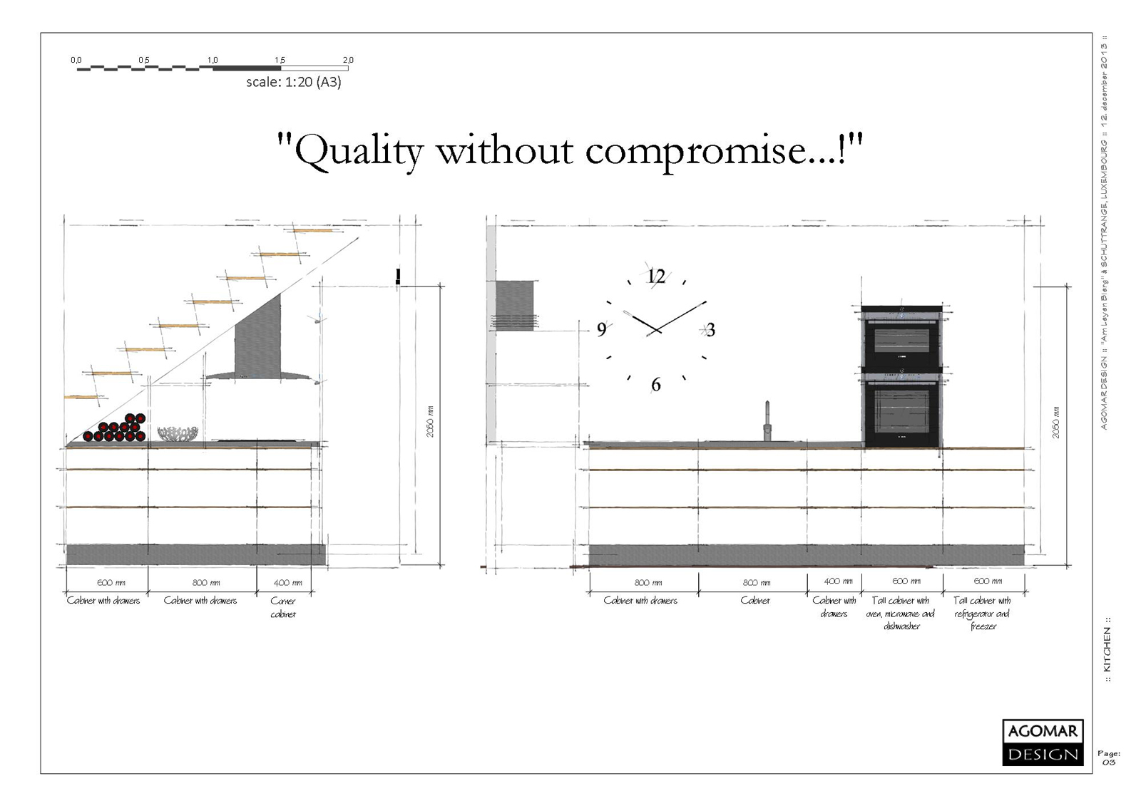
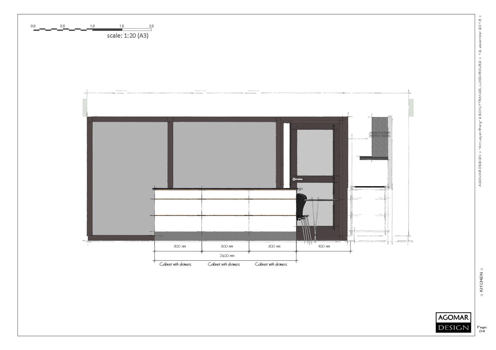
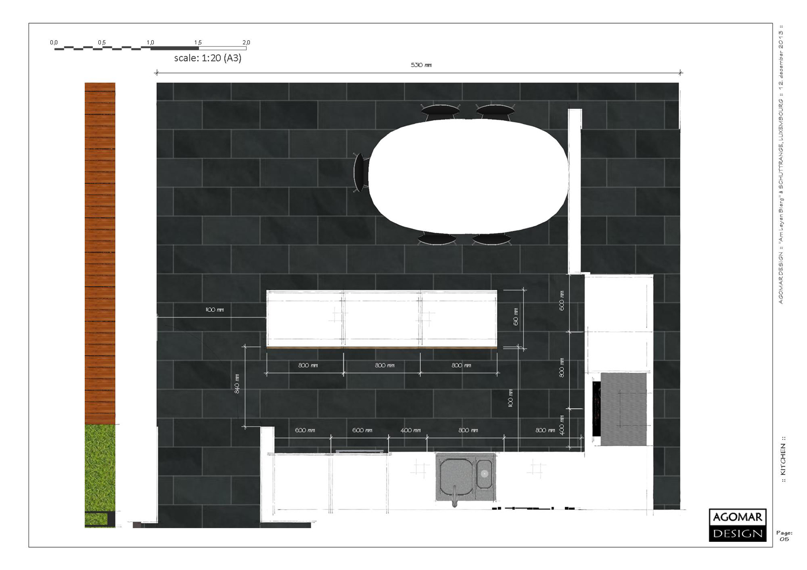
-
And here's a day-time and an evening-time render...
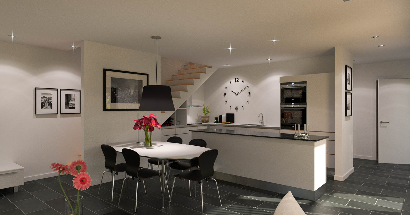
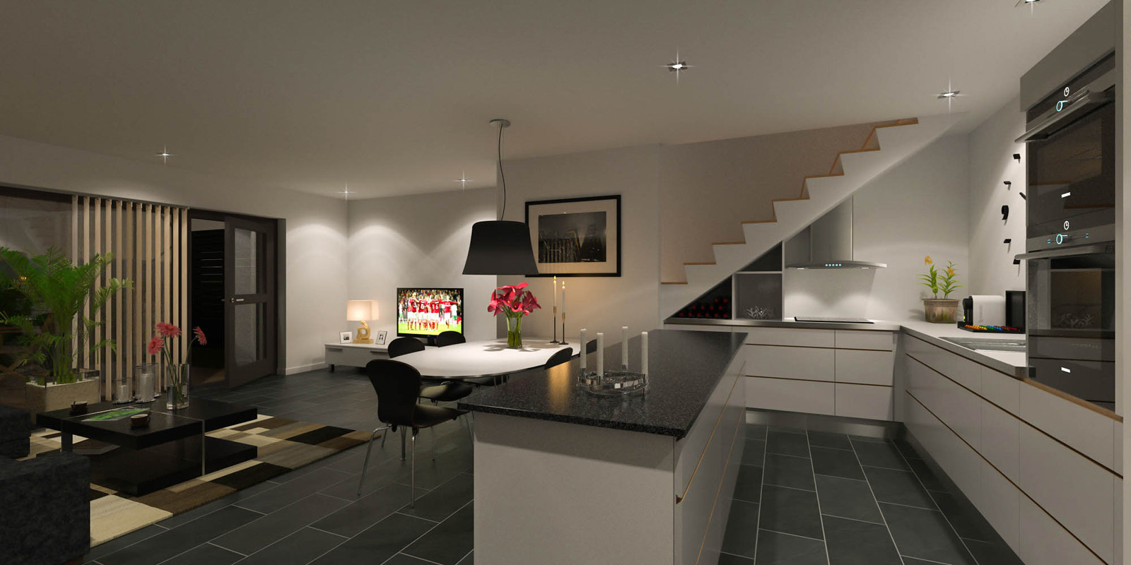
-
Very nice.
I particularly like the clock. I take it the mechanism is in the wall accessible from the space behind? -
Very cool

and what was the render ?
Guerilla ? (free for mono-post)
-
Thanks, guys...

@box said:
I take it the mechanism is in the wall accessible from the space behind?
Yes or a small space inside the wall to move the hands of the clock...
I've seen one, where you only need to drill a hole 5cm deep and 15mm i diameter...@unknownuser said:
and what was the render ?

Thea Render - of course...

-
very nice renders...that "semi-open stair solution" looks very cool. never seen something like this before

-
Beautiful design and renderings.
-
Thank you all...!
Much appreciated...!
-
inho, apart of the lens flares on the lights, everything is perfect... like it
best
V -
An update where I've moved the ceramic hob to be next to the tall cabinets and moved the sink and dishwasher to the kitchen island...

Another addition is the railing up the stairs as well as the glass to avoid things dropping from the staircase and kitchen smells from travelling up...Oohhh year - and some Christmas decorations, now that the season is approaching...

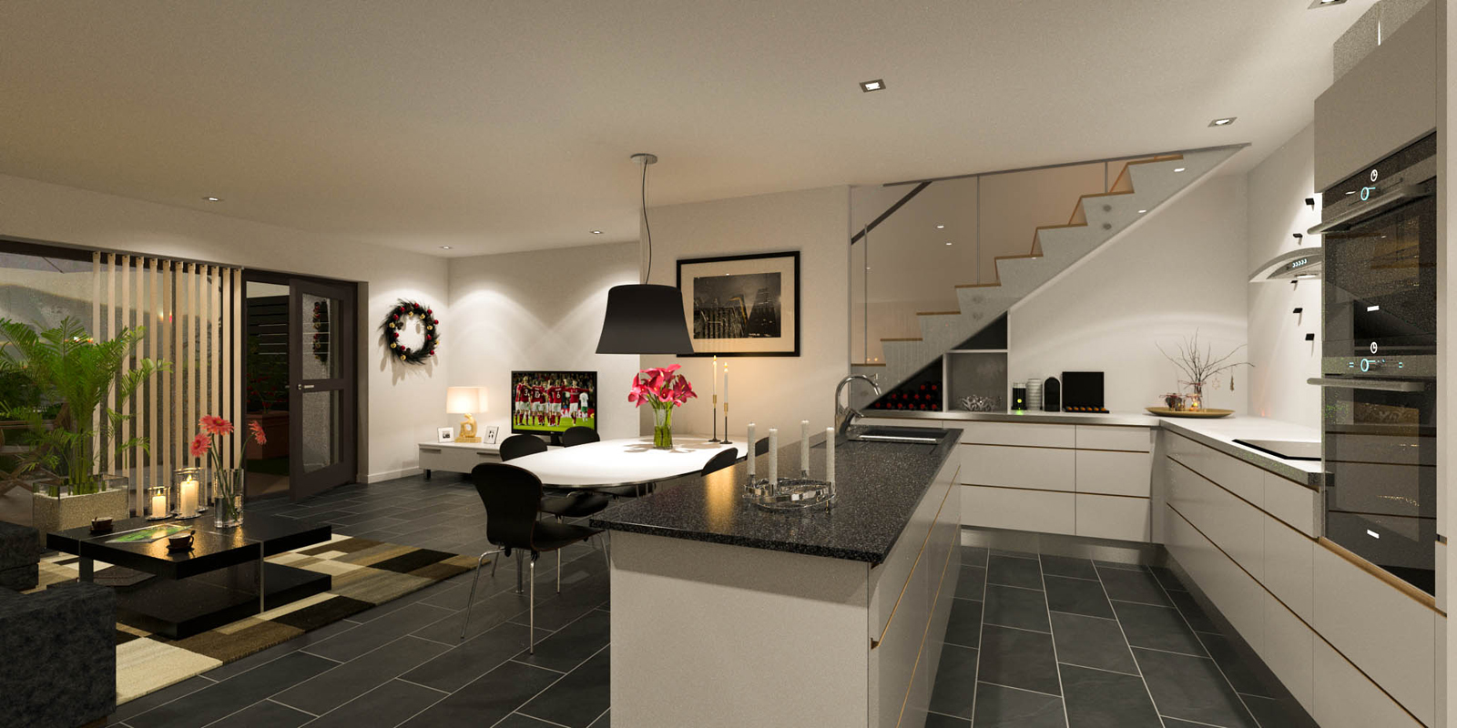
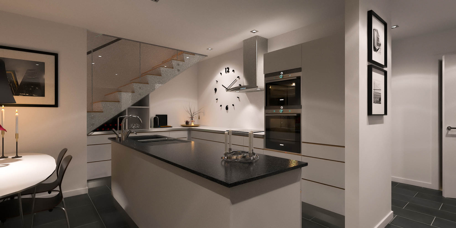
-
And here's some outputs from LayOut...
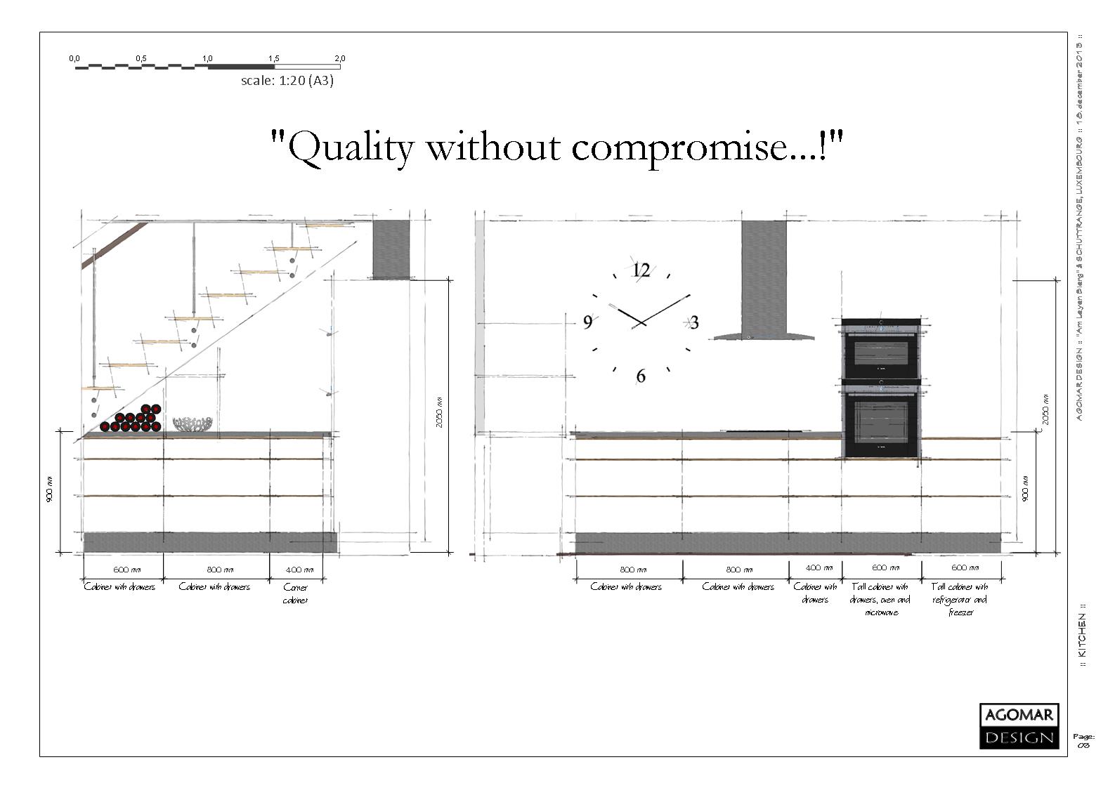
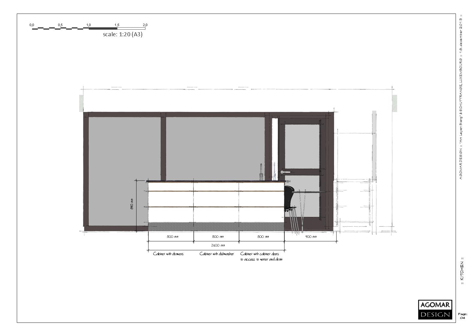
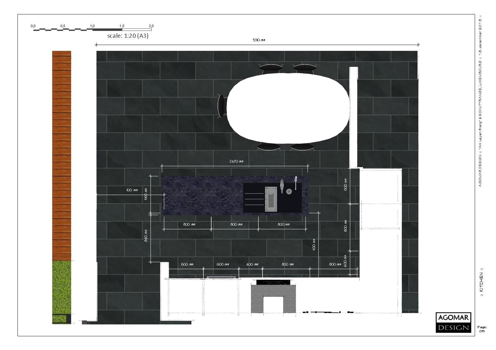
-
Loving the new renders, much cleaner. Excellent work!

-
Thanks, Oli...

-
-
yeah you stepped up the 2nd set congrats
-
Thanks...

-
Did you use a warming filter on these Kim? Or warm omnis?
-
No warming filters or alike...
I just set white balance to 7000...
-
oh in the darkroom. nice.
Hello! It looks like you're interested in this conversation, but you don't have an account yet.
Getting fed up of having to scroll through the same posts each visit? When you register for an account, you'll always come back to exactly where you were before, and choose to be notified of new replies (either via email, or push notification). You'll also be able to save bookmarks and upvote posts to show your appreciation to other community members.
With your input, this post could be even better 💗
Register LoginAdvertisement


