American cinema
-
Thought the first image was the reference image! Great work dude!
-
Top draw again

John -
Outstanding! The tall buildings in the fog are great!
-
Amazing renders.

-
Great mood.


-
Thanks guys,but kudos has to go to "Atlantic City Midmer-Losh Fan" on 3d warehouse who did the cinema model,I did the easy part!
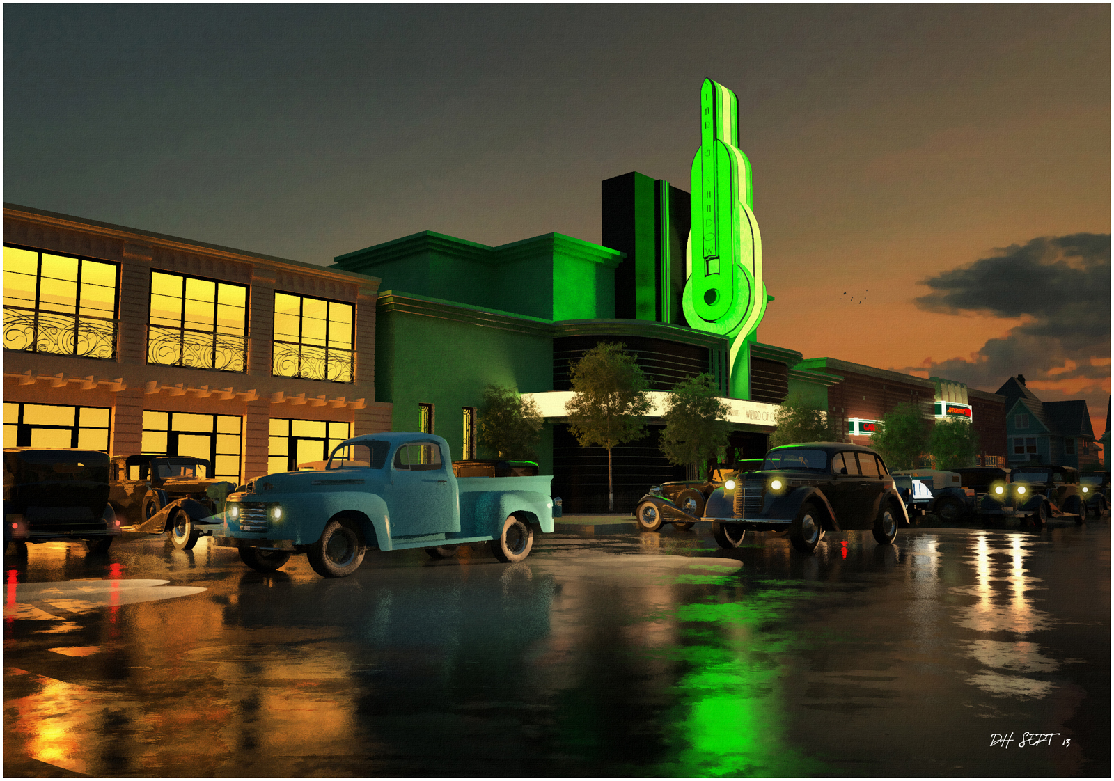
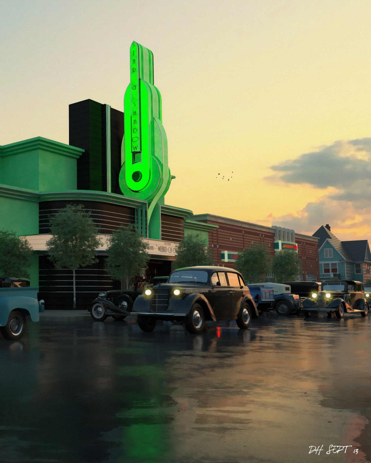
Attached are 2 more NPR images of the same view taken from the top end of the street,Again,the buildings were all sourced on 3D warehouse.
Like the previous images,these were done using relight in Thea render.
They were rendered out at 2400 pixels wide and reduced to 1600 for this forum.(view 05 is a cropped version of a much larger image showing the detail)
-
Don't worry about using Warehouse stuff, i use it to keep my hand in during lean modelling times. sometimes you can spend ages sorting ware house model. The renders look great!

-
Wow, this is really great stuff!
-
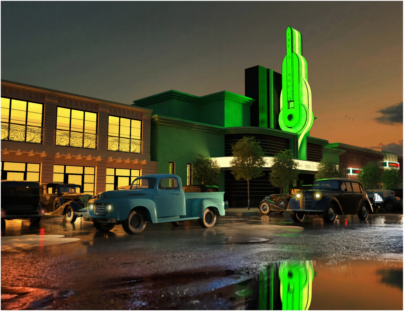
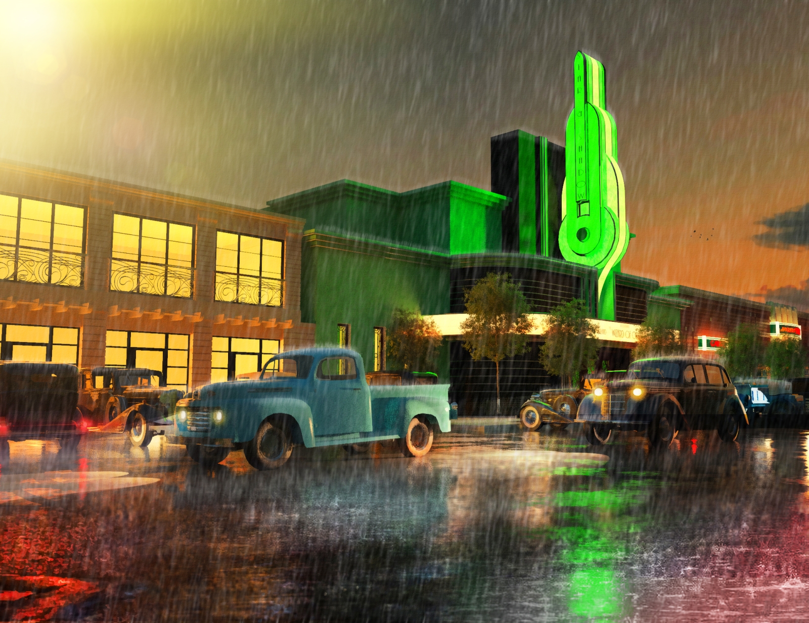
2 views,the first with a different road added in photoshop and the second during heavy rain.
-
Wow.

-
Beautiful David...
-
Excellent job, just the ghost looking buildings in the background look a bit weird in the first images. Can the thea objects be converted to use as maxwell proxies ?
-
this is great!
but if i may point out 2 things that would make it even better:
-
no street lamps; by 1930s all these busy streets had street lights
-
cars in the middle of the street with no drivers; maybe darken and add some reflection to the windshields, so that you cant see that there is no driver
but those are just "moddel" issues... the rendering and post-processing are very good
-
-
Beautiful renderings, sir. A theatre would not have trees in front of it, though, as they block the marquee. Not only from a visibility standpoint, but for changing the letters on it.
-
You are right about the trees,but I wanted to bring in some natural elements to the images.
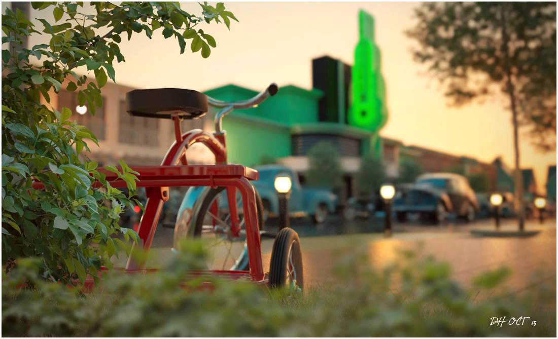
I have attached a recent Thea render of the street without artistic impression,although the foreground planting is post processed in photoshop.
-
Very Nice!!
-
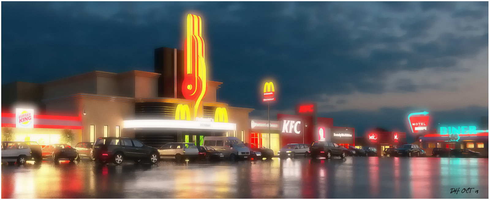
Attached are 3 images from the same main street but from a modern, more cynical point of view.
Like before all models for the buildings are from 3D warehouse and the cars are Dosch cars.
I think the tarmac area is too wide, maybe it needs something running along the diagonal but I wanted to get as much reflections as possible.


-
One more with added glow to the lights to help accentuate the damp wet evening mood.
-
Wow, perfect as always!
-
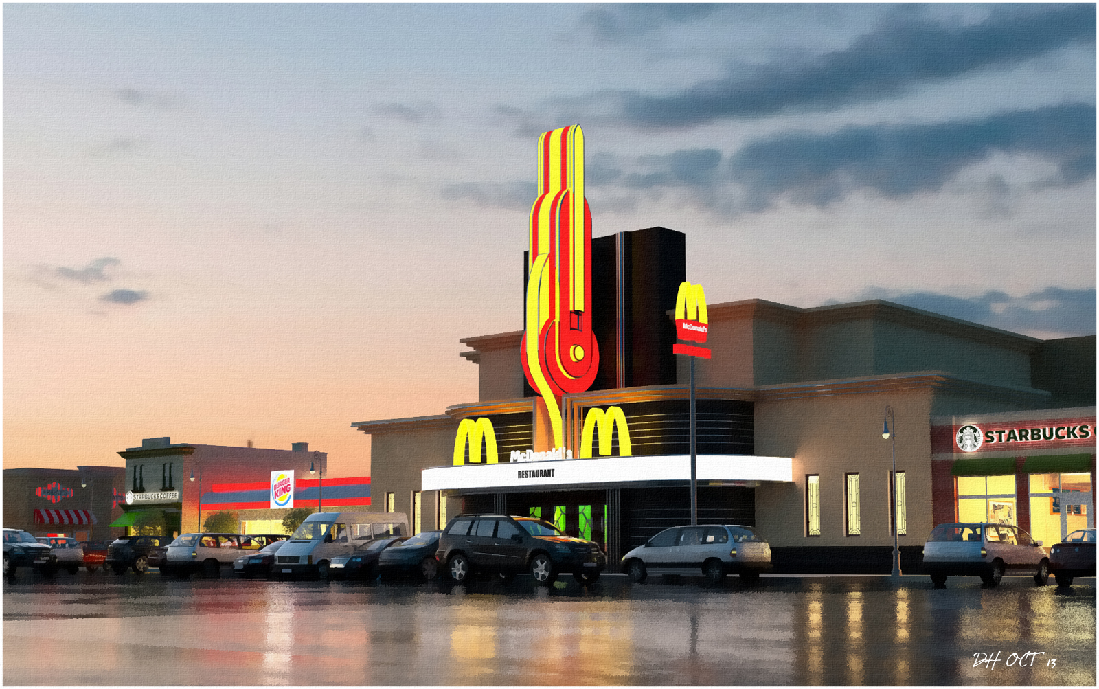
here's a view from the other direction.
Hello! It looks like you're interested in this conversation, but you don't have an account yet.
Getting fed up of having to scroll through the same posts each visit? When you register for an account, you'll always come back to exactly where you were before, and choose to be notified of new replies (either via email, or push notification). You'll also be able to save bookmarks and upvote posts to show your appreciation to other community members.
With your input, this post could be even better 💗
Register LoginAdvertisement


