SKUI — A GUI Framework for SketchUp
-
-
sorry, all the other scripts have
RUBY_PLATFORM =~ /(darwin)/ ? @dlg.show_modal() ; @dlg.show()I must have grab a pre 'Joel' version...
-
No problem
I will test it with some heavy scripts running beside...
My experiance is that this never a problem on mac, but it is on win. -
Hi,
Is there a way to ensure aspect is the same with win and mac (maybe a common standart font?). Has anybody achieved this?
Is it possible to use a backround picture? (that's why i would need same aspect..)
thx
-
I needed some buttons with images instead of text for my plugin, therefore made these changes in my local SKUI:
Example:
@window = SKUI;;Window.new(options)
b = SKUI;;Button.new( 'Hello' ) { puts 'World! ;)' }
b.position( 10, 5 )
b.background(File.join(PLUGIN_PATH_IMAGE, 'icon.png'))
window.add_control( b )
button.rb:
    def background( image_path )

      # calculate relative path
      require 'pathname';
      relative_image_path = Pathname.new( image_path ).relative_path_from(Pathname.new( PATH_HTML )).to_s

      @properties[ ;background_image ] = relative_image_path
      @properties[ ;caption ] = ''
    end
ui.button.js:
Button.prototype.set_background_image = function( value ) {
  this.control.css({'background-image'; 'url(' + value + ')','border'; '0','background-repeat'; 'no-repeat'});
  return value;
};
Are there any more people interested in this?
I'm still unsure how to implement it. It could be a separate "image_button" (sub)class based on "button", or (like I did now) additional properties for "button".If anyone is interested I can propose a patch on Github to TT...
Cheers!
Jan -
I'm wondering if the image perhaps fits better as an IMG element that sits in line with the text? Then the Button control could have some properties to control if the image to the left or right of the button text. ?
-
@thomthom said:
I'm wondering if the image perhaps fits better as an IMG element that sits in line with the text? Then the Button control could have some properties to control if the image to the left or right of the button text. ?
Hi Thomthom,
I don't understand exactly what you mean.
At first I just added a "click" event to the IMG element. But i figured that it would be better to approach them as real buttons.
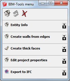
This is the menu I'm rebuilding with SKUI:

I want the images to behalve as buttons that start tools and fold/unfold menu sections(groupboxes).Or would you take a different approach?
-
It all sounds good. I was just making a question on the details of implementation. At the moment you have the image set as a CSS background property.
But I was wondering if making the image an IMG element so that it could position itself relative to the button text. -
@thomthom said:
But I was wondering if making the image an IMG element so that it could position itself relative to the button text.
Ahhh, you mean like this?
<button><img src="icon.png" /></button>
That does sound better!
-
Yea, something like that. It even allows for free positioning if you really need to - but will also add the extra option of aligning with the text.
That would be a nice improvement to SKUI.
-
You could even ship standard SU buttons, like (+), (-), etc.
-
@thomthom said:
That would be a nice improvement to SKUI.
I have added a pull request to the Github repository.
Let me know if you see any problems.
Btw I just noticed a different pull request which also adds images to buttons, but it seems to take a different approach... -
Hi TT,
As a response to your questions on Github.
What do you think of this approach?
If you could use the button as a container like groupbox the need for a background image would be eliminated... and the image class has all positioning methods you need(except maybe for z-index?).btn_hello = SKUI;;Button.new( 'Hello' ) { |control| name = control.window[;txt_name].value puts "Hello #{name}" UI.messagebox( "Hello #{name}" ) } btn_hello.position( 200, 0 ) btn_hello.tooltip = 'Click me!' window.add_control( btn_hello ) icon = SKUI;;Image.new('icon.png') icon.position( 0, 0 ) icon.size( 16, 16 ) btn_hello.add_control( icon ) -
Another question.
Do you recommend to leave the "core.css" file unaltered, and only add additional styling using themes?
I first completely uprooted core.css for my plugin in a way that all objects were relatively positioned and the fieldset would be automatically re-sized based on it's contents(normal html behavior).
But later-on I thought that doing all positioning from ruby/SKUI would better fit SKUI's design, even though it would take some more scripting to make everything line-up and re-size dynamically.
This would probably also prevent different behavior between browsers.Is this assumption correct?
-
Let me just step back a little (Sorry, I'm trying to catch up after coming home from the US).
The intent with the background image, is that to create a graphical button, or an icon glypth to go along with the button text? -
Traveling up and down to Boulder?

@thomthom said:
The intent with the background image, is that to create a graphical button, or an icon glypth to go along with the button text?
What I want to do is create graphical buttons, but an icon(like emoticons) in the text would be another option.
I also managed to set the background with javascript, works fine, but I think image buttons are so common that a built in option could be useful. -
Have you had a look at icomoon ?

Free SVG Icon Libraries, SVG Editor, Multicolor Icon Font Generator ❍ IcoMoon
Browse free and premium SVG icon sets in IcoMoon's library, import SVG and font files, edit them in the SVG editor, export to various formats including Multicolor (COLRv0) icon font, SVG sprite, web component, React, Vue, Elm, ico (favicon), and more.
(icomoon.io)
Makes it easy updating sets which can be a pain if using png-sprites for ex.
( You can create your own sets in Illustrator. )Could be a viable solution.
-
Right - I was thinking in the lines of inline glyph. Sorry not not quite following what you where aiming for. I was mostly checking in from my mobile and I can quickly scanning the posts.
I see the use for both here.
What I'm thinking is that for the glyph, the existing Button can be extended. For the graphical button, I'm wondering if perhaps a new class makes sense... ?
Or maybe not.... (thinking out loud here...)Maybe Button.glyph=
and Button.image_normal=, Button.image_hover=, Button.image_disabled=, Button.image_focused= ? -
@jolran said:
Have you had a look at icomoon ?
Never heard of icomoon before, but it does sound very interesting!
Do you know if exporting a project also includes your own uploades SVG icons? -

@thomthom said:
What I'm thinking is that for the glyph, the existing Button can be extended. For the graphical button, I'm wondering if perhaps a new class makes sense... ?
Or maybe not.... (thinking out loud here...)A new (sub)class, or maybe set a "type" for the button?
@thomthom said:
Maybe Button.glyph=
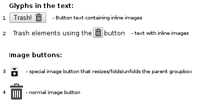
and Button.image_normal=, Button.image_hover=, Button.image_disabled=, Button.image_focused= ?this would work nicely for "use-case 2", but not for "use-case 1". And I can't think of a way to position it halfway a line of text...
Difficult to find a universal solution...
What I'm trying to do is only(at the moment) use-case 3 and 4.
Hello! It looks like you're interested in this conversation, but you don't have an account yet.
Getting fed up of having to scroll through the same posts each visit? When you register for an account, you'll always come back to exactly where you were before, and choose to be notified of new replies (either via email, or push notification). You'll also be able to save bookmarks and upvote posts to show your appreciation to other community members.
With your input, this post could be even better 💗
Register LoginAdvertisement


