Need help to get better
-
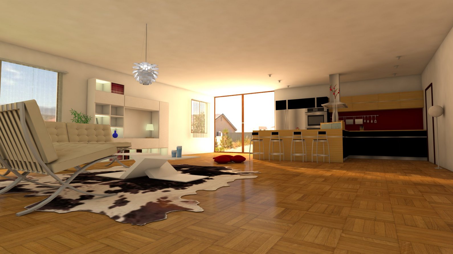
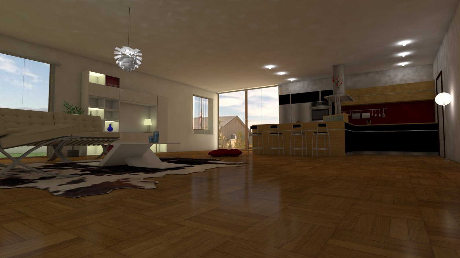
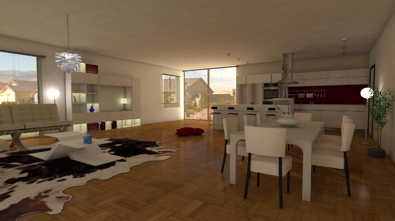
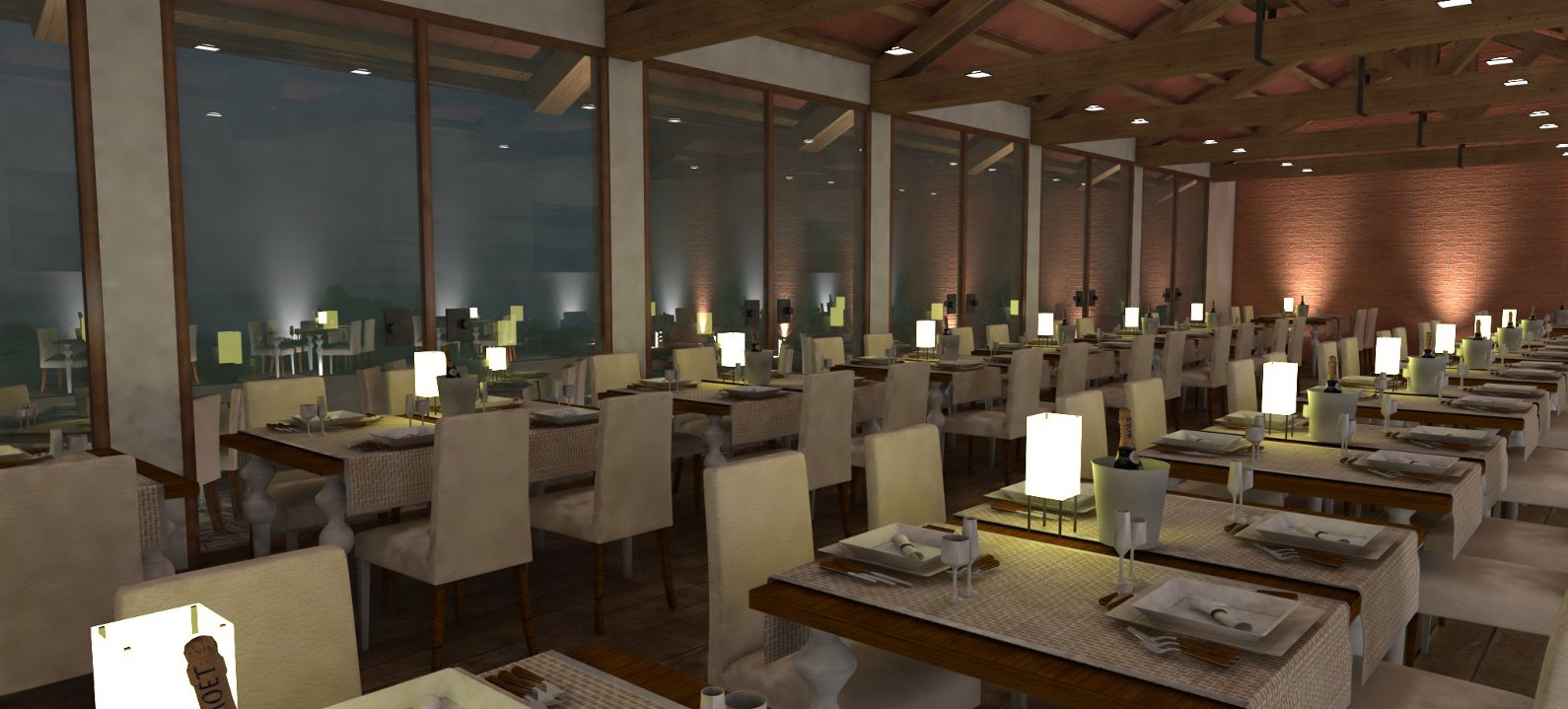
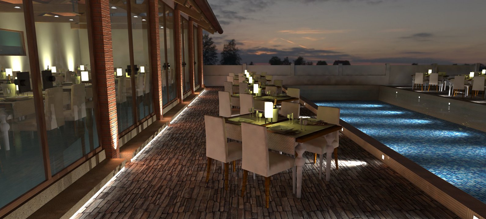
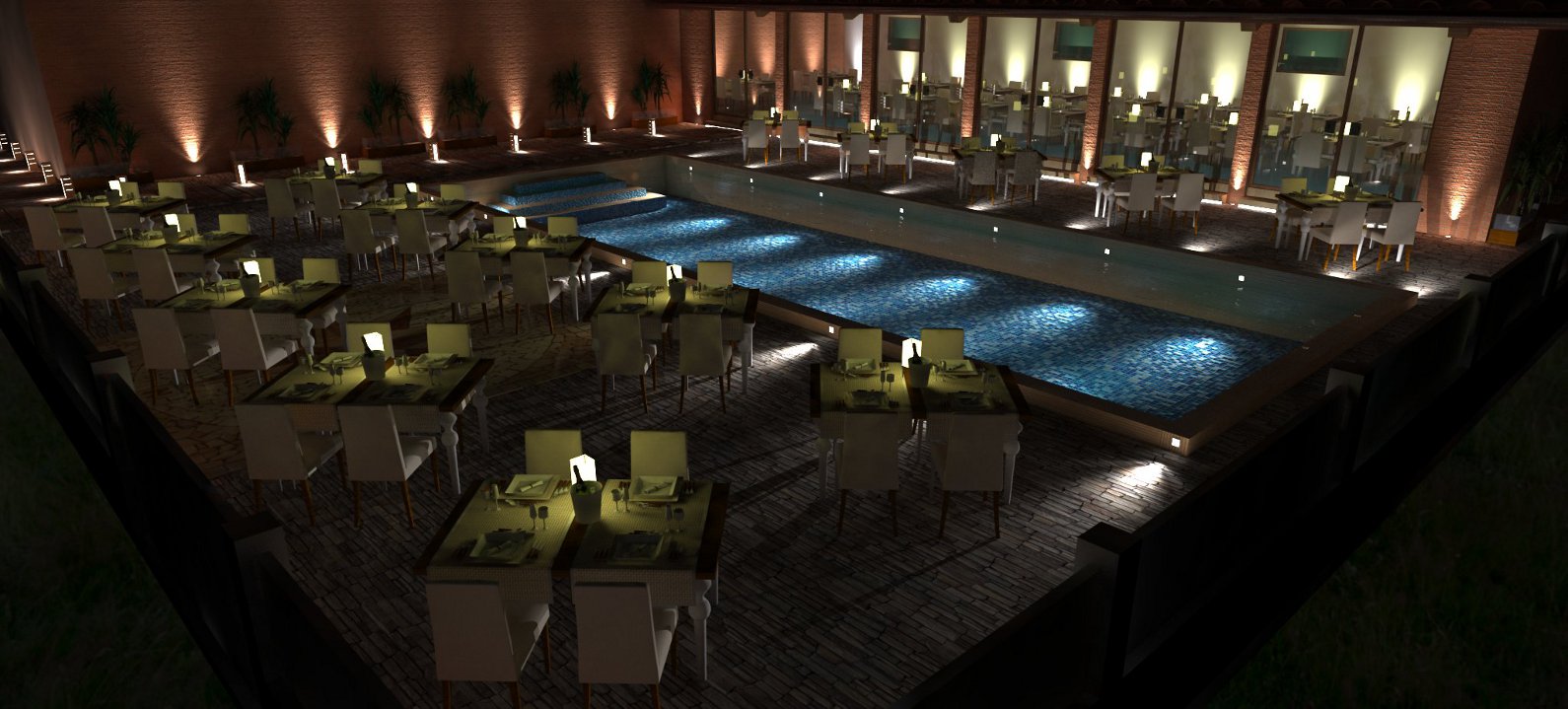
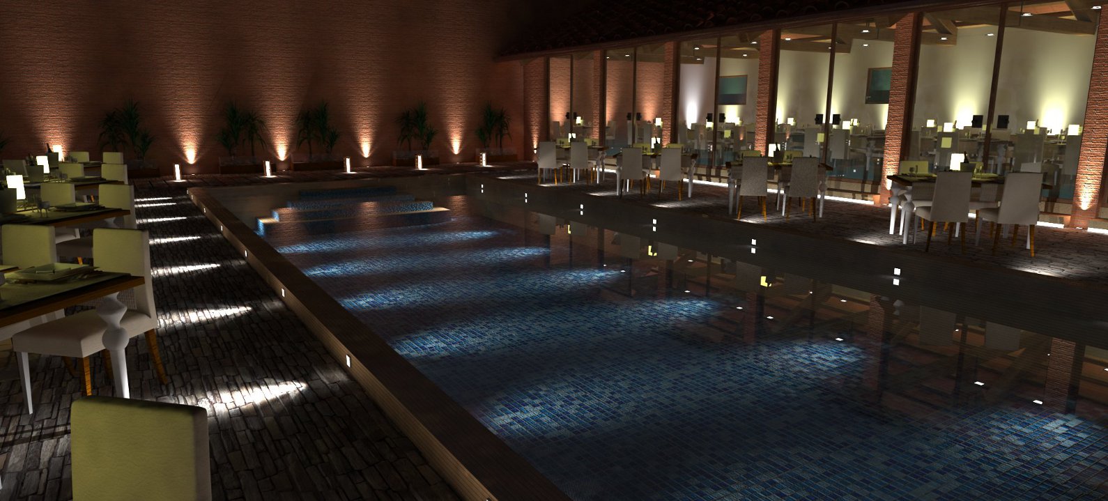
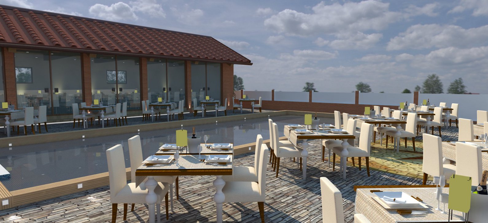
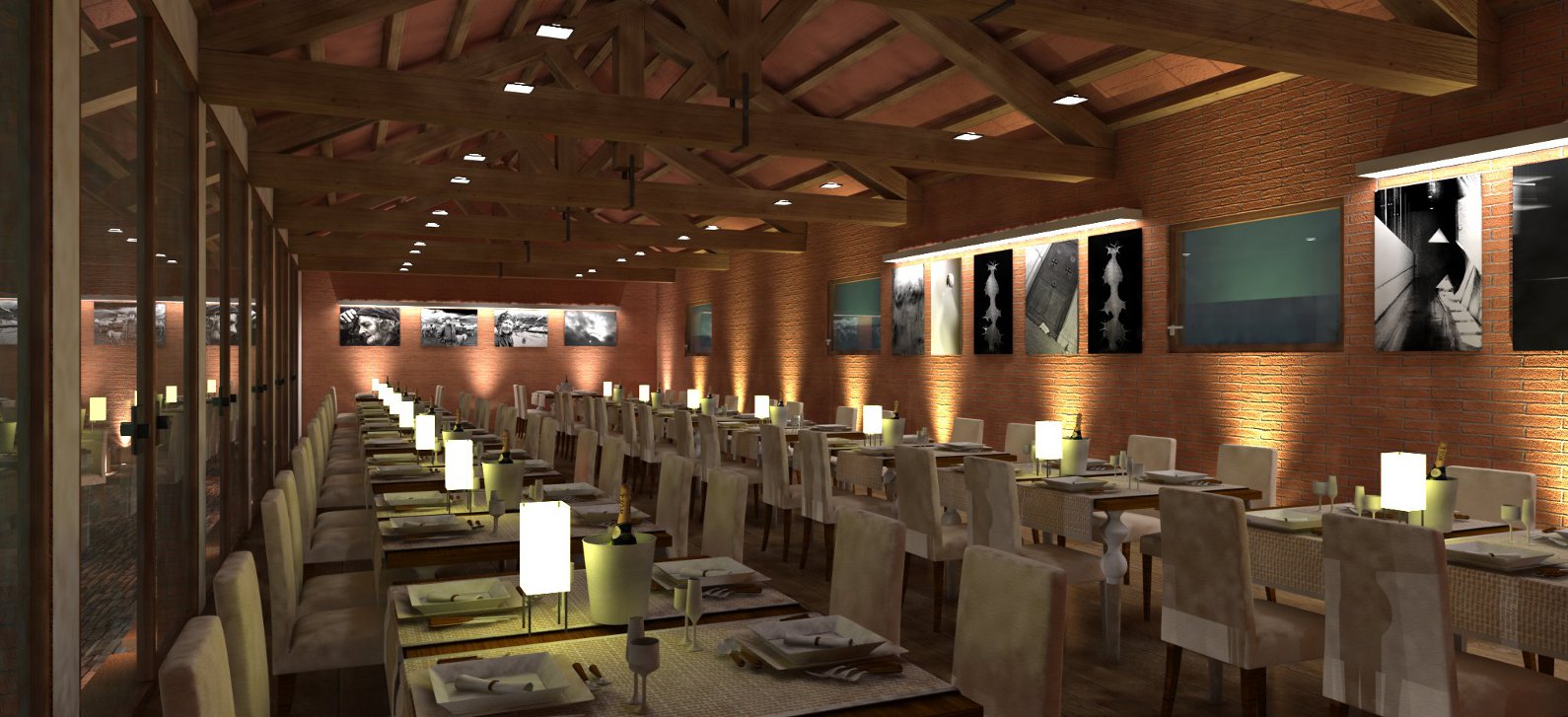
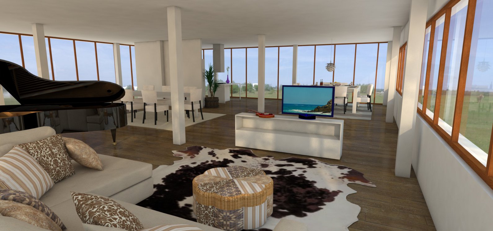
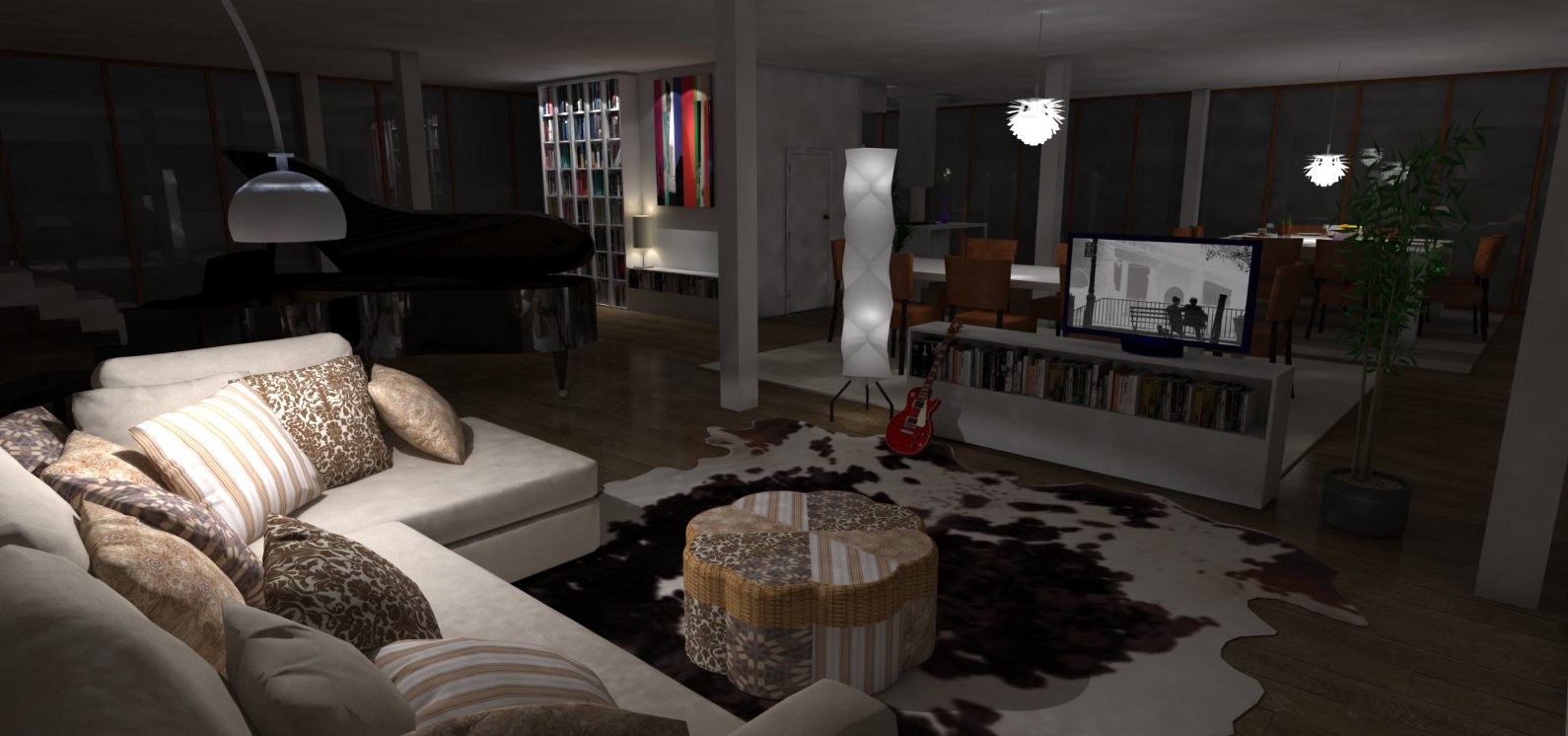
Hi All! I'm new with this forum so I hope I'm choosing the right place to post some of my rndrs so that you can help me in improoving my quality that some times I find not so realistic.
I'm working a lot after these but still I'm not getting better.
My problems are mostly about lights.
When I use emissive materials I usually get noise on white walls.
about glasses and caustics I'm having troubles so I don't see any..
Here some pics, thanks for your time!
-
I think you should tell us which engine you use, then maybe someone will have some tips.
-
I'm using V-ray for sketch up 8
-
Looks great... I can't offer anything. Photo-Realistic.
-
Tnxs! where can I see yours? (sorry I'm new, you probably already posted some)
-
Who me? I don't do Renders except a few test... No one pays me to do it. But you can see my models on my company facebook or my website there's a link in my signature.
-
I need help overcoming my inferiority complex after seeing these renders.
One thing: the water in the night/evening scenes looks 100 % transparent.
I can't see the surface, that's right below the spotlights.
But I suppose it's because the water is completelly still... -
@adorno said:
I need help overcoming my inferiority complex after seeing these renders.
One thing: the water in the night/evening scenes looks 100 % transparent.
I can't see the surface, that's right below the spotlights.
But I suppose it's because the water is completelly still...I'm afraid that the real problem is that I can't really manage water reflexion in a proper way. anyway thanks for apreciating. I'll look for some tutorials for water!
-
If I can be even more annoying; a few things that look odd:
1: As mentioned the bottom of the pool stands out perfectly as if the water doesn't distort your view at all.
2: The glasses are meant to be glass, right? Instead of green plastic. Glass would look even better, and the champaign cooler could be shiny metal.
The green lamp on the table makes everything on it look like green plastic.3: The square boxes shadow effects look strange. I'm guessing they come from the legs of the chairs, but it doesn't look right somehow. Maybe increase shadow quality in V-Ray.

-
@adorno said:
If I can be even more annoying; a few things that look odd:
1: As mentioned the bottom of the pool stands out perfectly as if the water doesn't distort your view at all.
2: The glasses are meant to be glass, right? Instead of green plastic. Glass would look even better, and the champaign cooler could be shiny metal.
The green lamp on the table makes everything on it look like green plastic.3: The square boxes shadow effects look strange. I'm guessing they come from the legs of the chairs, but it doesn't look right somehow. Maybe increase shadow quality in V-Ray.
So preciuos!, thanks.
Details meke the difference, thanks for telling
Tommaso
-
If YOU need help, than I'm hopeless.

Nice renders.

-
I have a tiny sugestion to enhance the quality of your darker pictures. In Vray Options>DMC Sampler, in Noise Threshold try 0,005 and Subdivs Mult about 10 or 20. I found that really helpful witht those nasty blotches you can find in flat surfaces, although it may slow your rendering time!
Also, in Options>Camera, maybe you could decrease the time of Shutter Speed and increase in Film Speed (ISO), so the picture is lighter.
They look really nifty! Definately loving the backgrounds. But it would be super if you did those things Adorno mentioned! Great work -
You create images like this and you think you need help? Based on my few attempts at rendering, I need therapy!
-
@hellnbak said:
You create images like this and you think you need help? Based on my few attempts at rendering, I need therapy!
Oh great, then I'm really beyond help.

-
Dude, try SU options editor then go Irradiance map change HSph. Subdivs. default is 50 make it 100 or higher.
 the higher HSph. Subdivs. the longer the rendering time.
Hello! It looks like you're interested in this conversation, but you don't have an account yet.
Getting fed up of having to scroll through the same posts each visit? When you register for an account, you'll always come back to exactly where you were before, and choose to be notified of new replies (either via email, or push notification). You'll also be able to save bookmarks and upvote posts to show your appreciation to other community members.
With your input, this post could be even better 💗
Register LoginAdvertisement


