sketchucation logo sketchucation
    • Login
    ℹ️ Licensed Extensions | FredoBatch, ElevationProfile, FredoSketch, LayOps, MatSim and Pic2Shape will require license from Sept 1st More Info

    External cafe watercolours
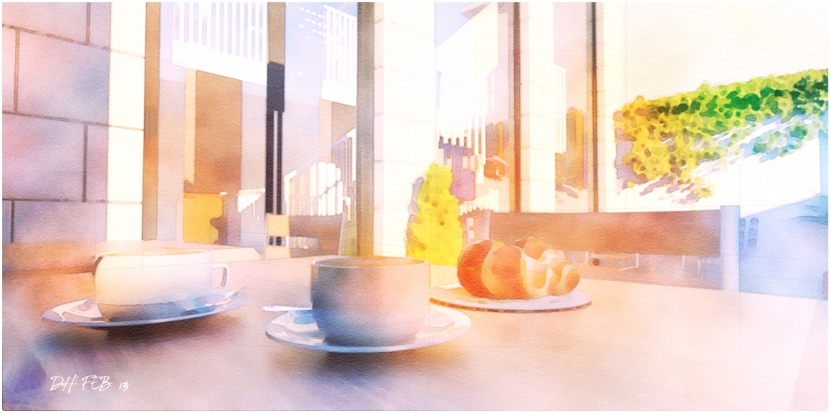
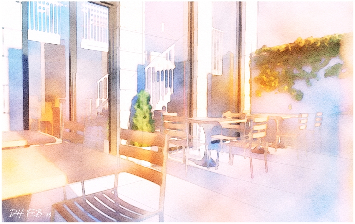
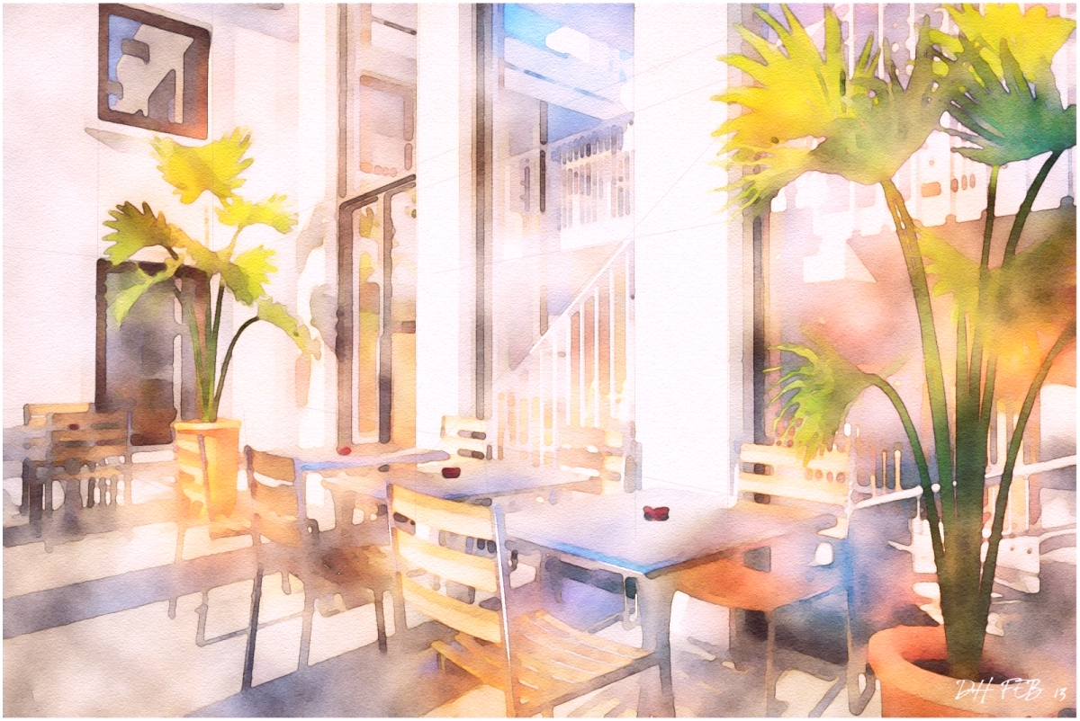
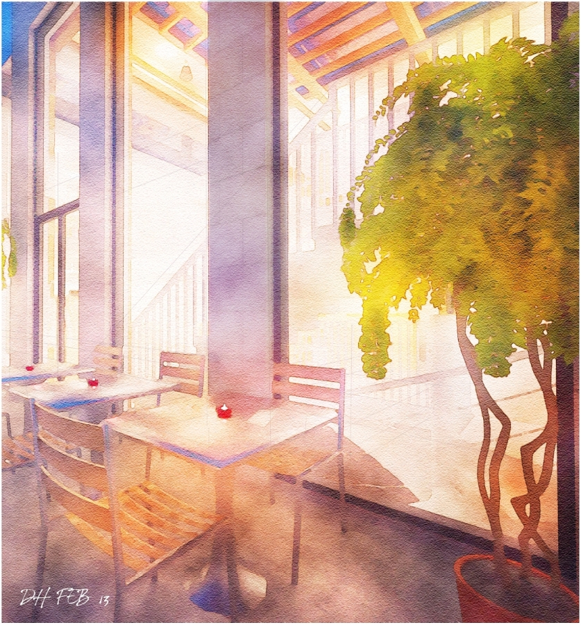
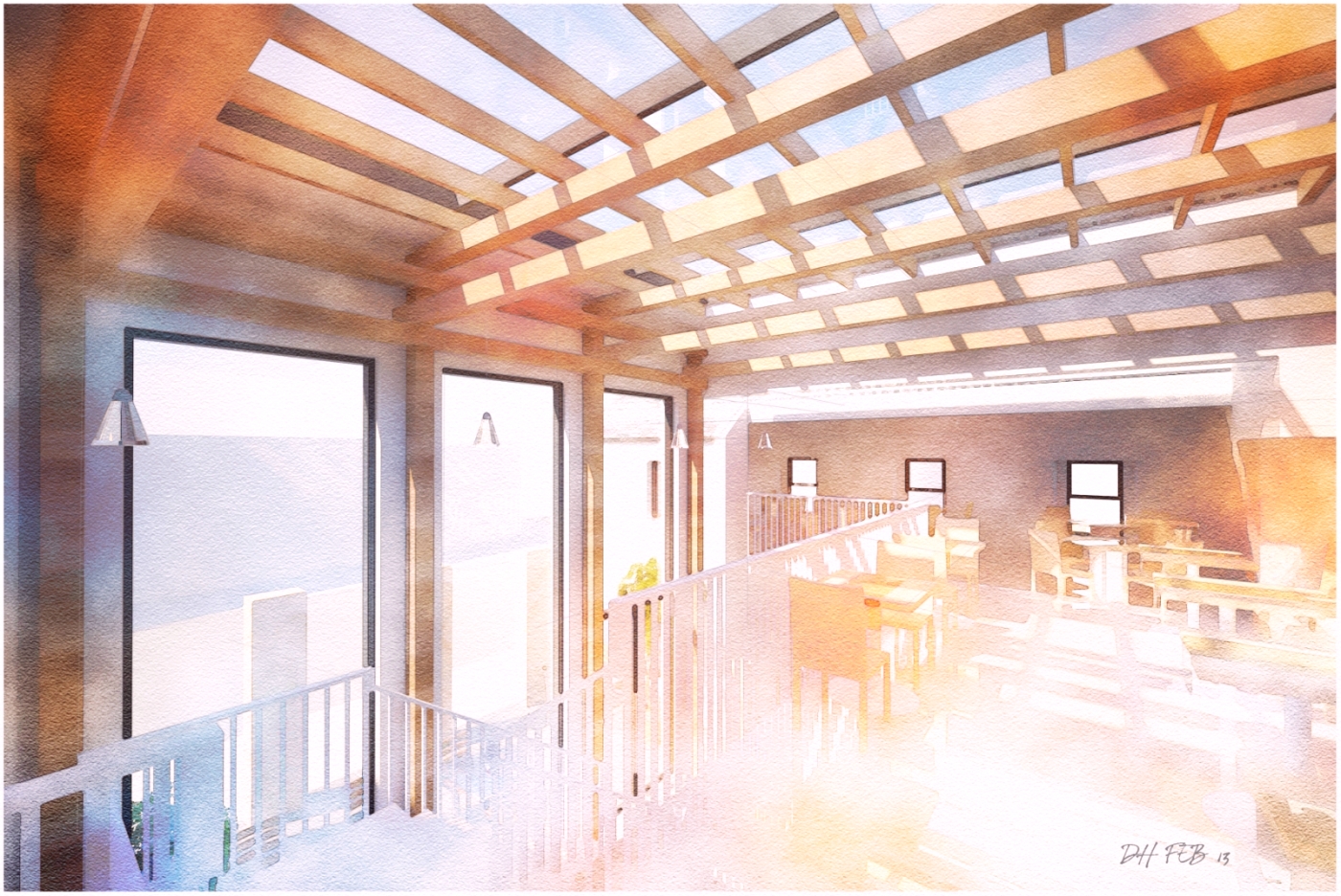
    Scheduled Pinned Locked Moved Gallery
    15 Posts 9 Posters 447 Views 9 Watching
    Loading More Posts
    • Oldest to Newest
    • Newest to Oldest
    • Most Votes
    Reply
    • Reply as topic
    Log in to reply
    This topic has been deleted. Only users with topic management privileges can see it.
    • Rich O BrienR Offline
      Rich O Brien Moderator
      last edited by

      That's not FotoSketcher anyway. It's looks like some custom PhotoShop filter but not like one I've seen. Is it your own creation?

      Is it some type of bokeh overlay using the original image? It's very convincing.

      Sent from my iPad

      Download the free D'oh Book for SketchUp πŸ“–

      1 Reply Last reply Reply Quote 0
      • Rich O BrienR Offline
        Rich O Brien Moderator
        last edited by

        Actually that last image is stunning!

        Whatever you are doing I'd keep it locked in a vault.

        Sent from my iPad

        Download the free D'oh Book for SketchUp πŸ“–

        1 Reply Last reply Reply Quote 0
        • D Offline
          davidh
          last edited by

          Thanks guys,
          The effect is done purely in photoshop using standard filters with colour overlays.Its an effect I have been working towards for quite a while and is probably as close as I can get to a digital watercolour effect .

          1 Reply Last reply Reply Quote 0
          • tademaT Offline
            tadema
            last edited by

            Hello David, your styles just keep getting better...love the tones πŸ‘

            1 Reply Last reply Reply Quote 0
            • soloS Offline
              solo
              last edited by

              These are awesome, I'd be interested in buying your presets if you made them available.

              http://www.solos-art.com

              If you see a toilet in your dreams do not use it.

              1 Reply Last reply Reply Quote 0
              • jarynzlesaJ Offline
                jarynzlesa
                last edited by

                nice project. too much water in your colors for me, but πŸ‘ anyway.

                http://www.vizualizaceschodiste.mypage.cz/

                1 Reply Last reply Reply Quote 0
                • DanielD Offline
                  Daniel
                  last edited by

                  they look great, David.

                  My avatar is an anachronism.

                  1 Reply Last reply Reply Quote 0
                  • RichardR Offline
                    Richard
                    last edited by

                    Again mate, making the rest of us feel VERY inferior. They really do look like real hand works!

                    [BUILTBRAND.COM.AU](http://builtbrand.com.au/)

                    1 Reply Last reply Reply Quote 0
                    • L Offline
                      LUDMILA198
                      last edited by

                      Π₯ОРОШАЯ Π ΠΠ‘ΠžΠ’Π πŸ‘

                      1 Reply Last reply Reply Quote 0
                      • D Offline
                        davidh
                        last edited by

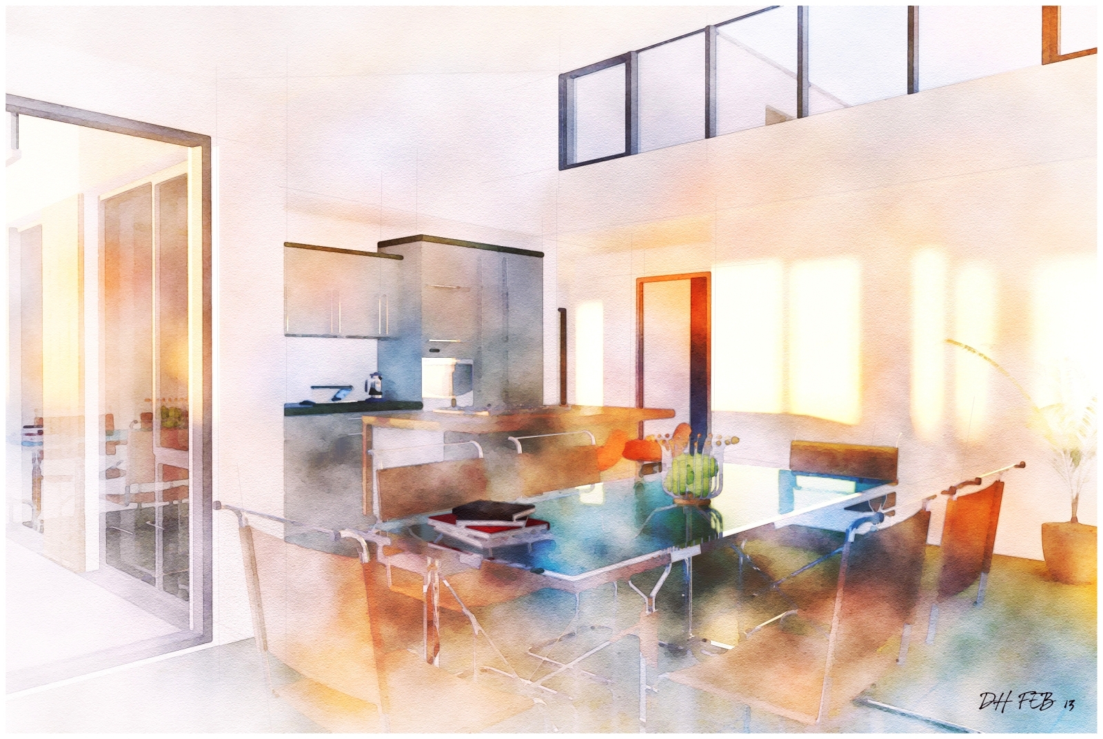
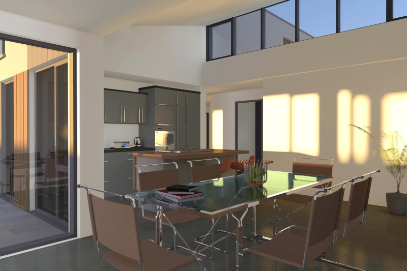
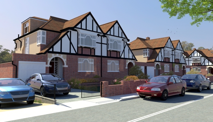
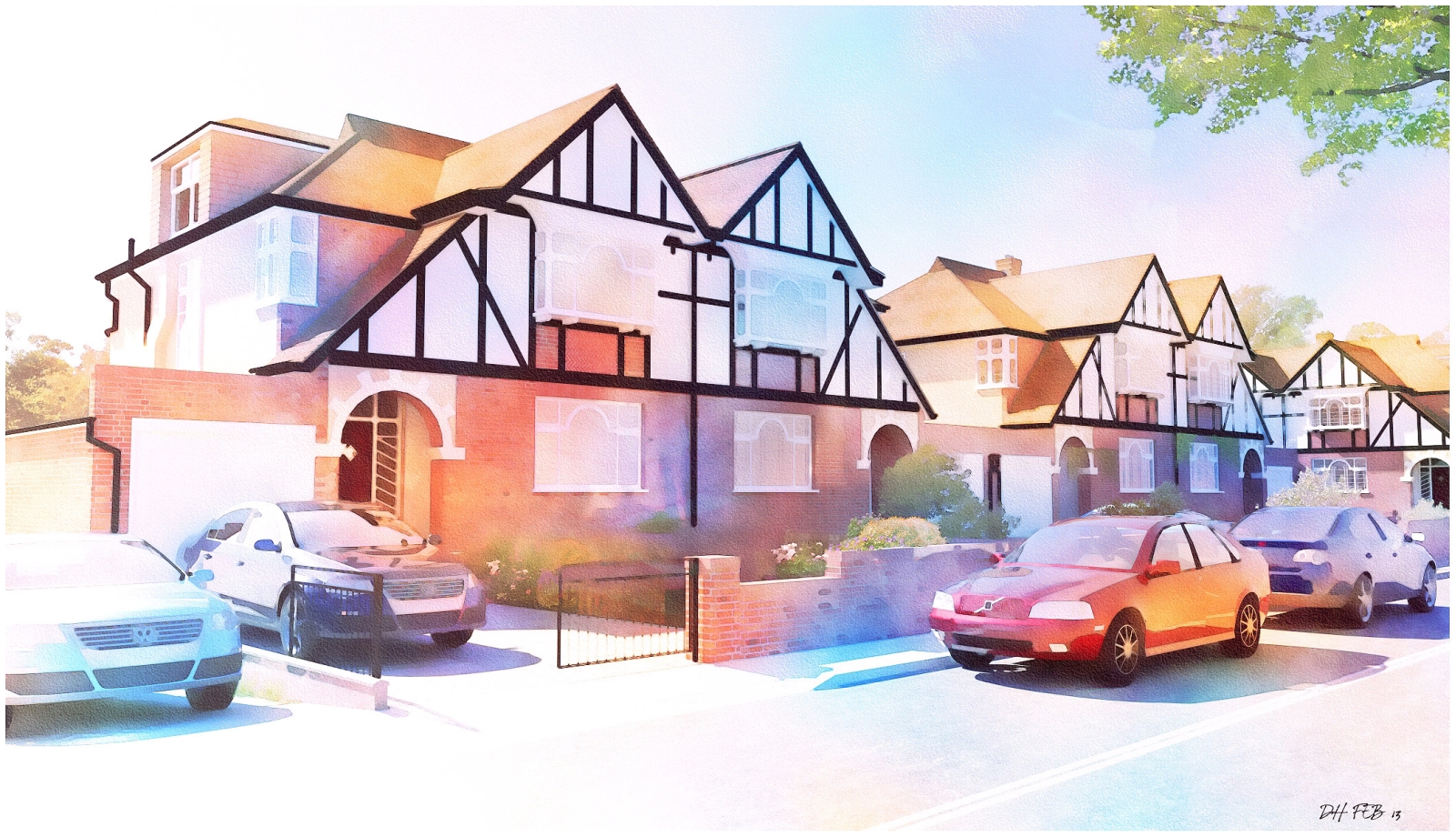
                        2 more based off original Artlantis renders(the original artlantis render for the kitchen is attached).I added faint lines in photoshop using the line tool with a very low opacity in the layer so they dont stand out.
                        I found the key to getting a better final image is to brighten the original render considerably or the result can look quite dark.


                        KITCHEN WATERCOLOUR 2.jpg


                        KITCHEN ORIGINAL.jpg


                        RED ROOM 1.jpg

                        1 Reply Last reply Reply Quote 0
                        • D Offline
                          davidh
                          last edited by

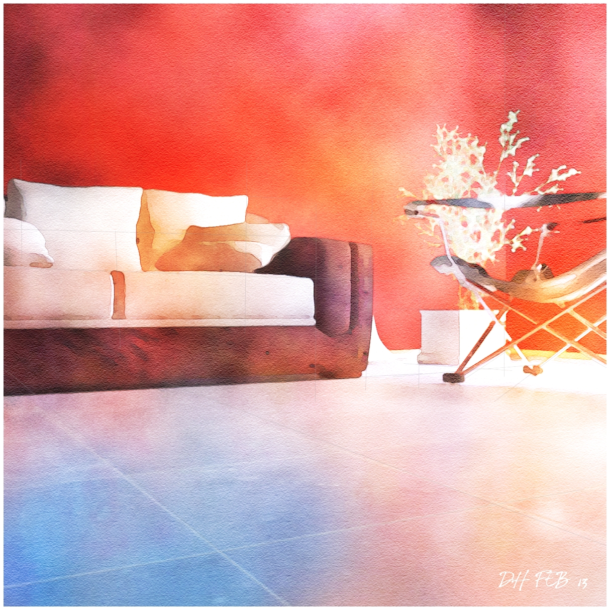
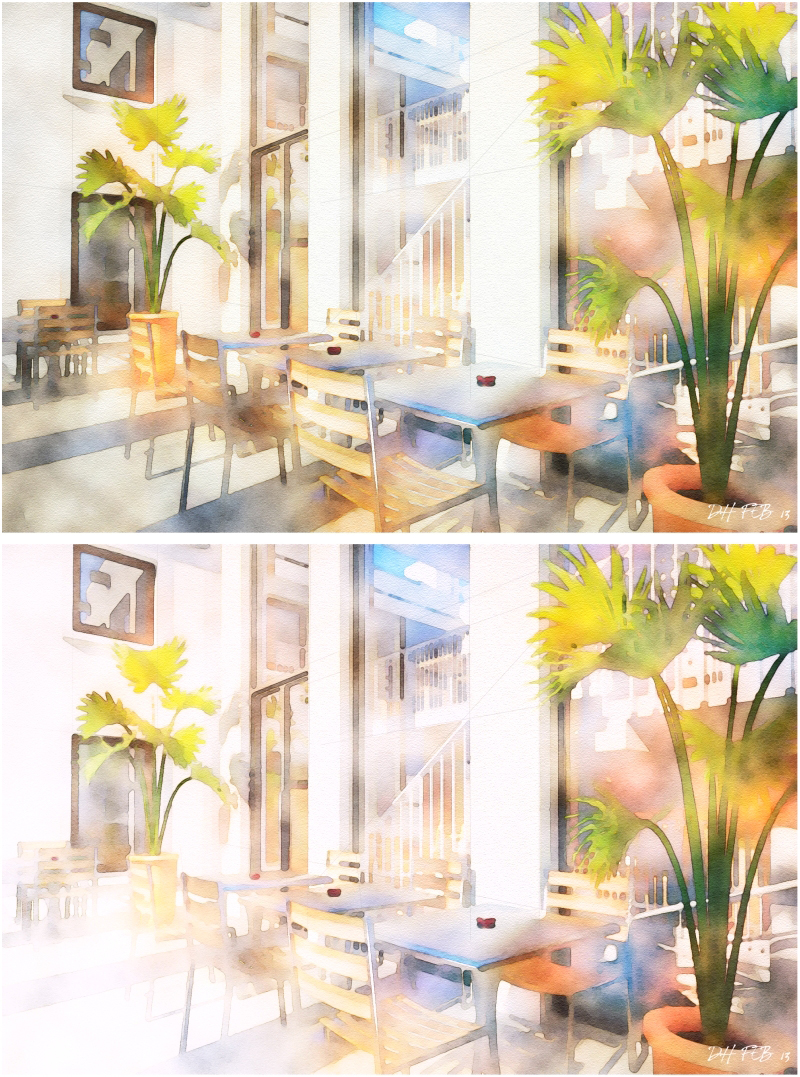
                          Heres an example of how increasing the brightness of one part of the image can really make a difference.Attached are 2 versions of an image I recently uploaded but decided that the original(the top image) was too murky and too busy.
                          I greatly increased the brightness on the left to reduce the murkyness and the image is much better.It also helps give the impression of blank paper,and a more looser,sketcheier feel to the image.


                          CAFE  TABLE WATERCOLOUR 3 compare.jpg

                          1 Reply Last reply Reply Quote 0
                          • D Offline
                            davidh
                            last edited by

                            Here's a streetscape I rendered a while back in Thea.The original Thea render is much darker than the final watercolour so I had to increase brightness and saturation before starting the main process.


                            street 03.jpg


                            WATERCOLOUR STREET BRIGHT.jpg

                            1 Reply Last reply Reply Quote 0
                            • 1 / 1
                            • First post
                              Last post
                            Buy SketchPlus
                            Buy SUbD
                            Buy WrapR
                            Buy eBook
                            Buy Modelur
                            Buy Vertex Tools
                            Buy SketchCuisine
                            Buy FormFonts

                            Advertisement