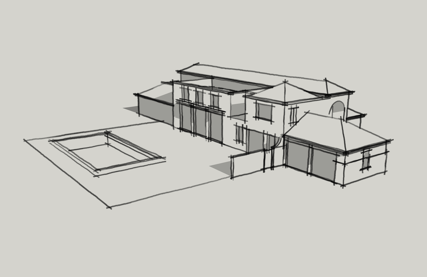
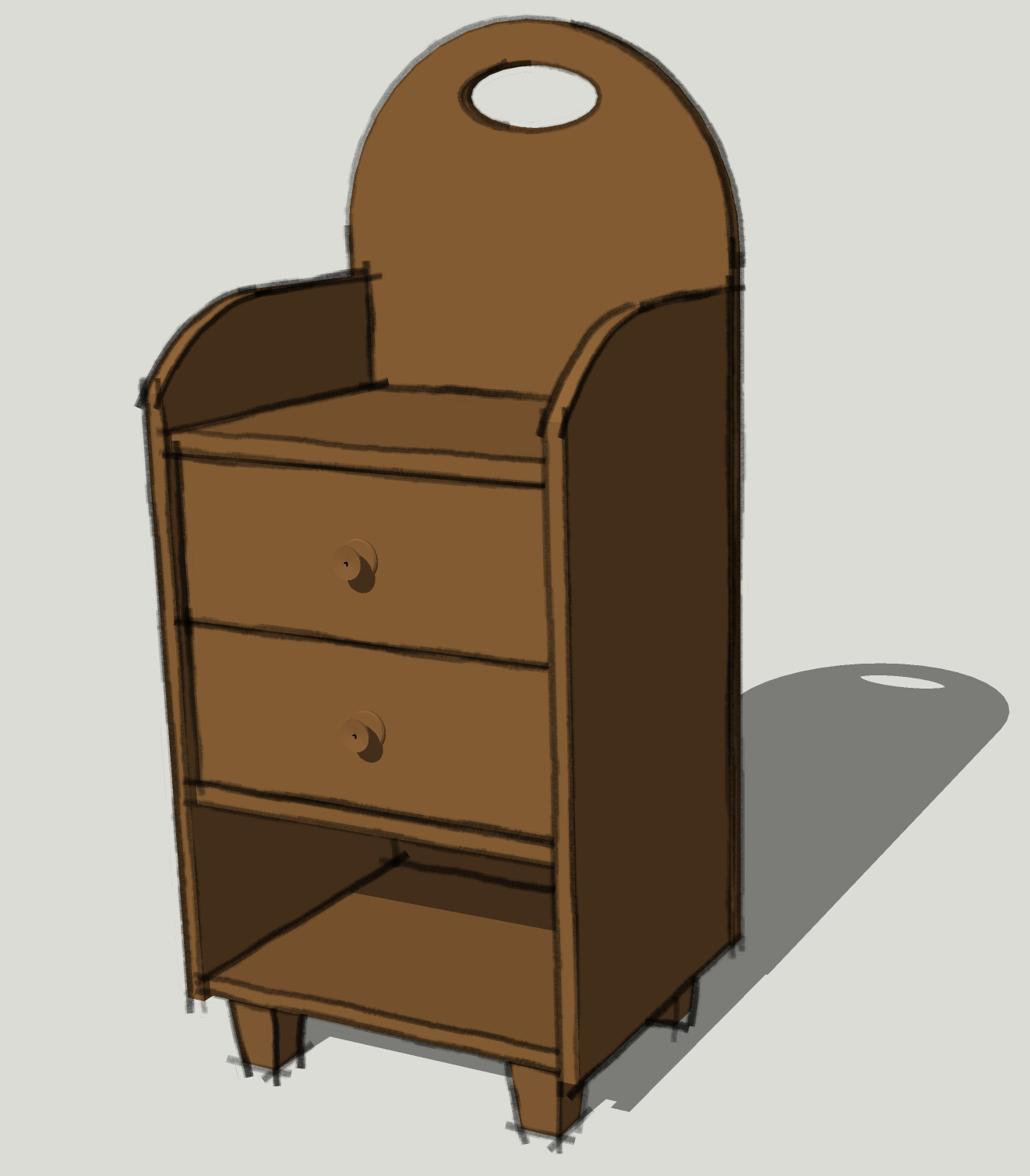
[STYLE] Faded Marker
-
-
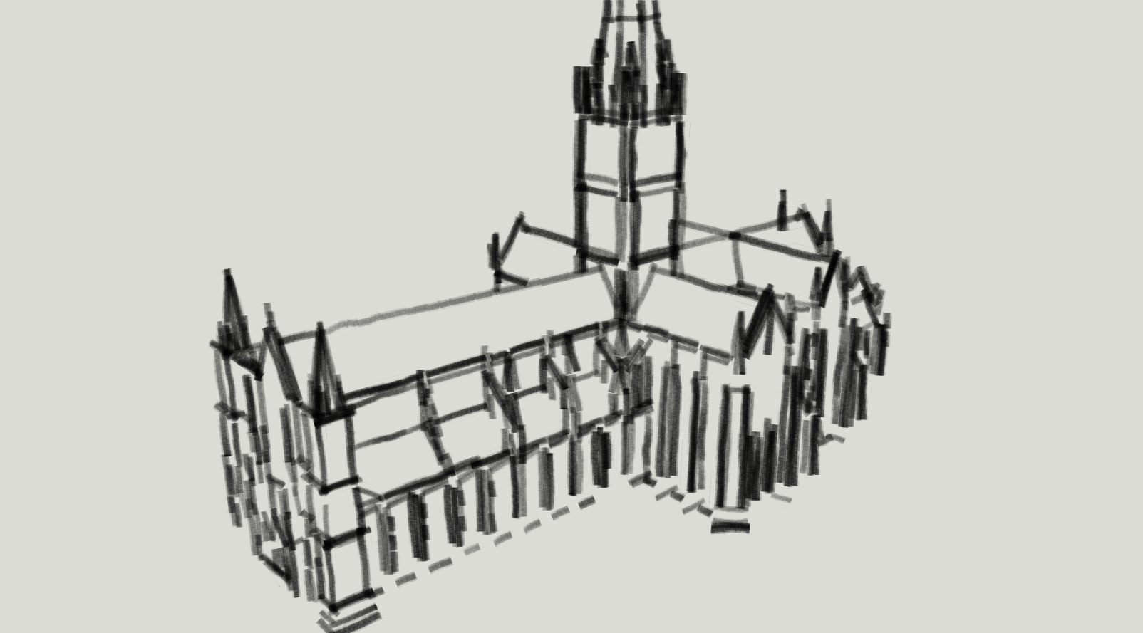
Thank you for sharing your fantastic styles. Here a little church example (exported at w=3000px) ...

-
Hi Carsten. Thank you.
That looks great. It's a good example of how a style's appearance can be influenced by the export size.
-
Styles in Sketchup is an astonished function!

With a model found on the Net -
Good work, sir.
-
This can't be considered as "a work" because it's just select a style and press a button!

Your research of new styles, yes that is real work!

-
Yes I find about 3000w is good for this sort of scale. Good for massing study. Also somehow soothing when you feel like modeling has been niggling everything down to tic's eyelash to keep it clean.

-
Peter, that's very nice. Most of the styles I've created seem to look best in the 3000 to 5000 px wide range. I tend to lean toward thinner lines. I thought this one looked kind of neat at screen size, too.
I like seeing what others get when they use my styles.
-
Dave, thank you.
-
Another example...

Hello! It looks like you're interested in this conversation, but you don't have an account yet.
Getting fed up of having to scroll through the same posts each visit? When you register for an account, you'll always come back to exactly where you were before, and choose to be notified of new replies (either via email, or push notification). You'll also be able to save bookmarks and upvote posts to show your appreciation to other community members.
With your input, this post could be even better 💗
Register LoginAdvertisement


