[STYLE] Chalk
-
Sweet.

-
Hi Dave,
That's a pretty nice one. I thought it needed more dust (the chalkboard is so clean) i mixed it with some watermarks in other styles. I'd send a copy, but as we went over before, I can't save styles.
Peter
-
Very cool, Peter does have a point about a few swipe marks for good measure.
-
 I like it
 -
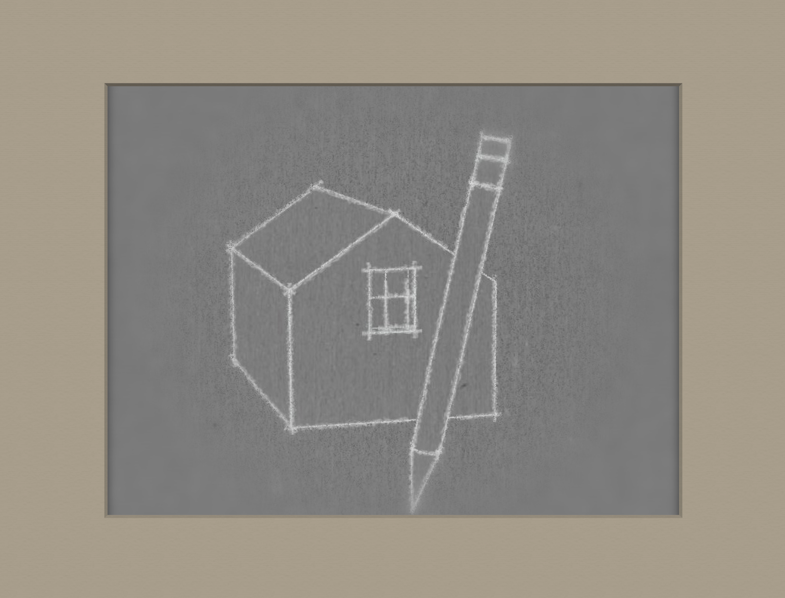
Dave keeps churning these out. As I mentioned I am styles challenged or just challenged in general... Here is a picture of a style ( I sent the file to Dave).
I thought it needed a bit more solidity and this is an overlay of (native) white edges added in GIMP.
It's a fun style to draw in, though you could go blind trying to be accurate.

I'd like to see a style that had the pink, cyan, and blue chalk we used to have.
and I think a background like Pete shows with more irregular eraser marks is best.
-
Thanks for sharing!
-
Thank you, all.
I agree with the need for something other than the dark gray background. Actually I've been there, done that.

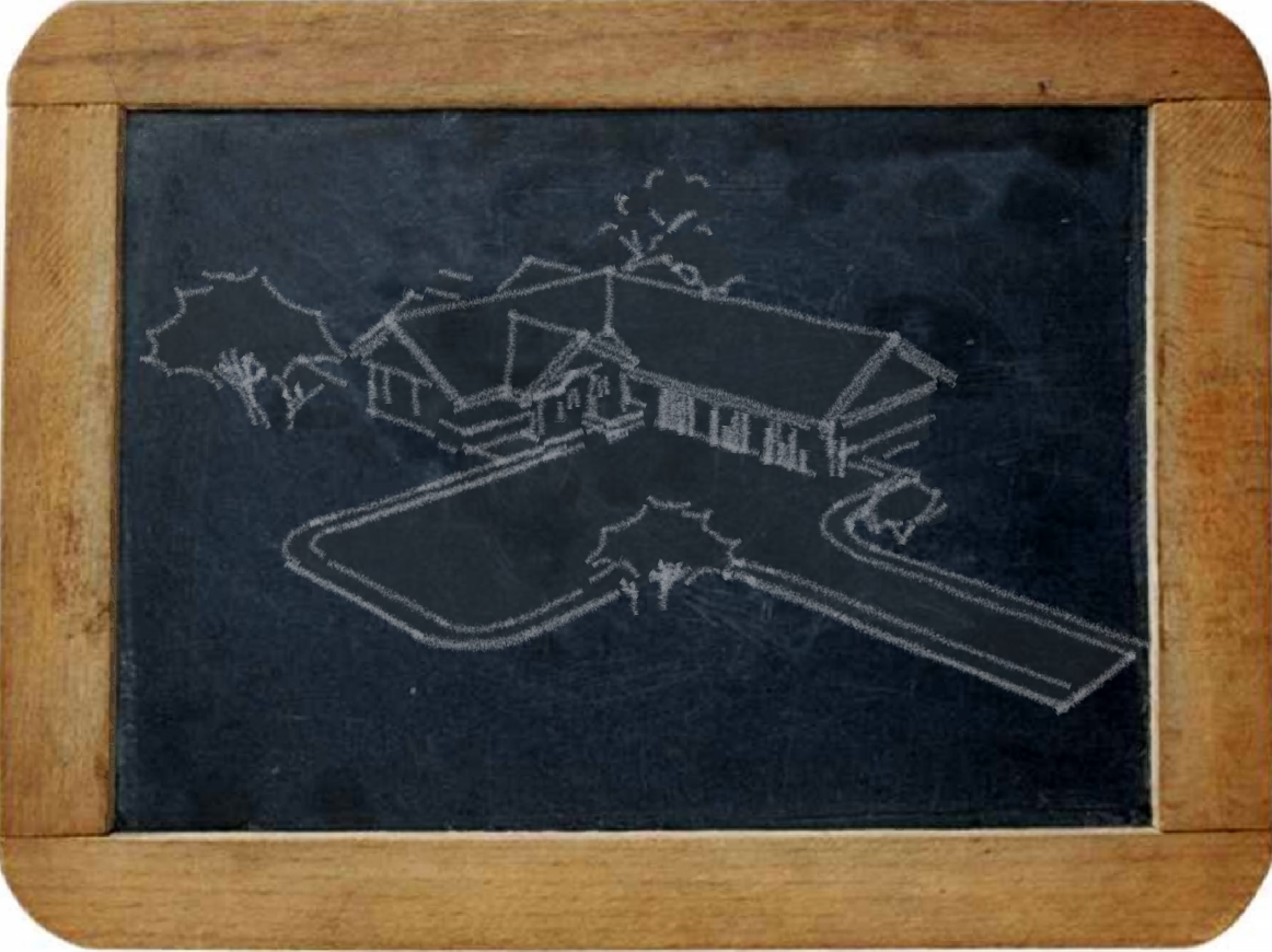
The date on the original style file is August or 2008. (I did use my new chalk lines with it for this image, though.It's not the greatest chalkboard image and if I could find a better one I'd add it.
Peter, it's not quite the same but you can have red, green and blue chalk lines.
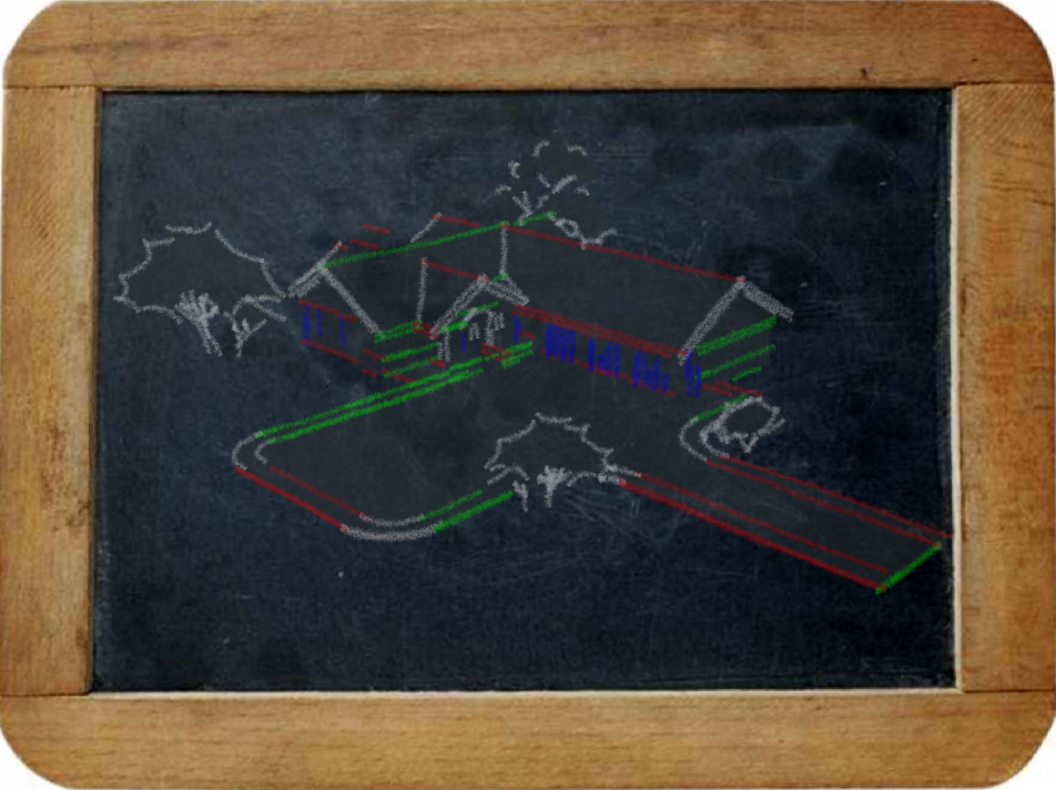
And you could apply pink, cyan and blue to edges in the model and set the line color to By Material. Or, you could export three separate images with the line colors set as desired. then overlay them in PS and erase the edges in the wrong colors. Not the same, though.
Oh, and I haven't received your file yet, Peter. I wonder where it went.
-
So I found a nice chalkboard image this morning. Here's what I get.
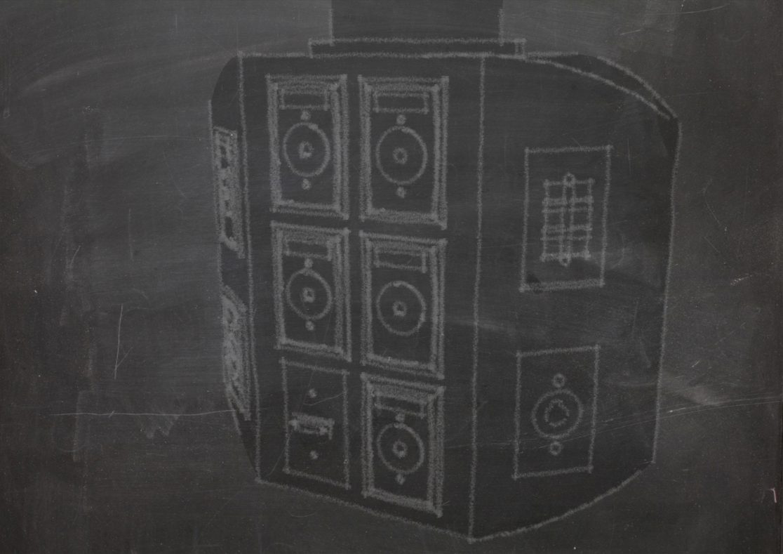
In this image I used the chalkboard as a watermark. In order to get it to show at all on the model you have to create an overlay so there are essentially two copies of the image; a background and an overlay. The opacity slider for the overlay has to be set more toward the image side so the lines of the model get washed out.
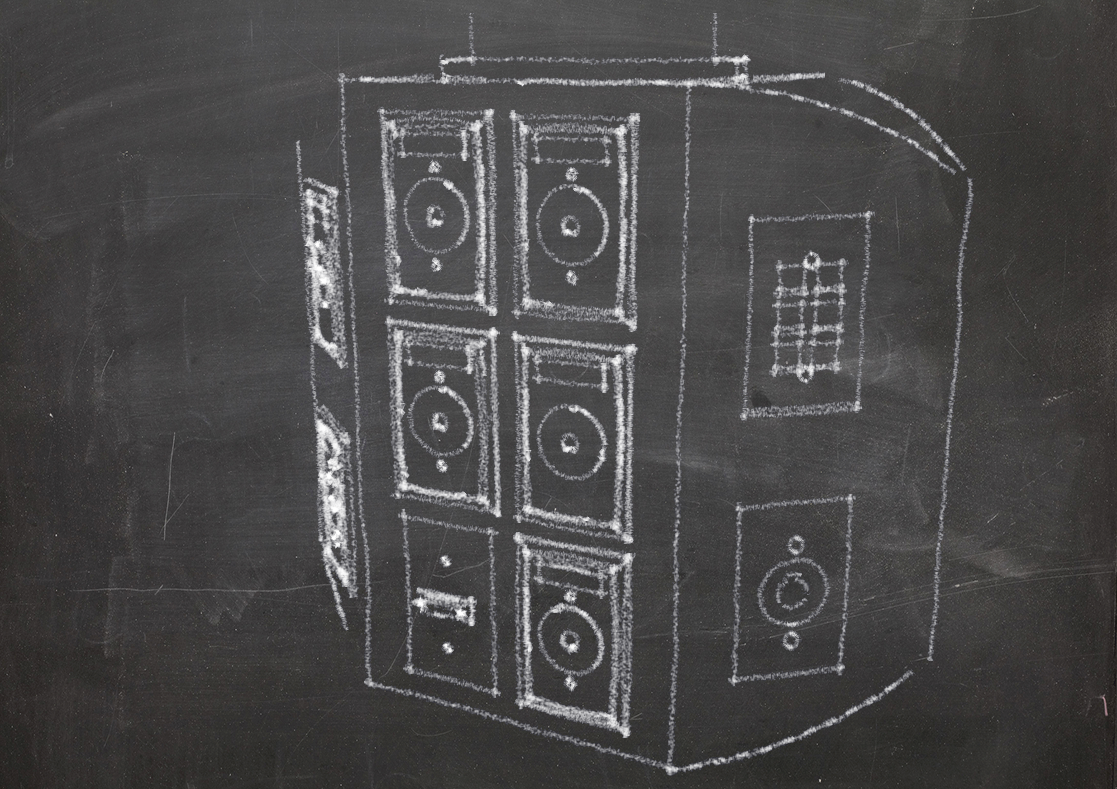
Now, in this image I used PhotoShop to combine the chalkboard with an image exported using the chalk style from above. I think it looks much more like a drawing on a chalkboard.
Although it simpler to just have a style with a watermark and export the result, combining the two images outside of sketchUp gives a better result.
It would be great if we could have a face style option that is a cross between wireframe and hidden line so that the background would show through the model but you wouldn't see what should be hidden lines.
-
@dave r said:
...
[attachment=2:250knhs9]<!-- ia2 -->Chalk2.png<!-- ia2 -->[/attachment:250knhs9]
The date on the original style file is August or 2008..............Yes Dave, 4 years ago
 ...
...
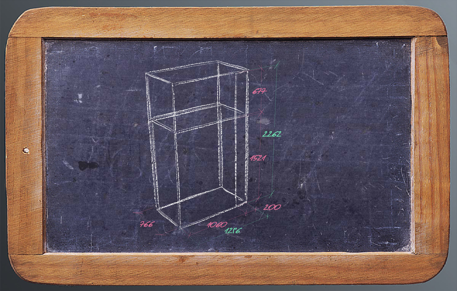
http://sketchucation.com/forums/viewtopic.php?f=40&t=11355

[attachment=0:250knhs9]<!-- ia0 -->desk2.jpg<!-- ia0 -->[/attachment:250knhs9]
-
Very nice. I loved colored chalk.
Thank you Dave.
Hello! It looks like you're interested in this conversation, but you don't have an account yet.
Getting fed up of having to scroll through the same posts each visit? When you register for an account, you'll always come back to exactly where you were before, and choose to be notified of new replies (either via email, or push notification). You'll also be able to save bookmarks and upvote posts to show your appreciation to other community members.
With your input, this post could be even better 💗
Register LoginAdvertisement


