NPR church
-
So many great NPR images in the last weeks, so I have to try one for myself... it's a church I have created for Google Earth.
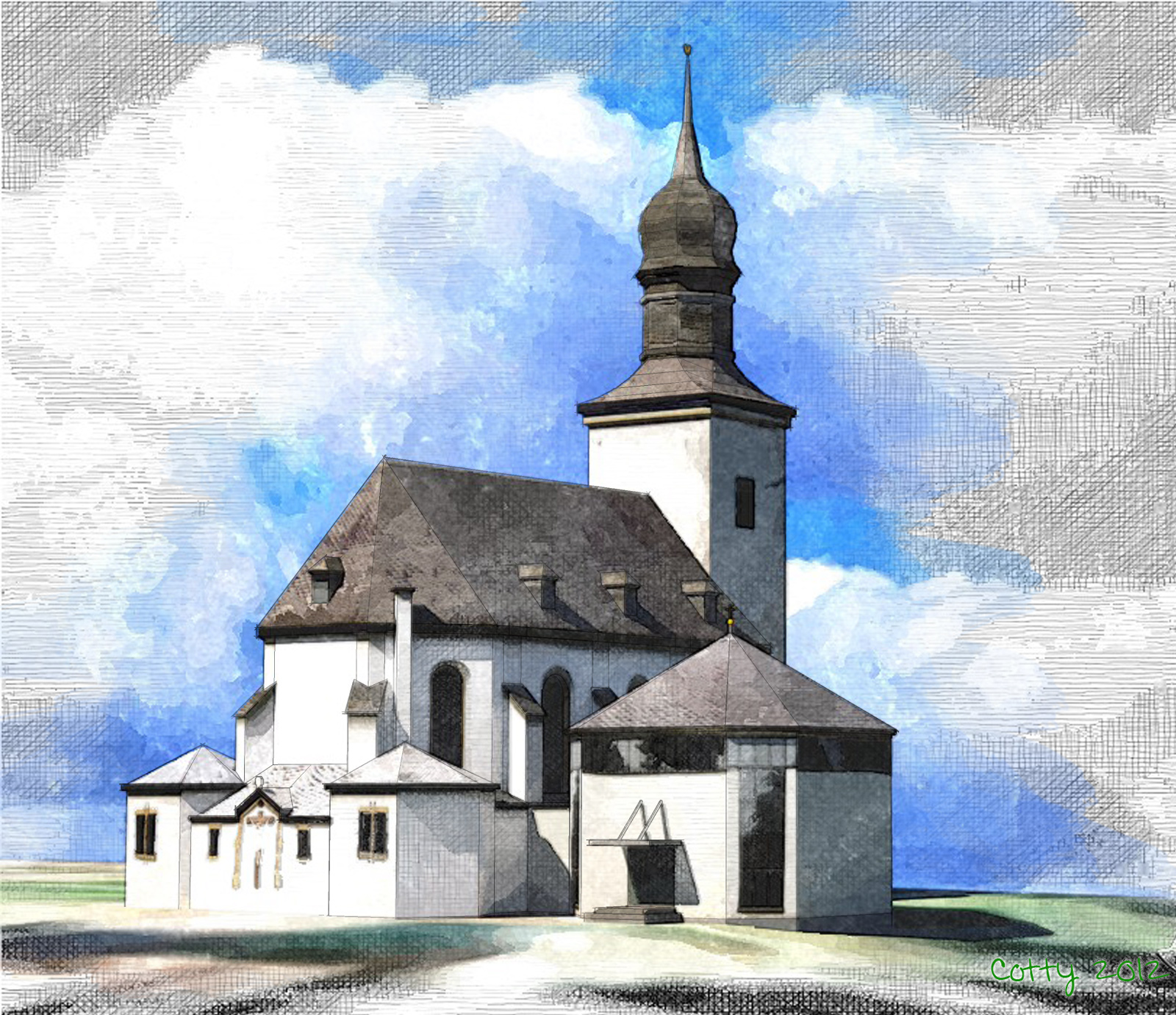
-
Very nice cotty..well done

-
Absolutely beautiful... great work! I especially like the blue sky peaking through acting as an aura highlighting the building. Where is this church?
-
@allanx said:
Very nice cotty..well done

I probably didn't tried it without your wonderful examples, so this compliment means a lot to me, thank you!
@wtrouser said:
Absolutely beautiful... great work! I especially like the blue sky peaking through acting as an aura highlighting the building. Where is this church?
You can watch it (besides the 3D Warehouse link in the first post) in Google Earth...
-
Wonderful example...what's your workflow?
Jim -
O yes, all thumbs up! I'm adding myself to the workflow question. It would be nice if we would always share some general workflow info, like software used. Except sketchup of course
 . I wonder if some of you guys use tablets for post production for example?
 -
Thanks for your comments! Here is a brief overview of the used workflow...
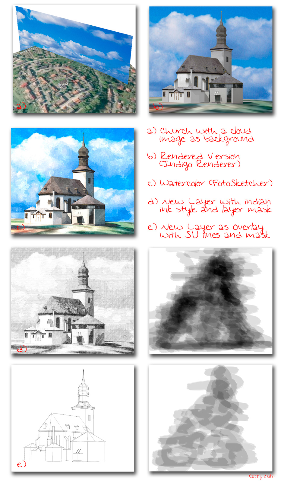
-
great work cotty, nice composition and I like the color palette... thanks for sharing your workflow
best
V -
Thnx for your workflow explanation..much appreciated

-
Yeah, thanks cotty. I've got a question to it - what is the advantage of using a plane with sky mapped on it instead of just a background sky? I can think of maybe a bit more control over it, but any other?
-
@unrealviz said:
Yeah, thanks cotty. I've got a question to it - what is the advantage of using a plane with sky mapped on it instead of just a background sky? I can think of maybe a bit more control over it, but any other?
I simply only used it this way and never thought about an alternativ way

-
Thank you for explaining the workflow.
This was very usefull!
-
Last week at Basecamp we ran into a lot of people who were interested in NPR renderings.
I took your church and ran it through our Soft Shadows and Sketchy Shadows stuff since it makes a good example of Sketchy Shadows from our NprTools add-on.
Here is the Church, in SketchUp, with a Sketchy Edges style - the shadows sometimes seem harsh with Sketchy Edges:
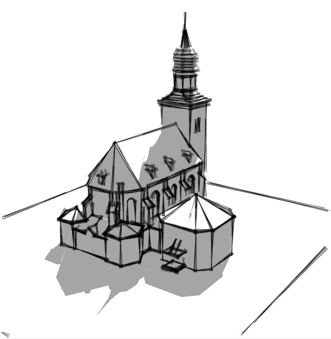
We then create a "soft Shadow" image:
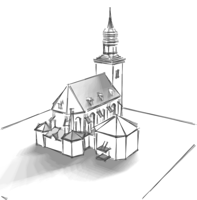
This is not as much "rocket science" as we like to pretend. What we do is change the date and time, save several shadow images, and then merge them all together. You can get a smoother soft-shadows image by requesting more intermediate shadow images. However, for Sketchy Shadows - the next image - it actually works better with a coarser soft-shadows image.
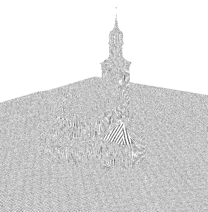
This next part, Sketchy Shadows part, was pretty clever, (I think at least). We replaced all the materials in the entire model with a sketchy hatch pattern, saved that images as well and then blended it with the soft shadows image to create a Sketchy shadows effect.
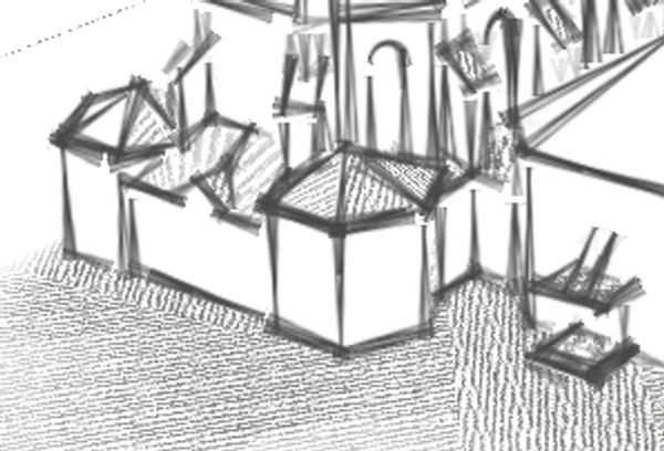
Note how that placing the sketchy pattern materal on the SketchUp model causes the hatch lines to be at different angles for different surface planes. You can get a similar sketchy shadow effect just using a watermark applied over the image. But I think that having the hatch patterns at different angles makes a better effect.
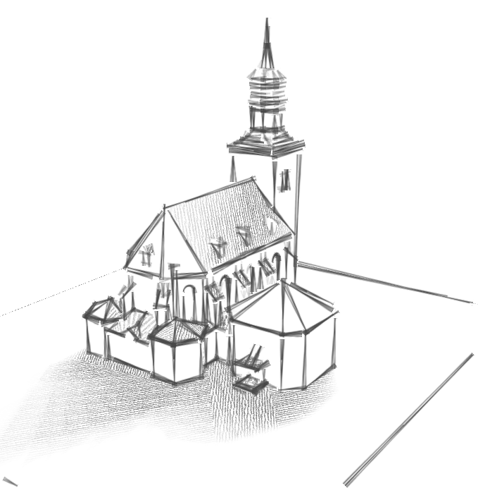
Here is a zoom of part of the image so you can see the patterns better:
Here is the model with hatch on all surfaces which was then merged with the shadow images. (This is pretty ugly, but I included it for people who want to try something like this themselves.) We actually made two of these images - with the hatch patterns in different directions and then merged them, based on the intensity of the soft shadows image to achieve the cross-hatch vs single line hatch cross-over in the final image.
-
Wow, this is some inspiring workflow! I liked the part about using the date and time to make soft shadows most - very creative.
-
Nice examples of different shadows! One question: is there a reason why the walls in the shadows are not dark anymore when the soft shadows are applied (second image)?
-
@cotty said:
Nice examples of different shadows! One question: is there a reason why the walls in the shadows are not dark anymore when the soft shadows are applied (second image)?
We added an option to show shadows on "shadows and surfaces in shade" or "shadows only"
Basically, with the second option, surfaces which do not face the sun, and wold not be lit by the sun even if nothing else cast a shadow on them, are ignored for the second option.
Here is a Sketchy Shadow version with shadows on "shadows and surfaces in shade".
(Also I changed the scale on the hatch pattern to have more white space between lines)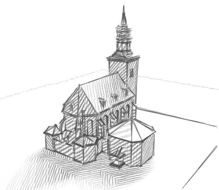
Hello! It looks like you're interested in this conversation, but you don't have an account yet.
Getting fed up of having to scroll through the same posts each visit? When you register for an account, you'll always come back to exactly where you were before, and choose to be notified of new replies (either via email, or push notification). You'll also be able to save bookmarks and upvote posts to show your appreciation to other community members.
With your input, this post could be even better 💗
Register LoginAdvertisement


