Website design for a client - home collection
-
I've just started a website design for a client, project home builder!
This is the first site I've tried to put together myself. I thought I would try squarespace, their new version *6 is aimed at being responsive to use on various hardware (monitor, iPad, smart phone) and for the most it works fairly well, albeit there are a few limitations so the site is designed as best I could to work as we want within those limitations.
It's not complete but for the first few pages (access range / avatar range) are final for now, well subject to feedback and text input!
Please dont blame me for the home designs, all I designed were the floor plans for the studio range. I've done all the renders over the last god knows how many years, so they have changed in style a bit as I dealt with limitations of Maxwell during the time the plugin was a bit "how ya goin"! Would love to redo them all really!
If you look at it on a smart phone you will notice a gap between the header and the start if the text, I've got to ask some tech questions to get around that, it works without the gap if I have nothing but a text header.
Look forward to some thoughts if you could share them! The site is still in trial mode so you have to enter as viewer.
-
Hello Richard, not sure if it's only me but it wont allow me to type the password in!
John -
Hmmm? Thanks John, not sure why that would be? Could have been as I've been working on it!
It certainly looks a stack different than it did when first posted!
Because the site is responsive I've been playing to get the best possible result across both desk and mobile platforms!
-
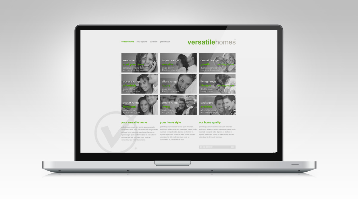
In the interim to the site being live, here are some screen shots.
General page layout
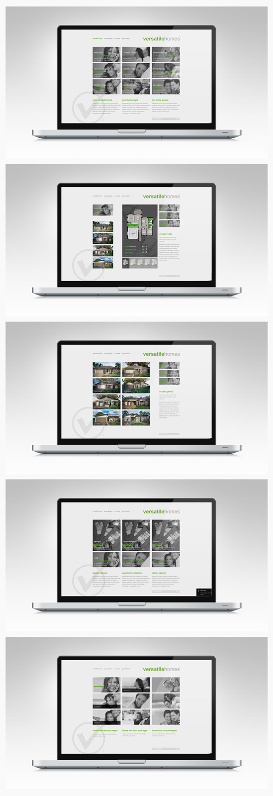
Home page

Home selection page

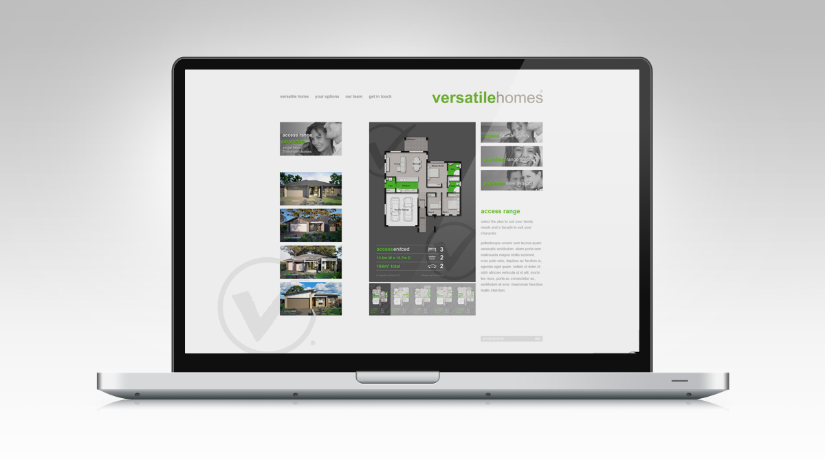
-
Hmmm? seems some bugs in the system
-
I had no problems viewing the site from Chrome on my Mac.
The sites looking good.
Let us know what you think about Squarspace, it looks quite good. -
Hey Richard
No problems with viewing here with Firefox on a Mac
A couple of thoughts:I may well be jumping the gun here, as you may still be at the point of using images as "Placeholders", I can see that is the case with text, so ignore me if I'm off base.
When I look at a page like Options,
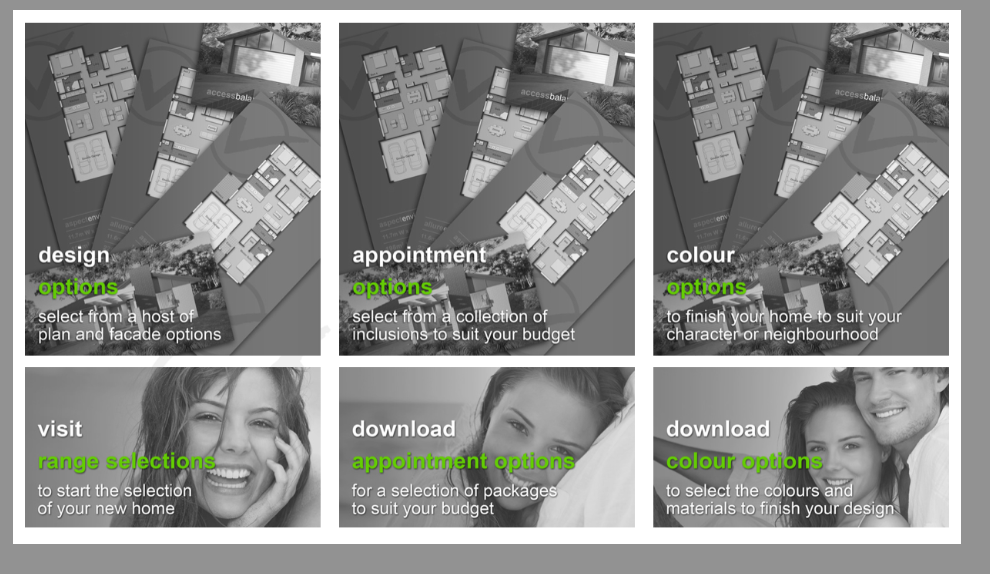 the fact that there is no differentiation between images and text, or perhaps because the images are busy, they tend to dominate, and therefore make the whole page seem like there is too much to view. I find my eye just jumping around, and not coming to the conclusions that I am sure you want me to.
I don't know if it the translucency of the background images, the fact they are the same, or what exactly it is, but I get the feeling you want me to engage in a decision making process, through a series of steps, but I am not getting this communicated graphically.
Since I have always admired your ability to get things done with clean simplicity, I have no doubt in the end this will be a stellar site. -
Thanks dale, mate they are indeed place holders thrown in for a discussion with the client this morning! However the first of those was as proposed and the next two to vary, but you have in the least sparked my thoughts to make them all less messy or dense and at the same to maybe review the use of all images.
One issue that jumps to mind is that the images working as buttons have nothing to differentiate from those that are simple page markers.
Thanks for the prompts mate, I'll review these ideas!
-
Works fine with Opera navigator

Must have a very big screen for don't use the mouse wheel!

Something curious : when you "zoom" a "photo" what is the normal use for "close it" ?
It's close automatically or...
-
Can you enlarge the exterior shots when you click on them? I am using chrome and cannot. I would like to be able to do that.
-
Frenchy! Mate I can easily adjust for smaller screen, I haven't viewed it on a lower res monitor, something I must organise! I really dont like to change my monitor res as it reorganises my desktop icons!
And yes there is no close button for the images when viewed large, this is an oversight in squarespace I think, you just have to click in to blank space!
-
@l_breault said:
Can you enlarge the exterior shots when you click on them? I am using chrome and cannot. I would like to be able to do that.
Thanks mate, you can enlarge the facade images from the facade gallery page, though given your feedback (thank you) I might also do this on the main range page too!
-

I wanted to click on the image for close it, and no think to click outside!
And must learn some latin words

-
Hey Frenchy! I found this from a post on the PPB:
Brilliant in browser tool for viewing websites in different browser sizes and portable devices!!! It's unreal!!
-
Thank you all for the valuable feedback the site has gone live! Now I just need to get cracking on all the downloadable content!
[url]
http://www.versatilehomes.com.au/[/url] -
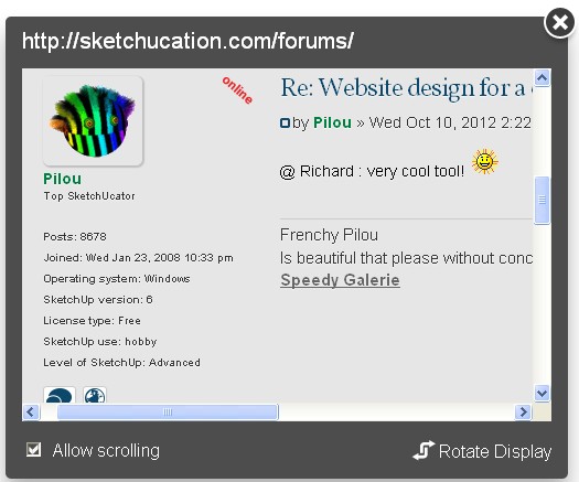
@ Richard : very cool tool!

here on Iphone!

-
With abyss trick

Always Iphone...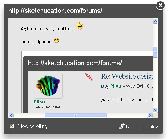
Hello! It looks like you're interested in this conversation, but you don't have an account yet.
Getting fed up of having to scroll through the same posts each visit? When you register for an account, you'll always come back to exactly where you were before, and choose to be notified of new replies (either via email, or push notification). You'll also be able to save bookmarks and upvote posts to show your appreciation to other community members.
With your input, this post could be even better 💗
Register LoginAdvertisement


