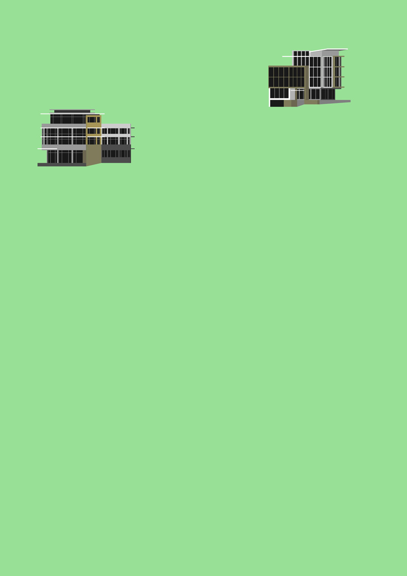
Compilation of designed works - poster WIP
-
So decided to do something a little different with an arty slant (as in cartoony) and start slowly compiling a selection of my designed works and concepts into a poster and have it large format printed and framed or mounted.
First two done and probably limit this one to maybe a dozen of so more - will try and stick to a fairly limited colour palette for all!
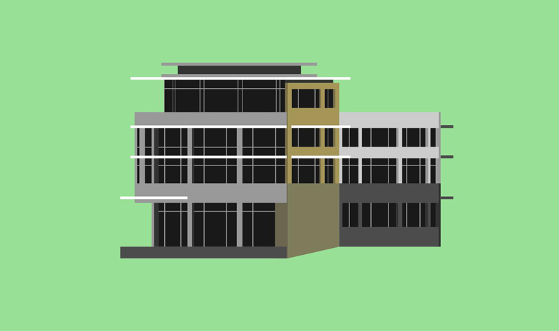
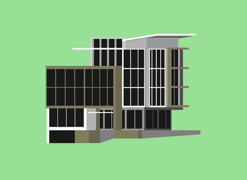
Creating the artwork by inserting the SU model and tracing the basics in Layout. Will think of some nice angles (still in parallel projection) to create interest in those that are fairly rectangular.
The whole poster at early stage

Close up

Close up

-
Richard, you might look at adjusting your setting to create stronger shadows. When looking at the closeups, the buildings appear flat, to me.
-
That is what I wanted mate, absolutely no life in them. There are no shadows just straight flat Layout traces!
-
@richard said:
That is what I wanted mate, absolutely no life in them. There are no shadows just straight flat Layout traces!
Richard, What do you mean by "Layout traces"? Thanks
-
I'd imagine Richard has Strokes off and fill on while tracing over the imported .skp in LayOut. Probably using .skp colors/shading to eyedrop the fills.
Me like

-
@rich o brien said:
I'd imagine Richard has Strokes off and fill on while tracing over the imported .skp in LayOut. Probably using .skp colors/shading to eyedrop the fills.
Me like

Thanks Rich!
-
Yes Peter just like Rich suggests, I'm tracing the SU model with filled rectangles - I tried exploding the model and using the existing vectors but the tidy up was a nightmare and there is more geometry than I need. I'd still like to reduce the detail that I've retained by about half so they are just simple representations.
-
Hmmm... I couldn't help but think that you could really push this into an almost cubist realm, otherwise what you are doing may only end up as a colored version of "elevations", and somehow I don't think that that is what you are aiming for.
This is interesting Richard, and I will follow your progress.
-
@dale said:
Hmmm... I couldn't help but think that you could really push this into an almost cubist realm, otherwise what you are doing may only end up as a colored version of "elevations", and somehow I don't think that that is what you are aiming for.
Your spot on Dale, I haven't quite got the style / detail right yet! Any thoughts we be appreciated!
-
cubist? What if each elevation or drawing was set off by an overall tone from an overlaid shape, contrasting with neighbors.
Hello! It looks like you're interested in this conversation, but you don't have an account yet.
Getting fed up of having to scroll through the same posts each visit? When you register for an account, you'll always come back to exactly where you were before, and choose to be notified of new replies (either via email, or push notification). You'll also be able to save bookmarks and upvote posts to show your appreciation to other community members.
With your input, this post could be even better 💗
Register LoginAdvertisement


