Forcing Sketchup to use IE8 and other Web Dialog problems
-
Same here, I also want to use latest Internet Explorer style; Buttons to be highlighted and rounded at corners like in IE8, checkboxes to be similiar to IE8, and everything else.
I noticed that thomthoms Cleanup3 tool has a webdialog with a similiar context to IE8. How do I make all my HTML style to be similar to IE8? Like this?<!DOCTYPE html> <html> <head> <meta http-equiv="X-UA-Compatible" content="IE=8" /> <!-- Some code --> </head> <body> <!-- Some code --> </body> </html>... I checked it, via webdialog and it was the same as original old style.
-
Isn't CSS round corners an IE9 feature?
-
-
-
I don't know about the default styling in embedded web controls. I thought we where talking about CSS styling.
The default styling I think might be affected by what common control manifest the host application uses...Can we perhaps see screenshots of desired result in a non-webcontrol Just to make sure we're talking about the same matters.
-
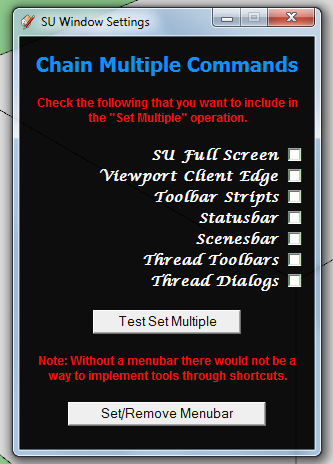
Here's an HTML Code opened via SketchUp Webdialog

...horrible
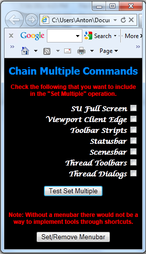
Now Here's an HTML code opened via IE9

...just looks beatiful.
Here's the whole HTML code:
<!DOCTYPE html> <html> <head> <meta http-equiv="X-UA-Compatible" content="IE=9" > <style type="text/css"> body {background-color;rgb(0,0,0)} h1 {font-family;Tahoma; font-size;20px; text-align;center; color;rgb(0,140,255)} h2 {font-family;Lucida Calligraphy; font-size;14px; text-align;right; color;rgb(255,255,255)} p {font-family;Arial; font-size;12px; text-align;center; color;rgb(255,0,0)} </style> <script type="text/javascript"> function update_checked(){ var cb1 = document.getElementById("cb1").checked var cb2 = document.getElementById("cb2").checked var cb3 = document.getElementById("cb3").checked var cb4 = document.getElementById("cb4").checked var cb5 = document.getElementById("cb5").checked var cb6 = document.getElementById("cb6").checked var cb7 = document.getElementById("cb7").checked window.location = ("skp;update_checked@"+[cb1,cb2,cb3,cb4,cb5,cb6,cb7]) } function test_set_multiple(){ window.location = "skp;test_set_multiple@" } function set_menubar(){ window.location = "skp;set_menubar@" } </script> </head> <body> <h1>Chain Multiple Commands</h1> <p><b>Check the following that you want to include in the "Set Multiple" operation.</b></p> <form> <h2><b>SU Full Screen <input type="checkbox" id="cb1" onclick="update_checked()"/><br /> Viewport Client Edge <input type="checkbox" id="cb2" onclick="update_checked()"/><br /> Toolbar Stripts <input type="checkbox" id="cb3" onclick="update_checked()"/><br /> Statusbar <input type="checkbox" id="cb4" onclick="update_checked()"/><br /> Scenesbar <input type="checkbox" id="cb5" onclick="update_checked()"/><br /> Thread Toolbars <input type="checkbox" id="cb6" onclick="update_checked()"/><br /> Thread Dialogs <input type="checkbox" id="cb7" onclick="update_checked()"/><br /></b></h2> </form> <center> <button onclick="test_set_multiple()">Test Set Multiple</button><br /><br /> <p><b>Note; Without a menubar there would not be a way to implement tools through shortcuts.</b></p> <button onclick="set_menubar()" >Set/Remove Menubar</button></center> </body> </html> -
Right - I'm not sure what triggers that. Markup or the host application.
On a sidenote, maybe I suggest some comments on your dialog. Tone down the contract 255,0,0 red on completely black 0,0,0 background is very hard on the eyes. If you pick a slightly more subtle tone so the contrast ratio is less I'll be softer on your eye.
It's also best to stick with one font - and I recommend a sans-serif font (which is the de-facto standard in all applications). Script and fantasy styled fonts are not very legible.
-
@anton_s said:
Same here, I also want to use latest Internet Explorer style; Buttons to be highlighted and rounded at corners like in IE8, checkboxes to be similiar to IE8, and everything else.
USE THIS META TAG:
<!DOCTYPE html> <html> <head> <meta http-equiv="MSThemeCompatible" content="Yes"> <!-- Some code --> </head> <body> <!-- Some code --> </body> </html> -
-
@thomthom said:
Right - I'm not sure what triggers that. Markup or the host application.
On a sidenote, maybe I suggest some comments on your dialog. Tone down the contract 255,0,0 red on completely black 0,0,0 background is very hard on the eyes. If you pick a slightly more subtle tone so the contrast ratio is less I'll be softer on your eye.
It's also best to stick with one font - and I recommend a sans-serif font (which is the de-facto standard in all applications). Script and fantasy styled fonts are not very legible.
Thanks, helpful sidenote

-
@dan rathbun said:
<meta http-equiv="MSThemeCompatible" content="Yes">
I especially like this, it makes the dialog look less like a webpage and more like an application dialog.
The operating system's default fonts and colors can be achieved with CSS2.1 system styles (is supposed to be enhanced/replaced by CSS3 appearance, but only Firefox implements that properly). In WebDialogs, I set the background color manually because not all browsers/OSs do it right:
dlg.execute_script('document.getElementsByTagName("body")[0].style.background="'+dlg.get_default_dialog_color+'"') -
CSS3 Appearance has been cancelled in the latest revision. (And have not gone back to the 2.x docs, and removed those dire warnings.)
-
@aerilius said:
In WebDialogs, I set the background color manually because not all browsers/OSs do it right:
dlg.execute_script('document.getElementsByTagName("body")[0].style.background="'+dlg.get_default_dialog_color+'"')I usually do it on the Ruby-side, before I call
show(), ie:dlg.set_background_color( dlg.get_default_dialog_color ) -
@Anton: Users will hate your right-justified switches.
In a left-to-right language, the checkboxes are on the left, and each label is left-justified.
Try this to make it look more like a dialog:
<form> <fieldset hidefocus="true" tabIndex="-1"> <legend>Chain Multiple Commands</legend> <label name="L1" id="L1" class="label_cbox"> <input type="checkbox" name="CB1" id="CB1" class="form_cbox" checked="false"/> SU Full Screen</label> <!-- ... etc. ... --> </fieldset> </form> -
@dan rathbun said:
I usually do it on the Ruby-side, before I call show(), ie:
When I saw that method in the docs, I liked it also more until I found that it didn't work on Windows 7 (returned white).
Interestingly, on Windows 7, the CSS color "%(#000080)[window]" is also white, but SketchUp'sdlg.get_default_dialog_colorworks. I think driven reported similar problems with OS X (we then used a hard-coded gray for the OS X dialog).I wished this all was less complicated.
-
Well.. it returns white on Win7 because that IS the system dialog background color "out of the box".
(One reason I hate Windows 6+ is they try to make dialogs look like webpages!)Anyway.. a user can set their own theme, or download a premade theme from the Web, in which the dialog background may not be white at all.
The other day, on XP, as a test I changed my system dialog color to Purple, just to test that method, and it worked, it returned the purple color that I had set. And SketchUp also used that color for background of it's dialogs and toolbars, etc.
Hello! It looks like you're interested in this conversation, but you don't have an account yet.
Getting fed up of having to scroll through the same posts each visit? When you register for an account, you'll always come back to exactly where you were before, and choose to be notified of new replies (either via email, or push notification). You'll also be able to save bookmarks and upvote posts to show your appreciation to other community members.
With your input, this post could be even better 💗
Register LoginAdvertisement


