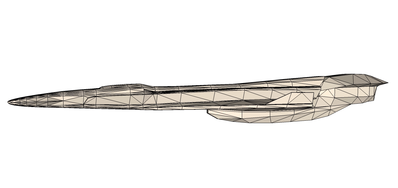
Spaceship (Collaborative Project)
-
I think I have to make the ship more compact, it looks a bit flimsy and doesn't have much coherency this way.
-
I completely agree, it needs to be bulked up, and it's hard to work with this, we need examples and illustrations like the bridge illustration, something to work from, we are going in blind here
-
Check these for inspiration. http://marian87.deviantart.com/favourites/12449583
http://star-dock.deviantart.com/gallery/
conceptships.blogspot.com -
Excellent, I liked this image straight up, it's exactly the style I taught we would end up with, it has both our style of work merged into 1, my boxy look and your streamlines look, only issue I have with this is it could be bulked up more, give it the illusion of sheer size http://AdamKop.deviantart.com/art/Chronicles-of-Man-Avernus-Carrier-2D-Commision-313767421?qo=1&catpath=faves;marian87;12449583&order=0&offset=1
Now this Image is impressive, the size of this ship is just amazing, combine this and the first and you will have a ship http://star-dock.deviantart.com/gallery/?26088965#/d567sm8
Now this is my usual style, the boxy look, but put curves on this like Marian's designs you would have a serious ship http://star-dock.deviantart.com/gallery/?set=26088965&offset=96#/d4tnjen
I'll have a closer look later as I'm only browsing on my phone, but so far those would be my ideas, the first images combined would create a ship which not only explores but have the capability to connolise and defend itself, much like BSG starship.
-
@Marion, the image on top of page 13 from "Marion's WIP" forum, the texture is fantastic, can you add that image to this forum, i think this is a fantastic design, it's my favourite of your work.
Also iv an idea I'd like to work and post up later for you to view, its an idea I think this project should go, it's going to be a challenge and I would like others to look at and contribute to, it's a starship we are designing and the scale of this project is going to be huge and it's for everyone to take and learn from, we are designing not only a starship concept but a ship that would function if in the real world, something which hasn't being done before on sketchucation, feel free to join in and build a working ship.
-
-
@iichiversii said:
Exactly, this is beautiful, it looks like a ship that could work in the real world and the texture is fantastic, I love it
Thanks.
I agree it looks beautiful but I have doubts about real world applications. -
@marian said:
This one?
Exactly, this is beautiful, it looks like a ship that could work in the real world and the texture is fantastic, I love it
If we could use this idea but built it much bigger, then map the interior in another SU and construct it as a whole ship, iv tried building a ship and interior but the shear size slowed it down, it's just not possible, but if we build the interior using another SU for each part of the ship, make it a epic journey for others to experience and visualise
What do you think?
-
@marian said:
@iichiversii said:
Exactly, this is beautiful, it looks like a ship that could work in the real world and the texture is fantastic, I love it
Thanks.
I agree it looks beautiful but I have doubts about real world applications.Well we wont just use real world applications, we need to think future applications also but making it recognisable at first sight, like when you look at an object it will be futuristic but the object is recognisable too if you get my meaning.
-
Ok this is only an idea for the project, obviously what you see here is only an interpetation of the ship, watch the animation and take note each componant appears repersents a part of the interior which is constructed to scale and place in another SU so that it doesnt clutter the entire project, remember this is only an example, from the start of the animation take it that the orange object which appears first is a repersentation of the ships hull
Its in the link which follows https://www.dropbox.com/sh/pz8qbu23gzgcz4d/4ANVdOYONF?m
I also added different coloured men to repersent levels of clearance, for the ship to be designed well not everyone on board has access to the entire ship, if that were the case we would have all sorts in the engine room, bridge and so on, so taught would have to go into the interior design, down to restrictions for crews entitlements on clearance
-
This ship is interesting, again a mix of the styles
http://star-dock.deviantart.com/gallery/?set=26088957&offset=120#/d50vjq3And this ship, nice
http://star-dock.deviantart.com/gallery/?set=26088957&offset=600#/dixzsh -
@Marian- something here to play around with
-
I like the shape, but the geometry makes it very difficult to work with. It's too high poly.
I either use low poly objects that I build up into complex shapes or I make low poly objects on which I use SDS/Artisan to then have an organic shape and then I add details. This way it's very easy to make modifications and work only on the shape without details getting in the way.
-
I could redo a low poly version, this was just a quick example I threw together to get some ideas flowing, any other suggestions?
-
That would be great. Just simplify the geometry and leave the panelling and other small details for when we have the whole ship in a coherent shape.
Like you said...it is a challenge to adapt to each other's styles, but I'm hoping we'll both learn something new. Sorry if I may sound harsh sometimes.
-
No bothers, I'll get started on this laters.
-
@unknownuser said:
Sorry if I may sound harsh sometimes.
Ha don't worry about it, I taught your design was shite too
We will get somewhere eventually, just going to take time -
@iichiversii said:
I taught your design was shite too
Well that is harsh. -
most of the time different styles collide, taught I would throw that in there.
So have you any new models in relation to this monstrosity? -
No, nothing new.
So...should we start looking at making another ship from scratch?
The model you started has potential.
Advertisement