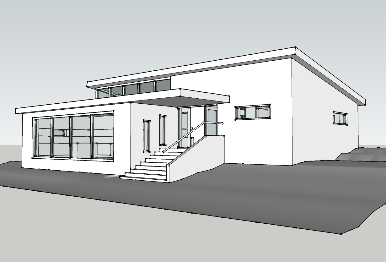
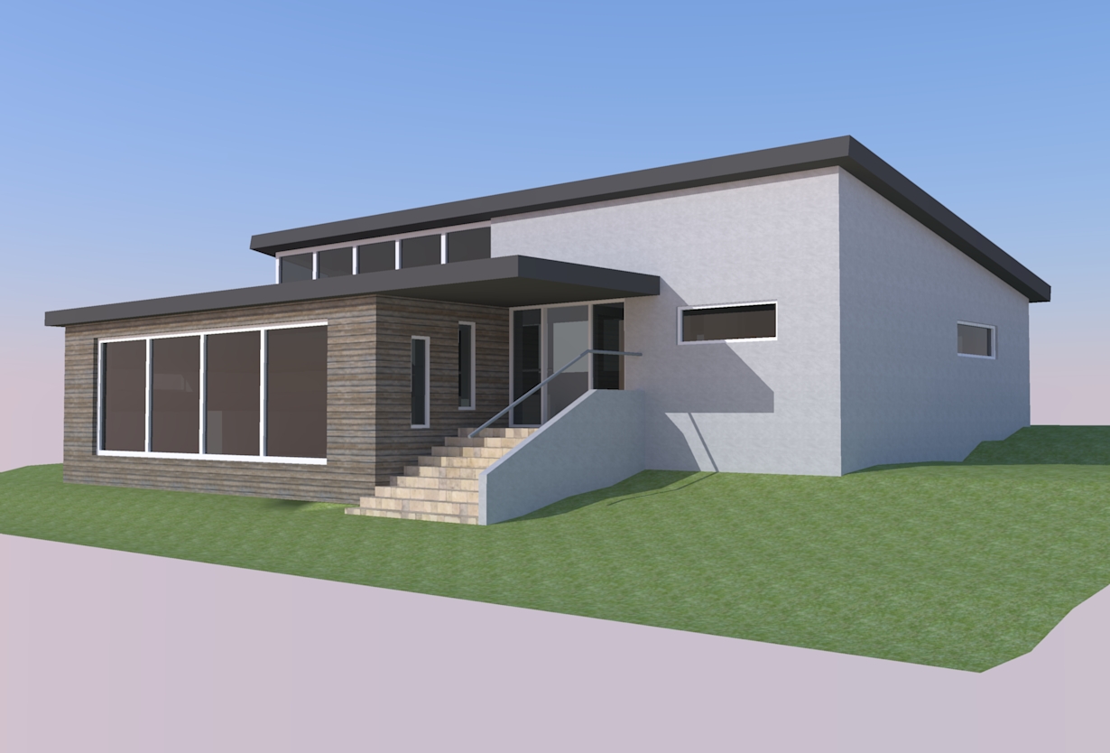
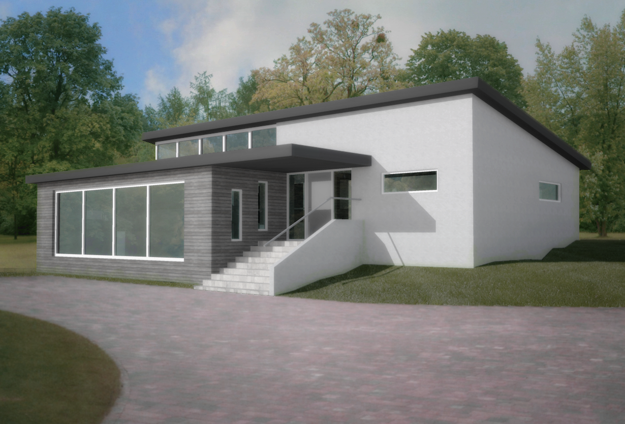
Split level concept house
-
This was an exercise in post work. modelled in SU, I the took a basic render from kerkythea and added the trees, sky, drive, and grass in GIMP. hard work and lots of tweaking!


-
Looks good. Two comments: 1) looks a little too hazy, out of focus, and 2) on the right, the straight angled lines where the building meets the grade do not look natural.
-
@daniel said:
Looks good. Two comments: 1) looks a little too hazy, out of focus, and 2) on the right, the straight angled lines where the building meets the grade do not look natural.
Thank you... two very good points. The first is easily tweakable in gimp, the second might have to be a bit of hand painting, as it were. Although I was intending to add a bit more greenery, planting along the walls etc, so that might be the best idea.
-
Mottle the light hitting the driveway. Like light filtering down through tree branches Add some foreground framing.
-
@roger said:
Mottle the light hitting the driveway. Like light filtering down through tree branches Add some foreground framing.
great idea... I shall try that
Hello! It looks like you're interested in this conversation, but you don't have an account yet.
Getting fed up of having to scroll through the same posts each visit? When you register for an account, you'll always come back to exactly where you were before, and choose to be notified of new replies (either via email, or push notification). You'll also be able to save bookmarks and upvote posts to show your appreciation to other community members.
With your input, this post could be even better 💗
Register LoginAdvertisement


