Beach House
-
 Hello to everyone here,
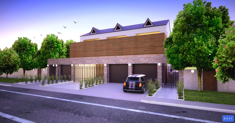
I have here a quick render of a Beach House, the modeling is done in Sketchup then rendered in Maxwell Render and Photoshop for some enhancement...
Thanks,
allanx

-
it looks very nice

-
Allan,
It is a nice clean render. It is a bit odd that there really is no focal point for me. In some ways the architecture is a bit flat in design. The little bushes in between the driveways look a bit odd.
Scott
-
Nice rendering, very nice rendering....where's the beach!
-
Beautiful work Allan, Is this in a development or on the water?
Where did you find that street texture or how did you do that? -
Hi Allan,
What I would do is take the view from a lower angle,more eye level than first floor,as it looks at the moment.In fact,as the first floor of the building is hidden behind the timber screen,drop the view right down to ground level/close to worms eye view and use the verticals of the building to create a more dynamic view.It may mean that the verticals are almost converging but it would offset the horizontal emphasis that the building currently has.If you can bring something in from the left such as an overhanging tree or a small part of an on-comming car,then it helps the eye by stopping the viewer "leaving" the image.As it is the image is all vertical and "diagonal bottom right to left".The more opposing diagonals you have,the more the eye is led around the image.
-
Thanks Irwan...
Scott, I think this is California Architecture..I think your right its quite very simple for my taste too...I will work on the Focal point and the bushes. Thanks
Thanks Daniel...
Thanks cheffey, I have downloaded that street textures years ago over the net and its free but not seamless you have to adjust it in PS. I can lend it to you if you want?
Thanks for the tip David, I am still experimenting on the images I have one more on the Beach side on the back of the house. I will try your suggestion and will post it here.
Thanks to all,
allanx
-
Update:
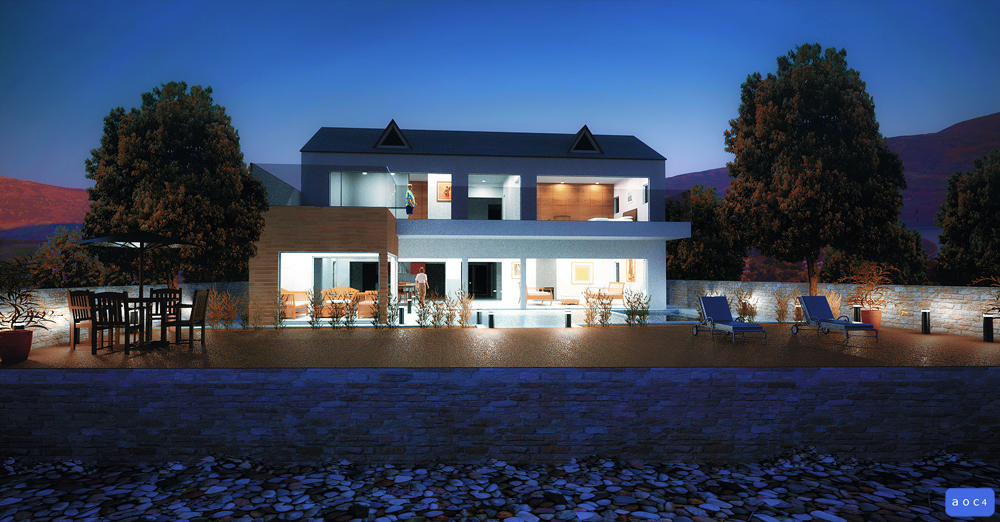
Added a night scene shot from the beach...
Thanks,
allanx
-
That's some pretty big sand.
-
You've got really great feeling to the night shot -- it looks like a Maxfield Parrish painting to me.
I think the Maxwell materials could use a bit of love -- particularly the deck looks like both the bump and specular could be turned down a bit and the stone wall looks like it could use a bit more specular and maybe displacement instead of bump.
But over all a really nice render.
Best,
Jason -
Allan mate nice clean renders, maybe a bit over saturated but they still look the part!
-
Thanks Jason and Richard for the comments and suggestions....
I will take note all your tips and will apply them as I am waiting for the comments from the client.
Best,
allanx
Hello! It looks like you're interested in this conversation, but you don't have an account yet.
Getting fed up of having to scroll through the same posts each visit? When you register for an account, you'll always come back to exactly where you were before, and choose to be notified of new replies (either via email, or push notification). You'll also be able to save bookmarks and upvote posts to show your appreciation to other community members.
With your input, this post could be even better 💗
Register LoginAdvertisement


