Any pointers for rendering?
-
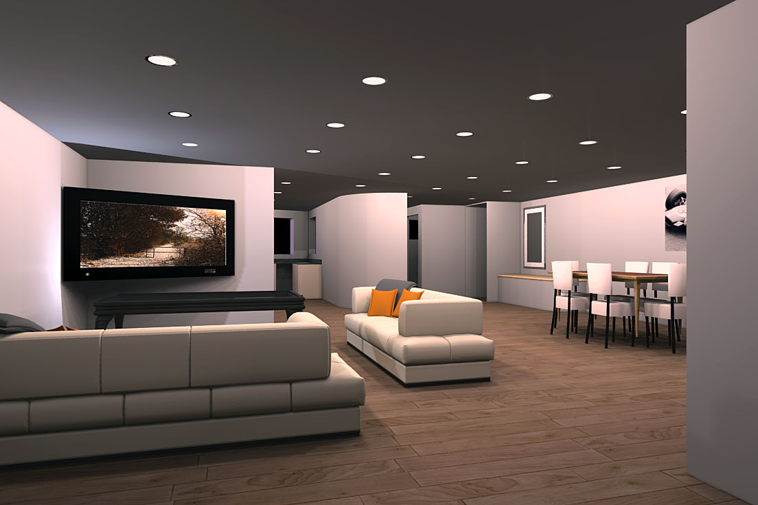
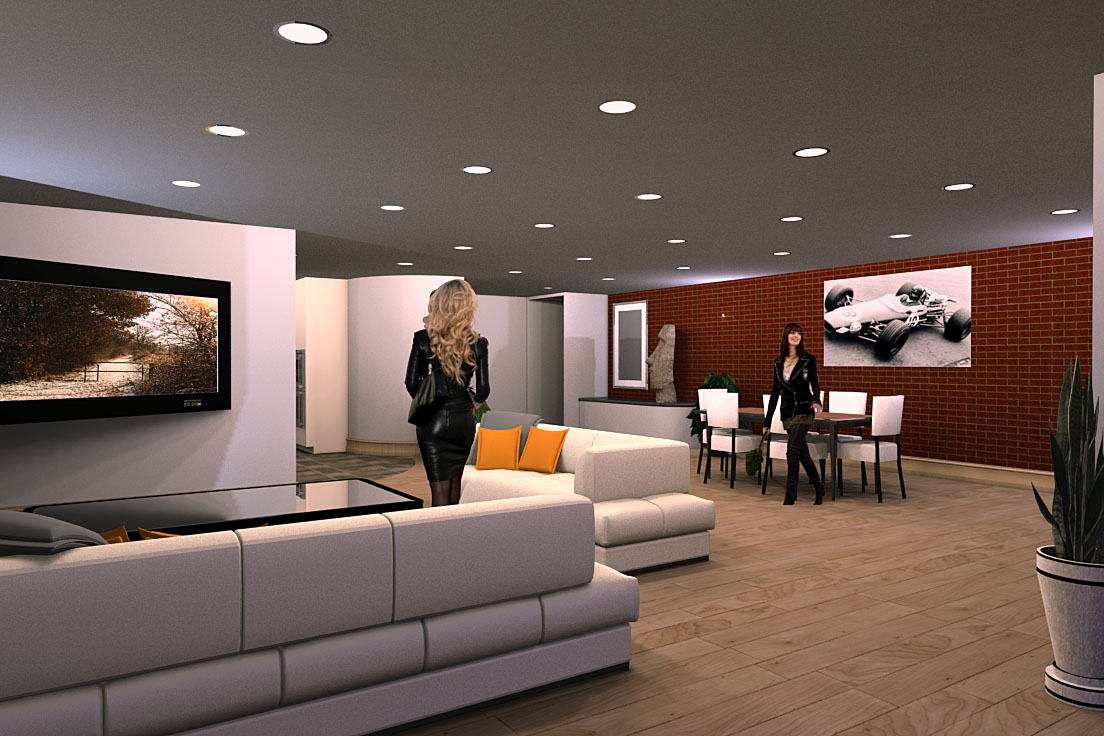
I am looking for c's@c's for this render, any pointers you may have I am willing to listen to. Not lookling to have folk do my rendering for me but I am some way off the almost photographic results some of you have achieved. Rendered in Renditioner 2 pro.
-
Mike,I can't help you with the rendering as I only use V-ray but it looks a fine job to me.
John -
Mike,
First thing I noticed is the shadow casted behind the TV is too sharp. The TV itself look too elongated. I don't if it is a console in front of the TV or not it just doesn't feels right to me. Dining area, the table looks floating in the air and maybe the chairs are way off to scale. The rooms looks empty to me and maybe you need to accessorize a bit more (random objects, art, pottery to soften up the space to make it look more inviting.)I never work with renditioner before so my knowledge is limited but the rendering turned out really clean and crisp. Are there any PP involved? Hopes that helps.James
-
Thanks guys,
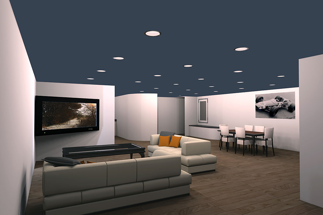
The tv is my own creation so I take responsibility for it's dimensions and appearance. Trying to come up with a better way to show F1 on the telly. As far as the ceiloing goes I have tried using the ceiling itself as a light source which renditioner can do, it needs toning down though which is something renditioner cannot do as far as I can see. Still looking. Thanks for taking the time guys, much appreciated.
-
Perhaps the ceiling needs some texture? I don't think it's too bright. To my eye, there seems to be ambiguity in where the walls meet the ceiling, if they do. Also, is the short wall behind the tv a flat plane? If so, then the revised shadow is suggesting otherwise. On design: This space needs some soft surfaces and textures. Both for warmth and for reduction of acoustic reverberation.
-
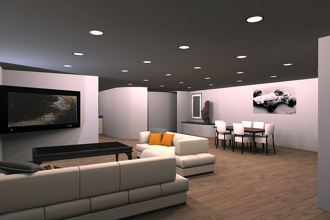
Fair enough as it goes, the ceiling has been improved by toning down the light element. Essentailly giving the ceiling less luminance. Another attempt. The wall behind the tv IS a flat plane, the best guess I have for the shadow is the effect of giving the ceiling luminance as well as the recessed lights. Guesswork though. Apart from adding a few 2d people all I can think to add is the finished kitchen area and some clutter like a book or magazines, coffee cups etc.
-
Hi, Mike:
Believe me, the concept and the model are great, and I appreciate that it takes effort to achieve what you have here. Currently, the feel of the space, to me, is a bit idealized. Maybe that is what you wish. My comments are of course only my opinion, but, as for texture, I guess I was thinking that wall surfaces would have some perceivable surface effects, and perhaps for soft surfaces a rug in the sitting area. Where wall meets floor, especially a wood floor, wouldn't some sort of transition piece customarily be applied? You don't think the coffee table is a bit tall? -
Thanks Tony, I appreciate your comments, seriously appreciate folk taking the time to consider the render. Looking into the points you mentioned and will get back when I have addressed them.
Rendering seems to me to be more of an art than a science but I reckon the science bit needs to be addressed too. I just wish the whole thing was more scientific and less hit and miss. Or perhaps I need to read a few more tuts.
The coffee table is probably way too tall but it was meant to be a stop gap until I could make something better.
-
What's going on with the sharp shadow-line on the ceiling behind the TV wall?
The floor is also wider-plank than I'd expect, but not unreasonable.The biggest factor keeping it from photorealism is grunge and mistakes. Clutter, that kind of thing.
-
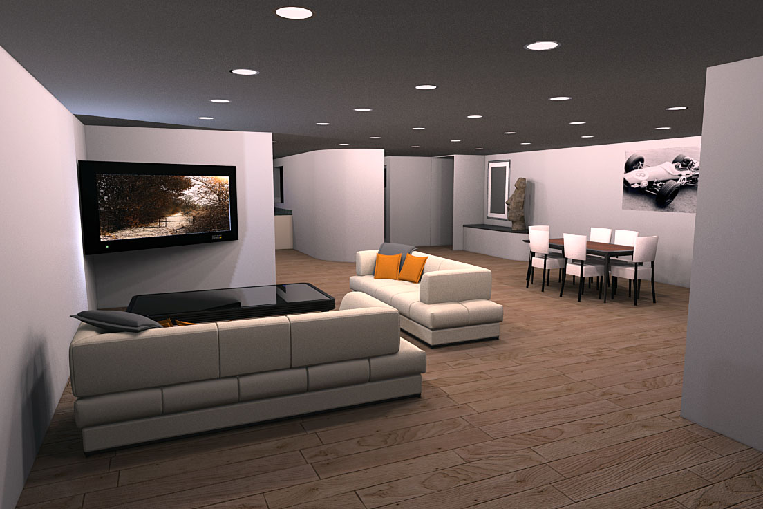
A last pop at this render before I call it a day. The shadow is caused, I reckon, by the use of a ceiling as a light unit - even if it is only low powered at 14watts. Only thing I can think of. Clutter is something I am looking at coffee cups and a magazine or two and something plant like for the near wall on the right side (foreground). I would have got a picture of my sisters but not sure the monitor can take that kind of punishment.
I am most gratefull for folk taking the time to make suggestions, makes this process a little more like rendering and less like a deadline.
No rug yet but looking to make one soon.
-
Mike,
I think you are off to a good start. What your missing are the small details. Things like baseboard, light switches, power outlets, etc can really pull a render together. The coffee table is way out of scale. The tv, I think because of its distorted scale, becomes the overall focal point. It draws your eye until you can figure out what is going on with it. What the render is really missing is a quality ambient occlusion. I also think the large sculpture is out of place. Like I said it is a good start but has a ways to go. What has helped me is looking at interior design magazines and studying what makes a nice interior image.
Scott
-
Thanks Scott, not used ambient oclusion and no clue how to tbh. SOmething to look up.
-
I have added some 2d people. Not happy but the choice is somewhat limited as far as I can see.
-
Hi, Mike. Nice job so far! Interior renderings are always so much work. If you are still interested in some comments here are my two (-and-ten) cents:
- Could you put the TV flat on the shorter wall? I think the TV in the corner looks awkward.
- I think the floor and ceiling could use a little reflection. Not much, but everything except the coffee table looks a little flat. Just a hint (or more) of some glossy reflections could help.
- Bloom could also help soften things up. I don't know if Renditioner does bloom, but you can always Photoshop it quite easily. You could also add some lens refraction effects on the ceiling lights. Might be distracting, but might work.
- Speaking of ceiling lights, there are quite a few! Maybe take some of the recessed lights out and and add some floor lamps or even a hanging light over the dining table?
- I like the idea of a feature wall, but the brick texture isn't quite right. Perhaps just a different color paint?
- The race car needs a frame and glass. It looks like a poster, which isn't all that classy.
- Not sure who lives here, but these two ladies are very distracting. One trick I like to use is a little horizontal motion blur in Photoshop. It gives the illusion of a long-exposure photograph. Oh, and when scaling people, make sure all their eye levels roughly line up. The blonde is much too tall and makes the space seem short. Somebody sitting on the near couch facing away from the camera might be less distracting. I like to make up stories about the people I put in my renderings, figure out what they are doing. I think that often makes them seem more natural (or maybe I'm just kidding myself, but it makes my life more fun).
And just to reiterate, this is a really nice rendering already. I think everybody agrees about that. Just trying to help you kick it up to the next level. Good luck!
-
Nice work. I like following the thread so I might learn something as you figure it out. Yes the ladies are distracting. (I think either a very rich teen age boy or a race car driver lives here. Who else would have an F1 photo as art and such visitors?)
But on a serious note, I find the light effects on the ceiling distracting, however they are caused. That would be the first fix I would look for. Other stuff is coming along nicely.
-
I am very geartful for the comments and suggestions. I reckon it is a hard thing to criticise someone else's work in case they go 'off on one', cannot take it etc. The comments and suggestions here are being taken to heart and I will carefully analyse what I am doing with my approach to hopefully improve. I have seen other folk here, almost step over a line and there is a palpable shift in results which I hope to emulate. Something which is only going to be possible thanks to other folk taking time and thought to put their experience into words. Thanks guys, very much.
Just a thought, this is turning into a proper wip so if someone wants to move this thread it may be more appropriate elsewhere.
-
Hi, Mike:
Technically, if the two figures are the same height, their eye levels would be about the same in standard perspective?
Just for kicks I did a study model of the layout of your scene, building rough mockups of all of the furniture, and visually estimating distances. I assume the ceiling is 8 feet? And by proportion, the width of the open space is about 26 feet? Is there kitchen with dining beyond the TV wall? What happens in the space where the camera is located, and what happens beyond the wall with the plant on the right? -
The ceiling height is 8' and the width is a bit more than 26' but that is not important. The two characters are different heights.
The area behind the television is the kitchen which will have a small breakfast bar the dining area is on the right by the brick wall. The space where the camera is located is access through patio doors to the garden and beyond my mother in law's tongue is a lift and stairs. The building is intended to be 100% less abled friendly so the lift is not one of those afterthoughts stuck in the space of a closet.
PS. my mother in law's tongue has been scaled down so as not to be too intrusive (unlike my mother in law) and is decidedly less prickly too.
Hello! It looks like you're interested in this conversation, but you don't have an account yet.
Getting fed up of having to scroll through the same posts each visit? When you register for an account, you'll always come back to exactly where you were before, and choose to be notified of new replies (either via email, or push notification). You'll also be able to save bookmarks and upvote posts to show your appreciation to other community members.
With your input, this post could be even better 💗
Register LoginAdvertisement


